MapCarte 144/365: Counties Blue and Red Move to the Right by New York Times, 2012

MapCarte144_watkins

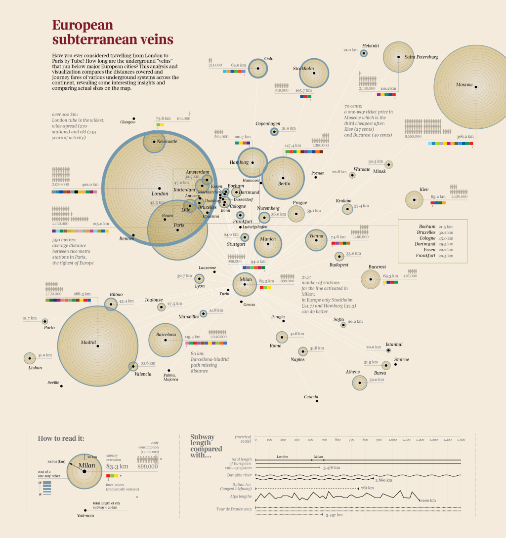
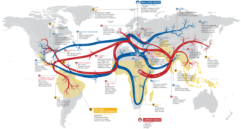
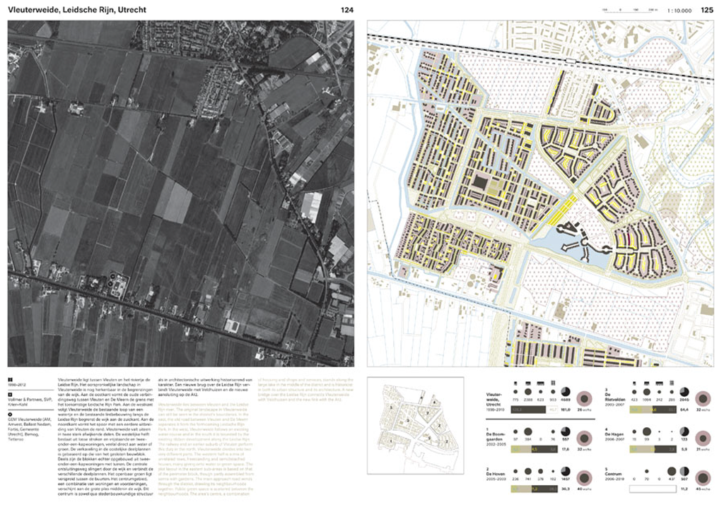
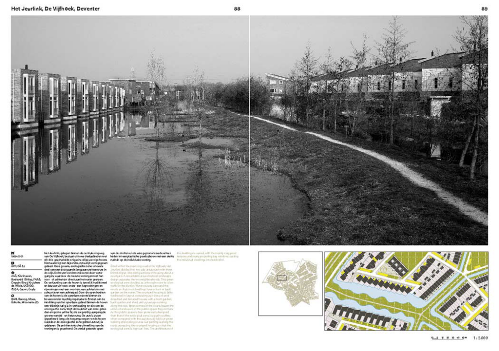
Some of the best print cartography has always resided in the pages of quality newspapers. The use of maps and graphics have long been used effectively to illustrate stories and to provide a visually impactful way of engaging readers. Who wants to wade through pages of text that attempts to describe something when a full page spread of well crafted graphics can provide far more information as well as be more visually appealing?

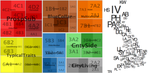
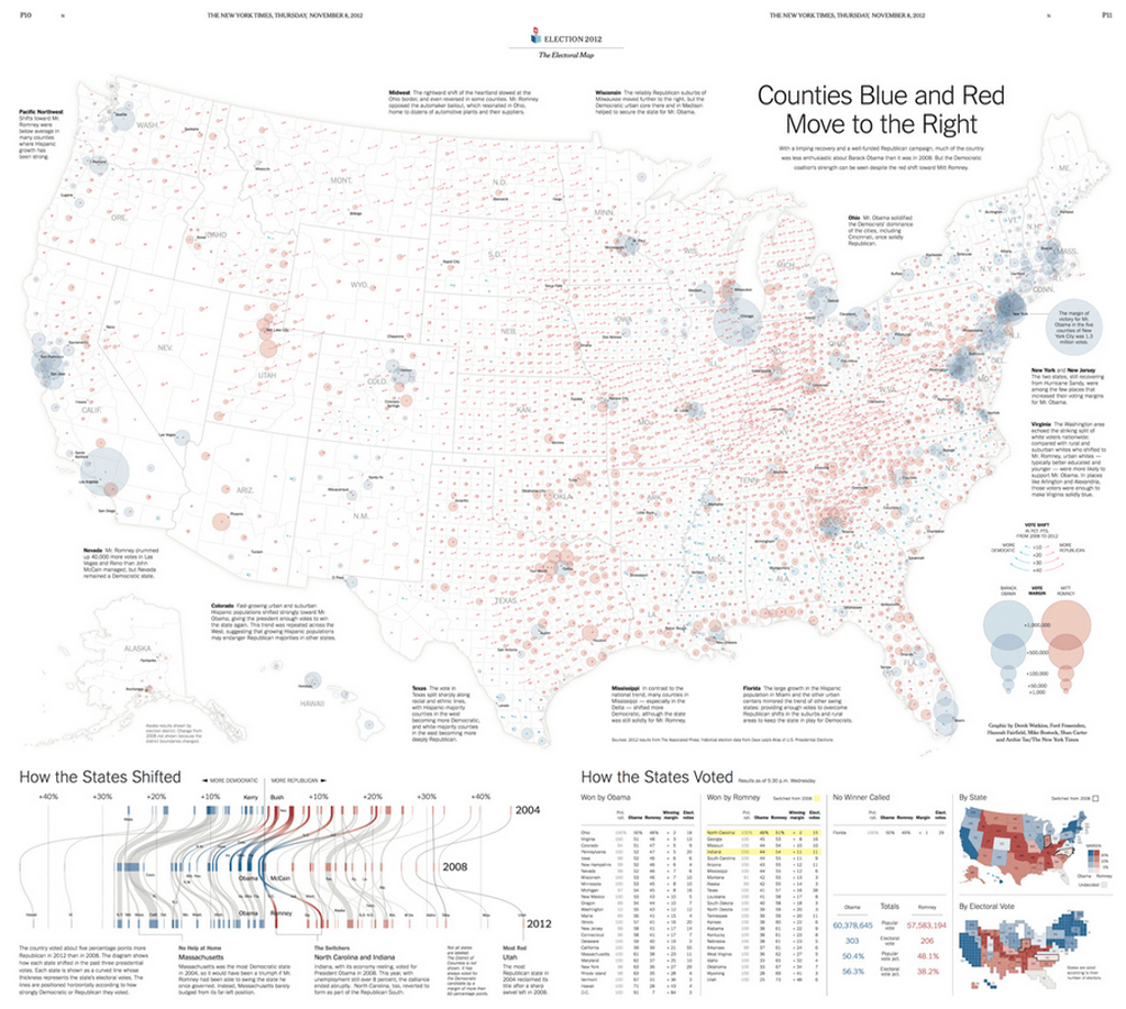
The New York Times are currently at the forefront of journalistic cartography both in print and online. Here, Derek Watkins et al. uses a two-page print spread to illustrate not just the results of the 2012 Presidential election but also the context at a county level. The proportional symbols are well positioned and the overlaps are generally handled well (though transparency can cause some issues of perception with this sort of massively varying data it’s always a compromise). The swing in votes is illustrated by a small arrow which shows how voting changed between 2008 and 2012.

MapCarte144_watkins_detail

There are useful textual vignettes surrounding the main map to give some sense to the pattern the map illustrates and a band at the foot anchors the page with a novel graph showing change at State level. Tabular data presents the actual data and there’s even room for some headline figures and a State and Electoral Vote map…the latter using a cartogram approach.

This is an excellent example of composition and layout. Each component tells a part of the story and they fit together like a perfect jigsaw to tell the bigger story. The colours are both indicative of the different parties but are also in sympathy and balance across the page. The visual hierarchy is subtle but reinforces key information across the entire page.

Excellent print cartography that combines a rich variety of complimentary elements in a finely tuned overall composition.

MapCarte 137/365: European subterranean veins by Accurat, 2012

MapCarte137_veinsIf a map’s main intent is to communicate information through graphical form then they are, by definition an information graphic. Modern parlance has seen the rise (and over-use) of the term infographic which has become synonymous with dramatic, often abstract representations of data. They are often composed of a collection of linked graphs, punctuated by key words, phrases or numerical highlights…the better ones offer some sort of coherent whole that places an emphasis on a well structured layout. This is also the description of a map. Maps have always been infographics, long before someone invented the term…though in the same way that not all infographics are meaningful or well designed, so the same goes for maps. Maps that are abstract (or highly diagrammatic) might very well be seen as belonging to the new fashion for journalistic infographics more than more traditional styles.

This example by Accurat is a terrific example of taking a single theme and developing a strong, abstract depiction of space through the organisation of a range of graphical elements. The shapes of land/water and any typical geographies are eschewed in favour of a mechanism that simply showcases the information. The structure of these components makes the geography implicit rather than the geography itself being used to organise the content.

MapCarte137_veins_detail

The map provides the reader with a fascinating exploration of the underground transport  veins that traverse major European cities. The title is attractive and catchy. The layout is clear and well balanced. The colours are simple and do not compete with each other. The main elements – the proportionally scaled circles give an immediate sense of comparison and scale. There’s a wealth of information on the number of lines, the number of users, the cost, the length of extensions and the geographical reach of the system. The use of size is used to great effect in different ways to connotate magnitude. Colours show us difference. Small multiples illustrate number of users. Labels and textual components are used as a literal symbol to give us headline facts and figures. All classic visual variables, well executed. There’s an extremely subtle visual hierarchy also at work that organises textual components and shades of colour which together give us a sense of figure and ground as well as contrast.

The map itself is clean and well composed but the legend is also extremely well organised giving clear information with even the title ‘legend’ (one of the most pointless labels on any map) being replaced by the far more useful ‘how to read it:’. The graph shows us some comparisions with other distances – rivers, mountains, roads and the Tour de France route. Great comparisons that provide some additional perspective.

This is a very well constructed information graphic. It deals with data that is organised spatially and the spatial dimension affords us comparisons. It’s a map…in the same genre as those by Beck, Minard, Snow etc.

MapCarte 126/365: Contagion by Hasaim Hussein, 2009

MapCarte126_husseinUsing a map as the backdrop on which you drape a striking thematic overlay is common practice in cartography. Maps do not have to be the containers of data, they can simply be the framework on which other information is laid out. Of course, it helps considerably that the overlay has some spatial component else the map would be rather pointless.

Hasaim Hussein has created a striking map showing the likely transmission path in space and time of three of the world’s most deadly contagious diseases, leprosy, smallpox and malaria. Matching the subject with the symbology is an easy way to convey a sense of the map’s data so the use of red arteries (for leprosy) and blue veins ( for smallpox) work well as the tendrils flow across the world. Central Africa is the origin of leprosy and northern Africa the origin for smallpox. Malaria doesn’t spread in the same way so, instead of transmission lines, it’s represented as areas of modern endemic malaria.

The visual balance is well executed in this work. The origin and density of the transmission lines is central and the map layout balances very well around this central fulcrum. The visual centre of the map is just above the graphical centre and this map layout hangs off that point perfectly. Contrast and hierarchy are also carefully managed with a light grey background map giving way to vibrant foreground colours. The origins and flows are simple to locate and follow and the various major time periods and places are linked to the main flow lines not just with a small unobtrusive leader line but also through matching the text colour to the disease and using small simple pictographs. These all help to focus the attention and enable us to move easily across the map from one recognisable component to another, related recognisable component.

A map tends to be read in parallel with the eye struggling to find an anchor and then figure out how to proceed. the secret with many good maps is to structure the work to help the eye and brain read as if the work was in serial (much like words on a page). By cleverly using structure you can make a complex pattern be easily read and digested. North arrows and scale bars? Absolutely no need on this type of map.

MapCarte 125/365: Where on earth have you been? by The Guardian, 2014

MapCarte125_guardian

A lot is currently being made of personalised geographies and maps that reflect our supposed desire to see content filtered in some way by what map-makers think we might want to see. Google are pioneering personalised content in Google Maps based on our search histories and other preferences. But there’s always been a far simpler way of understanding personalised geographies. Sometimes these are as basic as a world map in a pub where patrons are invited to place a pin to show their location…thus the map of the pub’s patronage takes shape. We may even have a map at home in which we place pins to show where we’ve been.

The Guardian, in collaboration with Kiln have created a simple application that allows us to create our personalised world of travel. The map requires you to input the countries you have visited and the number of times you’ve been there. It’s a simple interface to add your information and the map is then built. What this app does very well is not just default to a shaded choropleth but turn the data into a density equalizing cartogram. Countries visited are shown proportional to each other in size. The map is then presented as if on a folded piece of paper with a nicely constructed layout. You can print your map or share it.

Of course, what’s really going on is The Guardian is collecting data through the choices of our selections which is possibly the real purpose of the map. They still achieve that aim by making the application interesting, simple and designed to encourage participation.

Simple. Fun. Eye-catching. Visit The Guardian’s web site here to make your own personalised map.

MapCarte 123/365: Motorcycle Accidents by MCE Insurance, 2012

MapCarte123_motorcycle

Click on the image to view the online web map

Interactivity is the key to making a good web map. it does not have to be all singing, all dancing, it just has to be clear to the user in terms of how it works and then it needs to work.

The map of motorcycle accidents by MCE insurance illustrates how the user interface design supports interaction effortlessly. On opening, you’re presented with a nicely stylised base map of Great Britain. It’s tilted, has some texture, has some simple effects like patches of trees and also some moving clouds and a gleaming sun. These items aren’t particularly purposeful but they do create a look and feel that lifts what might have been a very simple base map above the mundane…crucially without over-doing it. Making your map ‘different’ is a good move as long as it doesn’t detract from the overall purpose. The monochrome base to all content except key figural elements works well.

The list of filters is neatly presented on the right in a vertical column. No awkward tabs to leaf through. Clicking on a filter turns it into a highlighted arrow pointing to the map. Symbols update. Hover over a location and you’re presented with clear facts in a popup (no click needed). Each filter is colour coded and the map updates accordingly with the same coloured themes that provides an immediate visual link. The information panel on the right provides some headline information.

The map, in many ways, is simply a visual anchor for the information. It takes a back seat and allows the user to drive other content. It’s a very useful way to incorporate maps and graphics together and to make the delivery of the detail more engaging.

MapCarte 122/365: Les 100 Tours by Idé, 2013

MapCarte122_lestours

Click the image to go to the online web map

While web maps clearly bring with them greater possibilities for data display (access to data through popups), animation and multiscale, not every web map necessarily needs all of these techniques to be successful. In fact, one of the basic tenets of map design is to keep it simple. Just because your technological palette allows it does not mean you need to deploy it.

This web map of the history of The Tour de France by Idé (a french computer graphics design agency) illustrates the philosophy perfectly. The map itself is static, single scale and cannot be zoomed or panned. It doesn’t need to. The base map detail is simple and effective. It does not need detail. The symbology is generalised but symbolic at the scale and meaningful. It suits the map perfectly, showing simple route paths between tour stages marked by point symbols. The stages are named, and the direction of the tour shown with small arrows. Colours are all in concert with one another and France itself is highlighted among the other land.

Idé don’t completely dispense with web controls. They use interaction to show the 100 years of the tour. The graphic time slider allows users to move to a particular year. The map updates. There are three pieces of information for each year – an anecdote, the stage classification and the overall classification. The map needs no more.

That’s it! There is nothing spectacular about this map except the simplicity is expertly crafted and the no-frills approach reminds us all that often the simplest graphical approach coupled with a clear use and usability make a really great map.

Update: The original post contained an error which attributed the authorship of the map to Henri Desranges…which of course is ludicrous. Apologies.

MapCarte 117/365: Atlas of Global Geography by Erwin Raisz, 1944

MapCarte117_raiszOne of the twentieth centuries foremost cartographers, Erwin Raisz was born in Hungary but emigrated to the US in 1923 and spent much of his professional career teaching cartography and curating the map collection at Harvard University. He was a prolific map-maker who produced thousands of maps comprising mainly of landform drawings. His style supported the easy interpretation of landform features “combining a scientist’s fascination with geomorphology with an artist’s drawing ability”

MapCarte117_raisz2

Rasiz’s maps were accurate, elegant and brought considerable aesthetic appeal to the depiction of the physical world in map form. His style was unique and his work was almost entirely pen and ink. More than his landform maps, Raisz published a seminal text on ‘General Cartography’ and introduced block-pile maps, created the orthoapsidal projection and value-by-area cartograms. His 1944 atlas showcased many of these techniques in a beautiful work. Each page of the atlas is a piece of art in its own right and shows how a cartographer should work in treating each theme as a unique challenge. While an atlas should be consistent, the consistency here comes in the quality and the variation of technique applied perfectly to each theme. The pages all look different yet they match in style and encourage exploration as each turn of the page brings a new visual delight.

The limits in colour printing meant the colour palette was at first glance very restrictive. However, this leads to a more consistent appearance with the same colours used across all maps and the thematic maps being predominantly two-colour. Such limitations also give the cartographer a strict set of constraints that focuses their design to optimize the pallete at their disposal. In short – technical constraints often bring out better work because quite simply it forces the cartographer to think and think inventively to take advantage.

MapCarte117_raisz3

Raisz spent much of his life educating people in the art and craft of cartography. In later life he experimented with the use of aerial photography in cartography but was skeptical about the use of computers to produce maps. His views were based on an impression that computers would remove the realism that a cartographer can bring to their work and that maps could end up being produced by technicians with little interest in geography or cartography.

MapCarte117_raisz4

Raisz died in 1968. Nearly 50 years on one could be forgiven for thinking he may have had a point but we can reflect on his work as a way to inform new work and bring some of his flair and technique to new map-making endeavors.

You can explore some of Raisz;s work here and also see high resolution zoomable version of pages of this atlas on David Rumsey’s site here.

MapCarte 110/365: Vinex Atlas by Jelte Boeijenga and Jeroen Mensink, 2008

MapCarte110_vinexcoverAn atlas is simply a compendium of maps. We normally see such collections comprise maps of the world and so the world atlas is perhaps the most common form. Of course, an atlas can be about any related theme and this example from 010 Publishers showcases the approach beautifully. The maps are of a related theme and the design of the atlas pages is consistent throughout – the key to a great atlas.

A report In the 1990s published by the Dutch Ministry of Housing, Spatial Planning and the Environment outlined a project referred to by its Dutch acroym ‘Vinex’. Hundreds of thousands of houses were constructed under the proposals which became known as Vinex districts. In planning terms the policy has been heavily debated and criticised. This atlas provides a detailed visual, spatial and statistical account describing all 52 Vinex districts. The atlas includes a thorough essay on the programme and then illustrates the districts with detailed maps, plans, graphs, aerial photographs and photographs.

MapCarte110_vinex2

The atlas has a very distinctive appearance being predominantly black and white with muted colours across the maps and flashes of yellow used to provide accents throughout. The ink to paper ratio is consistent which gives each page a very similar look and feel. The relatively high proportion of white space is used effectively to give each map and graph space to breath and contribute to the overall composition. The graphics are bold and crisp.

MapCarte110_vinex1

Designed by the Joost Grootens studio and published by 010, it’s an exceptional example of designing information-based graphics with detail being brought to focus with clear structure and precise depiction. The atlas won the 2009 ‘best book design from all over the world’, beating 700 other entries to the gold medal.

More page spreads can be viewed at the Joost Grootens web site here.


MapCarte 106/365: Mapping Connected Places by Ed Manley, 2014

MapCarte106_manley

Big data is one thing but Ed Manley describes the dataset he used to create this map as ‘massive data’. It’s the Oyster Card tap ins and tap outs across London’s transport network over a 3 month period in 2012. That’s a log of every single journey made by public transport. trying to make any sort of sense of such data requires a clear head but also the ability to mine the data to get to the crux of a very specific question. Without focus and homing in on a tightly controlled idea then work such as this becomes nothing more than a visual data dump. What Manley has achieved here is to extract meaning from the data and represent it with clarity.

The map shows how associated two places are in the transport network by mapping the most popular destination station for any origin station. It’s a gross generalisation but then that’s the idea…to see what the most likely end-point might be for a traveller from the origin of a journey. Manley only used peak period journeys between 7-10am on weekdays to avoid ‘noise’ caused by bidirectional journeys or the very different patterns of weekend travel. He therefore uses selective omission to great effect as well as a range of generalisation operations on the data to capture the nugget of detail he wants.

At a meta level it gives us a glimpse of the structure of the network by route for the morning commuter influx rather than the real network which might map infrastructure itself rather than the routes people travel. The curved lines emphasise the abstract nature of the concept well. Mapping true geography and a network would assign too much meaning to the actual route which may be inaccurate anyway given the multitude of ways to get from A to B. The saturated colours, clean black backdrop and sensible use of transparency add to the visual appeal of the map as does the fact there isn’t a title. The map stands on its own as abstract art. It demands that you read an associated commentary to understand the complexity. An interesting approach that works well.

MapCarte106_manley_detail

The map supports basic knowledge acquisition about interdependencies, key stations, spatial concentrations and stations which act as local hubs in addition to the concentration in central London.  too which are detailed on Manley’s blog about the map.

The old KISS principle of ‘Keep It Simple Stupid’, often taught in cartography classes, is a key tenet of this work. To clarify a complex system, keep it simple. This is exactly what Manley has done in designing not only a piece of data driven map art, but one with a purpose and which can be used to explore questions of the data. A lot of data driven map art is purely for appearances and when explored critically often shows up some serious liberties taken by the designer.

Check Manley’s blog here for more detail and a link to a higher resolution version as well as a version with labels.


MapCarte 102/365: Egalitarian Mapping of People in Britain by Jo Wood, Jason Dykes and Aidan Slingsby, 2010

MapCarte102_woodSuccessful and elegant display of large multivariate data is rarely achieved because many attempt to fit their data into geographical space.  Of course, geographical space is often a most inconvenient container for the data because of the constraints of size and shape; and with the smallest areas containing the most diverse and important data.

Cartograms have become a fairly typical way of taking the data outside traditional geography and ordering them in a different visual way to better display the relationships between areas. There are numerous examples but spatial treemaps not only allow you to show relationships across the data but detail within the data at different scales.  Here, Wood et al. show 1,526,404 postcode units in Great Britain, sized by population and arranged so that geographical relationships and postcode geography hierarchy are maintained.  The map is richly coloured according to a socio-economic classification comprising 7 super-groups split into 52 sub-groups that shows data concurrently.

MapCarte102_wood_legend

The map is beautifully arranged allowing patterns in the vast amount of information to become clear at local, regional and national scales.  In a single map, they have managed to effectively display detailed information about 60 million people recorded in 40 census variables in over 1 million places. The colour gives the appearance of a stain-glassed window inviting you to explore the information at different distances.  Sans serif type is a good choice to tie in with the clean regular lines of the map itself and transparency allows large labels to be placed unobtrusively.

Higher resolution versions and more explanation are available on the giCentre web site here.