MapCarte 354/365: Urban Forest by OOM Creative, 2013

MapCarte354_trees

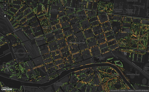
Click image to view the web map.

Melbourne’s Urban Forest Visual by OOM Creative is simply conceived and well built. There’s nothing pretentious or bloated about the map and it’s clean and elegant approach to mapping every tree in the city of Melbourne is a template for the use of modern web maps. The web site houses the embeded map so there’s no going to a separate site. The User interface is uncluttered and intuitive. The overall design builds on a limited but effective colour palette that repeats across the map and the site itself. The use of a dark basemap and bright colours creates a pleasing contrast between background and detail.

The map shows the location of every tree recorded by a census and categorises them by genus using different shapes. Almost immediately, this simple act of making the effort to categorise point data and show them differently takes this web map further than many similar maps that might just show the presence of a phenomena or not. Binary web maps are common (things exist and are shown, or they don’t). OOM Creative have thought cartographically about the work. Further, the symbols are coloured to indicate the remaining lifespan of the tree. Immediately, you can see where streets are populated with the same genus of tree creating a particular uniform scene, or perhaps where their is a rich variety. It’s easy to spot the botanical gardens! It’s also easy to see the spatial pattern of the health of trees and where resources perhaps need to be targeted for remediation or replanting in the coming years.

You can modify the map view to focus on the detail at a precinct level and also select a subset of the data to show trees by age or by use. The map forms part of a larger story about the Melbourne canopy and conservation efforts. It’s an educational web site of which the map forms a core component. Perhaps the most endearing aspect of the map is, in addition to clicking on each tree to reveal information, you can ’email a tree’. Designed as a way for people to report tree health, damage or other information, it has also been used as a simple way of communication to express to a tree how important it has been, or any range of other eccentric human reactions. In this sense the map provides a fascinating way for people to interact with their environment in an emotional way.

You can see the web map as part of the Urban Forest Visual web site here.

MapCarte 351/365: Paperscape by Damien George and Rob Knegjens, 2013

MapCarte351_paperscapeClick the image to view web map

Big data is one of those ill-defined buzzwords that is rarely used appropriately. It’s a fairly all-encompassing term that relates to a dataset that is so large, unwieldy and incomprehensible that it creates difficulties in terms of processing. For cartography, big data might be regarded as a dataset that creates difficulties for analysis in the sense of distilling it to something meaningful to map; or it might relate to the the visualization techniques we have to build to handle something that is problematic to display using traditional means. It’s debatable whether a million items is big enough to be called big data but it certainly creates big cartographic design problems. Paperscape attempts to resolve the problem by creating a map of nearly a million scientific papers.

MapCarte351_paperscape_detail2The map is a constellation of symbols; small circles coloured by the type of category of scientific work the paper explores. Colours tend to occupy similar spaces and sit comfortably within the overall constellation. The broad category is labelled but the beauty of the map is when you zoom in there’s a progressive reveal of detail. Circles become larger and we see more labels and more symbols appear. Larger symbols indicate increased citation rates as a measure of the paper’s importance. You can switch the colours to represent age with newer papers appearing more saturated along a single hue colour scheme.

MapCarte351_paperscape_detail1This is no dumb map though. Clicking the symbols gives you full bibliographic details and additional controls to create links to all other papers that are either referenced by or cited in the paper. It’s a novel way of representing a bibliographic database and does a great job of bringing a cartographic design solution to the representation of a million individual records and their complex interconnectivity.

It’s multiscale, easy to understand and interactive. It’s also well designed.

You can view Paperscape here.

MapCarte 257/365: Escape the map by Mercedes Benz, 2011

Escape the map was an online advertisement for Mercedes-Benz.  It offers an immersive, interactive experience for the viewer who becomes a participant in the map-based story.  The work has drama, doesn’t overtly force the brand and follows a ‘choose your own adventure’ type plot.  It’s sophisticated, memorable and unique.

The map and map related objects like the falling map pins and address (locator) are key metaphors in the story.  The advert immerses you in the future, how we may use maps in cars and how important location is and will become not just for navigation but as a defining way of living.  The heads up display on the electronic paper map works particularly well.

The work clearly illustrates how popular maps have become in the mass media and there are numerous references to familiar online web map services, virtual globes and their techniques (such as facial blurring on Google Street View) as well as having a sub-plot that references social media such as Twitter.  This familiarity with ubiquitous mapping and social media tools means the advertisement hooks us into a familiar world to tell its futuristic story.

MapCarte 254/365: Where Were You on Sept. 11, 2001? By New York Times, 2011

MapCarte254_911

 Click above to view interactive map

It’s often the case that a map with lots of push-pins is considered pretty poor cartography. Most would recommend that the data ascribed to each point be summed, aggregated or reported differently. Sometimes, though, the point of the push-pins goes beyond cartographic purism. This map paints an emotional picture of the response to the terrorist attacks of September 11th 2001 and was published on the 10th anniversary as a way of reflecting on the events of the day. Contributors were encouraged to leave a message and to tag their pin with an emotion such as ‘angry’, ‘fearful’, ‘unmoved’, ‘secure’ or ‘hopeful’. Any attempt to look at the responses analytically and come up with a different cartographic representation would detract from the raw emotion.

The very point of this map is to lay bare the data. It’s points on a map that reflect individual reactions to the horror of the attacks. Each person’s contribution is no more or less than any other and so providing a place for the comments to live is the purpose and it needs no more cartographic finessing. This, then, might almost be considered a spatial book of condolence.

There have been hundreds of maps that paint a picture of the attacks showing the detail of the site, the plan of the attack, the social network of the terrorists and the reconstruction but none that simply uses a map to give people a place to share their words. Maps can be divisive and the harsh lines we place on them to demarcate territory often cause conflict. This shows us that they can also be a place for humanity and that brings people together irrespective of boundaries.

MapCarte 123/365: Motorcycle Accidents by MCE Insurance, 2012

MapCarte123_motorcycle

Click on the image to view the online web map

Interactivity is the key to making a good web map. it does not have to be all singing, all dancing, it just has to be clear to the user in terms of how it works and then it needs to work.

The map of motorcycle accidents by MCE insurance illustrates how the user interface design supports interaction effortlessly. On opening, you’re presented with a nicely stylised base map of Great Britain. It’s tilted, has some texture, has some simple effects like patches of trees and also some moving clouds and a gleaming sun. These items aren’t particularly purposeful but they do create a look and feel that lifts what might have been a very simple base map above the mundane…crucially without over-doing it. Making your map ‘different’ is a good move as long as it doesn’t detract from the overall purpose. The monochrome base to all content except key figural elements works well.

The list of filters is neatly presented on the right in a vertical column. No awkward tabs to leaf through. Clicking on a filter turns it into a highlighted arrow pointing to the map. Symbols update. Hover over a location and you’re presented with clear facts in a popup (no click needed). Each filter is colour coded and the map updates accordingly with the same coloured themes that provides an immediate visual link. The information panel on the right provides some headline information.

The map, in many ways, is simply a visual anchor for the information. It takes a back seat and allows the user to drive other content. It’s a very useful way to incorporate maps and graphics together and to make the delivery of the detail more engaging.

MapCarte 119/365: Armsglobe by Google Ideas, 2012

MapCarte119_google

Click the image to go to Armsglobe

This data visualization (map?) was produced by Google as part of the 2012 Google Ideas INFO (Illicit Networks, Forces in Opposition) Summit. The data was provided by the Peace Research Institute Oslo (PRIO) and comprises a database of small arms imports and exports. There are over 1 million data points of individual exports and imports that map the transfer of small arms, light weapons and ammunition across 250 states and territories across the world between 1992 and 2010.

The purpose of the map was to highlight the illicit trade in small weaponry as a way to shed light on the fact that 60% of all violent deaths are due to small arms and light weapons. Creating a visually arresting, in-your-face map provides just the right aesthetic for capturing people’s attention. Sure, the data could have been mapped on a flat map with muted colours and a conservative approach but sometimes the subject matter and the purpose need something altogether different. The design is deliberately startling and captivating and illustrates patterns and trends in the import and export market so that one can better understand how they might relate to conflicts.

The armsglobe is fully interactive and allows intuitive zooming and rotation. Click events highlight a particular country and the labels rotate and scale as the map view updates. Graphs provide some quantifiable comparisons that show a breakdown of imports and exports. The viewer has control over showing or hiding some of the graphs as well as different ways to filter the data. In this way, one can show everything to gain an overall impression or focus on a specific type of import or export. there’s even a temporal slider to explore historic data.

Use of Armsglobe during the 2012 INFO Summit

The most impactful aspect of the design is the contrast between the map’s background and the flow lines themselves. A black background and a globe that has black water bodies and grey landmasses, turning lighter on selection is a perfect backdrop for the neon, pulsing flowlines. the animated symbology clearly shows the flow’s origin and direction as well as quantity. It’s unconventional but hugely effective.

Often the trick to producing a well designed map is not simply going with convention, but trying something altogether different. It’s often harder to succeed with the latter. This design approach wouldn’t suit every mapping need but here, it works in concert with the theme and the map’s purpose. Form and function.

MapCarte 67/365: World Food Program Donations by Santiago Ortiz, 2014

MapCarte67_ortizClick the image to view the online map

It’s the interactivity that makes this web map application by Santiago Ortiz so compelling. The mouse is predominantly used as a device to move across the image with mouseover controls allowing you to ‘brush’ the various components. As you move your mouse across the globe, country outlines or flow lines showing connectivity between countries are highlighted. The associated component in the graph is similarly highlighted so physical connections create visual connections seamlessly.

Clicking countries or graph components re-focuses the globe to the country of choice and refreshes the visual representation to make it country specific. Holding the mouse button provides an intuitive way of rotating the globe and the movement is smooth and pleasing on the eye.

The design is strong, with a heavily generalised map of countries depicted on the otherwise transparent globe that makes for a great visual atop a jet black canvas. The globe and the graph share colours (strengthening the visual links) and also share space with neither being dominant. The application is designed for exploration, to reveal patterns and to see how countries compare. A terrific example of slick, simple and powerful web map design.

MapCarte 62/365: 50 years of The Rolling Stones by Sergio Alvarez and Javier Santana, 2012

MapCarte62_stones

Click the image to view the online map

Maps are one of the oldest devices for telling stories. This fundamental concept seems to have been reinvented in the online realm as web maps provide a canvas for integrating a range of multimedia with maps as well as providing interaction to support user engagement. The ability of a map to invite a reader/user in and provide them with a rich, immersive environment is core to good map design. Web mapping extends the possibilities by providing additional ways to interrogate data. Here, a simple dataset of all locations of the touring history of The Rolling Stones is mapped.

The map itself is stripped of virtually all detail. The colours are limited to a few greys with the splash of highly contrasting red used to great effect in the typographic components. As the user ‘turns the page’ to reveal each tour year the map shows cities and the links between them; location labels are only revealed with a mouse over (not a click!) so they don’t clutter the image. Useful navigation tools are minimalist but intuitive.

Simple story. Simply presented with simple but highly effective design.