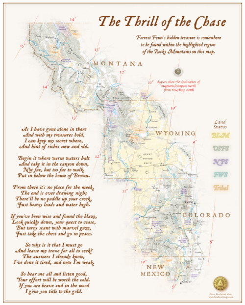
MapCarte 313/365: The thrill of the chase wall map by Benchmark Maps, 2013

MapCarte313_fennMaps of imaginary places are highly sought after as works of art and are used frequently to illustrate works of fiction in print and on film. indeed, MapCarte has already included three exquisite examples for Winnie-the-Pooh (MapCarte 14/365), Treasure Island (MapCarte 36/365)and The Hobbit (Mapcarte 247/365). But sometimes the imagination is based in a real world and supports the readers quest to find something amongst the rocks, trees, pastures and streams. Author and collector Forrest Fenn’s remarkable book ‘The Thrill of the Chase’ was published in 2010 and explored not only his life but also his secretion of a large treasure chest somewhere in the Rocky Mountains north of his home in Santa Fe, NM.

Fenn has placed $1 million in gold and gems inside a bronze treasure chest and hidden it. The book and a poem he wrote provide clues to its whereabouts and he promises that the finder of the chest can keep the contents. this, then, is a real world search for hidden treasure and what better way to augment the search than provide a map. Benchmark Maps, award winning publishers of maps and atlases, worked with Fenn to produce a fold-out map which was incorporated into a more recent book ‘Too Far to Walk’. They then produced a limited edition fine print poster of 100 copies, each personally signed by Fenn.

MapCarte313_fenn_detail

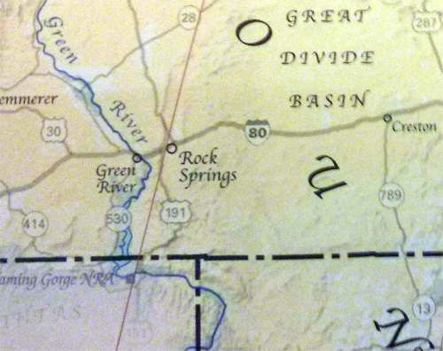
Benchmark’s beautiful cartography is brought to bear on the map with a layout that frames the Rocky mountains as the detail fades from the background; the shape of the natural features over-riding any administrative jurisdictions. Colours are used to delineate the public lands and typography is selected to match the feel of a treasure map. At this scale there’s no way one could use it as a map to genuinely search out the treasure but just to look at the area and ‘know’ it’s in there somewhere is part of the thrill. Of course, x doesn’t mark the spot but the map includes the poem Fenn wrote that contains clues.

A beautiful map that accompanies a fantastic real-world search for hidden treasure. This is cartographic treasure and as a limited edition print simply adds to the story.

As of the date of writing no-one has found the treasure. You can read more about the map on Benchmark Map’s site here or on Forrest Fenn’s website here.

MapCarte 247/365: The Hobbit and Lord of the Rings by J. R. R. Tolkien, 1937 and 1954

MapCarte247_tolkien_hobbit

Fantasy maps are increasing in number and scope as more video games take place in imagined worlds and computer power is able to render environments in ever more detail. The world of Minecraft is particularly interesting from a cartographic perspective since users can add worlds. Indeed, Ordnance Survey have added their Minecraft version of Great Britain to the virtual world. More details here.

But imaginary maps, or maps of imaginary worlds, are not new. Take, for example, The Hobbit and the Lord of the Rings trilogy by J. R. R. Tolkien. The films of the last decade have brought a new found interest that has seen countless maps and other geo-products developed including the very well produced The Hobbit Journey Through Middle-Earth as a way of teasing the film The Desolation of Smaug. You can see the web map here which uses a mix of sound, visuals and purported satellite imagery and maps that even have dancing clouds. It’s a great example of the current trend for photo-realistic worlds and immersive, interactive content.

Here though, we want to reflect on a much simpler yet more important and cartographically intersting version – the originals drawn by J. R. R. Tolkien himself.

MapCarte247_tolkien_hobbit2

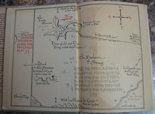
The lead map in this entry and the one above come from the inside front and back covers of The Hobbit published in 1937. They are two colour prints of the world as Tolkein envisaged it without CGI or fancy special effects. It presents the layout of the world with the key places. Mountains are represented in aspect across an otherwise planimetric map though there’s a hint at perspective with far off mountainscapes appearing on the horizon. It’s a sort of progressive projection and Tolkien was clearly a student of cartography enough to replenish his maps with high quality cartographic flourishes.

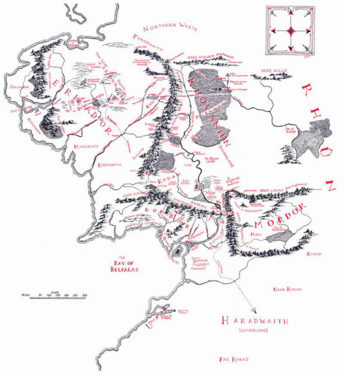
MapCarte247_tolkienThe final map here is from The Lord of the Rings book The Fellowship of the Ring, published in 1954 and gives us a view of the larger world the characters inhabit. Again, the two colour approach is used which allows highlights to be generated and contrast achieved. The linework is simple but effective and the use of white space hints at a world beyond.

As an inspiration for the landscapes that eventually made it to Peter Jackson’s films it’s easy to see how these original maps inspired the use of the landscape of New Zealand. A great example of the use of the real world to act as a set for an imaginary one.

Beautifully simple maps that bring to life an imagined place and which, along with others, underpin the fantasy maps of today.


MapCarte 236/365: Space Station Earth by Eleanor Lutz, 2014

MapCarte236_lutz

Web maps used to offer little more than the ability to drop a few (thousand) digital push pins onto a pre-defined base map. They rarely suited the purpose yet deman for better maps and the ability to do more with a web map has led to quite a revolution. In only a few short years we’ve gone from having to use canned base maps and symbols and even map types to a wide range of possibilities. It’s now possible to configure pretty much any aspect of your map, be it designing a novel backdrop through restyling options, using bespoke symbology, to leveraging technology to create something entirely new. This rich canvas is being exploited by those who are able to push the boundaries; both cartographers and others who simply want to play with maps, map data or present their ideas spatially in an innocative, fresh way.

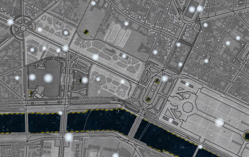
Here, Eleanor Lutz provides a great example of the way in which you can re-style OpenStreetMap data, through MapBox, to create a unique map. Space Station Earth harks back to classic viseo games as you hover and fly over a space-themed landscape. The geographies are familiar but the symbology is entirely re-designed. Some names have been changed to give the impression they’re space colonies (e.g. Paris Colony), custom textures are applied throughout and linework for roads and building outlines give us a meatllic, chrome-inspired world. Oversize markers simulate lights with a hazy glow in the depths of dark space.

Water becomes space itself so that land masses seem like artificial space-stations floating in a galaxy. The metaphor of space becoming the water than isolates different land masses works well. The depth and texture Lutz builds into her map within a map scale and between map scales is superb and demonstrates the essence of contrast and hierarchy in map design.

While for demonstration purposes, the map inspires and shows how far we’ve come in a short space of time in terms of designing maps on the web.

You can see the full Space Station Earth map here.

MapCarte 231/365: Walt Disney World Resort, 2014

MapCarte231_disneyClick image to view web map

MapCarte 114 focused on the original Disneyland map by Sam McKim from 1958. It was a beautifully drawn map that brought the magic of the Magic Kingdom to life as well as creating a brochure for people to use as a way of getting around the park. Here, we celebrate a web map of Walt Disney World Resort. In many ways it’s the modern counterpart to McKim’s originals but built for a new type of consumer.

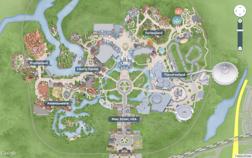
The web map is interactive in a way that the paper version cannot possibly be but it retains the sense of style of the originals. It uses the Google Maps framework but with their own content fused into the service so that the resort appears as part of the map itself. As you zoom in, detail is rendered so the map builds in detail. This isn’t just in the addition of more content, but also the detail in the textured landscape of the basemap. There’s even clouds that appear to float over the resort.

At the largest zoom level the buildings and layout of the resort is illustrated using beautifully rendered digital artwork with clean lines but with textures, shadows and depth. Many features are depicted planimetrically but those that are given more importance are drawn obliquely using an axonometric approach so some of their front and side elevations are shown. It’s a useful technique not only to give more detail to the buildings but to distinguish what’s important from the background.

Typical pictorial symbols are used across the map for certain points of interest (gift shops, restaurants etc) and labels sit cleanly. Pleasingly the typeface isn’t too large which can so often detract.

Well composed, clean and clear web mapping.


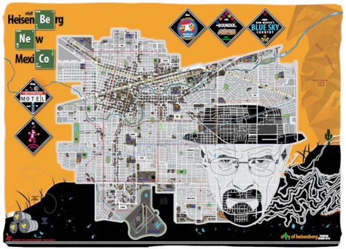
MapCarte 215/365: Visit Heisenberg by Aaron Kidwell, 2014

MapCarte215_kidwell

Imaginary cartography comes in all shapes and sizes but making the map look convincing goes a long way to creating the illusion of reality. Aaron Kidwell has based this work on the hugely successful television show Breaking Bad and named his town after the alter-ego of main character Walter White. The imagery used throughout the map aligns well with the symbolism of the show itself, particularly the graphics and the periodic table style typographic elements.

The map is more than just a cultural reference though. The cartography is clean and balanced. The map detail, predominantly in greyscale but with some accent colours, is fresh and well crafted. The hierarchy of detail and the contrast between features shows that the style would work perfectly well on tourist maps and brochures for more standard map products.

The golden/black background situates the map and the detail of the abstract mountainscape on the right is again unique. Finally, the character of White peers out from the topography and Kidwell has done a great job of merging the ‘reality’ of the map with the non-reality of the other imagery.

All in all, a very well constructed map that leans heavily on cultural references and rides the coat-tails of the hit television show. The cartography needed to be up to the mark though; and it is.

MapCarte 190/365: Cartographer’s Handscapes by Angela Dorrer, 2013

MapCarte190_dorrer1

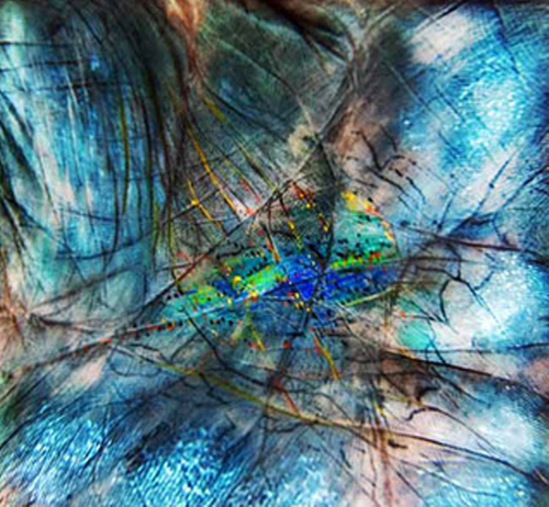
The convergence of art and cartography is perhaps never more abstract than in the hands of an artist using the hands of cartographers as her canvas. Angela Dorrer’s handscapes are constructed with no preparation or pre-defined ideas about how the work will develop, what appearance it takes or what it may represent. It’s spontaneous art using maps as a medium to explore people and attempt to reflect something of them in the work.

As Dorrer explains “In every hand there are elevations, valleys, paths, branches and patterns”. Out of this, she develops topographies and new cartographies by painting directly onto the palm: handscapes. Through painting she discovers and/or uncovers, what she refers to as a new country. She explores, she measures, she maps a terrain, she names and every aesthetic decision has cultural consequences. However the existence of the new country and this new painting is short term, as the host body will begin to break it down rapidly with bodily sweat.

During the International Cartographic Conference in Dresden, 2013, Dorrer painted handscapes on a range of cartographers. As she painted, the two people spoke and she interpreted the conversation into her map art. Once complete and a photograph taken, the cartographer was invited to provide a written interpretation of their handscape. The results are intriguing.

MapCarte190_dorrer2Knowing many of the individuals, the art does in fact do a good job of reflecting character. The descriptions make sense if you know a little of the background of the people and go a long way to explaining different cartographer’s take on…cartography. The way we make maps is a function of many things but there’s something very personal we all put into our maps…they reflect our own artistic and aesthetic abilities whether subconsciously or not.
You can view more Cartographer’s Handscapes at Dorrer’s web site here.

MapCarte 184/365: The Global Sharknado Threat by John Nelson, 2013

MapCarte184_sharknado


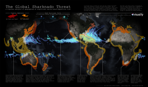
Maps don’t have to be serious but that’s not to say ‘fun’ maps cannot eschew design. This map of the sharknado threat to humankind reveals the terrifying impact that coastal hurricanes have on our fragile ecosystem. Rogue tornadoes have such an updraft that they are capable of lifting even large aquatic species (sharks) and propel them inland. What untold damage may occur from inland incursion of sharks is unimaginable…yet this map sets it out plainly.

John Nelson has applied some of his almost signature styling of using extremely dark satellite imagery as a basemap with thematic detail rendered in highly saturated colour overlays. Historic tornado data is mixed with species habitat and the threat zones identified with the scientific precision of hexagons. Text sets out the problem and adds to the frivolity of the work but regardless of the fanciful subject matter this map won a design award at the FOSS4G conference in 2013.

As we see in many imaginary maps, or maps of imaginary worlds, high quality cartography brings a certain realism to the subject matter. If it’s mapped well…it must be true. This, of course, is also the case more generally so it’s worthwhile looking a little closer at the next great map you see to establish whether it’s real…or unreal.

MapCarte 129/365: Ice Cream Island by As the Crow Flies cARTography, 2013

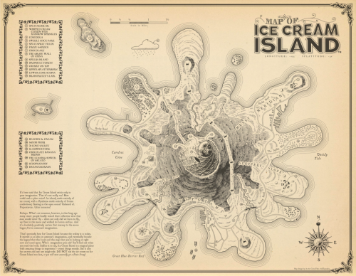
MapCarte129_icecreamIs there anything that cannot be mapped? Think about it…the entire world is our mappable object at every conceivable scale from planetary to the atomic. But yet people still find additional themes, objects and thoughts that give them something to make a map from. Cartography extends from reference mapping through to single theme maps, from national map series to a kid drawing his or her classroom and from a cartography student creating their first web map to a boy scout drawing out their imaginary worlds. It’s this last example that demonstrates that really, the fertile imagination innate in us all is often the start of something rather special in map terms.

As the Crow Flies cARTography drew Ice Cream Island to accompany a children’s novel series about a fantasy island of ice cream. The novel itself was to be encased in covers that made it appear as if an ice cream sandwich (chocolate covers with vanilla pages) . The map was to be printed on the inside of the unfolded cover – the wrapper to the ice cream sandwich. What a fantastic approach! But it’s the map that really takes this fantastical place to another level.

There’s a nod to an antique style with raked coastal vignettes, ornate hand-written letter forms and old school hachuring technique on the slopes. It has an antique burnish to the paper to give it age (and authenticity)  and the detail is drawn in a semi-realistic hand-drawn style so we get the feel of swampy areas and forests as well as more geometric depictions of settlement and transportation. The names follow the theme: Messypotamia, Strawberry River Flow, Beaches and Cream and Rocky Road; and there’s even a unique coordinate system comprising longitude and splatitude.There’s even a cherry on top of both the island (which appears to be the inverted cone of the upturned ice cream island) and the north arrow, the slopes mimic a slowly melting sauce and the description both balances the map layout and adds conviction to the story.

This is as well crafted a fantasy map as you’ll find. It’s simplicity helps it not be overly detailed but it resonates because it’s comprised of elements of real maps that we immediately recognise. That helps us immediately understand something of the shape, form and patterns before our eyes. We immediately feel empathy with the place and can easily imagine it to be real.

It’s a well produced map in its own right regardless of the reality or not of the subject matter. If only more ‘real’ maps were this well drafted!

You can see a much larger version of the map (and other similarly styled maps ) on the As the Crow Flies cARTography web site here.

MapCarte 14/365: 100 Aker wood by E. H. Shepard, 1924

MapCarte14_Shepard

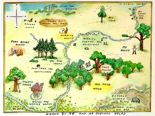
Maps of fictional places have always been ripe for cartographic depiction. One of the simplest, earliest and classiest is E. H. Shepard’s depiction of the fictional 100 Aker Wood in which the A. A. Milne children’s stories about Winnie-the-Pooh are set.

The map is small format and appears on the inside front covers of the books. As such, it immediately immerses the reader in the imaginary landscape providing settings for the many adventures. The map is whimsical and playful with the central characters being positioned throughout to depict them in the scene itself and even the north point is labelled POOH rather than NSEW. The imaginary wood is actually based on part of Ashdown Forest in Sussex, England. Many locations in the stories can be linked to real places in and around the forest.  The landscapes were directly inspired by the distinctinctive high, open heathlands of heather, gorse, bracken and silver birch punctuated by hilltop clumps of pine trees. Both the map and Shepard’s other illustrations can be matched to actual views, allowing for a degree of artistic licence.

The map has become synonymous with the Winnie-the-Pooh stories and shows us that through maps, our imagination can be brought to life.