MapCarte 227/365: U.S. Daily Temperature Anomalies 1964-2013 by Enigma labs, 2013

MapCarte227_anomalies

Click image to view web map

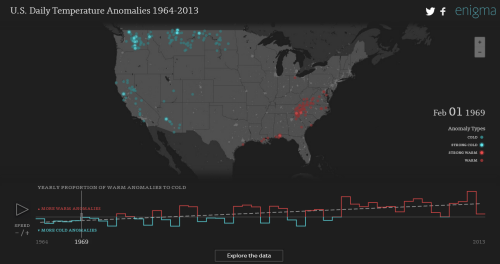
We’re almost drowning in data these days. The impact of the various Open movements is seeing the unlocking and emancipation of so much data from both private and public bodies. This causes difficulties in a sense because there always seems to be a race to do the coolest visualization in the shortest amount of time with any new dataset…and that usually leads to some pretty poor cartography. Quality so often takes second place to speed and the desire to be seen to be the first to have published something. Occasionally though, we see a gem and this web map of U.S. daily temperature anomolies is one such example.

There’s a huge amount of data to be sifted and for an approach to displaying the salient characteristics to be determined. A minimalist map base works well – anything to simplify the experience and give the reader a fighting chance at understanding the patterns is going to help. Colour is also at a minimum with just reds and colds used to signify major temperature trends. A counter keeps us up-to-date with the date and provides a useful visual anchor. The patterns of flashing dots dance across the map and because they tend to appear in waves we don’t get the usual disorienting impact of flashing maps.

The data has been simply categorised to make it clear and instantly recognisable and the chart provides a useful way to position the map in time in relation to the longitudinal data. The user interface is well crafted and everywhere you expect functionality, you get it. The map has basic pan and zoom; the graph slider can be moved. The animation can be paused and you can change the animation speed. The best bit, though, is the map is just the beginning. The data can be explored and scrolling down the page reveals well written, digestible detail, again presented with clear graphics in a strong layout.

Web maps that use defaults tend to suffer. When you go beyond the defaults and really think about each element of your work you develop something that is clearly in a league of its own (carto)graphically.


MapCarte 214/365: Breathing Earth by John Nelson, 2013

Animation in cartography can be a difficult beast to tame. Usually we use animation to show some sort of temporal change but as we animate we introduce cognitive load and complexity for our readers so we should be mindful to strip back the content to compensate. That often makes the map less purposeful as a result. When used effectively, animation can bring to light a pattern that might otherwise not have been evident and this is the impact John Nelson’s breathing earth has here.

It’s a matter of fact that global snow and ice cover changes annually but how do you show it? Nelson does several things well in this work. He uses a simple dataset…cloud free satellite imagery, one for each month. He picks the right projection (a polar azimuthal) which gives us focus for the content being mapped. He keeps everything simple and gives us a moving, pulsing legend to keep track of the month.

The results are great. Simple concept, simple product but anything but simple thinking about design and cartography.

Further details about the map and several alternatives can be found here.


MapCarte 213/365: “1945-1998” by Isao Hashimoto, 2003

The topic or theme of a thematic map goes a long way to explaining its success. No matter how hard you might try, a run-of-the-mill subject matter will always find it difficult to speak to a large audience and gain huge plaudits. It’s fair to say that many of the more successful thematic maps tackle an obscure or contentious subject matter. They most definitely do have something to say and if you marry the form and function well, then they stand out from the crowd.

Isao Hashimoto’s utterly simple approach to map-making would not work when applied to any number of thematic maps. Using simple shapes, an aesthetic that borrows heavily from computer games from the 1980s with their blocky graphics, annoying sounds and a blinking almost strobe like effect…this is not an easy map to look at. But that’s the point. The map is a statement on the horror of the 2053 nuclear explosions the map catalogues with a temporal framework of 1 second per month.

Early horrors make way to periods of relative quiet before huge testing programmes begin. The counters show the cumulative ‘scores’ and different ‘players’ enter the game as they become nuclear nations.

Hashimoto’s approach to the map and the style he embraced make this a stand-out map. The visual and audible discomfot matches the subject matter and the stark presentation brings home the message he wished to communicate perfectly.

MapCarte 212/365: LA-NYC by Minh Anh Vo and Victor Schuft, 2010

MapCarte212_papercut

Quite often you can reduce the complexity of a phenomena to be mapped right down to basic principles. Elimination of detail is a key concept in cartography and often we’re too afraid to remove content. Take a road trip though…really it’s just a single line and some means of saying something about the journey.

A road trip by designers Minh Anh Vo and Victor Schuft turned into a beautiful abstract linear map. Using a timeline as a guiding principle they use simple colours to differentiate days, marker flags, places and mileage. It almost looks like a kite flying across a page.

MapCarte212_papercut_detail1

Flags mark where State boundaries were crossed. Red and black blocks of colour on the timeline alternate to differentiate days. A geographically accurate line above the main diagram shows the real route. No other detail is necessary and what makes this map beautiful is the brilliant use of white space…plenty of it.

MapCarte212_papercut_detail2


It’s certainly at the abstract end of the cartographic spectrum but a very effective approach to the mapping of this journey.

MapCarte 204/365: NYC Taxis: A day in the life by Chris Whong, 2014

MapCarte204_NYCtaxiClick image to view web map

Increasing access to unique and intriguing datasets is driving a massive map-making movement. People are exploring data in many interesting ways and occasionally developing some creative cartographic products in the online medium particularly. Chris Wong has done just that. Taking a dataset of different New York taxi cab fares he’s processed and manipulated the data into a form that can be mapped in a compelling way.

Notwithstanding any dataset such as this is prone to some level of uncertainty and the fact that Wong took some cartographic license (the actual routes mapped are based on the Google API suggestion, not a GPS tracklog for instance) it’s the mapping that is really quite impressive.

By taking a single journey we are pairing the data right back from the millions of cab journeys. It helps show how real each cab is and how it travels independently of the rest. Our imagination can extrapolate to the whole and it’s a good way to personalize a theme when mapping. It overcomes the generalisations that must be made to make any sense when mapping the entire dataset.

The mapping is clean and intuitive. The yellow/black theme aligns with the taxi cab colours and creates a sleek, modern look and feel with high contrast between components and good use of ancillary colours and transparency. The hovering data panels provide cumulative information on time and running totals. The graph shows the linear pattern of fare accumulation. The movement of the map is particularly creative as the focal point (the cab) remains central in the map view as the map pans and the journeys are traced. This gives an excellent way of holding the gaze while the map does the work rather than relying on the user to pan and zoom around. It reduces effort on the part of the user who can simply sit back and view the moving map.

A beautiful web map in terms of design and the marrying of form and function.

MapCarte 169/365: Roadtrip 2009 by Ole Østring, 2009

MapCarte169_ostringIt’s becoming common practice to log personal details of life events. In some ways this began in earnest with the consumerisation of GPS technology. The ability to purchase a cheap consumer grade GPS receiver allowed people to capture points of interest and record tracklogs of their journeys. Smartphones brought the same technology into a consumer device and, with that, it was no longer geogeeks that were interested in recording such information. Now, everyone can record their paths through life.

The mapped result is often little more than a data dump of routes with all of the errors that GPS data returns. What these maps tell us is often very little but when you apply some cartographic nous they can become something altogether different as Ole Østring illustrates. His poster recalls a road trip around Europe in 2009. The geography of the trip is presented in a typical way by showing the routes he used on a basemap outline. What he then does though is use that as  a background and re-works the data to show a timeline illustrated diagrammatically as a modified golden spiral.

While not a true golden spiral, the work benefits from using such a purist’s shape. We are immediately drawn to it’s flow and see that it holds flow information of the route as a timeline. Thus, the journey is imagined in two ways – geographically and temporally. The poster contains all sorts of other useful statistical nugget of information clearly and cleanly presented. The overall image is strong with a clever use of colour and hierarchy for maximum contrast of key elements.

An example of taking what may otherwise be rudimentary data and turning it into something graphically exquisite.

There’s a detailed, zoomable version at Østring’s web site here.

MapCarte 122/365: Les 100 Tours by Idé, 2013

MapCarte122_lestours

Click the image to go to the online web map

While web maps clearly bring with them greater possibilities for data display (access to data through popups), animation and multiscale, not every web map necessarily needs all of these techniques to be successful. In fact, one of the basic tenets of map design is to keep it simple. Just because your technological palette allows it does not mean you need to deploy it.

This web map of the history of The Tour de France by Idé (a french computer graphics design agency) illustrates the philosophy perfectly. The map itself is static, single scale and cannot be zoomed or panned. It doesn’t need to. The base map detail is simple and effective. It does not need detail. The symbology is generalised but symbolic at the scale and meaningful. It suits the map perfectly, showing simple route paths between tour stages marked by point symbols. The stages are named, and the direction of the tour shown with small arrows. Colours are all in concert with one another and France itself is highlighted among the other land.

Idé don’t completely dispense with web controls. They use interaction to show the 100 years of the tour. The graphic time slider allows users to move to a particular year. The map updates. There are three pieces of information for each year – an anecdote, the stage classification and the overall classification. The map needs no more.

That’s it! There is nothing spectacular about this map except the simplicity is expertly crafted and the no-frills approach reminds us all that often the simplest graphical approach coupled with a clear use and usability make a really great map.

Update: The original post contained an error which attributed the authorship of the map to Henri Desranges…which of course is ludicrous. Apologies.

MapCarte 119/365: Armsglobe by Google Ideas, 2012

MapCarte119_google

Click the image to go to Armsglobe

This data visualization (map?) was produced by Google as part of the 2012 Google Ideas INFO (Illicit Networks, Forces in Opposition) Summit. The data was provided by the Peace Research Institute Oslo (PRIO) and comprises a database of small arms imports and exports. There are over 1 million data points of individual exports and imports that map the transfer of small arms, light weapons and ammunition across 250 states and territories across the world between 1992 and 2010.

The purpose of the map was to highlight the illicit trade in small weaponry as a way to shed light on the fact that 60% of all violent deaths are due to small arms and light weapons. Creating a visually arresting, in-your-face map provides just the right aesthetic for capturing people’s attention. Sure, the data could have been mapped on a flat map with muted colours and a conservative approach but sometimes the subject matter and the purpose need something altogether different. The design is deliberately startling and captivating and illustrates patterns and trends in the import and export market so that one can better understand how they might relate to conflicts.

The armsglobe is fully interactive and allows intuitive zooming and rotation. Click events highlight a particular country and the labels rotate and scale as the map view updates. Graphs provide some quantifiable comparisons that show a breakdown of imports and exports. The viewer has control over showing or hiding some of the graphs as well as different ways to filter the data. In this way, one can show everything to gain an overall impression or focus on a specific type of import or export. there’s even a temporal slider to explore historic data.

Use of Armsglobe during the 2012 INFO Summit

The most impactful aspect of the design is the contrast between the map’s background and the flow lines themselves. A black background and a globe that has black water bodies and grey landmasses, turning lighter on selection is a perfect backdrop for the neon, pulsing flowlines. the animated symbology clearly shows the flow’s origin and direction as well as quantity. It’s unconventional but hugely effective.

Often the trick to producing a well designed map is not simply going with convention, but trying something altogether different. It’s often harder to succeed with the latter. This design approach wouldn’t suit every mapping need but here, it works in concert with the theme and the map’s purpose. Form and function.

MapCarte 8/365: The Next Big Spill by Lauri Vanhala, 2013

Beautiful production on this video of marine traffic in The Baltic Sea gives the map a cinematic quality. The map is the main actor but the supporting cast of captions makes it easy to understand. The map provokes a questioning approach to what you’re seeing as the story unfolds. The zooming, panning and soft-focus gives the map a strong aesthetic and the use of a sensible soundscape adds to the atmosphere.

This map goes beyond simply animating data and expecting the viewer to figure out what’s going on. It asks a question in the title, builds expectation with a series of statements before the map is revealed. A sensible use of satellite imagery to provide the basemap and because of the dark background, highly saturated colour is used to great effect for emphasising the marine traffic colour coded by type.

it would have been easy to speed up the animation like so many online maps of temporal data but the slow speed adds to the overall impact.