MapCarte 273/365: Highways of the United States of America by Cameron Booth, 2014

MapCarte273_booth

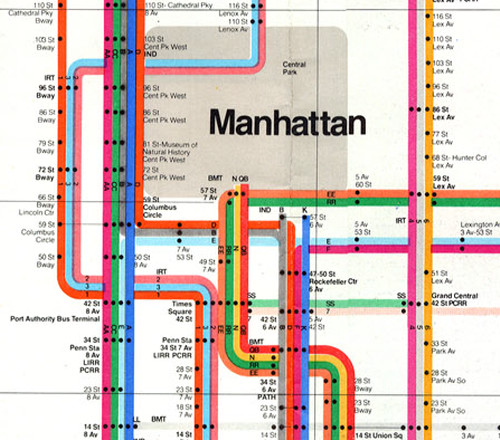
One of the drawbacks of Harry Beck’s fine subway map (MapCarte 1) is that far too many map-makers and designers have relied upon it as a template for their own map. It’s perhaps stifled creativity when we may have seen the next ‘Beck’ emerge instead. Once in a while though, the Beck magic is actually put to good use and Cameron Booth’s one such graphic designer who has worked with the general formula but deployed it meaningfully (sidenote: Booth maintains the informative and detailed Transit Maps Tumblr too). Of course, Beck isn’t his only design cue.

MapCarte273_booth_detail1

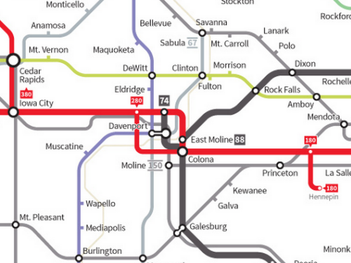
Booth has designed a number of maps in the schematic style but here we highlight his Highway’s of the USA which is the result of a two-year effort to check and codify every current Interstate and Highway. The schematic approach works well but Booth is quite keen to point out that rather than it being seen as a subway map, it’s a simplified road map and that thinking allows us to break loose from the subway metaphor to an extent. The clarity of the map is supported by the simplified linework which uses clean distinguishable colours. Station circles are used for towns and cities that contain an intersection and ticks for places that fall along the road. Places are sized according to their importance in terms of the number of roads that intersect and there are nearly 4,500 place names on the map which given the white space is a monumental achievement in controlling the graphic hierarchy and overall balance of the work.

MapCarte273_booth_detail2

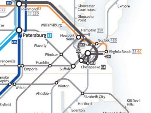
Route naming conventions are systematically applied and again contain a well developed hierarchy and overall the map is a harmonious work that while containing a strong nod to the subway genre makes use of the style and form to support a clear design requirement. The attention to detail is meticulous which illustrates the importance of ensuring every last element of your map is given due consideration. There’s good sense in the maxim that 90% of a map is produced in 10% of the time and the final 10% takes the remaining 90% of time. I don’t know, but I’d wager this sort of balance reflects Booth’s work on this map.

This isn’t just a map that takes a previous design and pours new data onto it. This is a fresh take on the genre and regardless of whatever subway maps have gone before, its form and function are perfectly articulated.

You can read more (and buy prints) about Booth’s map at his blog here.

MapCarte 188/365: Beijing-Shanghai High-Speed Railway by Dong Zheng, 2012


MapCarte188_sheng


Strip-maps have often been used with great success to illustrate transport networks. They are well suited to linear paths. This example, drawn entirely by hand by Dong Sheng illustrates the roughly east-west orientation of the railway with Beijing on the left and Shanghai on the right. It’s a promotional device rather than a navigation device so what is omitted structurally we gain aesthetically. The birds eye position allows us survey a picturesque landscape that contains not only key features but also traditional Chinese symbology (such as the two flying cranes that represent longevity)

Sheng distorts the scale of many features, particularly the objects directly related to the railway itself to make them prominent. What he also does well is apply a subtle cultural dependence of aesthetics so the graphics and symbology are deeply rooted in the minds of the map’s intended audience. It plays on the familiar in terms of the content but also the imagery and the presentational representation.

MapCarte188_sheng_detailA fuller discussion of the map by Stephan Angsüsser can be found in Cartographic Perspectives no. 73 (2012) here.


MapCarte 106/365: Mapping Connected Places by Ed Manley, 2014

MapCarte106_manley

Big data is one thing but Ed Manley describes the dataset he used to create this map as ‘massive data’. It’s the Oyster Card tap ins and tap outs across London’s transport network over a 3 month period in 2012. That’s a log of every single journey made by public transport. trying to make any sort of sense of such data requires a clear head but also the ability to mine the data to get to the crux of a very specific question. Without focus and homing in on a tightly controlled idea then work such as this becomes nothing more than a visual data dump. What Manley has achieved here is to extract meaning from the data and represent it with clarity.

The map shows how associated two places are in the transport network by mapping the most popular destination station for any origin station. It’s a gross generalisation but then that’s the idea…to see what the most likely end-point might be for a traveller from the origin of a journey. Manley only used peak period journeys between 7-10am on weekdays to avoid ‘noise’ caused by bidirectional journeys or the very different patterns of weekend travel. He therefore uses selective omission to great effect as well as a range of generalisation operations on the data to capture the nugget of detail he wants.

At a meta level it gives us a glimpse of the structure of the network by route for the morning commuter influx rather than the real network which might map infrastructure itself rather than the routes people travel. The curved lines emphasise the abstract nature of the concept well. Mapping true geography and a network would assign too much meaning to the actual route which may be inaccurate anyway given the multitude of ways to get from A to B. The saturated colours, clean black backdrop and sensible use of transparency add to the visual appeal of the map as does the fact there isn’t a title. The map stands on its own as abstract art. It demands that you read an associated commentary to understand the complexity. An interesting approach that works well.

MapCarte106_manley_detail

The map supports basic knowledge acquisition about interdependencies, key stations, spatial concentrations and stations which act as local hubs in addition to the concentration in central London.  too which are detailed on Manley’s blog about the map.

The old KISS principle of ‘Keep It Simple Stupid’, often taught in cartography classes, is a key tenet of this work. To clarify a complex system, keep it simple. This is exactly what Manley has done in designing not only a piece of data driven map art, but one with a purpose and which can be used to explore questions of the data. A lot of data driven map art is purely for appearances and when explored critically often shows up some serious liberties taken by the designer.

Check Manley’s blog here for more detail and a link to a higher resolution version as well as a version with labels.


MapCarte 79/365: New York City Subway Map by Massimo Vignelli, 1972

MapCarte79_vignelli

The 1972 map of New York City’s subway system by Massimo Vignelli has often been seen as a polarising map in design terms. For every one person who characterises it as a striking piece of design or commending its beautiful aesthetics, another will point to the geographical liberties it took. These included a square shaped Central Park that might come as a surprise for anyone exiting at 59th Street for a walk only to find the distance horribly distorted. Vignelli’s map only lasted 7 years and was replaced in 1979 with a more topographically correct version that included above ground detail, inter-modal transport links and dramatically thinned linework. This replacement was designed by a committee of 12 people.

The problem, perhaps, lies not with the map, but with the map users. While the London public grew to understand that Harry Beck’s map was grossly distorted yet a perfect solution to navigate from A to B, New Yorker’s simply didn’t appreciate the same approach. Despite the clean, modern lines and bold colours, Vignelli himself explained the issue at a conference in 2010: “I think the real reason is space. But not because Manhattan is too small, it’s because they want to put too much information that doesn’t belong in the diagram. That’s why. All of a sudden there is …and there is no reason. I mean, all you want to know is [how] to go from A to B,”

MapCarte79_vignelli_detail

Like Beck’s map, it was geographically inaccurate by design. Above ground detail was omitted. It was a schematic diagram to support ease of travel through a complex network. Vignelli had been tasked with streamlining the wayfinding task and bringing New York into the future. He succeeded in meeting the design brief yet people eventually reacted by demanding a ‘map’ as they perceived it in the more traditional sense. The replacement, far from being the simplified classic created by Vignelli attempted to overlay multiple disparate layers of information creating a fragmented and unpleasant version. Vignelli’s map was abstract yet provided clear information for the single task at hand.

A classic of cartographic design certainly…but also a classic case of transposing an approach to a new environment and a set of users less inclined to be accepting. Ensuring that a map’s user is satisfied might be considered paramount and so on this basis, Vignelli’s map has remained controversial and may even be considered a classic failure despite its obvious beauty and his good intention.

Vignelli did design a more recent NYC Map for The Weekender…this time a digital version which retained the main components of his original which he still staunchly defends. The digital version can be seen here.