MapCarte 352/365: 1:50,000 Topographic Map No.21, Triglav, Slovenia by Surveying and Mapping Authority of the Republic of Slovenia, 2004

MapCarte352_slovenia
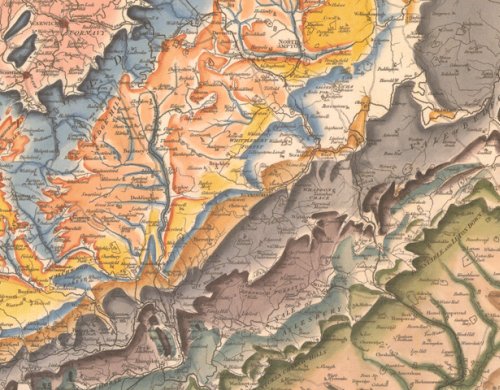
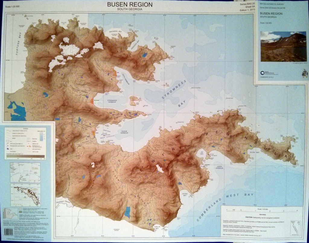
State topographic maps have a special relationship with the national landscape they are designed to symbolise and offer much more than a dry statement of facts and approach a kaleidoscopic fusion of art, science and culture. And far from being standardised, topographic mapping (especially in Europe) exhibits a wide diversity of cartographic styles, according to how the national landscape is to be used, valued, and preserved. As with any map, topographic maps are subject to the key decisions in mapmaking – choices over what to show and how to show it – and these choices can be slow to change. So what happens when a new country is born?

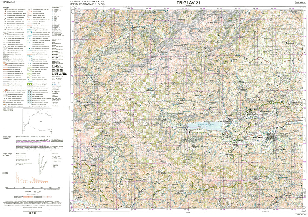
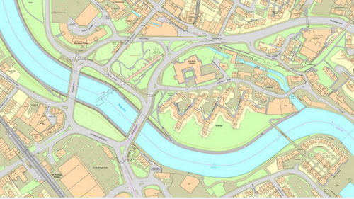
The central European nation-state of Slovenia achieved independence from the Socialist Federal Republic of Yugoslavia on 26th June 1991, joined NATO and the EU in 2004, and in 2007 became the first former communist country to join the Eurozone. Following independence, Slovenia established a comprehensive topographic mapping programme, with the new 1:25,000 series (comprising 198 sheets) being the first to completely cover the state territory in 1999, followed by the 1:50,000 series (58 sheets) which was completed in 2005. The map shown here is the sheet from the 1:50,000 series that includes Triglav, 2864 m, the highest mountain in Slovenia and highest peak of the Julian Alps, situated in the north-west of the country.

MapCarte352_slovenia_detail
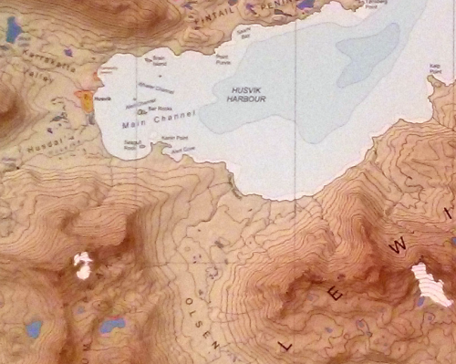
The landscape of the new country was captured and defined using a new cartographic language. Under the old regime, topographic maps were available only to certain users, and omitted key aspects of the landscape such as caves and depressions – key features of the Karst landscape that covers much of the country. These features now take their rightful place in the landscapes of the new and fully accessible series of topographic maps. The extraordinarily rich symbology – with over 200 graphically distinctive symbols in the 1:50,000 series – is broader than any other employed by a European national mapping agency at this scale. Here, the language of cartography is in full bloom.

MapCarte 345/365: British Trench Map 57C.SW.1 (Gueudecourt) (1:10,000) from World War I by the War Office, 1916

MapCarte345_trenchMaps fight a good war. Geographic intelligence has always been a pre-requisite for battle, whether in the form of Ezekiel’s clay model of Jerusalem or a digital terrain model from a reconnaissance drone.

The year 2014 marks one hundred years since the outbreak of World War I, a global conflict which began on 28th July 1914 and ended on 11th November 1918 with a cost of 16 million lives and the downfall of four Empires in continental Europe. After the German army had invaded neutral Belgium and Luxembourg, their march on Paris was halted and what became the Western Front fell into a battle of attrition with a line of trenches that changed little until 1917.

When the British Expeditionary Force (BEF) crossed the English Channel in August 1914, it relied upon on existing maps at 1:40,000 (Belgium) or 1:80,000 (France) and some at smaller scales, which were useful for planning troop movements, but not for the largely static war of attrition that required a more detailed knowledge of enemy defensive positions. From early 1915 the Geographical Section of the General Staff (GSGS) at the War Office began to produce new, larger-scale maps for the fighting units at the Front. At a scale of 1:10,000, the new maps could reveal details of the enemy Front Line, machine gun posts, bunkers, communication trenches to the rear and any defensive positions. Small teams of Royal Engineers and Ordnance Survey surveyors gradually grew into larger field survey companies who could correct, print and distribute maps from the British lines.

MapCarte345_trench_detailThe Battle of the Somme, fought by the British and French forces against Germany from 1st July to 18th November 1916, was one of the largest battles of the war and claimed over one million casualties. The 1:10,000 sheet shown here, Gueudecourt, depicts the trenches as on 2nd December 1916, with German positions in red and British/French in blue (as was the standard until these colours were reversed in early 1918). Gueudecourt was one of the most distant objectives of the British during the Battle of the Somme. The village saw decisive action from the Royal Newfoundland Regiment, who played a key role in capturing and successfully defending a German strong point. A memorial near the village, comprising a bronze caribou standing atop a cairn of Newfoundland granite, commemorates their achievement and sacrifice.

Images by permission of the National Library of Scotland

MapCarte 343/365: A deliniation of the strata of England and Wales by William Smith, 1815

MapCarte343_smithIn a world where many seem rather quick to suggest their map is ‘the first to show…’ it’s refreshing to be able to show actual firsts from the world of cartography that exhibit good design. English geologist William Smith is credited as the first to have created a nationwide geological map. Smith’s legacy is in the first ever map to collate a full geological record of a whole country into a single map.

Smith’s map is perhaps also an early marker for that most current trend in digital map-making – the mashup of third-party basemaps and some sort of overlay. He uses conventional symbols to show urban and rural areas, roads, tramways and collieries and mines. The geology itself is applied over the top and all hand-drawn using a range of colours to denote the different rock types. One of Smith’s approaches was to use the fossil record as a way of establishing the strata as opposed to simply rock composition. His map was more accurate as a result. Indeed, the map Smith created is not far off the modern geological map of England and Wales at this scale illustrating just how accurate he had managed to make his map.

MapCarte343_smith_detailThe map was made in a range of formats: on sheets, or canvas or mounted on rollers. In total the map measures approximately 8 feet tall by 6 feet wide. He oversaw the hand-colouring of each of ~400 maps and each is numbered and signed.

MapCarte343_smith_detail2It’s possible Smith could also claim to have made a map with one of the longest titles. The full title is: A delineation of the strata of England and Wales with part of Scotland: exhibiting the collieries and mines, the marshes and fen lands originally overflowed by the sea, and the varieties of soil according to the variations in the substrata, illustrated by the most descriptive names.

A fantastic cartographic first in both the quality of the surveying and the accuracy of the resulting work, but also for the beauty and richness of the cartographic depiction. In all ways, this map underpins much of what has subsequently been made regarding geological cartography.


MapCarte 336/365: National Geographic Atlas of the World, by the National Geographic Society, 1963-present

MapCarte336_natgeo1First published in 1963, the National Geographic Atlas of the World is now in its 10th Edition, published in 2014, and contains over 300 maps and nearly as many illustrations.  The maps are beautiful and engaging and the overall design has become a hallmark of National Geographic publications.

Though most new atlases are published to update changing geographies a key element in the success of an atlas series is continuity. If a design works, it becomes a house style and something instantly recognisable. Many people familiar with maps can spot a Nat Geo map in an instant…most other people will also be able to spot one even if they are unable to name it.

MapCarte336_natgeo2One of the most notable design features involves colourfully marking the country boundaries yet keeping the interior of the geographic areas as black text on a white background (this extract from the 1992 6th Edition).  This helps establish a clear figure-ground between mapped features and the labels and harks back to the use of hand painted tint bands on early historical maps.

The atlas is also notable for its use of the Winkel Tripel Projection, a standard since 1998, and for its custom proprietary fonts originally designed in the 1930s and named after staff cartographers of the era (Darley, Bumstead, Riddiford etc.).  The fonts and extensive labeling alone sets the atlas apart from others and gives it an unmistakable style.  Touches, such as the curved lettering from point features around a coastline, are also a signature National Geographic style.

You can see more of National Geographic’s atlas at their web site here.

MapCarte 317/365: MasterMap® by Ordnance Survey, 2001

MapCarte317_mastermap

Ordnance Survey has long held a reputation for unsurpassed quality and coverage in its mapping. It’s been steadfast in its approach to mapping of Great Britain such that the quality is world renowned and the envy of many countries. In 2001, Ordnance Survey launched a brand new product to bring its large scale products into the 21st century.

MapCarte317_mastermap2

Not so much a map as a digital product that records every single fixed feature of Great Britain in a contiguous database, MasterMap® represents the most detailed, consistent and up-to-date geographical vector database of any country at a scale of 1:1250.  Four separate layers contain topographic, transport, address and imagery data to form the full product. Later, additional layers for water and sites were added.

MapCarte317_mastermap3


MapCarte317_mastermap4

Every feature is assigned a Topographical Identifier (TOID) that gives it a unique reference as well as attribute information to classify it and support mapping tasks.  Continuous review means the database is as current as the latest ground survey data captured in the field and the product is versatile and flexible enough to suit a myriad of mapping purposes at different scales.

MapCarte317_mastermap5
MapCarte317_mastermap6

The schema is robust and currently the database contains over 460 million individual features with extensive metadata.  As a product, the release of MasterMap® was, and remains, innovative and its scale and level of detail are unsurpassed.  The uniqueness of its design is in the construction of a database that supports the mapping needs of a diverse set of user requirements. Key to the utility of the product is the ability to select and style the elements from the database that are required for a specific need. Thus, the product can be styled to give it the classic Ordnance Survey appearance, or to match a user-specified style and product requirement.

More details of Mastermap can be found on the Ordnance Survey web site here.

MapCarte 274/365: The Milford Track by Roger Smith/Geographx, 2014

MapCarte274_milford

Despite the almost incessant claims that print cartography is dead nothing could be farther from the truth. While we are seemingly inextricably linked to our digital mobile devices there’s something eternally useful about a paper map. The batteries never run out in the middle of nowhere. They suffer to a lesser degree in rain or bright sun. They can be crammed into your backpack…you can even damage them and not break the bank! That doesn’t mean that print cartography cannot develop.

In this example from Roger Smith, he applies his unique graphic approach to the creation of a series of maps designed to support planning as well as hill walking along some of New Zealand’s most famous and spectacular walks. Here we feature perhaps the most famous, the Milford Track, designed for outdoor use to support the need for navigation and information along the track.

MapCarte274_milford_detail

Smith uses a pseudo-natural looking base map which contains a lot of textures. The usual flat depiction of terrain (e.g. a solid green fill for forested areas) gives way to textures that mimic the environment. Here, he’s providing some sort of naturalistic look that falls short of the visual clutter associated with draped satellite imagery. The fills and textures are consistent and help to demarcate different vegetation types and the colours, browns and greens and rich and earthly.

The hill shading and attention to detail gives a dark, brooding appearance and helps give a sense of awe to the magnificent landscape. If ever a map evoked an environment then this is it. The Milford track itself is prominent and depicted in bright yellow (as in ‘follow the yellowbrick road’) that contrasts well with the background. The contours are also prominent and help to show how the track rises and falls with the topography. Typography is generally printed in light colours to contrast with the background and a hint of shadow is used to lift it which works better than the somewhat standard approach of using a halo.

Perhaps the most interesting aspect of the map is the design of the material. It’s printed not on paper, or even tyvek…but ona water-proof, insect-proof and tear-resistant product made of crushed mineral deposits. It’s printed on crushed rock and that means you can do pretty much anything to it and it’ll survive. You can’t do that on your iPad in the middle of a 4 day hike in the middle of nowhere.

MapCarte 206/365: Swiss National Map 1:25,000 1088 Hauenstein by Swisstopo, 2013

MapCarte206_swisstopo

There are very few maps in the world that might be described as perfect but the work of Swisstopo has been consistently at the pinnacle of topographic map design for decades. Their maps illustrate scientific accuracy and precision of construction but it might be argued that many topographic maps by many other mapping agencies can claim this also. What sets Swisstopo apart is their ability to create a beautiful map by carefully considering colour, balance, contrast, heirarchy, labelling density and positioning. These are all core to the map design process but achieving success with such consistency is almost magical.

The new range of 1:25,000 scale maps by Swisstopo, of which the Hauenstein sheet is one, shows that they have not lost their eye. Building upon the legacy of elegant maps that have gone before, this updated design shows clear lineage with contemporary flair. The lines are cleaner, the marks almost more deliberate.The text is so well placed it looks as if it sits perfectly at home amongst the other map features. The density of information is almost unbelievable and to achieve such a well balanced product without recourse to more omission and simplification is astonishing. The classic Imhof-inspired hillshade lends a clarity and brightness to the topography and gives it the unmistakable look of a Swiss topographic map.

The fact that Switzerland’s topography is spectacular of course lends itself to inspire cartographers to make a beautiful map but it’s another thing altogether to achieve it. These 1:25,000 sheets have been modernised but still deliver. They remain iconic and engaging and represent the very best of modern topographic mapping.


MapCarte 195/365: Central Park Tree Map by Ken Chaya and Edward Sibley Barnard, 2011

MapCarte195_centralpark

There’s nothing quite as absurd as a map-maker intent on capturing some phenomena to a ridiculous level of detail on a map. There’s something particularly impressive about such dedication and the search to create that perfect record that can be unsurpassed. Maps have always been seen as providing accuracy, precision and a documentary source so it’s no wonder that we can find all manner of individuals who take it upon themselves to dedicate huge numbers of hours to their cause.

Edward Barnard and Ken Chaya are responsible for perhaps the most detailed map of trees ever produced. As a project that began innoccuously in 2008, it soon grew to become a tireless survey of every tree in Central Park, New York City. The resulting map is not just a record of the nearly 20,000 specimens but a beautifully detailed cartographic product.

MapCarte195_centralpark_detail

The map does not constrain itself to a standard paper size and is produced in the same aspect ratio as the park itself on a long thin vertical strip. It would have been easy to splice it up into sections and run them parallel on a standard landscape page but the impact of using a non-standard page size is worthwhile. The colours are vibrant and each tree species is given its own mimetic planimetric symbol. This adds colour, texture and shape to the map to give a sense of the distribution, size and type of trees.

Some elements of the park’s physical structure are presented in obliquely which provides anchor points and recongnisable places. These work well to create some sense of depth in the work.

MapCarte195_centralpark_legend


Overall a beautiful map and testament to the dedication and perseverance of two men and their quest to make a map that had never been made.

More details at the author’s web site here.

MapCarte 189/365: Busen Region, South Georgia by British Antarctic Survey, 2013

MapCarte189_busen


Are there any parts of the world left unmapped? Given the ubiquity of online map services and the seemingly endless maps one can purchase of all parts of the globe you’d be forgiven for thinking there’s nowhere left to map. In fact it’s one of the classic questions one gets when asked what you do for a job. Upon hearing ‘cartographer’, the common response is along the lines of “hasn’t everywhere been mapped”.

This map, produced by the British Antarctic Survey fills in one of the missing pieces by mapping the Busen region of South Georgia in more detail than ever before. This is an inhospitable environment yet one which is seeing increased visits for tourism as people attempt to tread in the footsteps of Shackleton.

The map is the result of many hours of pouring over 90m imagery but, more than that, it required several months of ground survey work. The resulting map illustrates the harsh environment and the rocky landscape. The hillshading and elevation tints are well marshalled and there is sufficient labelling.

MapCarte189_busen_detailThis possibly isn’t going to be a best seller but it’s good to know that maps like this are still made and that those missing pieces in the world map are slowly being explored for cartographic purposes.


MapCarte 147/365: Earth by Millennium House, 2008-2012

MapCarte147_earth1There are general reference atlases and there are general reference atlases. Then there is the Earth atlas series by Millennium House. Formed in 2005, the specialist book publisher set out to become major players in the atlas publishing market by producing what they referred to then as the world’s largest atlas.

Earth Blue was produced by over 100 cartographers, oceanographers and geographers worldwide and contains 355 maps covering 194 countries. The cartography is classy but it’s the overall effect of combining the maps with extensive text of each country, over 800 beautiful images of the world and stunning 6 foot long gatefolds that makes the atlas a stand-out product. That…and the size. At 2ft by 1.5 ft this is no small book and the sheer size and weight of the tome make it a significant piece of work that reflects the scope of the effort that went into its design, compilation and production. The hand-bound leather covers, gilded pages, signed certificates of authenticity and limited edition numbering make these atlases a genuine collector’s item. There are two editions – Royal blue (2,000 copies) and Imperial Gold (1,000 copies).

MapCarte147_earth2 MapCarte147_earth3

The only problem with Earh Blue is that it wasn’t actually the world’s largest atlas…that title went to the Klencke Atlas published in 1660. So Millennium House stepped up their game and produced Earth Platinum. Each of the strictly limited 31 copies weighs 330 lbs and measures 6ft by 9ft. It is, genuinely, the world’s largest atlas as of 2012. The book contains 128 pages and all of the exquisite information, cartography and imagery found in Earth Blue but on a whole different scale and with the inclusion of Gigapixel imagery.

MapCarte147_earth4

This is cartography on a grand scale and it’s the sheer detail and size of the project and product that makes this work stand-out. In an age of digital publishing it’s a brave decision to enter atlas print publishing at the high end of the market but the Earth atlases are remarkable cartographic products.