MapCarte 286/365: Kii – Kinki 360° panorama map by Masaki Oda, 2009

MapCarte286_kinki

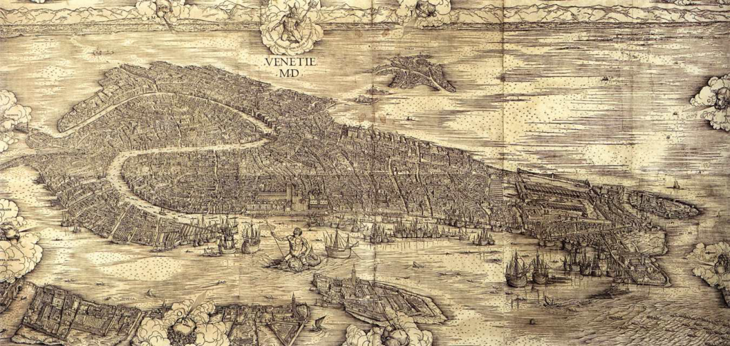
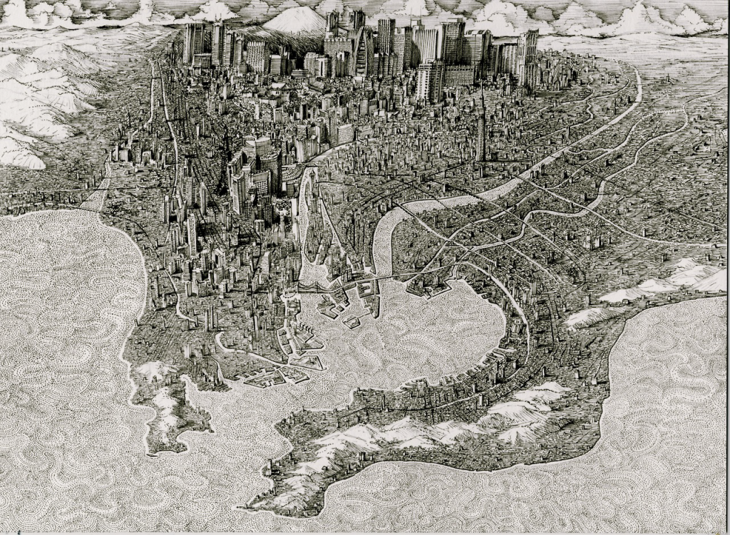
Japanese cartography is renowned for the quality and craftsmanship of their panoramas. The detail is exquisite and the scenes are so well framed with not only landscape but, often, a narrative of and contained within the vista itself. This beautiful example from the studio gTonbi-eye by Masadi Oda is in a full 360 degree perspective and depicts the landscape of the Kii peninsula near the centre of the Japanese islands.

As an area that receives large annual rainfall measures there is a lot of dense natural forest so the image is predominantly green though there are diverse landscapes revealed with plains, mountains and basins on view.

MapCarte286_kinki_detail1

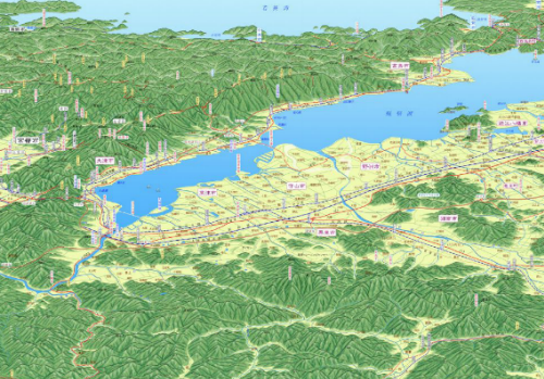
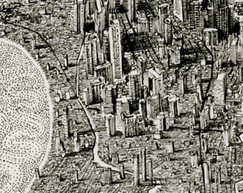
To the north is the city of Kyoto but the impressive design characteristic of this work is the combination of such a macro-level image but which also allows the reader to view the micro detail of different urban or rural regions. Creating a map that supports these tow very different scales and views is impressive. The maps are made by hand which makes their design all the richer since every stroke has been thought through and carefully applied. There’s no analytical work involved to apply equal treatments across similar data types which has the result of making each component just that bit different.

MapCarte286_kinki_detail2

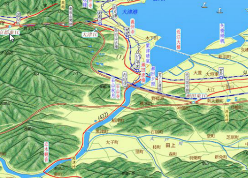
The mountainscapes are shown predominantly as aspect molehills but with a carefully applied hillshade to give added depth. The outlining of each mountain ridge in a darker colour wouldn’t be seen naturally but gives each mountain a presence and clarifies the image. At over 3 metres in length if you wrapped the map around you and stood in the centre you would genuinely see the landscape.

MapCarte286_kinki_detail3
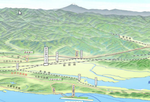
Finally, the author has added some realistic haze effects so that distant features seem subdued in comparison to the foreground. Our eyes are naturally accustomed to this in the real world and the map mimics it and makes the reader feel at ease. Even Mt Fuji makes a distant appearance in the distant haze.

Rich in detail, colour and thinking.


MapCarte 262/365: Map of Venice by Jacopo de’ Barbari, 1500

MapCarte242_barbari

The very first aerial photograph was taken by French photographer and balloonist Gaspard-Félix Tournacho, in 1858 over Paris. That fact alone makes this map, produced some 350 years earlier even more of a monumental cartographic achievement than its beauty alone suggests. Produced from wood-block printing on several large sheets, this birds-eye map shows the city of Venice with the Alps acting as a distant horizon.

The detail is exquisite with almost no stone unturned – literally. Every building, church and piazza is shown and such is the attention to detail that one could easily use the map then and now to navigate around the city.

Barbari’s skills as a painter and engraver show how mastery of one’s tools is fundamental to great cartography. What the map perhaps fails to convey is the way in which it was constructed. Given Venice is built on water traditional techniques of measurement (physical rods or chains) wouldn’t have been used to gain measurements. Instead, Barbari must have used trigonometry and then applied foreshortening to generate his oblique perspective. These are techniques not adopted for many years to come.

Whatever you use to design and make a map, knowing how to apply the tools to a high standard goes a long way to ensuring the result will be high quality. Painting, engraving and mathematics underpinned Barbari’s work. It resulted in a magnificent map.

MapCarte 230/365: Lübeck by Alfred Mahlau, 1934

MapCarte230_lubeck

Maps can be used as powerful promotional pieces. When an artist or illustrator with a very unique aesthetic uses maps as part of their work we often see the map design take on strong elements of their artistic leaning. So it is the case with German painter and graphic artist Alfred Mahlau. Much of his work was in graphic design for advertising, textile patterns, sets and even stained glass windows.

In general, Mahlau’s work was highly illustrative with minimal lines and strong blocks of colour. He was known for his lettering and his particularly clever way of dealing with umlauts as in this poster. Mahlau produced this poster, which has been reproduced in different colours and formats, as a promotional piece for the town of Lübeck in northern Germany which largely sits on an island in the River Trave and acts as one of Germany’s major ports. The island contains the old part of the city and as such has a number of historic buildings amongst a dense network of narrow streets that share the same red tile roofing and architecture.

Mahlau captured the essence of Lübeck in his perspective view. The many buildings are drawn in a similar style and the cathedrals and churches are seen rising above. It’s a simplified drawing but retains something of the character and charm of this small island settlement. The boats surrounding the island give away the fact it’s situated on water yet he cleverly uses subtle shadows to emphasise this aspect.

This view of Lübeck does way more than any aerial photograph or planimetric map could. It gives the town character and evokes a sense of place merely through the illustrative form.

MapCarte 197/365: Tokyo by Benjamin Sack, 2014

MapCarte197_tokyo


Perspective illustrations of cities and landscapes have always been maps that inspire. They tend to be highly illustrative and show places in detail. This example of Tokyo by Benjamin Sack is both typical of the genre but also unique in that it takes the rendering of the environment to an incredibly detailed level.

The map uses a typical perspective view which incorporates foreshortening. While creating difficulties in measuring from place to place it’s a highly effective way of rendering an image that mimics the human point of view. What Sack does well is use shadow and depth of ink to make the background darker. This creates an illusion of depth in the image. The foreground water uses some subtle texture to create a more interesting image.

MapCarte197_tokyo_detailOverall, a beautiful map that uses light and dark to great effect and which illustrates the power of black and white maps.


MapCarte 194/365: Three approaches to the U.S. By Richard Edes Harrison, 1940

MapCarte194_harrison

Richard Edes Harrison’s illustrations and, particularly, his fine illustrative maps have adorned countless magazine articles. This example for Fortune magazine shows three alternative approaches to the USA from Berlin, Tokyo and Caracas. The maps used a curved projection to show the US as it might sit on a globe but with exaggerations that made the foreground almost planimetric. The mid-ground was generally the focus of the piece and the distant curved over the horizon.

Colours are applied in a semi-realistic style to mimic landcover and the typography, as with all Harrison’s work is exquisitely applied by hand. There is, however, a somewhat sinister aspect to this map in the sense that the three approaches are viewed as if from the perspective of a potential enemy attack. The short passages of text postulate the route of a possible enemy and where their likely route might take them.

More of Harrison’s work for Fortune Magazine here.