MapCarte 179/365: Typographic maps by Axis Maps, 2010

MapCarte179_bostontypo

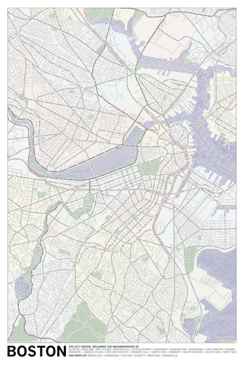
Typography is more commonly used on the map as a literal symbol simply to add context to features that are symbolised using other graphics. We also see a lot of maps where typography is used both as a locative, quantitative and literal symbol combined. Such maps might contain proportionally scaled labels that are located to indicate a specific feature. Often there are no other graphics and the maps have a certain aesthetic appeal.

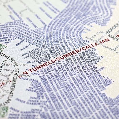
Here, Axis Maps take a slightly different approach by using typography to build the form of a planimetric map itself. The labels that might otherwise be shown once on a standard reference map are now used as a repeated shape to give form to a larger feature. Linear features contain an array of repeated labels and areas use labels as a pattern fill.

MapCarte179_bostontypodetail

Colour is also used to accentuate the difference between features so we typically see labels that indicate water shown in blue and roads in black. Green spaces are in…green. The overall effect is very appealing both at a distance where structure can be easily seen or close-up where the individual labels can be distinguished.

The maps were produced by manually positioning each letter. While automated label placement is now advanced enough to handle most cartographic jobs to a high standard, this is more of an artistic approach to labelling and requires considerable manual adjustment to get the look and feel just right.

More details and different cities are available on the Axis Maps web site here.

MapCarte 143/365: Journey Through Time by Swisstopo, 2013

MapCarte143_swisstopo

Click on the image to launch the Swisstopo Journey Through Time

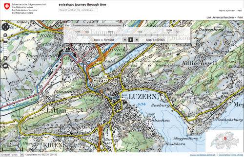
Swiss cartography is renowned for its accuracy, quality and artistry and no collection of maps, let alone topographic maps, could ignore them.  Swisstopo, the official name for the Swiss Federal Office of Topography are responsible for the production of topographic maps at a range of scales but how do you select a map representative of their work when we could conceivably fill an entire year of MapCarte blogs with just their work? Thankfully, they have produced a wonderful portal that allows you to explore the rich history of their work.

Journey Through Time lets you explore any area of Switzerland, from any time period mapped at any scale. It allows you to search, to animate through maps from different times, and to compare maps using an innovative overlay technique that fades one through to another using a simple slider control. Metadata is rich so you can easily identify the map and some of its background information. You can link to a specific map for sharing and also print out a full extract. As an example of a rich portal into national mapping this is beyond compare. As examples of design it’s tough to beat too.

The use of colour in particular has always been a characteristic of Swiss topographic mapping. On many map series (particularly the 1:100,000), colour is used to vary label meaning, show quantities, represent or imitate reality and to decorate which visually enlivens the map.  The Swiss “style” is well structured, maintains uniformity, uses white space effectively, contains beautiful typography and unrivalled depiction of relief on topographic reference maps.

The typeface sets a classic tone using primarily ‘antique’ looking serifs that includes a unique combination of thick and thin strokes.  Hill shading on most series and scales is in the classic Swiss style based on the work of Eduard Imhof.  The maps are rich in content and deliver complex information in a succinct, well organised manner.

Swisstopo topographic maps are truly works of art. It’s actually tough to pick a stand-out amongst their many stand-outs so to be able to explore their catalogue through time and compare their artistry allows us to appreciate the full range of their work.

MapCarte 131/365: London’s Kerning by NB Studio, 2007

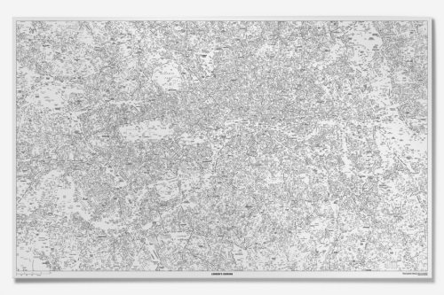
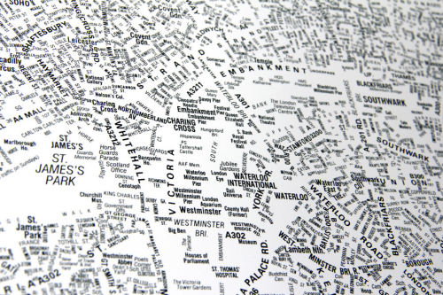
MapCarte131_kerningMaps based entirely on typography are abstract representations of a landscape and have been used effectively as fills for land use and through repetition for linear networks.  There’s a lot of them about. They are certainly artistic and it’s fascinating to effectively just use what we used to call the names plate to show a geography that doesn’t actually exist on the ground. Map text takes up a considerable amount of space on a map. It adds meaning and allows us to interpret the landscape using labels and descriptions that we understand.

Type functions literally as well as to locate mapped features.  This example, by NB Studio, was one of the first to gain wide attention and remains one of the most accomplished.  Prepared for The London Design Festival in 2006 as a commentary on social space, the large format poster went on to win the design week awards in 2007.  The map shows only names of locations, streets or places.  Larger fonts reflect more important spaces with smaller fonts representing a less celebrated space.  Smaller type is used as a replacement for roads and view at a distance, the structure of the city emerges as the form, orientation and positioning combine to create landmarks and shapes that can be easily identified.

MapCarte131_kerning2

The map is a great example of the power of typography in map-making and also illustrates how effective a single colour can be.  Maps do not always need to be in colour to be visually stunning or effective. Indeed, this map shows you don’t necessarily need points, lines or areas either! The title is both clever and gives the work character to provide a rounded product.

The poster can still be purchased via NB Studio’s web site here.

MapCarte 9/365: Country Codes of the World by John Yunker, 2008

MapCarte8_Yunker

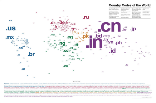
A map of the world’s top level country code domain names (as of 2008) that efficiently captures a number of pieces of information using some simple cartographic approaches. Locational information is encoded simply through the positioning of each label in the centre of the territory it relates to. There are no lines or boundaries on the map but because of the use of the label in this way we see the familiar shape of the world emerge. The sizing of labels helps this by varying according to relative population totals…with a contraction of China and India to enable them to fit the layout and a grouping of those countries under 10 million residents to avoid infinitesimally small type. The result is a proportional symbol map of population that uses text as both a literal and a scalable symbol. Colour is used to good effect to identify continents and as a visual link to the legend. Simple and abstract concept and a good example of the genre of maps whose form relies heavily on typography.

The map is available to buy as a high quality print here.