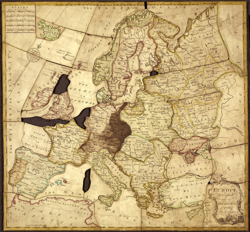
MapCarte 359/365: Europe divided into its Kingdoms by John Spilsbury, 1766

MapCarte359_spilsbury

Merry Christmas map geeks! What better way to celebrate the day than to highlight the use of maps and cartography in toys. Here, not just the earliest map used in a jigsaw but arguably also one of the very first jigsaws. John Spilsbury was an apprentice to Thomas Jefferys, Rotal Geographer to King George III, and believed to be the first commercial manufacturer of the jigsaw puzzle. His earliest jigsaws were referred to as ‘dissected maps’ and this set a trend in jigsaws for many years to come. Indeed, you can still find maps as a common theme in modern jigsaws.

The puzzles were initially produced to be aids in geography teaching. Countries were dissected along national boundaries so piecing the puzzle together allowed children to learn how the different countries connected to one another. Beyond the land, Spilsbury continued the dissection along lines of latitude and longitude.

A great use of maps. A brilliant educational aid and also an early indicator of the commercial value of using maps as a medium for a non-cartographic product. Spilsbury’s dissected puzzles were a commercial success. Spilsbury went on to create many such puzzles and created them in eight themes: the World, Europe, Asia, Africa, America, England and Wales, Ireland and Scotland.

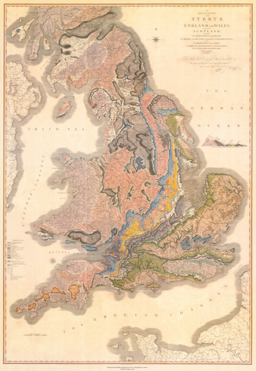
MapCarte 343/365: A deliniation of the strata of England and Wales by William Smith, 1815

MapCarte343_smithIn a world where many seem rather quick to suggest their map is ‘the first to show…’ it’s refreshing to be able to show actual firsts from the world of cartography that exhibit good design. English geologist William Smith is credited as the first to have created a nationwide geological map. Smith’s legacy is in the first ever map to collate a full geological record of a whole country into a single map.

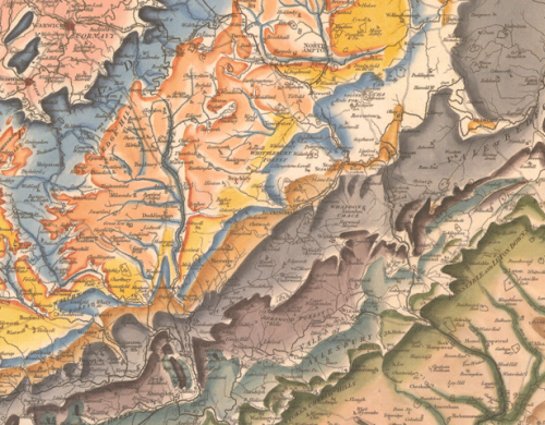
Smith’s map is perhaps also an early marker for that most current trend in digital map-making – the mashup of third-party basemaps and some sort of overlay. He uses conventional symbols to show urban and rural areas, roads, tramways and collieries and mines. The geology itself is applied over the top and all hand-drawn using a range of colours to denote the different rock types. One of Smith’s approaches was to use the fossil record as a way of establishing the strata as opposed to simply rock composition. His map was more accurate as a result. Indeed, the map Smith created is not far off the modern geological map of England and Wales at this scale illustrating just how accurate he had managed to make his map.

MapCarte343_smith_detailThe map was made in a range of formats: on sheets, or canvas or mounted on rollers. In total the map measures approximately 8 feet tall by 6 feet wide. He oversaw the hand-colouring of each of ~400 maps and each is numbered and signed.

MapCarte343_smith_detail2It’s possible Smith could also claim to have made a map with one of the longest titles. The full title is: A delineation of the strata of England and Wales with part of Scotland: exhibiting the collieries and mines, the marshes and fen lands originally overflowed by the sea, and the varieties of soil according to the variations in the substrata, illustrated by the most descriptive names.

A fantastic cartographic first in both the quality of the surveying and the accuracy of the resulting work, but also for the beauty and richness of the cartographic depiction. In all ways, this map underpins much of what has subsequently been made regarding geological cartography.


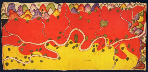
MapCarte 333/365: Disputed territories of Burma, Siam and China by Anon, 1889

MapCarte333_burmaIn the late 1800s the Burmese already had a good appreciation for topographic mapping and cartography in general. They used maps for taxation and land use and also as a way of plotting military campaigns. Many of these maps were collected by British diplomats and also colonial authorities but in addition, indigenous maps by the Shan and T’ai peoples were also collected. Here, a Shan map created in 1889 relating to a border dispute between Burma and China illustrates wonderful cartographic approach using colour to represent the different areas.

This map was painted by an anonymous Shan artist in tempera on paper and it covers an area of 47 square miles along the Nam Mao (Burmese Shweli) River. There are about eighty villages and hamlets shown in green. The map text is in Chinese Shan with red areas representing the British Shan state of Möng Mäo and yellow showing Chinese territory. The colours are rich and vibrant and leave the reader in no doubt as to land ownership.

Most of the map is planimetric but the mountainscapes on the upper and right borders show the bounding mountain ranges in aspect with wonderful colour. By modern standards there’s considerable cartographic license in terms of the precision of the topographic record. In design terms, the map is a work of art and a quite sumptuous representation.


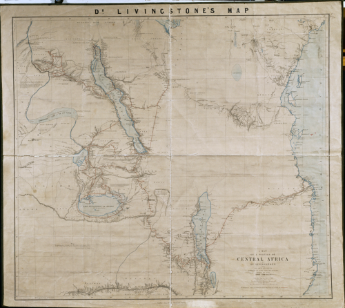
MapCarte 309/365: Central Africa by Dr. Livingstone, 1873

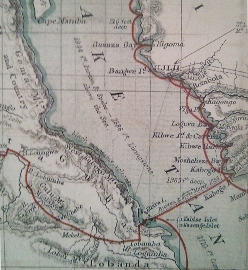
MapCarte309_livingstoneSome of the greatest maps ever made were by our explorers. Those intrepid individuals who sought to find and understand new places and make maps so that we could benefit. Of course, mapping an uncharted place alone doesn’t make a map great but the maps made by Dr David Livingstone in the mid to late 1800s are both key documents in the charting of continental Africa but also works of cartographic importance to.

Livingstone was many things but his role as scientific explorer and quest to find the source of the River Nile brought a new fascination with Africa and ultimately led to colonial interests and the so-called Scramble for Africa. He was concerned with Missionary work and firmly believed that his expeditions were in principal a way to replace the slave trade with commerce and trade. Many of his ideas and expeditions led to changes but in a mapped sense, he was able to fill in the many large blanks on the map. He is famous, of course, for being the first Westerner to see the Mosi-oa-Tunya falls which he re-named Victoria Falls after Queen Victoria. He was also the first Westerner to cross the continent at the latitudes shown in this map, which currently hangs in the Royal Geographical Society in London.

MapCarte309_livingstone_detailLivingstone was also credited with mapping and ‘finding’ many other notable places. His maps were beautiful. They clearly represented his travels showing great care and detail in the vicinity of his routes. His relief representation was particularly well crafted as was his typography. The use of contrasting red colours showing his routes clearly set out the travels. and the use of tints added to the overall map’s appeal.

Large format wall maps and many other forms of mapping create a rich portfolio of Livingstone’s expeditions. The maps serve as testament to the spirit of discovery but also show the craft of the cartographer and the importance of the map as a document of discovery.

MapCarte 308/365: Madaba Mosaic Map by Anon, 6th Century

MapCarte308_madiba

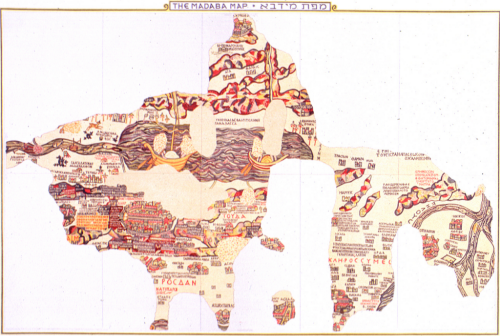
Art comes in many forms and many artists use maps as a vehicle for expression. The most impressive surviving example of Byzantine map-making is also the worlds oldest floor map. That is, a map on a floor made of mosaic tiles. It lies on the floor of St. George’s Church at Madaba in Jordan. Not all of the map survives as the image shows but the remaining segments clearly show the Holy Land with north upwards and Jerusalem in the centre. Topography and place names are present. Scale changes across the map which is an early example of exaggeration (as a process of generalization) to show areas of more importance as relatively larger. They required more space for the greater levels of detail.

MapCarte308_madiba_detail1

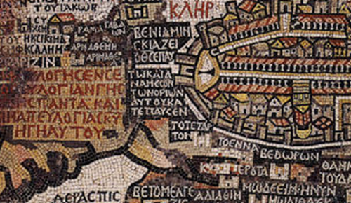
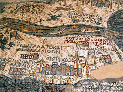
The map depicts scenes from the Bible as well as everyday life but the main intent of the map was to encourage religious pilgrimage. The detail and the intricacy of the map shows craftmanship of the highest order, both in designing such a work made entirely of mosaic tiles but also in its construction.

MapCarte308_madiba_detail2


The map was created with the laying and setting of tesserae, small square shaped tiles of marble, limestone and coloured glass. The original map would have been sketched out then craftsmen would have laid the tiles. This is almost paint by numbers but the combination of the original designer and the craftsmen able to execute delivery of the map shows how maps are made through collaboration of people with very specific skills.

A beautiful and artistic mosaic tile floor…which happens to be a beautiful map too.

MapCarte 306/365: The Story Map of Scotland by Colortext Publications, 1935

MapCarte306_scotlandThere’s a saying about things that are old become new again and we see plenty of that in cartography. In fact, many cartographic techniques seem to come in and out of fashion regularly as new map-makers find the technique or try and work out ways of creating a particular map type using new software. A good example recently has been the use of tesselated hexagons as a container for summarizing another dataset. We might call it hex-binning and for the last few years it’s become a popular way of mapping thematic point data because it creates visually and cognitively equivalent areas and which overcomes the death by push-pin red dot fever mapping.

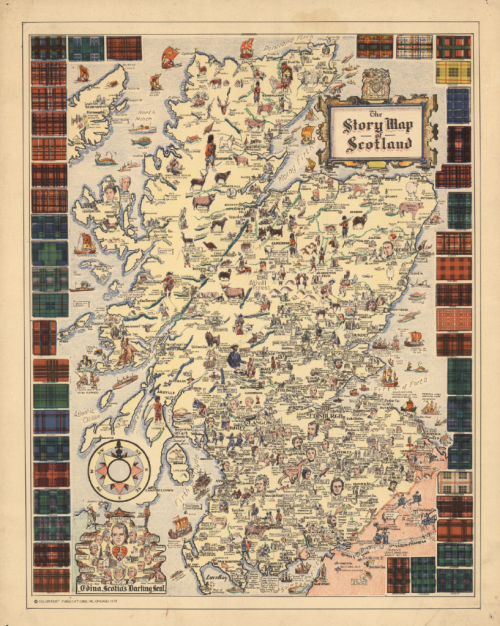
Another trend has been the use of new terminology to describe a particular type of map. To some of us a little older in the tooth a map is a map. We’d go so far as to categorize based on type (topographic, thematic for example) or scale (small, medium, multiscale) but the trend to create new brands and be seen as different is inevitable. A current fad is Map Stories or Story Maps. The idea that a map has a narrative and can tell a compelling story using a mixture of maps, graphics and textual components. As with most things, this idea isn’t new either. This map by the publishers Colortext was one of a series they labelled ‘Story Map’. It combines pictorial images, text and information that in this case tells the story of Scotland. It incorporates historical and cultural components in a place-based narrative.

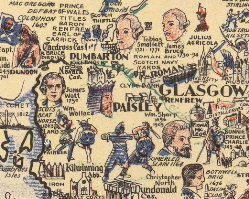
MapCarte306_scotland_detailIt’s possibly the first of the genre of Story Maps. Ernest Dudley Chase also produced a number of his own maps in the mid-1900s that he titled Story Map too. This is a well composed Story Map or, as some of us might say, a map. It’s pictorial elements are well composed and the map has a good density of information. The decorative border of the tartans adds further interest and the map as a whole combines several integrated themes to tell the story of Scotland.


MapCarte 267/365: Theatre of the Empire of Great Britaine by John Speed, 1611/12

MapCarte267_speed1

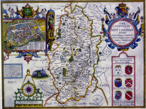
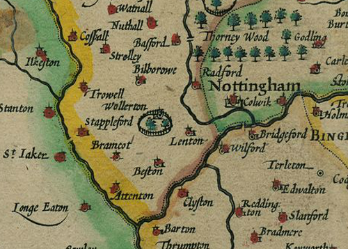
Many historical maps become objects of desire simply due to their antiquity. Rare and collectible maps are, however, not necessarily beautiful in design or aesthetic terms. The maps produced by John Speed in the early 1600s for his Theatre of the Empire of Great Britaine are exceptions and are both highly collectible and remarkable objects.

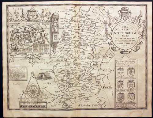
The atlas was the first to collate detailed maps of English counties, printed from copper plates which had been engraved in reverse by Jodocus Hondius in Amsterdam. Each atlas was either offered uncoloured or coloured by hand and though only a few colours were used it is this colouring that gives them such a pleasing appearance. The borders and main elemants of the maps framework such as the cartouche, coats of arms and vignettes are all coloured. the maps, actually, have a very limited amount of colour applied, used principally as a mechanism to highlight pictorial symbols (e.g. trees). The main use on the map is as a way of illustrating county and district boundaries using different adjacent coloured bands, a technique which went on to be used extensively in atlas design (for instance by National Geographic). The colours are bright and bold and add to a map already expertly detailed and engraved.

MapCarte267_speed2

Speeds maps were at the time constructed from the most up-to-date surveys (from Saxton for instance) so as scientifically accurate as they could have been. But they weren’t just derivative. Speed added his own innovations such as detailed town plans on many of the maps, panoramic scenes of topographic, historical or archaeological importance to the county and also coats of arms of local Earls and Dukes.

MapCarte267_speed_detail

These small yet highly decorative and attractive maps are collectible now, but were also a classic of information of the time.

A complete set of maps can be viewed online via Cambridge University Library here.

MapCarte 262/365: Map of Venice by Jacopo de’ Barbari, 1500

MapCarte242_barbari

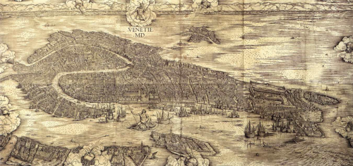
The very first aerial photograph was taken by French photographer and balloonist Gaspard-Félix Tournacho, in 1858 over Paris. That fact alone makes this map, produced some 350 years earlier even more of a monumental cartographic achievement than its beauty alone suggests. Produced from wood-block printing on several large sheets, this birds-eye map shows the city of Venice with the Alps acting as a distant horizon.

The detail is exquisite with almost no stone unturned – literally. Every building, church and piazza is shown and such is the attention to detail that one could easily use the map then and now to navigate around the city.

Barbari’s skills as a painter and engraver show how mastery of one’s tools is fundamental to great cartography. What the map perhaps fails to convey is the way in which it was constructed. Given Venice is built on water traditional techniques of measurement (physical rods or chains) wouldn’t have been used to gain measurements. Instead, Barbari must have used trigonometry and then applied foreshortening to generate his oblique perspective. These are techniques not adopted for many years to come.

Whatever you use to design and make a map, knowing how to apply the tools to a high standard goes a long way to ensuring the result will be high quality. Painting, engraving and mathematics underpinned Barbari’s work. It resulted in a magnificent map.

MapCarte 249/365: Hereford Mappa Mundi by Richard of Haldingham and Lafford, c.1285

MapCarte249_mappa

What can we possibly learn from historic maps? Well, the question is more like what isn’t there to learn from historic maps! Studying historical cartography not only gives us an unparalleled view into the world of that period but also gives us much prior art for contemporary cartographic design.

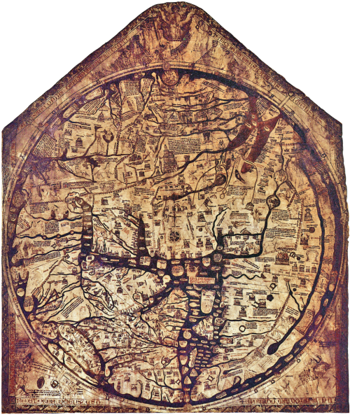
A mappa mundi is a form of T and O map dating from the medieval period. This most famous of all, the Hereford Mappa Mundi is the largest in known existence. It’s attributed to Richard of Haldingham and drawn on a single sheet of velum. The typography is in black ink, there are flourishes of red and gold and water is represented as blue or green. These all remain fairly standard cartographic conventions.

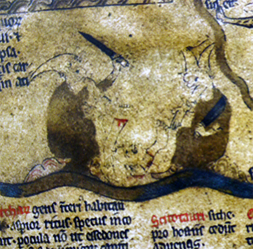
The map depicts biblical events, towns, animals, plants and scenes from mythology. Of course, it’s a product of medieval Christianity and as such, depicts the beliefs of the time. Jerusalem lies at the exact centre of the map which is precisely where modern map-makers also place the elements of most importance. There’s even a scene of cannibalism representing the location of the end of the world and which is inhabited by barbaric creatures.

MapCarte249_mappa_detailHistoric cartography gives us a sense of the past not only in terms of the content but also the way people illustrated their world. These are important historical documents not only for scholars of history but also for scholars of cartography.


MapCarte 241/365: The International Map of the World by Albrecht Penck, 1891

MapCarte241_penck2


One of the problems of having an unequally shaped planet, divided by both physical and human borders, for cartographers is how to map it consistently. Individuals, nations and organisations have prepared thousands of different ways of maping based on different projections, datums and coordinate systems. That makes it difficult when moving across the planet and wanting to use a uniform set of mid-large scale maps.

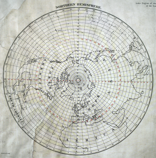
German geographer Albrecht Penck was a proponent of the need for consistent and accurate maps that covered the entire planet. In 1891 he proposed a worldwide system of maps. The International Map of the World would consist of 2,500 maps, each at 1:1,000,000 and representing 4 degrees of latitude and 6 degrees of longitude. Perfect! His schema can be seen in the map above.

In 1913, Penck’s idea came to fruition at a conference to establish standards and symbology. Decisions were taken on use of the Roman alphabet, colours, linework and topographic representation. Unfortunately the idea never really took off despite the ingenious design. With each country responsible for its own mapping it was impossible to coordinate or expect the requisite surveys to be undertaken. By 1914 only 8 maps had been produced following the schema. By 1945 405 sheets had been produced but only half followed the schema and despite being an early adopter, the United States soon decided to go it alone.

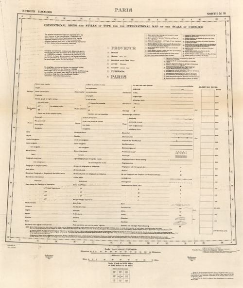
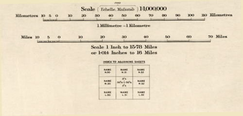
The following examples from Bartholomews shows their 1910 proof of the concept that they produced under direction from the International Map Committee. The map sheet specifications and legends are included as a template.

MapCarte241_penckMapCarte241_penck_detailCartography can be many things to many people. This project was designed to be educational, edifying and philanthropic – a consistent international map of the world for the good of humanity. History shows us it never materialised.