MapCarte 259/365: Yosemite Valley by John H, Renshawe, USGS, 1914

MapCarte259_yosemite

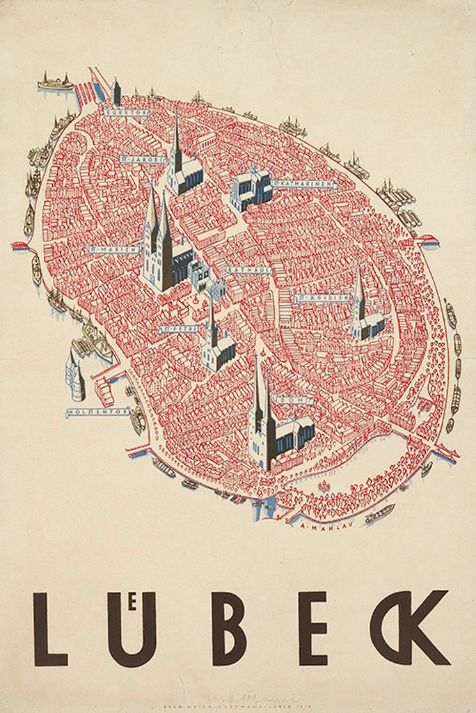
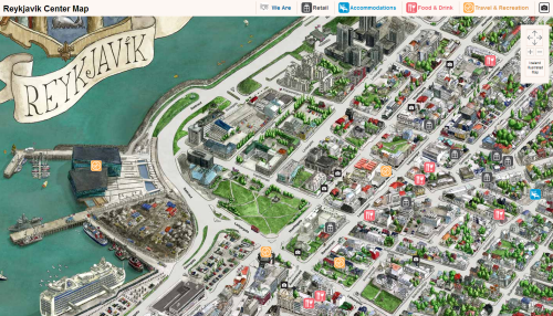
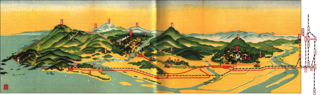
As more and more maps are created by digital means it’s easy to forget that many digital techniques still fail to achieve the artistry that a hand drawn map can bring to bear. Cartography has always been heavily populated by artists who have brought considerable graphical skill to the process of design and production but as we search for ever more automated techniques that more people can deploy we perhaps lose a little of that exceptional individual work. Hand drawn maps bring a style that can be as different and unique as a Monet to a Van Gogh or a Turner to a Banksy.

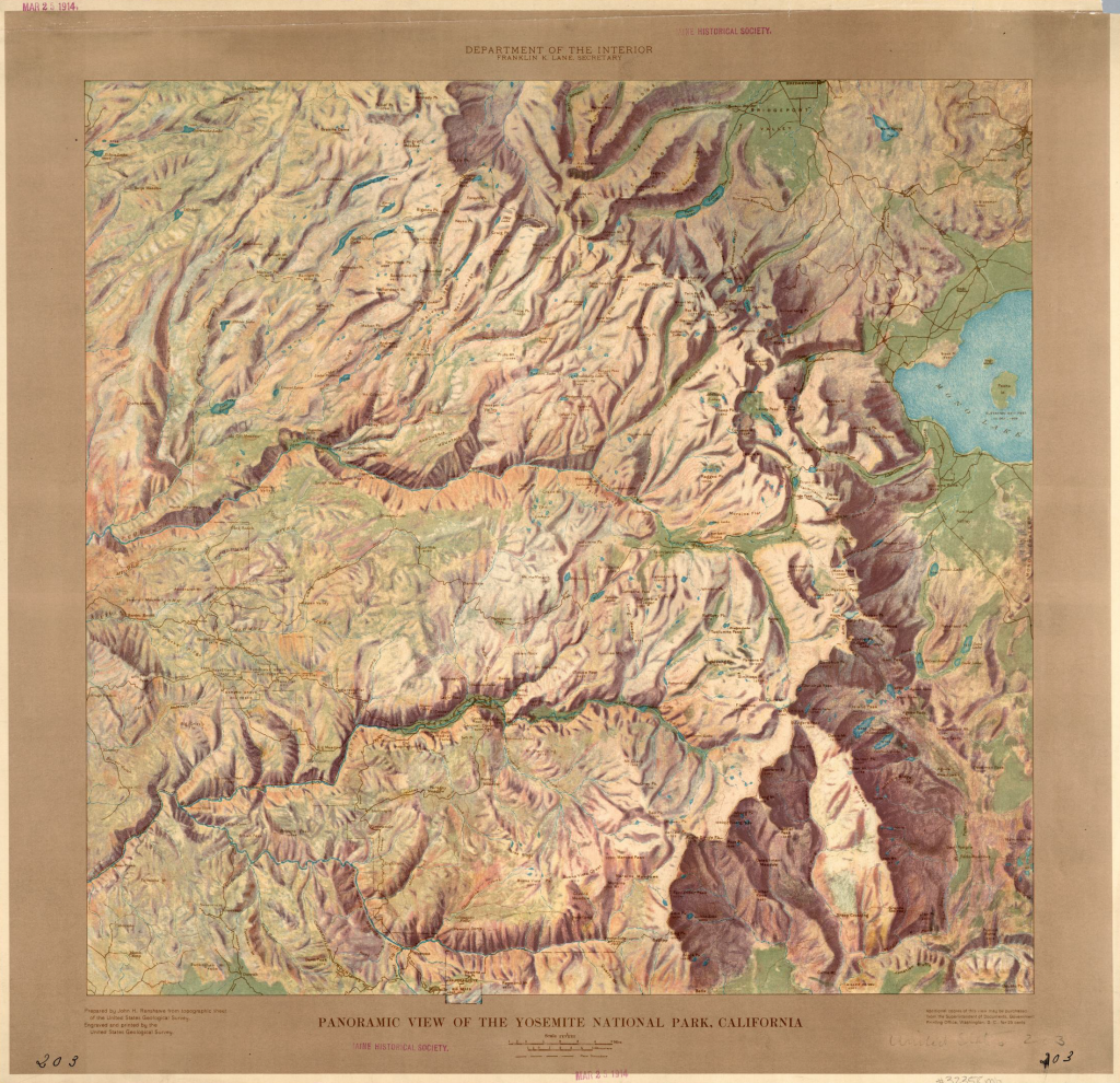
Here, John Renshawe shows us a rich palette of colour with deep browns and earth tones to depict Yosemite Valley. Lush greens and bright blues complement this excellent colour scheme that attempts to show the landscape as rich as one might find it in reality.

MapCarte259_yosemite_detail
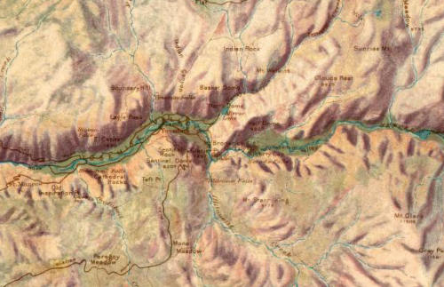
The manually developed hill shade is particularly striking and though analytical hillshades have advanced tremendously, the ability of an artist to consider individual elements in the terrain rather than a computer’s approach of applying a technique systematically provides a unique and pleasing result.

The text sits comfortably in the map and the use of a border in a complementary colour completes the overall image. A beautiful, rich and warm map.


MapCarte 231/365: Walt Disney World Resort, 2014

MapCarte231_disneyClick image to view web map

MapCarte 114 focused on the original Disneyland map by Sam McKim from 1958. It was a beautifully drawn map that brought the magic of the Magic Kingdom to life as well as creating a brochure for people to use as a way of getting around the park. Here, we celebrate a web map of Walt Disney World Resort. In many ways it’s the modern counterpart to McKim’s originals but built for a new type of consumer.

The web map is interactive in a way that the paper version cannot possibly be but it retains the sense of style of the originals. It uses the Google Maps framework but with their own content fused into the service so that the resort appears as part of the map itself. As you zoom in, detail is rendered so the map builds in detail. This isn’t just in the addition of more content, but also the detail in the textured landscape of the basemap. There’s even clouds that appear to float over the resort.

At the largest zoom level the buildings and layout of the resort is illustrated using beautifully rendered digital artwork with clean lines but with textures, shadows and depth. Many features are depicted planimetrically but those that are given more importance are drawn obliquely using an axonometric approach so some of their front and side elevations are shown. It’s a useful technique not only to give more detail to the buildings but to distinguish what’s important from the background.

Typical pictorial symbols are used across the map for certain points of interest (gift shops, restaurants etc) and labels sit cleanly. Pleasingly the typeface isn’t too large which can so often detract.

Well composed, clean and clear web mapping.


MapCarte 230/365: Lübeck by Alfred Mahlau, 1934

MapCarte230_lubeck

Maps can be used as powerful promotional pieces. When an artist or illustrator with a very unique aesthetic uses maps as part of their work we often see the map design take on strong elements of their artistic leaning. So it is the case with German painter and graphic artist Alfred Mahlau. Much of his work was in graphic design for advertising, textile patterns, sets and even stained glass windows.

In general, Mahlau’s work was highly illustrative with minimal lines and strong blocks of colour. He was known for his lettering and his particularly clever way of dealing with umlauts as in this poster. Mahlau produced this poster, which has been reproduced in different colours and formats, as a promotional piece for the town of Lübeck in northern Germany which largely sits on an island in the River Trave and acts as one of Germany’s major ports. The island contains the old part of the city and as such has a number of historic buildings amongst a dense network of narrow streets that share the same red tile roofing and architecture.

Mahlau captured the essence of Lübeck in his perspective view. The many buildings are drawn in a similar style and the cathedrals and churches are seen rising above. It’s a simplified drawing but retains something of the character and charm of this small island settlement. The boats surrounding the island give away the fact it’s situated on water yet he cleverly uses subtle shadows to emphasise this aspect.

This view of Lübeck does way more than any aerial photograph or planimetric map could. It gives the town character and evokes a sense of place merely through the illustrative form.

MapCarte 228/365: Milano Congressi (MiCo) by Matteo Riva, 2013

MapCarte228_milano


Distilling a complex city like Milan into a map to support a 3-day trip to the city by a tourist unfamiliar with the area means additional constraints for the cartographic processes. The processes of selection and omission become vital, perhaps moreso than for a general purpose map which has the luxury of providing the scope to include more. Here, if you include more than can be reasonably navigated in three days you risk the user becoming frustrated, or perhaps trying to achieve too much.

Matteo Riva’s work in graphic design and illustration sees him use simple geometric shapes and straight lines in much of his work. He uses a lot of saturated block colours and a lot of contrast. Typographic components are key to the overall design and play an important role. All of these facets are seen in his map of Milan. Clean, simple geometries and vivid use of colour creates a collage of the city. Key places are marked but the white space (grey given the background colour) shows how much is missing. The benefit is it gives the selected places space to breath on the map. None of the graphics is competing for space.

At a glance it’s obvious what are buildings or parks or roads or the subway. Underground stations and hotels feature prominently because they are the main hubs people traverse between and through.

The design supports the map’s purpose well and the unconventional graphic approach lends a certain character to the map that shows that different isn’t necessarily a bad thing in cartography.

You can see more of Riva’s illustrations and maps on his web site here.

MapCarte228_milano_detail

MapCarte 224/365: Bangkok by Nancy Chandler, 1974-present

MapCarte224_bangkok2


Tourist guides are essential travel companions to help us navigate the unfamiliar.  We trust them implicitly to give us sage advice, to identify the key places to visit in an often constrained amount of time and to present a city or region in a way that supports our quest for discovery. In many ways they represent the view of a place that we perceive rather than the place itself because it’s such a strong filter. It’s also a difficult job for a cartographer to determine what to include or exclude because they’re effectively making choices that thousands and more will follow blindly.

The best maps and guides become well known for their accuracy and utility and the more a product is revered the more we trust it. This applies to Nancy Chandler’s maps of Bangkok. They are unique. They don’t necessarily give you the top attractions but that is entirely the point. Since the first edition in 1974 right up to the current 26th edition they provide a rich window on the quirky and unique places to eat, drink and visit. And they do it in style with a fantastic colour scheme and hand drawn approach. The colours give the map a unique aesthetic that somehow captures the hustle and bustle of Bangkok. They make the map sing and dance and give the reader a sense of colour, vibrancy and excitement. In support of a product for tourists this is great cartography.


MapCarte224_bangkok1

The double-sided map splits Bangkok into sections and the central shopping areas. The information is detailed on all sorts of museums, restaurants, hotels, galleries, temples and many other features. There’s copious text which acts to annotate locations. Without the text there would be a great deal of white space but that simply evidences the judicious editing and careful selection of the content. This map highlights a very personal geography but one that many people identify with. The map has become a staple companion for countless people who visit and has become part of the excitement of the city itself.

Making a tourist map that becomes part of the enjoyment of the tourist experience itself is an achievement. This map certainly holds a special place for visitors to Bangkok.

You can see more of Chandler’s work and other maps at her web site here.

MapCarte 141/365: Birds-eye view from Summit of Mt Washington by Boston and Maine Railroad, 1902

MapCarte141_birdseyePoint of interest signage often contain maps to give some context to the geographical features in an environment. We often see mountains, lakes and other prominent natural features illustrated and named. They sometimes take an elongated form that shows an aspect elevation. But the cartography of such signage often goes a little further and uses a ‘panneau’ technique. A panneau is form of panoramic view that contains a 360 degree horizon projected on a flat plane in the form of a circle. They are typical in mountainous areas but can also be found in urban areas with a well known example situated at the Arc de Triomphe in Paris.

This fine example from the early 1900s illustrates the structure of a panneau which has a central part that corresponds to the closest point of observation – in this case the summit of Mt Washington. The main illustration is placed in a wide outer ring where the drawing depicts a 360 degree view of the surroundings. Panneau’s are usually oriented with north at the top and as in this example, typographic elements are right-reading when facing out from the central point of observation.

MapCarte141_birdseye_detail

The approach is highly efficient and captures a considerable amount of detail in a relatively compact form. It gives an excellent mechanism to view each bearing which shows the landscape set out perfectly. This map also illustrates the cloud base often seen below the summit and, uniquely, is designed to show the route and ultimate destination of the cog railroad that ascends the mountain itself.

An intriguing and innovative solution to the depiction of a view around a central point of view, highly effective and a captivating approach to tourist mapping.

MapCarte 135/365: The Chevalier map of San Francisco by August Chevalier, 1911

MapCarte135_sanfranVery rarely do we see maps titled in such a way that they go beyond the theme or subject matter of the work. More than that, how many maps do we ever see where the author adds their own name to the title. It’s a bold statement and one that’s difficult to pull off since recognising a piece of work by the author’s name is usually only conferred by peers after the work is published and widely admired. August Chevalier didn’t wait and his map of San Francisco bears his name. On this occasion any hint of self-agrandising might be allowed since the map is stunning.

The “Chevalier” Commercial, Pictorial and Tourist Map of San Francisco (its full title) was designed and engraved by August Chevalier, lithographer and publisher. The original first edition was later published with improvements and additions in 1911. The map portrays San Francisco in a way that we rarely see today by emphasising the relief. For a relatively large scale (1:9,400), the map unusually employs contours to depict relief. More typically, it also shows all of the important buildings as life-like pictorial representations so in some respects combines techniques more often seen on different scales of map type. This works to great effect.

The map also uses hill-shading to accentuate the character of the topography and the clear and bold street names add local detail. The parklands are shown clearly as are the docks and other key places which become recognisable by their use. A neat trick sees Chevalier allow his map to extend beyond the graphic border. This gives an expression of the landscape continuing beyond the map and allows it to appear less constrained; a little more fluid. The shaded vignette effect used to depict the water is slightly patterned and also expertly applied to accentuate the landform.

MapCarte135_sanfran_detail

This is a beautiful poster sized map that captures something of the city that modern maps overlook. San Francisco, like many cities, has considerable variation in land use and topography but our sometimes overly abstract representations and distillation of features to geometric shapes can lose some of the character. Chevalier proudly put his name to this map and he deserves the accolades.

MapCarte 127/365: Iceland Illustrated by Borgarmynd, 2012

MapCarte127_iceland1

Click on the image to view online web map

Combining the artistry of a hand drawn map with a modern digital publishing approach may at first seem like some sort of paradox yet there is nothing that states a hand drawn map has to be on paper and a digital map has to be nodes and vertices. In fact, some of the most interesting cartography comes from combining techniques that at first sight might appear to be not particularly well suited to one another.

Iceland Illustrated, by Borgarmynd, have created a large 3D hand drawn terrain map of the country principally as a tourism related product. It is available as a printed map but they have also re-purposed it to provide the backdrop to an online web map. The map provides a beautifully rendered backdrop which is used to provide a base for the location of geotagged photographs of Iceland’s spectacular scenery with modern pictograms showing the locations. Compare the approach with the same areas on Google Maps illustrates the difference. Where Google shows us barren nothingness, Borgarmynd has detail, rock drawing, colour and features. Of course, Google’s approach has to be consistent globally…but when you’re mapping a specific place you can stretch your artistic license a little.

MapCarte127_iceland2

Click on the image to view online web map

The same approach has also been taken for their map of Reykjavik proving that you can easily transfer the same detailed, hand drawn watercoloured approach to a large scale environment and make it equally fit for purpose as the base for an online web map. Again, pictograms mark the locations of photographs and other points of interest. The only difference between the country and city level maps is the former is planimetric (with some plan oblique rendering of mountains) and the latter is an isometric drawing in greater detail.

A very successful marriage of old and new.

MapCarte 32/365: Guide for visitors to Ise Shrine, Japan c.1950

MapCarte32_ise

This intriguing Japanese tourist map demonstrates some interesting design. It’s hand painted giving it a certain artistic aesthetic (similar to panoramic maps) and the use of colour presents the landscape in an abstract way but with a golden ‘glow’. While unnatural, this frames the main map. The various towns are illustrated and embeded amongst familiar mountains. The lack of detail presents a pleasant and accessible landscape that invites the reader in.

The most intriguing aspect however is that the oblique representation of the landscape gives way to a diagrammatic and planimetric view of the extended rail link to the right. This allows the map to show the detail of the city network alongside the more compressed and generalised main map. Two very different scales on one map…much like an inset but one which is integrated into the map in a unique way. The painting has less content as it approaches the right edge before it becomes schematic to support the transition and the upright orientation of the typography works well with other vertical map elements.

Finally, a great example of letting the map content define the layout rather than the opposite. The landscape naturally expands east-west and creates a long, narrow map format. A good example of letting the map itself influence the overall design rather than constraining it to standard formats.