MapCarte 370/365: A world of lotus, a world of harmony by Liao Zhi Yuan, 2015

MapCarte370_yuan

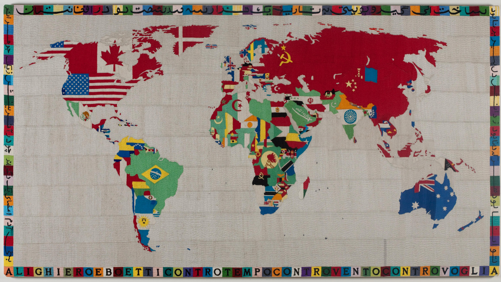
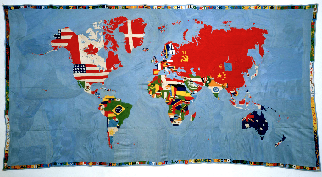
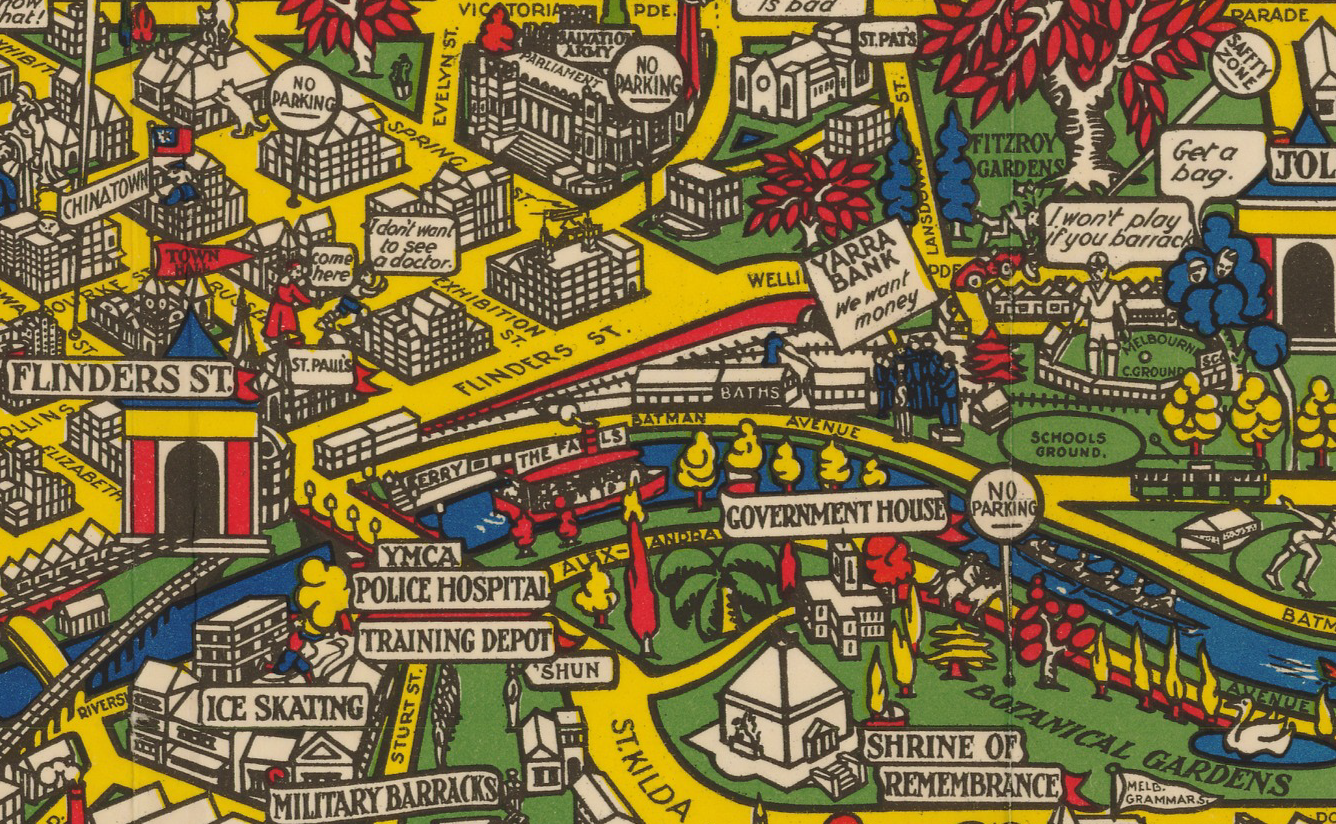
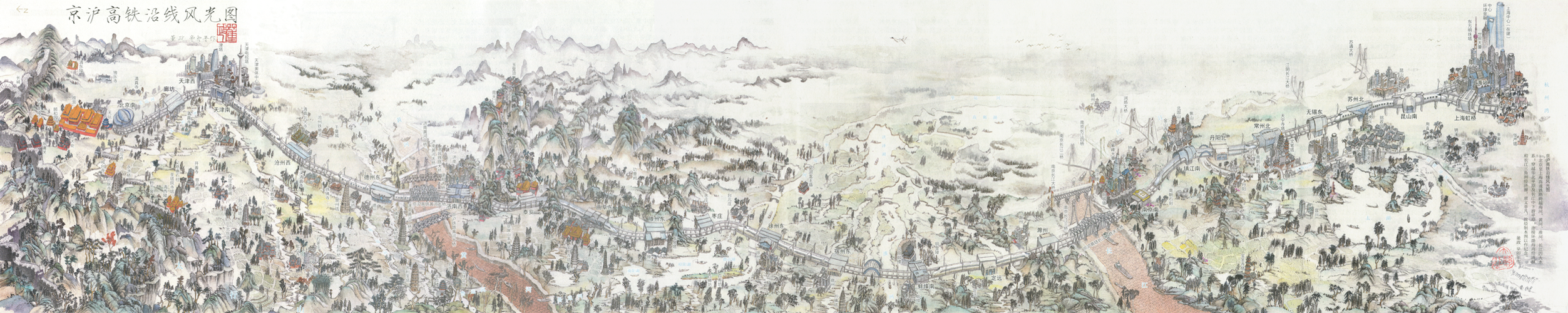
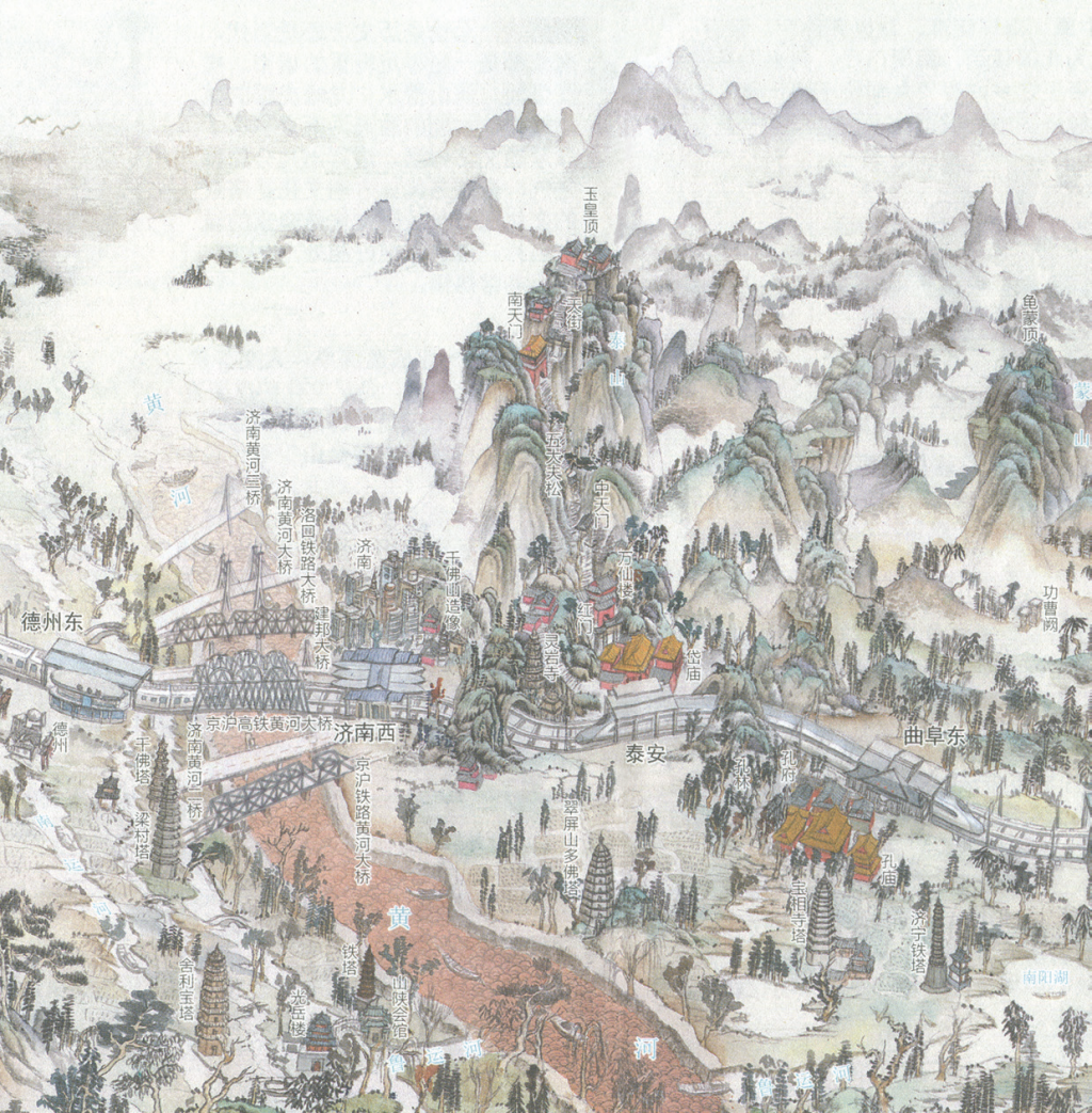
Cartography has always been, in part, an artistic pursuit and in a world where many more maps are now made digitally we see a lot of bland cartography in design terms. Still, hand drawn maps inspire and have something very human about them. The marks of the pen and the shades of the colouring give the map character. Of course, when we’re growing up we routinely draw with pen and paper and the recent entries to the International Cartographic Association’s Barbara Petchenik children’s map competition evidence the imagination and artistry among the world’s youngsters.

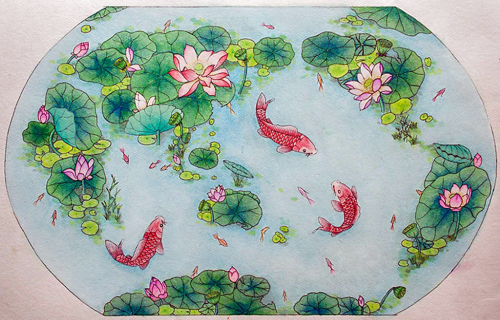
This beautiful map from 15 year old Liao Zhi Yuan of China typifies not only a high level of artistry but also in interpretation and use of the map form. Pictorial maps often make heavy use of non-map imagery or combine elements to make up a map form. Here, the use of the aquatic lotus flower, reflecting cultural significance, forms the shape of the landmasses of the world map within an ornamental pond. It’s a simple yet effective idea that communicates a message of harmony using established symbolic visual metaphors. The map itself is a lovely piece of cartographic art and well drawn.

Of course, we don’t all have to have an artistic talent to make maps but if you’re going to make maps like these it certainly helps. It should also act more generally as an inspiration to think creatively and to aspire to make maps that are set apart from the rest.

MapCarte 358/365: Cairo to Khartoum by The Graphic, 1884

MapCarte358_cairokhartoum1MapCarte358_cairokhartoum2Selection and omission is a key cartographic requirement. We make many decisions about the content of the map. One of the more dramatic consequences of this process is omission of all but a single geographic feature and this map of the River Nile from the late 1800s illustrates the principle perfectly. The whole river itself is over 4,000 miles in length and 2 miles in width at it’s widest. It passes through 11 different countries, though this map only illustrates the portion from Khartoum (where the Blue and White Nile meet) to the coast at Cairo.

General reference maps simply wouldn’t suit the purpose of highlighting the settlements and places along a river. The scale wouldn’t allow it and the amount of white space would make the balance of the map inappropriate. You’d be forced into adding all sorts of other topographic detail simply to fill space.

Instead, as a supplement to The Graphic, this map focuses on just the river. It becomes a linear cartogram with some segments straightened and a lack of almost all other topographic detail except for places that directly border the river itself. It’s akin to some of the classic early strip maps used to map roads and it translates well to a river. The river becomes the central anchor to the two page spread and around it are beautifully illustrated vignettes – panoramic scenes of the towns, villages and natural scenery along the river.

Maps can omit so much and still be perfectly suited to telling the story of the form itself. Here, the river and only the river. It makes perfect sense to omit all else.

MapCarte 346/365: Bird’s eye view of South Africa by G. W. Bacon, ca 1890

MapCarte346_southafricaBird’s eye views fascinate us because they give us a panoramic, perspective view of a landscape as if we were seeing it with our own eyes. Typically, such views are of cityscapes or relatively small areas but with some cartographic license we can turn our skills to the depiction of much larger areas. This chromolithographic print, published by G. W. Bacon captures an entire country using the technique. It’s neither perfectly planimetric nor uses a progressive projection but there are subtle changes in the perspective from south to north, accentuated by the depiction of landforms throughout.

The content is fairly routine in terms of topography with roads, rivers, towns and cities as well as major mountains, rivers and some political and administrative features. Insets are used to show the Transvaal in the upper left and northern Natal in the lower right giving the layout balance as well as space for more detail in these areas.

MapCarte346_southafrica_detailOf course, timing is everything in cartography and the map was was published just after the First Boer War (1880-1) and in the period leading to the Second Boer War (1899-1902). The British were particularly keen to understand the landscape and names which were becoming part of daily life in newspapers. Maps such as this helped contextualize the far off land and better appreciate the places which had, by now, been discovered to hold large gold and diamond reserves.

More than all of this, the map is well coloured and pleasing as a form of cartographic art. The mountains, in particular, are depicted using a plan oblique technique and sit well amongst the otherwise flat plains. The use of light across the image hints at the way sunlight might hit a picture with the south being slightly darker than the north, particularly around the inset. The same is true for the rendering of the water and around the lower right inset. This gives the work added depth.

MapCarte 310/365: Mappa by Alighiero Boetti, 1971-1994

MapCarte310_mappa1Many artists work with maps. Indeed, we’ve focused on two exponents of the art world who have very successfully worked with map imagery as part of their work in Jasper Johns (MapCarte 3/365) and Andy Warhol (MapCarte 294/365). Here, we focus on Alighiero Boetti who famously used the map for a series of works in the late 1900s. He became fascinated with the outlines of maps as human constructs – borders that demarcated often contested places. At the same time he also became interested in embroidery and he worked with Afghan craftswomen who created a series of world maps. He didn’t specify any constraints and the maps he created from the woven fabrics are a function of the way in which the craftswomen interpreted the world. This applies specifically to colours across the maps which changed between different versions based on the choices of the women themselves.

MapCarte310_mappa2Boetti began to use the maps not only for their colourfulness but also as a lens on western cartography and the reality of the world view of the Afghan women. In some respects the craftswomen were also learning some of the craft of cartography. The maps also reveal a sense of global changes in political structure as the shapes of countries and the flags change over time. They become a collection of geopolitical reference points despite their otherwise unscientific appearance and construction. Boetti also experimented with different map projections that could be used to emphasis the politics of the time with different sizes and shapes of land masses and countries shaping the way the map was designed.

MapCarte310_mappa1_detailBoetti’s woven maps have become icons of the modern art movement which make statements about cartography, projections and the shape of the political world. Indeed, the very fabric of how the world is constituted and how it changes is woven into the different Mappas over time. There’s no typographical components and no pen and ink. These are real, tangible, human maps made by humans. The meaning imbued in them is a function of the deep impressions made on the Afghan craftswomen.

MapCarte 306/365: The Story Map of Scotland by Colortext Publications, 1935

MapCarte306_scotlandThere’s a saying about things that are old become new again and we see plenty of that in cartography. In fact, many cartographic techniques seem to come in and out of fashion regularly as new map-makers find the technique or try and work out ways of creating a particular map type using new software. A good example recently has been the use of tesselated hexagons as a container for summarizing another dataset. We might call it hex-binning and for the last few years it’s become a popular way of mapping thematic point data because it creates visually and cognitively equivalent areas and which overcomes the death by push-pin red dot fever mapping.

Another trend has been the use of new terminology to describe a particular type of map. To some of us a little older in the tooth a map is a map. We’d go so far as to categorize based on type (topographic, thematic for example) or scale (small, medium, multiscale) but the trend to create new brands and be seen as different is inevitable. A current fad is Map Stories or Story Maps. The idea that a map has a narrative and can tell a compelling story using a mixture of maps, graphics and textual components. As with most things, this idea isn’t new either. This map by the publishers Colortext was one of a series they labelled ‘Story Map’. It combines pictorial images, text and information that in this case tells the story of Scotland. It incorporates historical and cultural components in a place-based narrative.

MapCarte306_scotland_detailIt’s possibly the first of the genre of Story Maps. Ernest Dudley Chase also produced a number of his own maps in the mid-1900s that he titled Story Map too. This is a well composed Story Map or, as some of us might say, a map. It’s pictorial elements are well composed and the map has a good density of information. The decorative border of the tartans adds further interest and the map as a whole combines several integrated themes to tell the story of Scotland.


MapCarte 271/365: Japan, the target: a pictorial Jap-map by Ernest Dudley Chase, 1942

MapCarte271_japan

Pictorial maps often allow a certain degree of artistic license and can be extremely effective instruments of propaganda. This wonderful map from World War II by Ernest Chase uses colour and symbology effectively to create a graphically simple yet powerful image of Japan as a ‘target’. The colours clearly demarcate the enemy and the use of stylized Japanese rising sun symbology supports the notion of a threat posed.

Different aircraft types give a sense of superiority in the air and their flight paths diverge upon Japan provide an impression of wholescale attack and the enemy having little chance of either retaliation or defence. The aircraft are even drawn with the effect of movement and convergence to emphasise their rapid attack. Perhaps it’s the concentric circles drawn across the map that identify distances to various cities and between cities such as San Francisco and Manila that provide a sense of accuracy and precision as if the map could actually support military purposes.

Some general topographic detail is included as well as the location of naval bases. The hierarchy is well established and the map bleeds well into elements of the border. Overall a beautiful map and an example of the pictoorial style used to create a busy and evocative impression in the map readers mind.

MapCarte 266/365: Wonder map of Melbourne by John Power Studios, 1934

MapCarte266_melbourneIn 1914 Macdonald Gill drew his Wonderground map of London (featured in MapCarte 15). It brought a cartoonesque aesthetic to the streets of London and included pictorial elements and other delightful characters that produced a playful, whimsical but detailed and well marshalled map. Twenty years later, this map appears. It’s a map of Melbourne, Australia which displays a remarkable resemblance to Gill’s original. Considering we’ve already discussed Gill’s map, why is it necessary to include a derivative?

In design terms, there’s very little that is genuinely new in cartography. Most of what we seen owes something to what has gone before either in terms of some small element or, perhaps, in its overall style. Taken to extreme, derivative works can become merely pastiches (see the perpetual use of Beck’s subway map as a basis for alternative cartographies for instance) but sometimes they reflect an homage to a particular approach.  There’s a fine balance between homage, pastiche and plagiarism but here, the authors have shown a keen eye for their own landscape and geography and created a map in the style of Gill’s but with a clear Australian dimension.

MapCarte266_melbourne_detail

In this sense it’s worth promoting the idea that design doe not necessarily need to be wholly original to work. Many great cartographic effects and styles get re-used and re-imagined. New places and new ideas can add to the canon but in the main, maps tend to show subtle or blatant lineage.

MapCarte 260/365: Baseball Stadiums ArtMap by World Impressions, 1987

MapCarte260_artmap1

Pictorial maps are often some of the most artistic, combining illustrations of a theme to create a dramatic, attractive poster. They are commonly used to build a picture of a phenomena that perhaps draws people in who have some vested interest in the content…sport being a favourite theme for such maps because of the passion and association people bring to the map.

Here are two examples of maps by World Impressions that showcase the very best of the collage approach that incorporates key imagery from all teams. the first illustrates baseball and the second, American Football. The illustrations vary considerably from paintings of the natural landscape to key historic sportsmen to stadiums and team logos. The lack of uniformity creates interest and the poster allows a viewer of the map to immediately identify their own team as well as their opponents across a map that gives them an equal visual treatment.

MapCarte260_artmap2Textual components are minimal but the borders are well framed using allied imagery. Here we have a map that is designed simply to stimulate our passion for the sport and the teams we support. It shows where the teams are based but the spatial component is secondary to the emotional response the map is intended to invoke.

Done well, as these two maps are, pictorial maps can be attractive as pieces of art. They often adorn our walls and act as a reminder of our team and their place.


MapCarte 188/365: Beijing-Shanghai High-Speed Railway by Dong Zheng, 2012


MapCarte188_sheng


Strip-maps have often been used with great success to illustrate transport networks. They are well suited to linear paths. This example, drawn entirely by hand by Dong Sheng illustrates the roughly east-west orientation of the railway with Beijing on the left and Shanghai on the right. It’s a promotional device rather than a navigation device so what is omitted structurally we gain aesthetically. The birds eye position allows us survey a picturesque landscape that contains not only key features but also traditional Chinese symbology (such as the two flying cranes that represent longevity)

Sheng distorts the scale of many features, particularly the objects directly related to the railway itself to make them prominent. What he also does well is apply a subtle cultural dependence of aesthetics so the graphics and symbology are deeply rooted in the minds of the map’s intended audience. It plays on the familiar in terms of the content but also the imagery and the presentational representation.

MapCarte188_sheng_detailA fuller discussion of the map by Stephan Angsüsser can be found in Cartographic Perspectives no. 73 (2012) here.


MapCarte 160/365: Air France by night and day in all the skies by Lucien Boucher, 1938

MapCarte160_airfrancePictorial maps are often used in marketing and advertising. They have little function other than to encourage people to pause a while and explore…and possibly to then make some association with the product or service offered. Pictorial maps are perfectly suited to this need because they combine maps and map-like imagery with other illustrations designed to capture attention and captivate.

Lucien Boucher produced a number of pieces for Air France in the early 20th century which were advertisments for the global coverage and glamour of air travel at the time. This version, from 1938, combines a subtle outline map with key places with a celestial planisphere that shows the various signs of the zodiac. The suggestion is of fantasy and the experience you’ll have flying. It’s designed clearly to capture the imagination and provide a strong brand message.

Actual linear flight routes are superimposed across the map to place Air France clearly amongst the imagery and to situate it both graphically and in the minds of the reader. This is a very stylised approach to advertising that combines maps with other rimagery to create a memorable, high-impact product.

More of Boucher’s maps for Air France can be seen at the David Rumsey Map Collection here.