MapCarte 248/365: In the shadow of foreclosures by the New York Times, 2008

MapCarte248_foreclosures

Very few newspapers have a team dedicated to data visualization and information design. Many produce data dumps that are the antithesis of design.  The New York Times, however, creates consistently high quality maps and graphics to tell their stories.

Small Labs Inc provide an excellent repository of over 300 superb examples of their work to date which are a catalogue of best practice in thematic map design – viewable here.  It’s almost invidious to select one example of their work that sits above all others but we’re going to try…

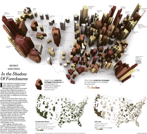
The map of foreclosures from 2008 displays multiple variables in a striking 3D graphic giving the map the look of buildings on a city landscape.  The map labels don’t dominate even though they add important contextual statistics.  Subtlety is the key here.  The fine san serif shape means it sits further in the background and doesn’t obstruct the foreclosure shapes.  The white US country background provides a neutral landscape for the buildings to emerge from.  Simple, thin, solid black lines delineate the state lines. The map page is complemented by two traditional but expertly constructed choropleths and the overall page maintains a clean fresh appearance with excellent visual balance.

We could point to the fact that the perspective 3D view makes measuring the building heights for comparison a little difficult but in the context of the readership and presentation it’s sometimes perfectly reasonable to break a few cartographic rules. A great example of data journalism that uses cartography to good effect and with purpose.

MapCarte 244/365: War in the Falklands by London Sunday Times, 1982

MapCarte244_falklands


There was a time not so long ago when newspapers included simple yet dramatic illustrations, often that incorporated maps. That’s not to say that such work doesn’t still exist but it tends to encompass larger scale projects. What perhaps has not changed is the drama that a media illustrator often brings to the subject. Of course, this is by design not only to capture attention but also to perhaps enforce an editorial perspective.

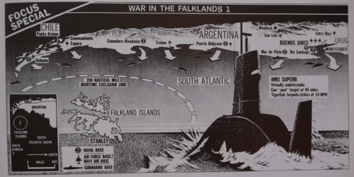
Here is a lovely example of a black and white newspapre graphic (dare we say infographic?) from  1982 by The Sunday Times of London. The Falklands War between Great Britain and Argentina was underway and the British Navy and Military were on their way to battle. This map flips the map to a transverse perspective to fit a horizontal layout. Argentina is at the top – seemingly overbearing as an oppressor, emerging from a dark backdrop. The bottom half shows an ocean in perspective with a foreboding British submarine making a hasty route to the islands. The arrows from Argentina reinforce the invasion. The islands are stuck in the middle!

This is propaganidist cartography. Subtle but effective at rallying the Telegraph’s right-wing readership who file in behind the advancing submarine. Such maps and illustrations had to be rapidly produced but they were often highly dramatic. They told not only the story of where, but were imbued with layers of additional imagery and meaning.


MapCarte 234/365: Africa without its margins by Philippe Rekacewicz, 2012

MapCarte234_africa

Newspaper maps often showcase the very best of graphic design since graphic design is one of the cornerstones of producing a well prepared publication. The ability to combine text, photographs and illustrations across a pleasing layout not only develops a house style but a sense of character that readers identify with. Maps are part of this style and Le Monde have consistently produced high quality graphics whether it be a small, simple location map or a more detailed piece that conveys a richer story.

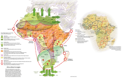
Le Monde maps do not always follow the same graphic approach yet they are all expertly produced. This example from Philippe Rekacewicz takes a hand-drawn approach. It looks like a sketch map but the content of the map demands a fuzziness. Mapping Africa without borders means a map with very uncertain areas. The hand-drawn approach is endearing and lends itself well to this uncertainty. You easily forgive the lack of accuracy of the lines and demarcation simply because of the graphical approach. The colouring in is as you would expect from a set of colouring pencils with pencil coastline and the hint of erased and redrawn elements.

The smaller map depicts how the real borders were drawn by the French, British and other colonial powers but it’s the larger map with it’s borders indicative of mineral belts, nomadic zones and the spaces in between that’s particularly alluring.

Newspaper maps often show us how one-off cartographic products should be produced. Le Monde produces some of the best and although we’ve selected one example here it’s worth perusing their gallery here.

MapCarte 144/365: Counties Blue and Red Move to the Right by New York Times, 2012

MapCarte144_watkins

Some of the best print cartography has always resided in the pages of quality newspapers. The use of maps and graphics have long been used effectively to illustrate stories and to provide a visually impactful way of engaging readers. Who wants to wade through pages of text that attempts to describe something when a full page spread of well crafted graphics can provide far more information as well as be more visually appealing?

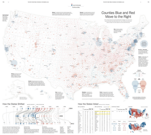
The New York Times are currently at the forefront of journalistic cartography both in print and online. Here, Derek Watkins et al. uses a two-page print spread to illustrate not just the results of the 2012 Presidential election but also the context at a county level. The proportional symbols are well positioned and the overlaps are generally handled well (though transparency can cause some issues of perception with this sort of massively varying data it’s always a compromise). The swing in votes is illustrated by a small arrow which shows how voting changed between 2008 and 2012.

MapCarte144_watkins_detail

There are useful textual vignettes surrounding the main map to give some sense to the pattern the map illustrates and a band at the foot anchors the page with a novel graph showing change at State level. Tabular data presents the actual data and there’s even room for some headline figures and a State and Electoral Vote map…the latter using a cartogram approach.

This is an excellent example of composition and layout. Each component tells a part of the story and they fit together like a perfect jigsaw to tell the bigger story. The colours are both indicative of the different parties but are also in sympathy and balance across the page. The visual hierarchy is subtle but reinforces key information across the entire page.

Excellent print cartography that combines a rich variety of complimentary elements in a finely tuned overall composition.