Happy international Kite Day 14/365

Breezy oi! It’s International Kite Flying Day so I wanted a colourful map that simply uses kites in an illustrative manner. The first static map was fairly simple, and very easily made. But I then imagined the map with movement and wondered if it could be animated. Turns out that’s well within the capabilities.

World map of kite flying

Original Prompt (ChatGPT)

I want to create a map to celebrate International Kite Day. Please create a world map where each country is formed of a collage of brightly coloured kites. There should also be numerous kites flying around the map and the entire illustration should appear like it’s been drawn on a breezy day, perfect for kite flying.

Are you able to animate any of the kites? What I’d like is the peripheral kites and their tails to shimmer, perhaps with a little light shimmering effect. This is for embedding in a web page so just a short looped MP4 will suffice.

Happy Printing Ink Day 13/365

It’s National Printing Ink Day so here’s a simple map-like illustration made from the three main inks used in four-colour offset printing., cyan, magenta, and yellow. Now – given you’re likely seeing this map on a screen, and it’s never actually been printed, then what you’re looking at are the additive mixing of red, green, and blue but let’s not let that minor issue ruin it. It’s also not really halftone but maybe our AI hasn’t quite grasped that yet.

Illustrative map using print colours

Original prompt (ChatGPT)

Using only three print colours cyan, magenta, and yellow, make an illustrative world map of countries with halftone symbol fills and, as far as possible, use the four color theorem so no two adjacent countries are the same fill colour.

Happy Curried Chicken Day (12/365)

A tasty map for today’s National Day of Curried Chicken. I’m not sure why curry needs its own special day because every day could be a good day for a curry. I know what I’m having for dinner tonight.

A map of the curries of India

Original Prompt (ChatGPT)

Create a map of India showing all the regional variations of curry. Give the map a strong Indian aesthetic with deep, rich, vibrant colours. Title the map “Curries of India” and label the curries.

The original map was fine but as ChatGPT is prone to do, it mis-spelled ‘Arabian Sea’ as ‘Araban Sea’ so it was asked to change it.

This is perfect but please change the label ‘Araban’ to ‘Arabian’

Happy Step in a Puddle and Splash Your Friends Day (11/365)

I can’t think of a much better cause to celebrate than puddles of water with which to splash your friends so first of all, here’s a map. Second…go find a puddle and splash your friends. That’s all!

A world map with continents as puddles of water.

Original Prompt (ChatGPT)

Make an image of a world map that makes the continents look like watery puddles among muddy oceans. Put in a few footprints in the mud that look like they were made by boots, and also a dinosaur footprint with the closest puddle looking like the water is shaking from the dinosaur step, but make sure it only shakes the water. Add a few tufts of grass to the muddy areas. Finally, add the reflection of the head of a T-rex to the water puddle of South America

Happy Save the Eagles Day (10/365)

Pretty simple prompt for today’s National Day dedicated to saving Eagles which gave this map of the global habitat for some of the major species. Apologies to New Zealand for being dropped off the map. It seems AI does what many others seem to do with New Zealand, though to be fair it could be argued it’s there – just covered by a giant Golden Eagle.

Map showing the global habitat of species of Eagles

Original Prompt (ChatGPT)

Create a map to show the range of habitat for some of the world’s main species of Eagle.

And because that was quick and easy, here’s a bonus map showing where rock band The Eagles have toured.

A map of the touring history of The Eagles

Original Prompt (ChatGPT)

Please create a map of countries in which the rock band The Eagles has ever played a concert. Use the list of countries from this page https://www.setlist.fm/stats/concert-map/eagles-6bd6bede.html. Add pictures of guitars, bass guitars, keyboards and drums to the map as if the map were on a stage. Create the map in a vintage tour poster style.

Happy Word Nerd Day (9/365)

It’s a day to be celebrated if you’re a nerd about words but, of course, the word “nerd” isn’t the same the world over. So let’s ask ChatGPT to create a playful map to illustrate the different words that are used to say “nerd”.

This one took a little bit of effort. In short, AI isn’t particularly great at labelling maps and often includes misspellings, labels that you didn’t request, or random words. The original request included a component that asked the AI to fetch different translated words across the globe, parse them into a table, and then make the map. It did a great job of creating the table, but not so good at then making the map using what it had found.

But I was half way there, so I downloaded the table, and asked ChatGPT to make the map using data that I then uploaded. This seemed to go way better, and here’s the result.

A map of the word 'nerd' in different languages.Original prompt (ChatGPT)

I want to create a world map infographic to celebrate National Word Nerd day. I’d like you to create a playful style map that positions the following labels on or adjacent to the countries they represent. The title of the map should be “World of Nerd Words” and a short explanation should be included that says “The word NERD translated across the World”. You must include all of the following labels on the map.

Ñoño — Mexico / Central America
Ñoña / Ñoño — Colombia
Cerebrito — Argentina
Empollón — Spain (can be placed over Iberia if included)
Nerd — United States
Geek — Canada
Caxias — Brazil
Nerd — United Kingdom
Streber — Germany
Intello — France
Secchione — Italy
Nerd — Netherlands
Nörd — Sweden
Nørd — Denmark
Nerd — Norway
Bokmal — Finland
Intello — Morocco
Nerd — South Africa
Akademiker — Israel
书呆子 — China
书呆子 — Taiwan
괴짜 — South Korea
オタク — Japan
Nerd — India
Nerd — Australia
Nerd — New Zealand

Happy National Bubble Bath Day (8/365)

While Ian is taking a lead on creating AI prompt-built web maps, I’m going to be experimenting with using AI to generate static maps. Today is National Bubble Bath Day so here’s a map to illustrate global bathing habits. I wanted to see whether the average number of baths or showers varied by country, and what sort of scented bathing products tended to be preferred. And given this isn’t a particularly serious issue, then let’s make the design somewhat playful.

A world map showing bathing habitsOriginal Prompt (ChatGPT)

Hello, I would like to create a static map to celebrate National Bubble Bath Day.

The map should show the average number of baths or showers taken per person, per week for the most recent year with the most complete global data. Please find appropriate data that illustrates this information.

The map design should be playful and frothy. It should show the data by using a proportional symbol, per country, otherwise known as a bubble. Each bubble should appear like a soapy bubble. It should be shown using transparency so the bubbles overlap, but the overlaps should not be too much. Each proportional symbol should be colored to represent the scent of the most imported essential oil for 2023, again using available data likely from global import sales data.

The legend should include a series of indicative proportional symbols to show the data values, and also the colors used to represent the different scents. The overall style of the map should be like a children’s cartoon. The title of the map should be simply “Bathtime!”.

Please use playful soapy styled fonts throughout. Add additional graphics like yellow rubber ducks to the background of the map but make sure these aren’t too visually overpowering.

The 365 Day Map Challenge

Back in 2015 the Commission committed to providing a critique of a map a day for an entire year which resulted in (actually a few more than) 365 maps with some brief comments about what made them work. The intent was to create an atlas of examples of great map design to help people to find inspiration for their own work.

We’re now ten years on from that daily effort and we’re going to do it again… but with a twist. Rather than share examples of maps we know, love, and think evidence great design we’re going to publish maps that WE make, every single day in 2016. With due respect to Topi Tjukanov‘s fantastic grass-roots community led 30 Day Map Challenge we’re going to dial it up to 11 and do one a day for an entire year.

Two questions come to mind… why? and how?

The technology that we use to make maps tends to shift in leaps. While the art and science remains relatively unchanged there tends to be a shift in technology once every decade or so. In 2015 we wanted to share maps to counter the problems with early web mapping efforts as people moved towards online mapping (or who entered the field of mapping upon discovery that maps can be designed by code). With immature technology came pretty rudimentary maps. It’s the classic one step forward, two back, as people grappled with new and emerging technology and shifted their map production workflows. It takes time for design to catch up. We’re at a new inflection point with the emergence of AI. And that will provide the focus of our endeavour because we’re seeing similar issues emerging.

So… can we encourage better mapping through developing an awareness of how to use AI to make a half-decent map? and can we work towards establishing best practices through our experimentation?

We’ll therefore be creating a map, every single day, to illustrate the use of AI for making maps. These will (at least to begin with) be built using Web Mapper GPT. Each map will be built using ONLY a natural language prompt. And we’ll publish them here on the Map Design Commission blog with a copy of the prompts used to make the map. Things may change across the year given this is fast-moving technology. And we fully expect the maps we’re able to produce by year-end to be quite different in quality than those that we are able to create at the outset. That said, we think you’ll be staggered to see what is achievable already.

Much like Topi published a set of 30 topics for the 30 day map challenge every November we need topics, but for each day of the year. It seems like every single day of the year is dedicated to some sort of international or national cause or other, some serious, some not so. These will be our topics. We’ll pick a ’cause’ from each day of the year and make a map that in some way riffs off that idea. Some will be serious, some not so.

We hope you’ll join us each day, and follow our journey as we explore ways to use AI to make maps, and how we can develop best practices for map design along the way. Either come back to this blog each day to check-in, or follow #365daymapchallenge on X, or Bluesky, and with occasional summaries on LinkedIn. And of course this is only our sandpit…YOU can use Web Mapper GPT yourself to experiment making your own natural-language driven maps.

See you on January 1st, and Happy Mapping!

Ken, and Ian, on behalf of the Map Design Commission

Big in Japan!

Commission Chair Kenneth Field and Vice-Chair Ian Muehlenhaus attended the 29th International Cartographic Conference and 18th General Assembly in Tokyo, Japan, 15–20 July 2019.


They hosted half a dozen paper sessions with nearly 30 excellent papers on the themes of map design. The papers can be viewed either in full, or as abstracts here, along with all of the other papers presented at the conference:

Field and Muehlenhaus also organised and chaired the judging of the International Cartographic Exhibition which saw nearly 400 maps and map products of all types on display.


One of the products on display as part of the outcomes of the Commission on Map Design’s work in the period 2015-2019 was also recognised with an award. Cartography., authored by Kenneth Field won 1st place in the Educational Products category. We are particularly proud of this award given the Commission’s overarching terms of reference to help educate people in the craft of excellence in cartographic design. All 2019 awards can be seen on the main ICA website here.


After two terms as Chair of the Commission, Kenneth Field is stepping down and is replaced by Ian Muehlenhaus as the new Chair for the period 2019-2024. The Commission’s updated Terms of Reference for the period 2019-2024 were ratified at the General Assembly in Tokyo. Ken will continue to assist Ian as Vice-Chair. This change also means the Commission is now supported through the United States National Committee for the ICA after having been nominally under the United Kingdom Cartographic Committee under Ken’s stewardship.

Here’s Ian presenting a wonderful discussion on banal cartography at the conference…so, one thing’s for certain, you’ll not find any banal map design stuff here for the next four years at least 🙂 Congratulations Ian, and good luck in your new role as Chair of the ICA Commission on Map Design.


Cartography (full stop)

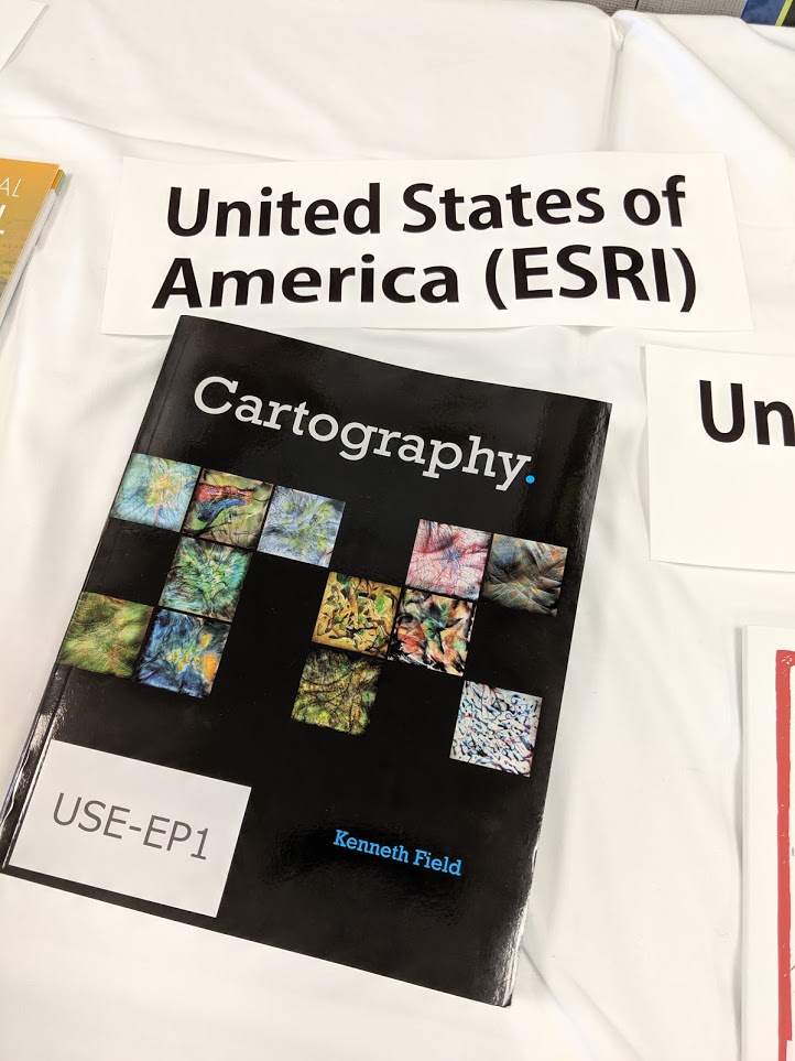
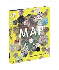
The Commission web site has been a little quiet recently, largely because my main focus has been in the completion of a major new book. I’m delighted to announce that Cartography. (Cartography, period OR Cartography, full stop) was published on June 28th by Esri Press and is available from all good online retailers. While not an official ICA publication it does bear the ICA logo due to the support received from many ICA friends and colleagues during its preparation. It therefore represents one of the main outputs from Commission members for the current period 2016-2019.

Making maps has progressed from filling empty spaces with mythical creatures to trying to unravel the complexities in data to present meaning with clarity. Cartography. sets out to demystify the discipline and promote the idea that thinking is key. Approaching mapmaking by thinking about what you want your map to say, how to build something meaningful from visual ingredients, how people read the graphical signage, and what emotions you want to spark is the magic needed to make a better map.

Data and the tools to make maps have become ubiquitous and so many more people are making maps. Technology has made the mapmaking task fast, simple, and reproducible but thinking what the technology is actually doing helps you make a better map. It is almost incomprehensible to understand how maps were made even 20 years ago. Automation has played a huge role in design and production but in some ways it may have led to a lack of appreciation of what goes into making a good map. Making a map fast does not necessarily lead to a great map.

Cartography doesn’t need to be hard and whilst there’s plenty of what might be called rules, these are just guidelines developed from decades of practice and people working out what works and why. Maps should be objective and have scientific rigor but there’s plenty of scope for creativity. Any design-led field sits at the intersection of science and art, and learning some of the rules means you’ll know when best to break them.

A lot of thought and experience has gone into making this book. It encapsulates the wisdom of many people who have taught me and from whom I have learnt. What I have tried to achieve is a translation of cartography from a specialist domain to one that builds a bridge between cartographer and mapmaker. I’ve tried to make the subject practical and valuable, not only as a reminder to professionals but as a companion to all who need to make a great map. We’ve all been beginners somewhere along our journey, and we’re all amateurs at some things. As a cartographic professional, I hope this supports people in their own cartographic journeys.

The book weighs in at 576 pages. There’s over 180,000 words, and 333 illustrations which mix classic and contemporary maps with original examples and illustrations. Over 100 organisations and individuals have contributed by giving permission for their work to be incorporated. Material is organized alphabetically, providing an accessible, encyclopedic approach rather than presented linearly as a traditional text book. The book, then, is a collection of not just my ideas but that of many, many experts in the wider cartographic, and allied fields. To that end, I believe it brings together the very brightest talent currently involved in both academic and commercial cartography to help me bring this book to life

The Bulletin of the Society of Cartographers has referred to it as a ‘game changing book’. Reviewer Christopher Wesson sums the book up: ‘What Kenneth Field has created here is a brilliant reference book on behalf of our field of cartography. Finally! A book that truly represents Cartography in 2018.’ But don’t take my word for it, you can read the review here. Once you’ve had a look, let me know what you think. I can be found on Twitter @kennethfield and I’m using the hashtag #cartographybook.

Cartography. Is available in softcover (ISBN: 9781589484399, 576 pages, US$94.99) and in hardcover (ISBN: 9781589485020, 576 pages, US$129.99). Both editions can be obtained from most online retailers worldwide. They are available for purchase at esri.com/series or by calling 1-800-447-9778. Outside the United States, visit esri.com/esripressorders for complete ordering options, or visit esri.com/distributors to contact your local Esri distributor. Interested retailers can contact Esri Press book distributor Ingram Publisher Services.


Some praise for the first edition:

“An Impressively creative and useful scholarly contribution.” – Mark Monmonier, author of How to Lie with Maps; Distinguished Professor of Geography, Syracuse University, NY.

“Read the book for pragmatic advice or to braden your horizon; for me, it did both.” – Menno-Jan Kraak, president of the International Cartographic Association (ICA); professor, University of Twente, Enschede, Netherlands; author of Mapping Time and coauthor of Cartography, Visualization of Geospatial Data.

“What Kenneth Field has created here is a brilliant reference book on behalf of our field of cartography. Finally! A book that truly represents Cartography in 2018.” – Christopher Wesson, The Bulletin of the Society of Cartographers.

“This beautifully designed book, meant to inspire and lead by creative exemplars, illuminates well-grounded cartographic concepts in a way that emboldens you to implement ideas onto maps.” – Patrick J. Kennelly, Ph.D., professor of geography, Long Island University, NY

“This book actually makes me think that I should teach cartography again, now that there is a decent text” (Assc. Prof. Bernie Jenny, Monash University, Australia)

“I would accept this as a gift.” – Daniel Huffman (somethingaboutmaps.com)

“A work of substance and passion” – Colin Field (my brother)

“who’s going to buy that?” – Amelia Field (my niece)

“I’ve read a little bit and I’m impressed.” – Eleanor Field (my daughter)

“It’s incredible – an amazing publication” – Lauren Tierney (Washington Post)

“It’s not bad” and “a masterpiece” – Ian Sims (Esri, with British humour)

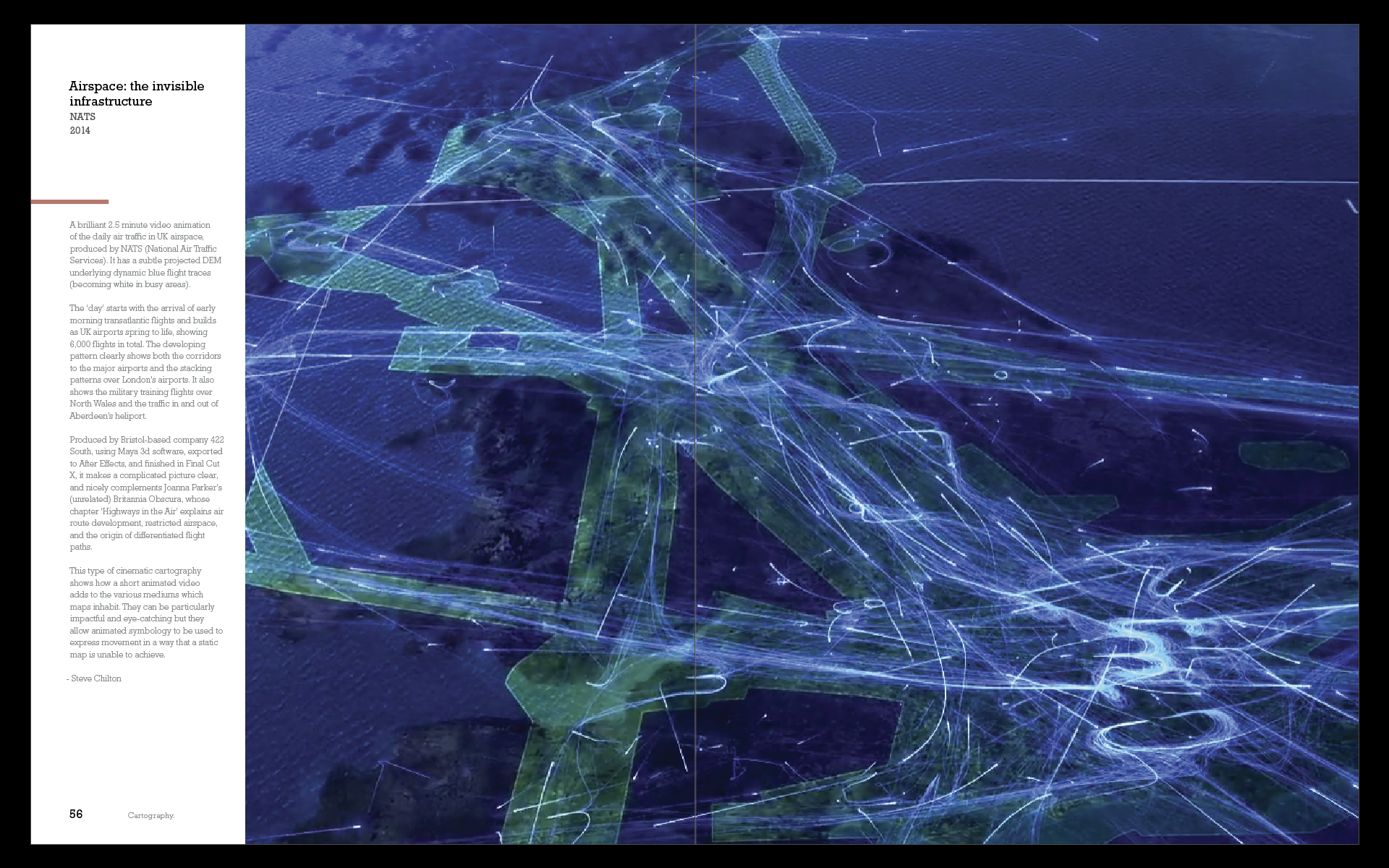
“a real gamechanger in the field” – Steve Chilton (Chair, Society of Cartographers)

“A bit big to take on a plane” – anon reviewer

“A work of creative scholarship, sort of like a painting hanging in a gallery—something about which one is reluctant to question the brush strokes or choice of colors. Art is supposed to make you think, and Ken’s book does that.” – anon reviewer

“a beautifully designed book that highlights important considerations for those interested in map making” – anon reviewer

“the structure is immensely satisfying. Dive as deep or as shallow as needed and in and out of topics as you please. Kudos.” – Warren Davison (via Twitter)

“This edition just blows my mind amazing!!” – Fernando Benitez (via Twitter)