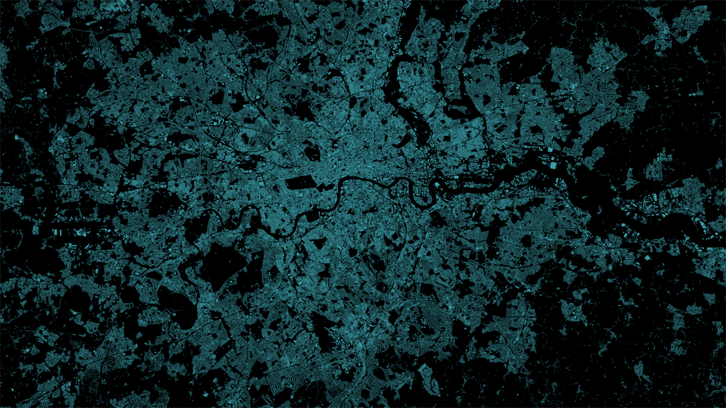
Big data is one thing but Ed Manley describes the dataset he used to create this map as ‘massive data’. It’s the Oyster Card tap ins and tap outs across London’s transport network over a 3 month period in 2012. That’s a log of every single journey made by public transport. trying to make any sort of sense of such data requires a clear head but also the ability to mine the data to get to the crux of a very specific question. Without focus and homing in on a tightly controlled idea then work such as this becomes nothing more than a visual data dump. What Manley has achieved here is to extract meaning from the data and represent it with clarity.
The map shows how associated two places are in the transport network by mapping the most popular destination station for any origin station. It’s a gross generalisation but then that’s the idea…to see what the most likely end-point might be for a traveller from the origin of a journey. Manley only used peak period journeys between 7-10am on weekdays to avoid ‘noise’ caused by bidirectional journeys or the very different patterns of weekend travel. He therefore uses selective omission to great effect as well as a range of generalisation operations on the data to capture the nugget of detail he wants.
At a meta level it gives us a glimpse of the structure of the network by route for the morning commuter influx rather than the real network which might map infrastructure itself rather than the routes people travel. The curved lines emphasise the abstract nature of the concept well. Mapping true geography and a network would assign too much meaning to the actual route which may be inaccurate anyway given the multitude of ways to get from A to B. The saturated colours, clean black backdrop and sensible use of transparency add to the visual appeal of the map as does the fact there isn’t a title. The map stands on its own as abstract art. It demands that you read an associated commentary to understand the complexity. An interesting approach that works well.

The map supports basic knowledge acquisition about interdependencies, key stations, spatial concentrations and stations which act as local hubs in addition to the concentration in central London. too which are detailed on Manley’s blog about the map.
The old KISS principle of ‘Keep It Simple Stupid’, often taught in cartography classes, is a key tenet of this work. To clarify a complex system, keep it simple. This is exactly what Manley has done in designing not only a piece of data driven map art, but one with a purpose and which can be used to explore questions of the data. A lot of data driven map art is purely for appearances and when explored critically often shows up some serious liberties taken by the designer.
Check Manley’s blog here for more detail and a link to a higher resolution version as well as a version with labels.