MapCarte 357/365: Great Polish Map of Scotland by Jan Tomasik, 1974-1979

MapCarte357_scotland
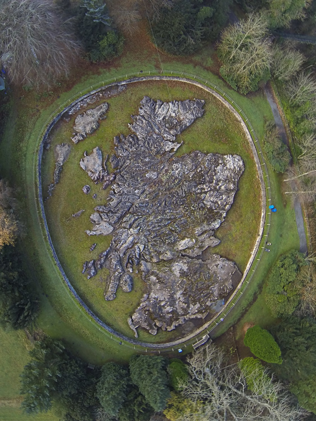
As far as cartographic curiosities go, the creation of a large concrete scale model of Scotland has to be one of the most bizarre. All the more when you appreciate it was built by a Polish war veteran. The Great Polish Map of Scotland, or Mapa Scotland) measures 50m by 40m and is located in the grounds of Barony Castle Hotel in the village of Eddleston in Scotland. It was constructed between 1974 and 1979 and is arguably the world’s largest terrain model…which makes it’s design somewhat impressive.

MapCarte357_scotland2
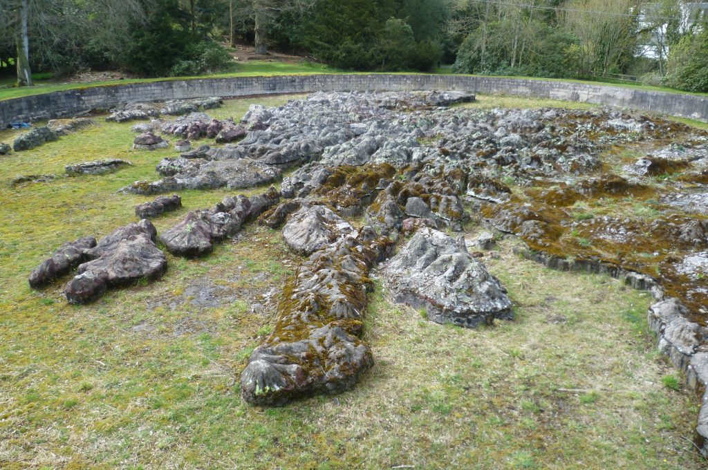
The map was conceived by General Maczek and Polish companions as a reminder of their part in the defence of Scotland and of Scotlands wartime hospitality during World War II. Maczek had a love of geography and so a giant relief model. The hotel had been used as a base for Polish forces during the war and some years later another Polish war veteran, Jan Tomasik, became owner and his friend, Maczek, stayed there subsequently. Tomasik had by this time set about restoring some of the water features in the grounds and he and Maczek set about creating the giant map.

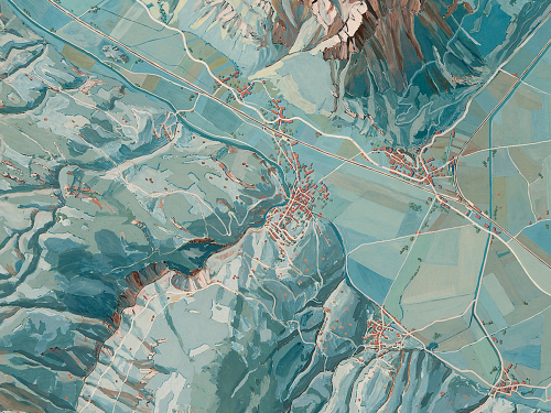
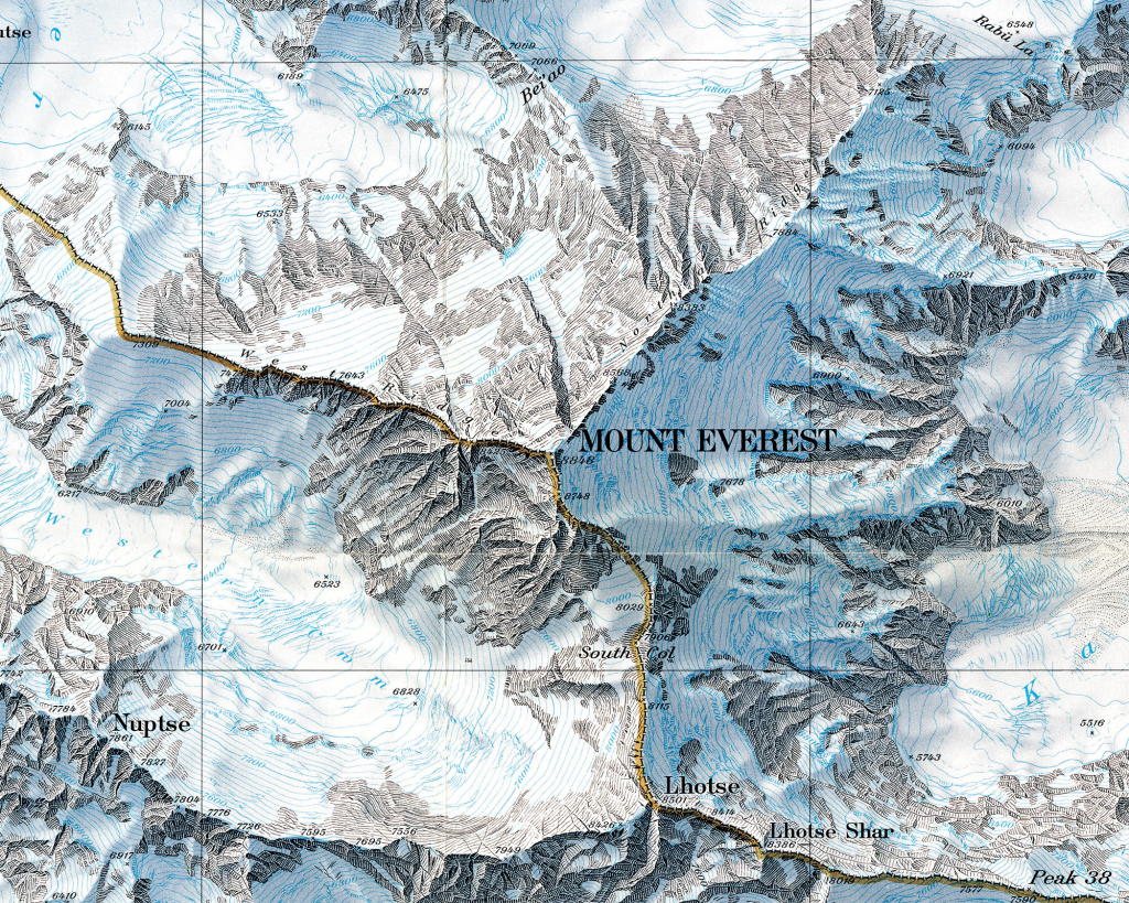
There probably aren’t many maps made entirely out of concrete and which have water channels and pumps to surround it with fresh sea water. This was a monument on a monumental scale but which took Polish workers only a few weeks to build. The map is at a scale of 1:10,000 and has a 5x vertical exaggeration in line with the standard adopted by allied forces in WWII.

The map has fallen into disrepair though coupled with current owners De Vere hotels, the map is currently undergoing a restoration. You can see more about the map at the web site here.

MapCarte 346/365: Bird’s eye view of South Africa by G. W. Bacon, ca 1890

MapCarte346_southafricaBird’s eye views fascinate us because they give us a panoramic, perspective view of a landscape as if we were seeing it with our own eyes. Typically, such views are of cityscapes or relatively small areas but with some cartographic license we can turn our skills to the depiction of much larger areas. This chromolithographic print, published by G. W. Bacon captures an entire country using the technique. It’s neither perfectly planimetric nor uses a progressive projection but there are subtle changes in the perspective from south to north, accentuated by the depiction of landforms throughout.

The content is fairly routine in terms of topography with roads, rivers, towns and cities as well as major mountains, rivers and some political and administrative features. Insets are used to show the Transvaal in the upper left and northern Natal in the lower right giving the layout balance as well as space for more detail in these areas.

MapCarte346_southafrica_detailOf course, timing is everything in cartography and the map was was published just after the First Boer War (1880-1) and in the period leading to the Second Boer War (1899-1902). The British were particularly keen to understand the landscape and names which were becoming part of daily life in newspapers. Maps such as this helped contextualize the far off land and better appreciate the places which had, by now, been discovered to hold large gold and diamond reserves.

More than all of this, the map is well coloured and pleasing as a form of cartographic art. The mountains, in particular, are depicted using a plan oblique technique and sit well amongst the otherwise flat plains. The use of light across the image hints at the way sunlight might hit a picture with the south being slightly darker than the north, particularly around the inset. The same is true for the rendering of the water and around the lower right inset. This gives the work added depth.

MapCarte 264/365: Plan oblique relief Europe by Jonas Buddeberg, Bernhard Jenny & Johannes Liem, 2014

MapCarte264_planoblique


Click the image to view the web map

Representation of terrain is as old as cartography itself and there remain numerous ways of creating interesting effects. Plan oblique can be traced back to the work of Xaver Imfeld in 1887 (featured in MapCarte 182). It’s an interesting technique because it uses a planimetric base (thus preserving scale in all directions across the entire map) yet represents terrain in apparent 3D. The trick is that the terrain is effectively stretched in the north/south axis such that the base of the terrain remains static and the peaks move…stretching everything in between. The technique overcomes some of the limitations we inevitably get with panoramic maps where foreshortening and occlusions are potentially problematic.

There are plenty of ways one can create a plan oblique effect using Digital Elevation Models (unless you have a preference for the hand-drawn approach like Imfeld) but the beauty of the map application developed by Buddeberg et al. is it gives the user all the tools to modify the variables that control the appearance on the fly. Azimith and inclination are basic variables to allow the creation of hillshades and 3D relief. Additionally, users can modify hyposmetric tints, the rotation and, crucially, the inclination of the viewing angle that modifies the plan oblique effect. The user controls are intuitive; the effect impressive; and the way in which the application reveals the nuance and beauty of a plan oblique representation unparalleled.

MapCarte 182/365: Reliefkarte der Centralschweiz by Xaver Imfeld, 1887

MapCarte182_imfeld2

Throughout cartographic history there have been a number of eminent artists, map-makers and illustrators who have brought beauty and precision to the depiction of relief. We can trace relief depiction back to the very earliest maps when illustrations of mountains in aspect were etched into clay tablets. Since, many different techniques have been used including panoramas, oblique illustration, hachures and contours.

At first sight this beautifl map by Imfeld appears to be just another planimetric map with well executed hill shading but looking closer, it uses an intriguing additional approach. Rather than viewing mountains in an orthographic perspective, Imfeld has re-positioned the viewing angle to create a parallel orthographic view. This has the effect of showing the mountains partially in aspect which accentuates their form while not obscuring too much detail.

MapCarte182_imfeld

Imfeld, from Switzerland, became famous for his cliff drawings and especially for two masterpieces: The “Reliefkarte der Centralschweiz” shown here and his map of the Mont Blanc area. He’s less recognised as the first to use a parallel orthographic projection which has seen many reinventions yet here it is, drawn by hand to a high degree of precision. His mastery of colour, tone and shading is spectacular. Though containing many labels, they merge into the map without becoming dominant.

A superb topographic map, ahead of its time in many ways but giving modern map-makers a great example of relief depiction that improves on the standard orthographic approach.

MapCarte 143/365: Journey Through Time by Swisstopo, 2013

MapCarte143_swisstopo

Click on the image to launch the Swisstopo Journey Through Time

Swiss cartography is renowned for its accuracy, quality and artistry and no collection of maps, let alone topographic maps, could ignore them.  Swisstopo, the official name for the Swiss Federal Office of Topography are responsible for the production of topographic maps at a range of scales but how do you select a map representative of their work when we could conceivably fill an entire year of MapCarte blogs with just their work? Thankfully, they have produced a wonderful portal that allows you to explore the rich history of their work.

Journey Through Time lets you explore any area of Switzerland, from any time period mapped at any scale. It allows you to search, to animate through maps from different times, and to compare maps using an innovative overlay technique that fades one through to another using a simple slider control. Metadata is rich so you can easily identify the map and some of its background information. You can link to a specific map for sharing and also print out a full extract. As an example of a rich portal into national mapping this is beyond compare. As examples of design it’s tough to beat too.

The use of colour in particular has always been a characteristic of Swiss topographic mapping. On many map series (particularly the 1:100,000), colour is used to vary label meaning, show quantities, represent or imitate reality and to decorate which visually enlivens the map.  The Swiss “style” is well structured, maintains uniformity, uses white space effectively, contains beautiful typography and unrivalled depiction of relief on topographic reference maps.

The typeface sets a classic tone using primarily ‘antique’ looking serifs that includes a unique combination of thick and thin strokes.  Hill shading on most series and scales is in the classic Swiss style based on the work of Eduard Imhof.  The maps are rich in content and deliver complex information in a succinct, well organised manner.

Swisstopo topographic maps are truly works of art. It’s actually tough to pick a stand-out amongst their many stand-outs so to be able to explore their catalogue through time and compare their artistry allows us to appreciate the full range of their work.

MapCarte 68/365: Grand Canyon: Bright Angel by United States Geological Survey, 1903

MapCarte68_usgsRepresenting relief is always a challenge for cartographers and there are numerous alternatives. How, then, do you decide to represent the Grand Canyon which has one of the world’s greatest vertical difference across one of the shortest horizontal distance?

United States Geological Survey chose to simply use contours and their map of 1903 shows how simplifying the map by choosing only a single representation can bring increased clarity. More normally, you would see hill shading or hypsometric tinting used in conjunction with contours but in Grand Canyon the contours are packed so tightly together that they capture the topographic variation perfectly on their own.

MapCarte68_usgs_detail

The ochre colour of the contours adds to the effect since they reflect the reddish sandstones found in the canyon and the thickening of key contours gives a sense of the sandstone layers that in the canyon have a very distinctive pattern. There is very little additional detail other than the hydrology and labels. There doesn’t need to be any additional detail as the contours make this map what it is.

MapCarte 58/365: Karte der Gegend um den Walensee by Eduard Imhof, 1938.

MapCarte58_imhof_walenseeThis original image measures 9.6m in width and illustrates he area around Walensee at 1:10,000. Created by Eduard Imhof, the work appeared in his classic text Cartographic Relief Representation which had a single purpose in teaching the means by which to represent relief in maps. This is a painting in gouache that Imhof used to show a plan view portrayal as naturally as possible.

Imhof employed the techniques of a landscape painter. All linear elements that might be produced using woodcuts, etchings, engraving or lithography are removed since they are abstract and do not appear in a natural landscape. No aerial photographs or existing maps were used as underlay. The result is a beautiful, aesthetically pleasing impressionistic painting yet one that is highly accurate.

MapCarte58_imhof_walensee_large_detail

As Imhof himself explained “In detail, the interplay of surface colour, vegetation colour, light and shadow, of reflections and aerial perspective are shown. According to their location and the basic tint of the ground or ground cover, the shadow tones are India red, brown, grey, blue or deep green. Contrast effects also play their part. Even shadows are often lightened and varied in colour by reflected light, but cast shadows are strongly deepened. A slope bathed in sunlight appears bright ochre or yellowish red, but in shadow it is a deep red violet. In a large scale portrayal such as this, with its simple and powerful relief forms, the coloured mosaic of ground cover influences the colour of the depth effects but does not destroy them”

The virtual library of Eduard Imhof is here.

MapCarte 42/365: Mount Everest by the National Geographic Society, 1988

MapCarte42_natgeo

Mount Everest has been mapped extensively using a plethora of relief representations.  Possibly the most frequently cited example of excellence in design is by Eduard Imhof in the 1960s for his impressive use of colour. Here, though, Bradford Washburn used Swissair Survey aerial photos and Space Shuttle infrared photos to plot Mount Everest at 1:50,000 before applying his beautifully drawn representation.

Possibly the last example of hand drawn Swiss relief representation makes clear the most detailed and accurate map ever made of Mount Everest.  The digital age has yet to provide ways of matching such exquisite artistry.  The peaks, glaciers, rocks and hydrography are particularly clear with scree slopes depicted in astonishing detail.  Blue contours sit well in the overall design and take on the appearance of layers of ice.  The typography is beautifully set and the map has a soft, photo-realistic feel that adds visual impact.  The border separating China and India is so subtle it looks like it is actually painted on the ridgelines.  A masterpiece of accurate planimetric terrain representation showing natural beauty and scientific information in the most vivid possible way.