MapCarte 173/365: Wine Consumption by Alexandre Suannes, 2006

MapCarte173_wine
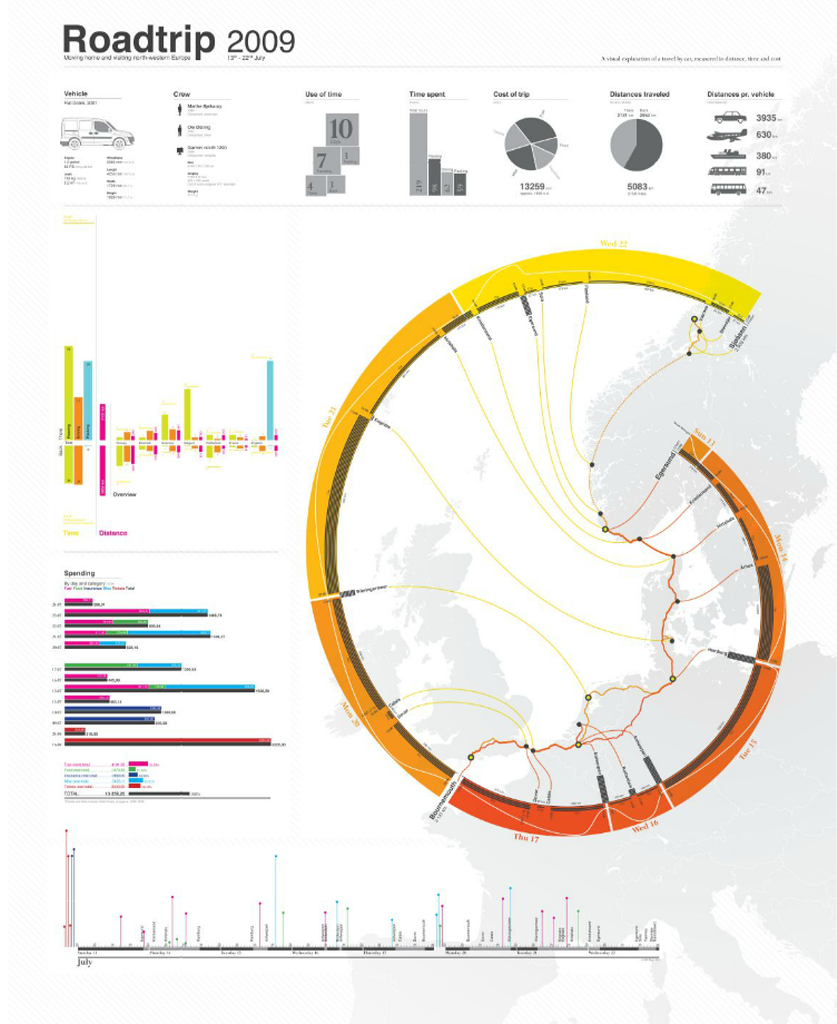
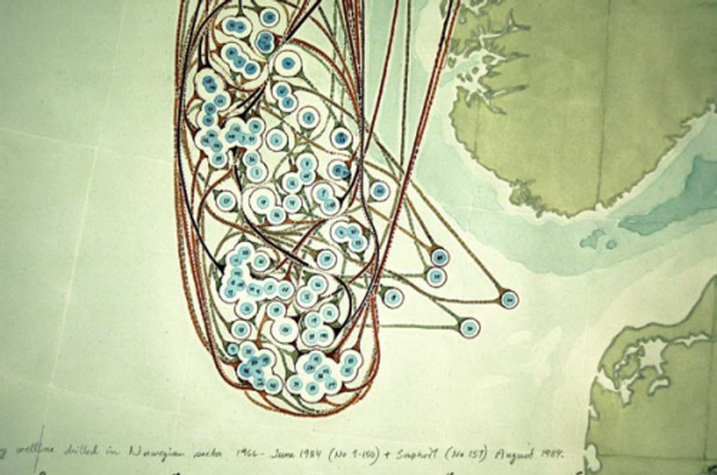
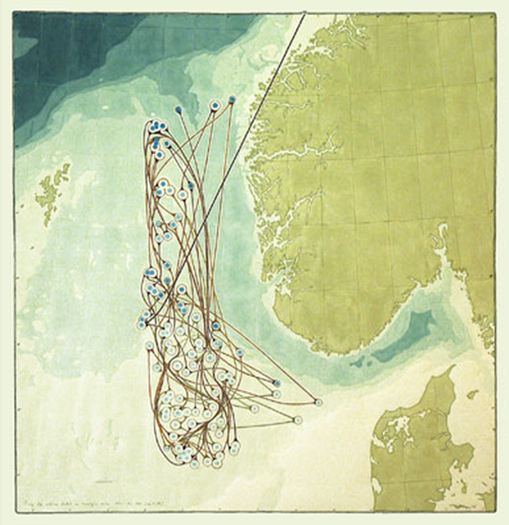
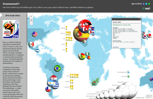
Often the simplest and most abstract maps are the most eye-catching and when the map is designed to appear in a magazine article that’s precisely what’s needed. This is a very simple dataset of wine consumption per person by country. There isn’t much one can do with the data if you’re constrained to a standard world boundary dataset. You could use a choropleth or a proportional symbol map or perhaps venture into cartogram territory but if you have the artistic license to explore different approaches then you can develop something totally different.

This, then, is really just a set of proportional circles rearranged in the form of a bunch of grapes. One might class it as a Dorling cartograpm though there isn’t really any sense of geography being maintained. The colours work well and even though colour is not used to encode anything about the data the different colours don’t detract from the message. This proves that cartographic rules can be broken if a separate element in the design is strong enough to carry it. Normlly, we’d associate different the different hues to some qualitative difference between countries but instead, the grapes motif overrules that impression. It does so effectively.

The overlaps also add to the effect even though usually we’d avoid overlaying symbols like this using transparency as it can confuse the message. Because the colour is not part of the map’s encoding the author can get away with it. Finally, the leaves, the ornate lettered cartouche and the simple legend complete this elegant and effective map.


MapCarte 169/365: Roadtrip 2009 by Ole Østring, 2009

MapCarte169_ostringIt’s becoming common practice to log personal details of life events. In some ways this began in earnest with the consumerisation of GPS technology. The ability to purchase a cheap consumer grade GPS receiver allowed people to capture points of interest and record tracklogs of their journeys. Smartphones brought the same technology into a consumer device and, with that, it was no longer geogeeks that were interested in recording such information. Now, everyone can record their paths through life.

The mapped result is often little more than a data dump of routes with all of the errors that GPS data returns. What these maps tell us is often very little but when you apply some cartographic nous they can become something altogether different as Ole Østring illustrates. His poster recalls a road trip around Europe in 2009. The geography of the trip is presented in a typical way by showing the routes he used on a basemap outline. What he then does though is use that as  a background and re-works the data to show a timeline illustrated diagrammatically as a modified golden spiral.

While not a true golden spiral, the work benefits from using such a purist’s shape. We are immediately drawn to it’s flow and see that it holds flow information of the route as a timeline. Thus, the journey is imagined in two ways – geographically and temporally. The poster contains all sorts of other useful statistical nugget of information clearly and cleanly presented. The overall image is strong with a clever use of colour and hierarchy for maximum contrast of key elements.

An example of taking what may otherwise be rudimentary data and turning it into something graphically exquisite.

There’s a detailed, zoomable version at Østring’s web site here.

MapCarte 168/365: Deutschlandkarte by Matthias Stolz, 2009 & 2012

MapCarte168_stolzThe production of maps in weekly publications and academic journals has been a mainstay in a number of publications but none has perhaps been as beautifully designed than those in the weekly magazine of German newspaper Die Zeit.

MapCarte168_diezeit1

The series of thematic maps has featured in a continuous single-spread feature in the weekly mazazine and now numbers well over 200 separate maps. It would be invidious to select one that rises above the others so here, we reflect on the maps by including the two book compilations by Matthias Stolz that provides a compendium of 101 of the maps, a couple of examples and a link to the Pinterest board.

MapCarte168_diezeit2

Various cartographers, artists, map-makers and designers have produced the maps over many years and they cover all manner of everyday topics exploring the distribution of facilities throughout Germany to popular hairdresser’s names and divorce rates. Each map is unique and often highly stylized or artistically driven. They offer not only a wonderful look at the serious and not-so-serious aspects of daily life in Germany but any aspiring thematic cartographer should explore these maps and cannot fail to be inspired.

MapCarte168_diezeit3

There’s rarely a map that one wouldn’t find catches their attention. That’s the point…they are designed to reel you in and take an interest in whatever it is that is being mapped. They make use of strong visuals and adorn the map with copious illustrations. They take graphic licence to another level in playing with cartographic symbology. Often, rules are broken but to good effect.

There’s plenty more of the maps to see on the Die Zeit Pinterest board here.

MapCarte 167/365: Dry well-bores by Torgeir Husevaag, 2005

MapCarte167_husevaag2

Most maps are designed to show something that people want to know. Some are designed to show people what they might prefer not to know. This isn’t necessarily negative cartography but it’s often an uneasy way of looking at the world.

After some 50 years of successful oil exploration and drilling in the North Sea which has supported the Norwegian economy, Torgeir Husevaag paints a picture of all the futile test-drillings, literally. His hand-drawn approach lends a certain human exposure to the highly scientific approach of the drillings themselves. It’s an almost paradoxical way of representing the subject matter which would more usually be seen through engineer’s plans and charts using sterile, heavily specified symbols and linework.

MapCarte167_husevaag

The 150 or so dry bores are numbered and linked to show them in sequence. There’s no particular need for this and the lines don’t actually exist but by showing them in this manner he creates a richer story. It explains the perhaps haphazard, unscientific search akin to looking for a needle in a haystack.

This is an alternative history told through a sequence of maps. The illustrations are well produced and the unconventional symbology a rich metaphor for the futility of the endless search for black gold.

More at Husevaag’s web site here.

MapCarte 165/365: FIFA Development Globe by Studio NAND and Moritz Stefaner, 2012

MapCarte165_stefaner

View the web map by clicking the image above

Globes are always powerful symbols and more and more use of them is being made in the online world, largely as a result of the impact that Google Earth has had and people’s appetite for rotating, panning and zooming earth-like objects. We have always spun globes…we are just now able to do it digitally as well as we can the desk globe.

Moritz Stefaner, in collaboration with Studio NAND, Medienfabrik and Jens Franke have designed a truly abstract globe to act as a container for thematic detail relating to FIFA’s football related educational activities worldwide. The digital medium supports such an abstract approach well with countries and continents constructed from tessalated triangles. Triangles also follow through to the symbology used to represent the different activity with numeric and qualitative information being assigned. Symbols can be filtered and, of course, the globe can be manipulated to focus on specific countries.

As the globe spins we see the inverse of landmasses through what is, in effect, a transparent model. This could cause visual clutter but the elegant abstract nature of the approach allows the design to capitalize on the aesthetic.

Colours, graphs, statistics and navigation are all intuitive and the application performs smoothly. There are focus-context changes made all the time as you spin the globe to bring different information into view and you can filter any amount of the content. There’s even an ambient low-level soundtrack to provide an aural abstract experience at the same time as interacting with the globe and various clicks and indications that some state change has been implemented by the user controlling the map.

A globe is an enjoyable experience because it’s tactile and allows you to see what’s round the corner as it is spun. This digital version is no less tactile which is a success for a digital application.

More detail on Moritz Stefaner’s web site here.

MapCarte 164/365: The Beautiful Game by Kenneth Field, 2010

MapCarte164_field

One from me…

There’s a world of difference between designing maps for inclusion in small format publications which are designed to be viewed at about 18 inches and a large format poster designed to catch the attention of someone as they pass by, perhaps fleetingly, in a gallery. This map was designed for the latter, the original being A0 size.

The poster displays the global distribution of national professional football teams. The use of a Dorling cartogram technique scales the symbols to the number of professional teams in that country. The cartogram neither maintains topology, shape of feature centroids yet we are still able to pick out that it’s a world map since most adjacent countries touch each other. The map could have been presented using a choropleth or some other standard mapping technique but when you want maximum visual impact you need to design something far more eye-catching.

The entire symbology  of the map is football related from the football sphere symbols that also contain team logos to the background of a football stadium. From a distance the football symbols seem to drop or dance about inside the stadium cauldron. National football association badges locate countries and symbols are grouped into FIFA confederations. The poster is designed to offer more than simple visuals though; it provides readers with a way to explore the structure of the game as well as the etymology of the term ‘football’ itself and how it varies globally with different vernaculars.

It deliberately uses saturated, vibrant colours that would not necessarily work for other presentations and in total it’s quite a visual assault on the eyes. Subtle it is not, but maps do not have to be subtle to be effective depending on the viewing environment. It won a few awards which is why it gets a mention in MapCarte. I even managed to add a little version of me sat in the stands just for fun.

Such one-off maps can have longeivity in a design sense too. I used a similar visual approach to a more recent map…the full history of the FIFA World Cup, published to coincide with the 2014 Brazil World Cup. This map used more conventional proportional symbols though still retained the football theme by adding a football design to the proportional symbols themselves along with a touch of shadow to provide some depth. An abstract basemap provides a simple backdrop:

MapCarte164_field2

You can view the web map here or download a copy of the full size print map here.

MapCarte 161/365: Maps Descriptive of London Poverty, by Charles Booth 1898-9

MapCarte161_boothCharles Booth, an English philanthropist and businessman is renowned for his survey into life and labour in London at the end of the 19th Century.  Critical of the value of census returns as a way of identifying inequality, he set to work investigating poverty for which he was recognized by awards from the Royal Statistical Society and the Royal Society.

The Maps Descriptive of London Poverty (there are 12 in the set of whichare an early example of social cartography..or cartography that draws attention to social circumstances in order to encourage some sort of social change.  Using Stanford’s  6 inches to 1 mile Map of London and Suburbs, Booth coloured each street to indicate the income and social class of its inhabitants.

MapCarte161_booth_detail

This choroplethic overlay on a light base is an early form of ‘mashup’ and used a rudimentary diverging colour scheme with black for the lowest class (Vicious, semi-criminal inhabitants) through dark blues and into reds and yellows (Upper-middle and upper classes, wealthy).  Neighbouring colours were deliberately similar in hue so the map illustrated social transitions across space though strong gradients are easily seen when blacks and reds are in close proximity.  The overlay is slightly transparent to allow the underlying base map detail to be seen for interpretation.

Taking a planimetric basemap that gives a sense of structure and overlaying thematic detail seems commonplace these days but at the time these maps were evolutionary. They weren’t the first thematic maps but they were some of the most detailed and well prepared. As a device to communicate they could hardly be more perfect.

More details at the Charles Booth online archive here.

MapCarte 158/365: Visualizing friendships by Paul Butler, 2010

MapCarte158_facebookIt seems almost inconceivable that we once lived in a time where mapping abstract geometries, overlaying hundreds, if not thousands of features and applying a huge dose of transparency wasn’t mainstream. Yet it was only four years ago that Paul Butler suggested that “visualizing data is like photography.  Instead of starting with a blank canvas, you manipulate the lens to present the data from a certain angle.”

His social graph of 500 million facebook users cleverly demonstrates this philosophy.  He asks “what might the locality of friendship look like between users of facebook” and takes the links between facebook user’s location and the location of their friends, plots a black-blue-white great circle arc between them and the result is a detailed map of the world.  There are no other geographical datasets yet the shapes of continents, locations of cities and some international boundaries emerge. The map is made entirely out of human relationships and the geometries that represent them. He takes the approach of an airline route map yet applies it to other, more ephemeral connections.

The black background contrasts well with the almost fluorescent lines to create a fiber-optic appearance that lights up the globe.  The long distance curves contrast well with the shorter, almost straight, lines of local connections to create an intriguing spider-web pattern.  The facebook logo is so widely known that the map needs no other data or contextual information to enable us to make sense of the theme or patterns.

MapCarte158_facebook_detail

This sort of map has become commonplace; almost boring as people replicate the technique with a multitude of abstract datasets. It obviates the need for a reference basemap to ground the thematics but if you’ve got enough data then the structure of the familiar is seen. You need no other geographies.

MapCarte 155/365: The carbon atlas by The Guardian, 2007

MapCarte155_carbonThere’s something very appealing about a well composed thematic map. The geometric character of the symbols often used as an overlay gives the work an abstract aesthetic whether they are draped across a real map of the world or not. Of of the central tenets of good thematic map design is that the underlying geography is really just a placeholder. Providing topographic detail is really nothing more than a distraction to the main event. The most explicit illustration of this is when the base map is disregarded altogether.

Here, The Guardian use a Dorling cartogram based on proportioanlly sized circles that convey both quantity of the phenomena being mapped as well as the geography itself. There’s no need for a base map as the position and adjacencies of the symbols work perfectly to tell the story. Cartograms are not to everyone’s taste though and they tend to find more favour outside North America than within which is in itself curious. They are often reserved for reporting of election results when the size and shape of real areas is secondary to the proportion of vote and the amount of red or blue one wants to paint across the map in true proportion.

They are also more heavily used in the media precisely because they are visually striking and attention-grabbing. The strong geometry coupled with bold colours used to differentiate between continents is particularly impactful. There’s a really good hierarchy of detail in the map from the large simple symbols through the typographic components providing facts to the small-print where we can read a little of the story. There’s a useful legend in the top right that relays the colour coding as well as an overall measure and the graphs and country list at the foot provide detail for those wanting to mine it.

A strong print graphic that The Guardian has used in subsequent years to good effect when updating the information.

MapCarte 153/365: The distribution of voting, housing, employment and industrial composition in the 1983 General Election by Danny Dorling, 1991

MapCarte153_dorlingOne of Edward Tufte’s often repeated quotes goes something like this… “The world is complex, dynamic, multidimensional; the paper is static, flat. How are we to represent the rich visual world of experience and measurement on mere flatland?”.  Indeed, this problem is at the heart of cartography and becomes prominent when we’re looking to map multivariate thematic data. With a palette of points, lines and areas and a range of visual variables it’s often difficult to concoct a way to mp the data without seriously compromising something. It’s a challenge to represent complex data using simple, easy to decipher graphics.

This example of a multivariate cartogram by Dorling does just that.  The cartogram that he created is based on the redistribution of proportional symbols such that they do not overlap. The underlying geographical structure is largely ignored though symbols are placed as close to their original position and in relation to their neighbours as possible. Here, the complex social landscape would normally be represented by a geometric symbol such as a circle which would be proportional to the population of the area they represent. Dorling goes one step further though by using Chernoff Faces to ascribe additional information.

Sizes of faces are proportional to the electorate and shape, eyes, nose and mouth each display additional socio-economic variables allowing a theoretical maximum of 625 different faces.  In reality only a fraction of these permutations exist, each coloured in one of 36 trivariate colours. Maps such as this require a clear legend. Dorling makes the legend larger to support the fact that this map requires readers to refer to it frequently. While this idea might be contrary to a lot of cartographic design theory (symbols should be capable of being interpreted with minimum recourse to the legend), such multivariate symbology needs clear unambiguous explanation.

The strength of the image is its overall impact as well as allowing readers to mine detail.  Faces evoke emotional reactions and show social differences we can easily interpret.  Sharp local divisions or gradual changes emerge.  While such glyphs can often overload a map image, Dorling combines them masterfully and the strong colours on a black background create additional contrast and impact and the recognisable shape of the Great Britain emerges.

Another of Tufte’s mantras is that you can symbolise complexity by giving detail. Here, Dorling makes a very efficient and simple looking graphic by providing a wealth of detail. It’s an art form to be able to represent complexity simply but maps can be very efficient ways of presenting multivariate data if done well.