MapCarte 336/365: National Geographic Atlas of the World, by the National Geographic Society, 1963-present

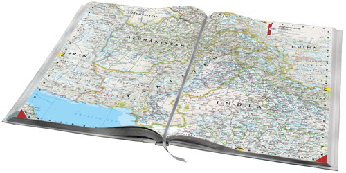
MapCarte336_natgeo1First published in 1963, the National Geographic Atlas of the World is now in its 10th Edition, published in 2014, and contains over 300 maps and nearly as many illustrations.  The maps are beautiful and engaging and the overall design has become a hallmark of National Geographic publications.

Though most new atlases are published to update changing geographies a key element in the success of an atlas series is continuity. If a design works, it becomes a house style and something instantly recognisable. Many people familiar with maps can spot a Nat Geo map in an instant…most other people will also be able to spot one even if they are unable to name it.

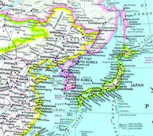
MapCarte336_natgeo2One of the most notable design features involves colourfully marking the country boundaries yet keeping the interior of the geographic areas as black text on a white background (this extract from the 1992 6th Edition).  This helps establish a clear figure-ground between mapped features and the labels and harks back to the use of hand painted tint bands on early historical maps.

The atlas is also notable for its use of the Winkel Tripel Projection, a standard since 1998, and for its custom proprietary fonts originally designed in the 1930s and named after staff cartographers of the era (Darley, Bumstead, Riddiford etc.).  The fonts and extensive labeling alone sets the atlas apart from others and gives it an unmistakable style.  Touches, such as the curved lettering from point features around a coastline, are also a signature National Geographic style.

You can see more of National Geographic’s atlas at their web site here.

MapCarte 314/365: Atlas Maior by Joan Blaeu 1662-1672

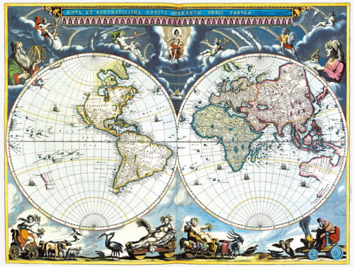
MapCarte314_blaeuatlasDutch cartography is renowned as amongst the very best, principally due to the many dutch cartographers, engravers and printers in the late 16th and early 17th century who formed the period known as the Golden Age of Dutch Cartography. Joan Blaeu was one of the very finest cartographers, son of cartographer Willem Blaeu though originally qualified as a doctor of law. Joan Blaeu became official cartographer of the Dutch East India Company. Alongside his father, he published many atlases and globes, initially using the copperplates purchased from the widow of another cartographer Jodocus Hondius II. Their first original atlas was published in two volumes in 1635 entitled Theatrum Orbis Terrarum. In itself, this was a magnificent pice of scholarly work but here, we celebrate perhaps his finest achievement, the Atlas Maior.

MapCarte314_blaeu1

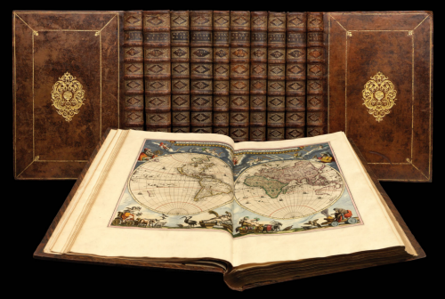
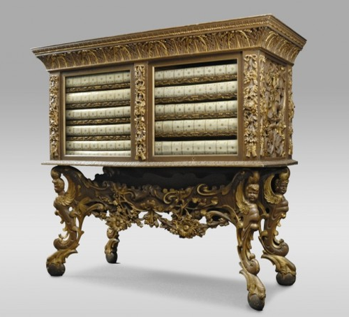
After his father’s death, Joan Blaeu carried on the business and made many atlases, often working alongside other notable cartographers of the time. His Theatrum evolved into his final work, the Atlas Maior which had a monstrous 594 maps bound in eleven volumes and in its own ornate case (in the Latin version). This was the largest and most expensive book published in the 17th Century and contained some of the most detailed and finest cartography of the period.

MapCarte314_blaeu2

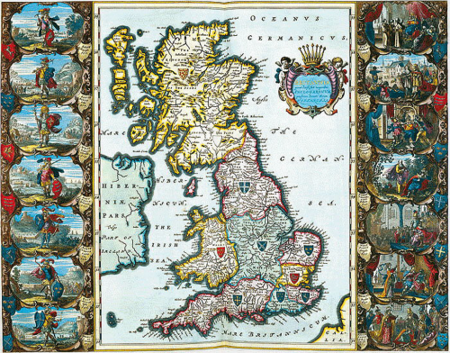
The maps are designed to showcase not only Dutch knowledge and world explanation but also cartographic expertise. They contain dense, rich information with beautiful and ornate layouts. The colours are vibrant and used to delineate different countries or regions with internal vignettes. Typographically, the maps contain a wealth of information using legible but ornate calligraphy. The many cartouche and painted marginalia add to the sense of this being a comprehensive work both scientifically and artistically.

MapCarte314_blaeu_cabinet

Blaeu had originally intended Atlas Maior to be the first of a much larger series. It contained maps of the earth, sea and heaven yet he intended to add maps of the coasts, seas and oceans in a second edition and of the skies in a third edition. He died before he was able to fulfil this ambitious opus yet even still, Atlas Maior is one of the most important works in the history of cartography. The design of such a large project was both revolutionary and brave.

MapCarte 303/365: London: The Information Capital by James Cheshire and Oliver Uberti, 2014

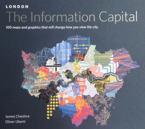
MapCarte303_cheshire1This is likely to be the only entry in MapCarte that can claim to have achieved the standards of design and innovation required to be discussed herein before it’s even been published. This new book of 100 maps of London by James Cheshire and Oliver Uberti is actually published today and having seen the pre-press material some weeks ago it was clear that one or two of the maps were special. Indeed, the more one saw of the work in the book, the more it became obvious this entry should celebrate the entire book rather than attempt to select one or two noteworthy examples. It’s an atlas of noteworthy examples and that’s a strong statement before all of the maps have been seen. Some accolade – but this is a book that contains some of the very best of modern cartography which sits at the intersection of information graphics, compelling storytelling and inspiring cartography.
MapCarte303_cheshire2This book is the collaboration of geographer and visual journalist. Geographer Cheshire has produced some fantastic previous work (featured in MapCarte 7) and here, he takes his keen eye for the interesting and obscure and translates the data into simple, clean yet imaginative maps with the help of Uberti. Self-described as a visual journalist, Uberti clearly knows how to shape a story using beautiful graphics. The combination works well and the team have produced a fantastic array of visual treats, each using different graphical approaches but without falling into the trap of making each map different just for the sake of making it different.
MapCarte303_cheshire7For any cartographer, the book contains a plethora of brave and rich design. The unique approaches taken to displaying the data bring something very different to the world of mapping. These are no ordinary thematic maps. They stretch the boundaries of convention and deliver works that engages not only our interest in the themes but our interest in how the design has been constructed and how it works. It’s a coffee table book for the average punter interested in a fascinating look at London but for anyone interested in cartography it offers something much more.
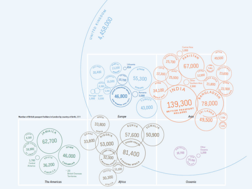
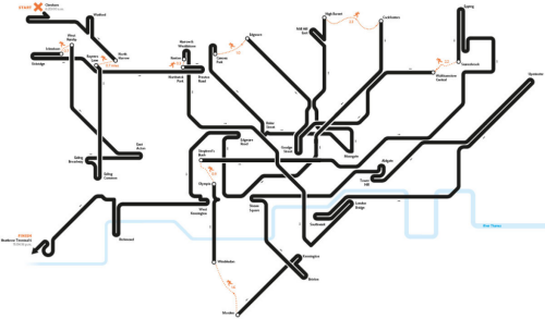
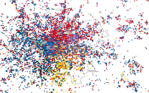
MapCarte303_cheshire8Maps showing the optimal route through the London Underground take the familiar and cast it in such a way that we immediately see the path. The map of football supporter territories is a patchwork of small raster cells. The map showing the number of passport holders in London by nationality brilliantly uses a symbolic round passport stamp as a proportional symbol that contains both label and number and also clusters using colour to represent continents. Overlaps do not matter. It’s a cartogram and the design works wonderfully.
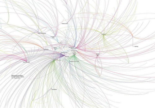
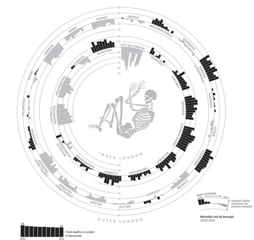
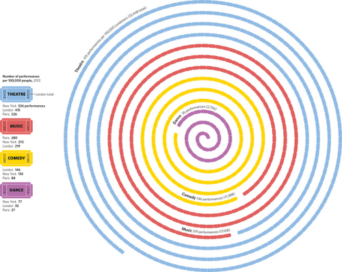
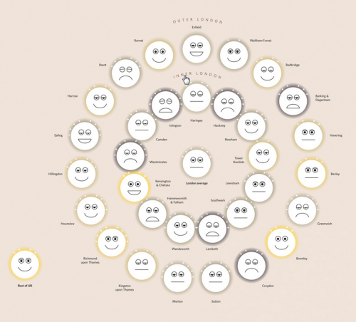
MapCarte303_cheshire6Flow maps of Oyster card tap ins to represent commuter journeys, the distribution of entertainment by type as a strip of tickets and the arrangement of bar charts organised to represent the shape of inner and outer London all play with geography but retain the essential message.MapCarte303_cheshire5 MapCarte303_cheshire4Not all the graphics and map types are entirely original in the sense that it’s impossible to create 100 new map types. The treatment is original though; highly original. And the authors have also plundered the archives to resurrect and make fine use of some arguably under-used techniques like Chernof Faces and Coxcombs.
MapCarte303_cheshire3Altogether a superb illustration of the art of cartography. A masterful appreciation of data and the ability to distil it into meaningful and interesting maps. Each map offers up something new and interesting. They go beyond the mundane and create a portfolio of design to inspire and delight any map nerd and many more besides.

The authors ask interesting questions that they then translate into maps and take their inspiration for mapping the fascinating facts of London from previous pioneers of London mapping such as Harry Beck, Charles Booth and John Snow. It works. This book stands shoulder to shoulder with some of the very best in thematic mapping to paint a portrait of the city.

You can explore the book further at the web site here or via James Cheshire’s web site here.
MapCarte 300/365: Historical Atlas of Canada by University of Toronto Press, 1987-1993

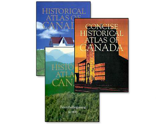
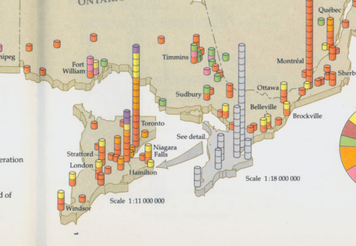
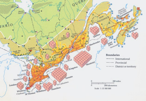
MapCarte300_canadaAny atlas project will undoubtedly set out to chronicle a place in detail, attempting to leave no stone unturned in its quest to be a definitive, authoritative statement. Not many atlases actually achieve that almost unattainable level but the Historical Atlas of Canada does. Prepared as a three-volume set of print atlases and published between 1987 and 1993 the detail and execution is breathtaking. These are hand-drawn maps, each of which is a masterpiece in its own right but as a collection gives us a picture of the historical development of Canada that few other countries can similarly point to. The themes you would expect to be covered are all there, presented in rich plates with detail and attention to detail.

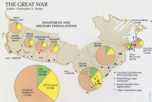
MapCarte300_canada1The complexity of creating an atlas like this which demonstrates not only a depth of scholarly activity but a craftsmanship of the highest order is mind boggling. Each map is somewhat innovative in its own way whether it be the use of insets that are used to magnify certain areas, or how smaller areas are sometimes greyed out while a larger version takes precedence, or how 2D is mixed with 3D gridded proportional symbols that aids our interpretation of magnitude. Each map brings something unique to cartography and as much as it acts as a record of Canadian history it should be used as a model of cartographic excellence too.

MapCarte300_canada2The atlas has latterly been made available as an online project and while there’s sense in this because it has the potential to reach many more people, the exquisite nature of the cartography and the way in which turning the pages allows you to interact with the maps in a human way is perhaps lost.

MapCarte300_canada3This is an elegant collection of maps deserving of the status of atlas. It’s a compendium of cartographic delights.

You can browse the online version here.


MapCarte 293/365: Atlas of infectious diseases by Oregon State University, 2014

MapCarte293_healthatlas

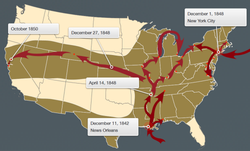
Most web maps tend to be based on a single theme. They exist behind a URL and they rarely sit in a context. We visit the map, we see it, we leave it. There are few products that have attempted to compile a digital set of maps into a coherent atlas and presented as an application. The atlas of infectious diseases does just that and is all the more remarkable because it was designed and produced as a student project at Oregon State university.

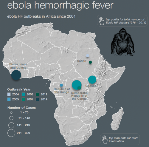
The atlas is designed for the iPad as a downloadable app (though a static version containing the maps is also available as a PDF download). The atlas showcases a range of infectious diseases using strong graphics, designed for digital display with simplified map shapes, bare basemaps and highly contrasting thematic overlays. These maps are designed to communicate quickly and efficiently.

MapCarte293_healthatlas_cholera

The maps hang together as a coherent whole even though they show distinct subject matter. their use of colour goes a long way to ensuring continuity across the pages. navigation is intuitive and there is a good use of supplementary graphical material and textural components.

MapCarte293_healthatlas_ebolaThe map types vary enough to maintain interest but never as a way of simply creating unnecessary differences. the map types support each theme well. The atlas builds a strong picture of the history of infectious disease as well as a contemporary assessment.

Design of digital atlases needs a different mindset than that of a more comprehensive print version. They need to be simpler in terms of the complexity of visuals (though not simplistic), contrast needs to be well managed across each page and there needs to be sufficient interest to encourage people to ‘turn the page’. As an exercise in creating a modern cartographic product it’s perfect for student engagement. What we have here is a benchmark for how students can design and produce a high quality product using modern design and authoring tools.

More details can be found at the atlas web site here.


MapCarte 279/365: World Atlas of Wine by Littlehampton Book Services, 1971

MapCarte279_wine1

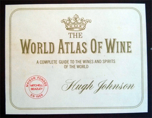
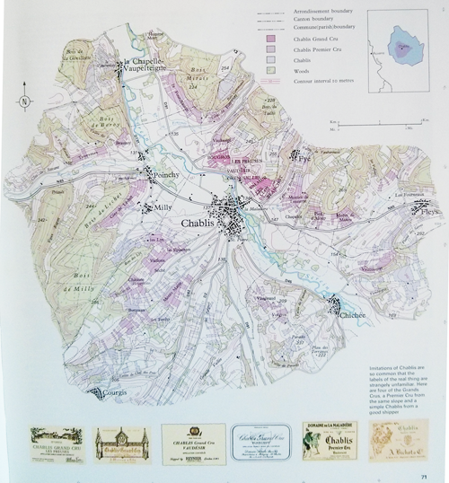
Hugh Johnson’s world alas of wine, publihed by Littlehampton Book Services is a magnificent example of thematic atlas cartography. The numerous pages explore the terroir in a way that had not previously been attempted in such detail. Each page explores the specific local geography of a region and the various wider geographies that impact the wine of that region. For instance, the page here showing Chablis, France, illustrates the topography and differentiates between Chablis, Chablis Premier Cru and Chablis Grand Cru through a pleasing colour scheme. The main map is placed in its regional context and the nice addition of different labels adds to the layout.

MapCarte279_wine2

The maps are simple yet beautiful works of art that explore the fields and vineyards of the different producers. They show clearly the topograpy as well as the local land ownership and production.

MapCarte279_wine3

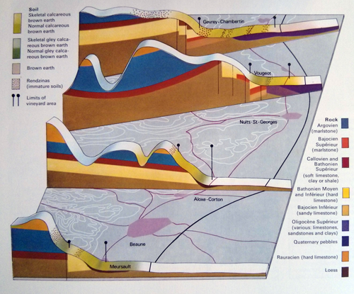
But the maps are not just topographic; a number explore the geography through 3D block diagrams and alternative representations which bring to life the geography of wine. The atlas is jam packed with maps of all parts of the world though the focus of this first edition is on he main European producers. Later editions give more prominence to the increasing contribution of new world winerys.

A perfect excuse to pour a glass of your favourite wine and then pour over a delightful atlas to explore its origins.

MapCarte 235/365: The Klencke Atlas by Johannes Klencke. Maps by Joan Blaeu, 1660

MapCarte235_klencke

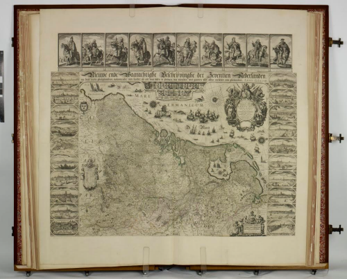
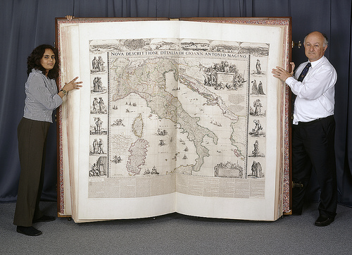
Until recently, the Klencke Atlas was renowned as being the largest atlas in the world (a title now taken by Millenium House’s Platinum Earth atlas) but size alone would not necessarily get the work into a list of great maps. The atlas was presented to Charles II in 1660 by a consortium of Amsterdam merchants led by Johannes Klencke. The 41 maps it contains are largely the work of Joan Blaeu, a master of the Dutch Golden Age of Cartography.

MapCarte235_klencke2

The atlas was conceived, likely by Johan Maurits, Duke of Nassau-Siegen, as an enormous book containing maps of the world and its heavens. It was to collectively contain the world’s knowledge. For that, a truly large atlas was born but it is the maps it contains that make the cartography so enthralling.

Blaeu’s work was meticulous, detailed and of a consistently high quality. His maps are all works of art in their own right and symbolic of the artistry of the Dutch cartographers and engravers of the time. The Klencke atlas is not merely an over-sized book and contains very little white space. Each map fills the large sheets in detail and the borders contain numerous illustrations of cityscapes and persons. Even the seas and oceans are adorned with sailing ships representing exploration and discovery.

A large, beautiful and historic atlas that represents a golden age of map-making. The atlas is large but it’s impressive cartography too.

MapCarte 232/365: Atlas de Cuba by Garardo Canet and Erwin Raisz, 1949

MapCarte232_cuba


Atlases are designed to set out a social, economic, cultural and physical history of a place. They provide a slice in time that explains a country or a region and are often out-of-date fairly rapidly due to changing circumstances. It’s an inevitable problem for many atlas producers that as soon as one edition is published, work on the next begins in earnest. Of course, that also brings rewards since we can amass a collection of atlases that together paint the changing picture and, as cartographers, show us the changes and altering style of map-making and representation.

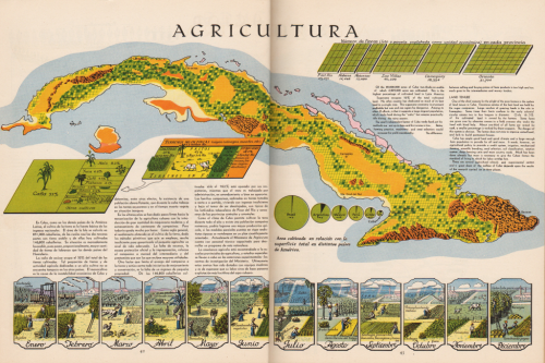
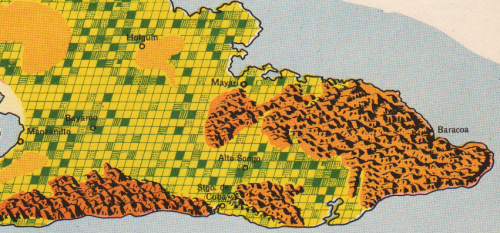
The Atlas de Cuba by Canet and Raisz was a little different. It attempted to paint a living picture of Cuba…literally given the hand drawn beauty of the work. They set out to explore problems and how these might manifest as well as what the solutions may be. Raisz’s work is evident. His maps are bold in use of colour and graphically rich as they combine beautiful landform mapping with innovative thematics. The page illustrated here, on agriculture, is typical of the maps. Relief is depicted in oblique ‘molehill’ style and the land use is laid out in a regular grid to create a patchwork of statistical information on the different crops. Simple blocks of complimentary colours give us a clear indication of the crops and the page is adorned with other graphs, legends and illustrations to bring the work to life.

MapCarte232_cuba_detail


There’s a simplicity in the work of this atlas that belies the effort it takes to make such maps. Keeping things simple is a mainstay of cartography but actually being able to achieve it and bring a subject to life is no simple task. To get it right across an entire atlas is an even more impressive achievement.

You can see many more illustrations from the atlas on John Krygier’s blog here.

MapCarte 174/365: Great World Atlas by Dorling Kindersley, 2008

MapCarte174_dkatlas

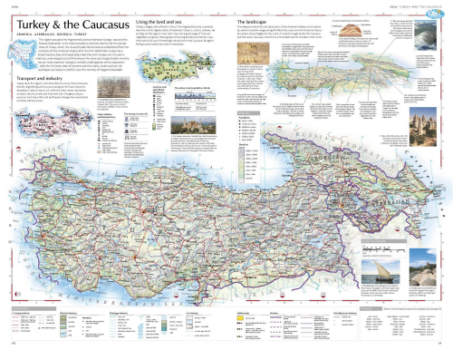
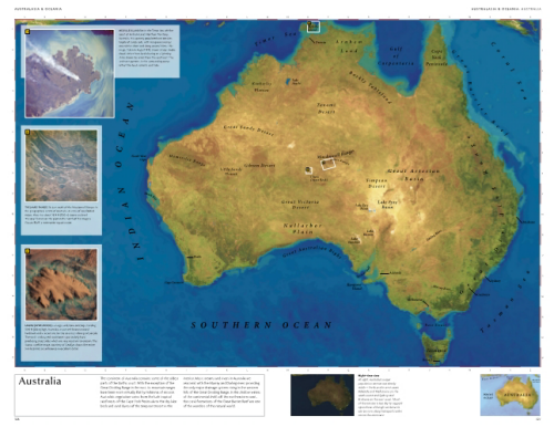
Dorling Kindersley first published their Millennium World Atlas in 1999, inspired by the success of their Eyewitness Travel Guide series.  The latest version (published in 2008) contains 528 pages with rich, vibrant cartography, a wide range of cloud-free satellite images, high quality terrain models and fold-out pages.

Dorling Kindersley were one of the first to use satellite imagery linked to maps and as hybrid map/satellite image illustrations.  Each page is beautifully presented with many using a unique approach of clipping map areas from their surroundings as opposed to allowing map detail to bleed off the edge of the page.  This particular treatment allows the page to be filled with images, facts, illustrations and text which gives supporting information rarely found elsewhere in atlas mapping.  

MapCarte174_dkatlas2

Each map features its own legend rather than relying on one in the preliminary pages.  Given the amount of content and irregular shapes the balance, structure and harmony of each page is remarkable and the detail gives readers an opportunity to explore geography as a traveler rather than using the atlas merely as a reference tool.

DK have become expert at creating pictorial atlases that make each layout a rich source of visual and textual information. The maps are excellent but it’s the coherence they generate by bringing together a range of relevant content that makes their atlases so beautiful.


MapCarte 168/365: Deutschlandkarte by Matthias Stolz, 2009 & 2012

MapCarte168_stolzThe production of maps in weekly publications and academic journals has been a mainstay in a number of publications but none has perhaps been as beautifully designed than those in the weekly magazine of German newspaper Die Zeit.

MapCarte168_diezeit1

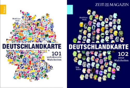
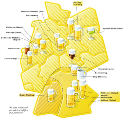
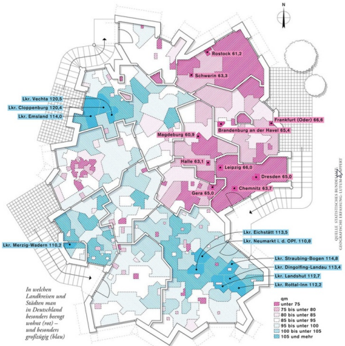
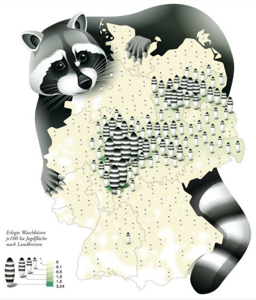
The series of thematic maps has featured in a continuous single-spread feature in the weekly mazazine and now numbers well over 200 separate maps. It would be invidious to select one that rises above the others so here, we reflect on the maps by including the two book compilations by Matthias Stolz that provides a compendium of 101 of the maps, a couple of examples and a link to the Pinterest board.

MapCarte168_diezeit2

Various cartographers, artists, map-makers and designers have produced the maps over many years and they cover all manner of everyday topics exploring the distribution of facilities throughout Germany to popular hairdresser’s names and divorce rates. Each map is unique and often highly stylized or artistically driven. They offer not only a wonderful look at the serious and not-so-serious aspects of daily life in Germany but any aspiring thematic cartographer should explore these maps and cannot fail to be inspired.

MapCarte168_diezeit3

There’s rarely a map that one wouldn’t find catches their attention. That’s the point…they are designed to reel you in and take an interest in whatever it is that is being mapped. They make use of strong visuals and adorn the map with copious illustrations. They take graphic licence to another level in playing with cartographic symbology. Often, rules are broken but to good effect.

There’s plenty more of the maps to see on the Die Zeit Pinterest board here.