MapCarte 222/365: Baseball’s Many Physical Dimensions by Lou Spirito, 2013

MapCarte222_baseball

Small multiples are a great way to illustrate comparisons because their side-by-side layout allows us to move across the different images while retaining an impression of the last shape or pattern in visual memory. They are particularly useful for time-series. They can be used simply to compare like-for-like when exploring how the same phenomena might vary from place to place.

Lou Spirito has taken the US Major League baseball fields and done just that, by laying them out in a grid on the right of his map that shows the different dimensions and characteristics. This allows him to show detail for each field in its own context as well as provide a comparison. He goes further though by using an overlay technique to emphasise differences which are not necessarily visible from the side-by-side view.

MapCarte222_baseball2


The effect of overlaying the fields gives us an insight into how they vary; and how markedly they vary in their overall shape, dimensions and using the graph at the foot, the minimum and maximum heights of the outfield wall. He has given us multiple views of the same information, each of which teases out a particular part of the information.

On their own, neither the small multiples or overlay provides us with the visual to support easy interpretation. Together they give us a wealth of information.

MapCarte 221/365: Submarine Cable Map by TeleGeography, 2013

MapCarte221_submarine


TeleGeography have become renowned not only for the detail and accuracy of their annual map of the world’s submarine cables but also for the design and style they exhibit. Let’s be honest…the data isn’t necessarily the most scintilating for a general audience but they’ve taken the approach of switching the design annually to reinvigorate the map and the interest.

The 2013 version was particularly impressive. Taking cues from the maps of yesteryear and designing it as an historical document is an interesting counterpoint for a modern dataset. The execution is impeccible with cartouches, muted colours, vignettes and parchment style fills. Even the typography follows suit and the title is akin to old-fashioned ornate copper-plate engraving. It’s this attention to detail that makes the map so well composed rather than just an historical style applied clumsily.

While the 2013 map is a terrific juxtoposition of design and theme, you can see many more examples of the changing face of TeleGeography’s map on their web site here and an interactive version here.

MapCarte 217/365: Apollo 11 traverse on a football pitch by Joe O’Dea and Thomas Schwagmeier, 2005

MapCarte217_apollo


Comparisons are extremely important for visual communication. Without comparisons we have no baseline about which we can make some sort of decision. When maps are involved, we often see areas that exhibit more, or less…or have values that are higher or lower. We sometimes use multiple maps to display how patterns have changed over time. There’s many techniques but the fundamental principle involves giving your map reader a basis for comparison to support their ability to assess what they are looking at relative to something else. Making the ‘something else’ familiar or understandable is crucial.

So if you were mapping the geography of the first moon landings by Neil Armstrong and Buzz Aldrin how do you give your reader a comparison given no-one, by definition, would ever (or are very unlikely ever) to have seen the place. The answer is to give them something that is familiar. The map presented here plots the various activities of the moon landing faithfully. It uses simple geometries that in themselves are understandable. Presenting the work atop a football pitch with its universally familiar markings is a clever approach. immediately, we have a sense of scale and extent. The football pitch is arguably the most internationally of sports and translates well with no other language or description necessary. The fact they gave it a strong colour and made it integral to the work also benefits the map. They could have used a faded outline but for comparison we need a strong visual.

An excellent use of a comparative symbol and extent to support the main map reading task.

MapCarte 137/365: European subterranean veins by Accurat, 2012

MapCarte137_veins
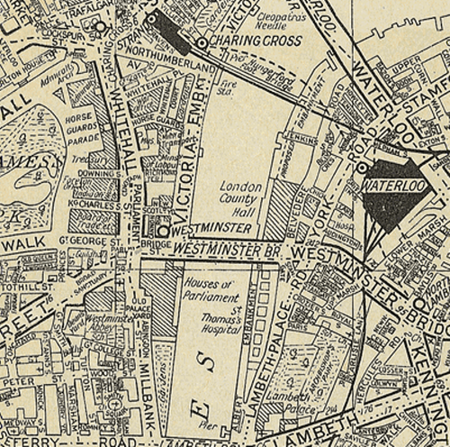
If a map’s main intent is to communicate information through graphical form then they are, by definition an information graphic. Modern parlance has seen the rise (and over-use) of the term infographic which has become synonymous with dramatic, often abstract representations of data. They are often composed of a collection of linked graphs, punctuated by key words, phrases or numerical highlights…the better ones offer some sort of coherent whole that places an emphasis on a well structured layout. This is also the description of a map. Maps have always been infographics, long before someone invented the term…though in the same way that not all infographics are meaningful or well designed, so the same goes for maps. Maps that are abstract (or highly diagrammatic) might very well be seen as belonging to the new fashion for journalistic infographics more than more traditional styles.

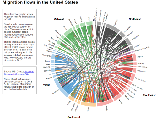
This example by Accurat is a terrific example of taking a single theme and developing a strong, abstract depiction of space through the organisation of a range of graphical elements. The shapes of land/water and any typical geographies are eschewed in favour of a mechanism that simply showcases the information. The structure of these components makes the geography implicit rather than the geography itself being used to organise the content.

MapCarte137_veins_detail

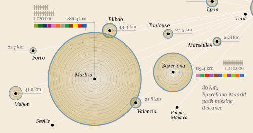
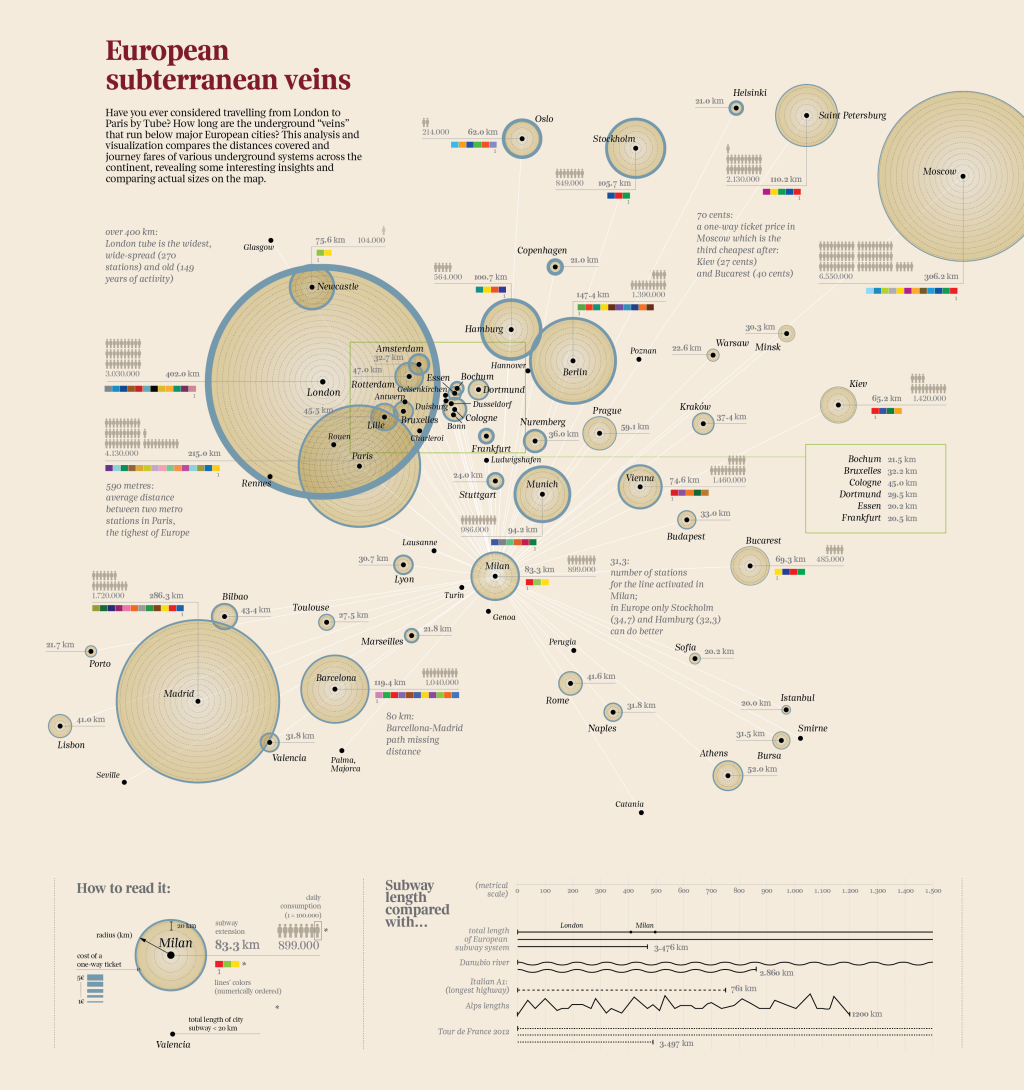
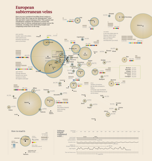
The map provides the reader with a fascinating exploration of the underground transport  veins that traverse major European cities. The title is attractive and catchy. The layout is clear and well balanced. The colours are simple and do not compete with each other. The main elements – the proportionally scaled circles give an immediate sense of comparison and scale. There’s a wealth of information on the number of lines, the number of users, the cost, the length of extensions and the geographical reach of the system. The use of size is used to great effect in different ways to connotate magnitude. Colours show us difference. Small multiples illustrate number of users. Labels and textual components are used as a literal symbol to give us headline facts and figures. All classic visual variables, well executed. There’s an extremely subtle visual hierarchy also at work that organises textual components and shades of colour which together give us a sense of figure and ground as well as contrast.

The map itself is clean and well composed but the legend is also extremely well organised giving clear information with even the title ‘legend’ (one of the most pointless labels on any map) being replaced by the far more useful ‘how to read it:’. The graph shows us some comparisions with other distances – rivers, mountains, roads and the Tour de France route. Great comparisons that provide some additional perspective.

This is a very well constructed information graphic. It deals with data that is organised spatially and the spatial dimension affords us comparisons. It’s a map…in the same genre as those by Beck, Minard, Snow etc.

MapCarte 53/365: Atlas and Guide to London by A to Z (the Geographer’s Map Company), 1938

MapCarte53_AZ

Phyllis Pearsall, a painter and writer, founded The Geographer’s Map Company in 1936 after discovering that the Ordnance Survey map she was following to get to a party wasn’t up to the task and she became lost.  Her endeavors are possibly the first attempt to generate a citizen sourced map and might be seen as a forerunner to the OpenStreetmap movement and products.

She conceived the idea of mapping London which involved walking over 3,000 miles and over 23,000 streets mapping each as she went.  Pearsall proofread, designed and drew the map with the help of a single draftsman.  Although a map containing hundreds of combinations of type form: bold, italics, spacing of characters, color, san serif, reversed type, size, rotation, upper and lower case, the design and placement of the typography is meticulous.

MapCarte53_AZ2

In the modern version, the use of orange primary routes, yellow secondary and white local was unique and possibly the inspiration for Google Maps at street level.  The pocket book size of the original was a perfect form for navigation and despite the atlas being crammed with detail it is extremely well structured in graphical terms.

MapCarte 41/365: Migration flows in the United States by Chris Walker, 2013

MapCarte41_walker

Click image to view online web map/diagram

As Harry Beck’s underground map proves so well, a map need not follow conventional geography. Charles Minard’s map of Napoleon’s March on Moscow is in a similar vein being heavily diagrammatic. The data may be geographical yet presenting it in a meaningful way may require the rejection of geography.

Here, Chris Walker takes a similar approach and uses a chord chart to show the inter-state migration of people in the US in 2012. Good use of size to connotate magnitude and colour to enable differentiation between the States at a regional level. Simple mouseover interaction means viewers don’t get RSI through having to click everywhere and the chart modifies to reveal single State flows. Trying to put this information onto a map wouldn’t work as it’d be too overcrowded yet because of the positioning of the regions the circle at least provides a clever link to the real geography.

A great example of using a simple approach to a complex data yet still retaining the detail that makes the topic worth exploring. The simplicity of the graph allows the detail and the complexity of the data to be seen clearly. This works. Simply.