MapCarte 369/365: Illustrated London by Mike Hall, 2011-present

MapCarte369_hallHigh quality linework and meticulous colouring give rise to clean cartography. In this age of web maps it’s good to see that illustrators still find value in crafting maps by hand to create one-off sheets. Mike Hall has been creating a series of maps of London’s Boroughs since 2011. This example of tower hamlets is an example of the skill with which he fashions beautiful, well balanced maps that combine detailed cartography with marginalia that harks back to historic maps.

The inclusion of crests, shields, illustrations and views of key places along with decorative borders and typography show mastery in layout that displays a keen sense of the importance of form as well as function. The map is intended to delight; to be seen and used as much as an artistic piece as a way of exploring the geography. Maps always did ‘fill in the gaps’ to create a whole that was greater than the sum of the parts and Hall brings the philosophy up to date with his creative cartography.

Each of the maps in the series riffs off particular themes or historical events from the Borough so each has a unique identity. As a set, they bring to life the rich variety of London’s landscapes as a tapestry of maps that reflect their very different characters.

Hall’s work goes beyond this series of maps. His isometric drawings and other map-based illustrations are equally impressive. Modern map-makers can certainly learn a few things about the art and craft of cartography by studying his work.

See this series of maps and Hall’s other work at his web site here.

MapCarte 276/365: Medallandssandur by Torgeir Husevaag, 2010

MapCarte276_medallandssandur

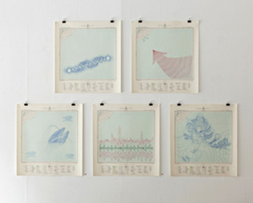
Art and cartography can evolve in all manner of strange circumstances. Many cartographers will try and imbue their work with an artistic element. Many artists use cartographic works to create a piece of art. This example belongs to the latter category though in some respects it bridges the two.

MapCarte276_medallandssandur3

Torgeir Husevaag stumbled upon a series of old topographic maps during a stay in Iceland and bought them with an idea to make something of them. The map sheets were interesting because very little of the printed area had any land. They were predominantly sea and typical of a printed sheet system that inevitably leaves some sheets bereft of much detail.

MapCarte276_medallandssandur2

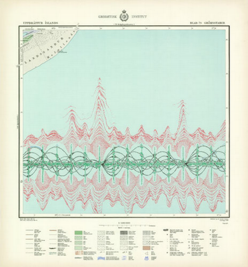
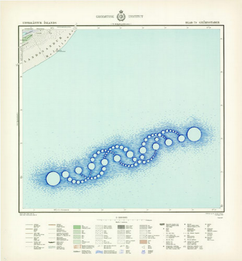
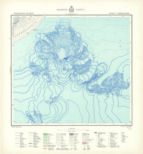
Husevaag’s artistic approach looked at the vast expanse of nothingness and attempted to fill in the gaps with invented phenomena. This, indeed, was an attempt to mirror the perpetual cartographic habit of filling gaps in maps with something, anything. He added a number of different features by drawing on the maps to show a representation of whale song using a sonar pulse, the juxtaposition of crop circles represented in blue in the sea, a pair of mating whales, and an impression of Iceland’s largest mountain depicted as contours in the ocean.

MapCarte276_medallandssandur1

This MapCarte is purely art but draws inspiration from past cartographies to generate new images and uses for the empty spaces on maps.

MapCarte 272/365: London Galaxy by Charley Glynn, 2013

MapCarte272_galaxy

Sometimes the simplest of approaches can yield some of the most compelling work. The combination of digital data and a plethora of different software tools with which to manipulate it makes the job relatively easy. To create something that makes people sit up and take notice still requires an idea; throwing data into your favourite software tool doesn’t result in a beautiful product by default.

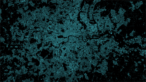
Here, Charley Glynn has used a dataset of lower order roads in the London area and simply rendered them with a light line weight and a neon turquoise colour on a black background. The effect gives us not only an impression of the density of the road network but also of an electrical storm with shafts of bright light emerging fractured from the centre of the image. The density creates a natural central bright spot but it’s also easy to pick out the River Thames, major parks and also the major routes in and out of the city which have been left black.

Simple idea. Well executed and resulting in an evocative, crisp image of London that we rarely see in more mainstream products. It’s data art in map form.

MapCarte 219/365: Kara’s Wave by Matthew Cusick, 2009

MapCarte219_cusick


No list of aesthetically pleasing maps would be complete if every once in a while we didn’t delve into the purely artistic form. Maps are, after all, beautiful objects in their own right and ignoring their possible function as tools for communication they perform a function as a piece of visual art. This is the reason why many people hang maps on their walls, even paper their walls with maps or collect map-related objects.

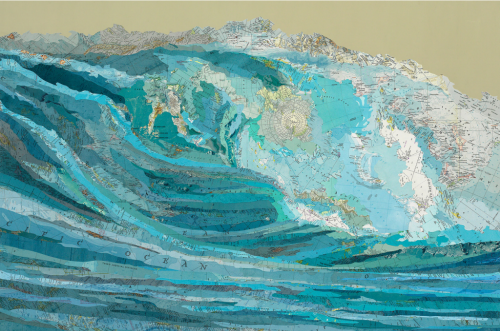
Matthew Cusick approaches maps as part of a palette of colour, shade, texture and meaning which he weaves onto the canvas along with acrylic paint. Rather than simply using just paint, he uses pieces of maps from which he creates a collage to bring to life an artistic work. Kara’s wave makes considerable use of topographic maps and bathymetric charts. He has built a picture of the wave using maps and at a distance it appears no different to any other painting. Placement of the maps is not accidental or random. The shapes of the pieces gives shape to the overall piece and we can see the swirling mass of water take shape. Textual components follow the same lines and ingeniously, a polar azimuthal projection of Antarctica is used as the fulcrum of the crashing wave…the circular shape adding to the motion and the white landmass suggesting the foamy wash.

Maps as art give them a new life perhaps when their original purpose has waned. They certainly give artists a rich medium with which to work. Cusick has many other examples such as an image of a car…made predominantly of street maps which blends the map type perfectly with the picture’s theme once again. Many more of his works can be seen on his web site here.

MapCarte 170/365: Tour de France 2010 by I Love Dust, 2010

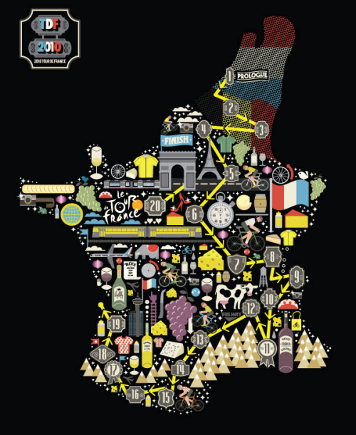
MapCarte170_tdf2010Map shapes used as containers for a collage of graphics isn’t necessarily original but they work very well, particularly for magazines, posters and promotional material. They actually require very little cartography. Country outlines are iconic and change very little. Couple them with a map theme that also has clear connections to the country and you have an attractive graphic which will catch the eye.

I love Dust produced this enticing map for Bicycling magazine to illustrate Le Tour de France. The map outline is filled with simple graphics representing the race or the regions. The map is simply a motif and the result is an abstract tour of various symbols. Embeded in the map on the same graphic level is the outline route itself, beginning in The Netherlands and finishing in Paris.

It’s a simple graphic celebration of the race in map form. A very effective way of using cartography as art.

MapCarte 73/365: Some People are on the Pitch by David Marsh, 2010

MapCarte73_marsh

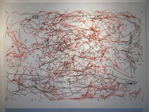
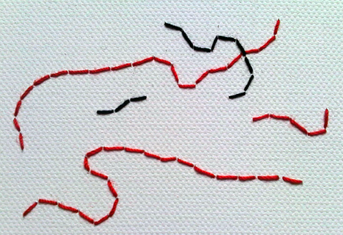
Cartography is often about expression. It’s about taking simple geometries and working with them to tease out salient characteristics through a range of processes of simplification, classification and symbolisation. What we end up with is an expression, through cartography, of something interesting or informative that perhaps the data as a jumbled mess couldn’t convey itself. What happens, then, when we do nothing and simply present the data. David Marsh has done just this with his map of player movement from the 1966 World Cup final between England and Germany at Wembley. It’s a map but it also exhibits an abstract aesthetic.

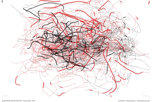
Marsh has plotted the movement of players during the entire game and the overlapping tracks create a fascinating image of the game. There isn’t any real need to bin the data into simpler visual units, or create heat maps or do any sort of cluster or hot spot analysis. Marsh proves that the raw data in itself can be revealing as well as giving us a look at the match unfiltered. It’s a data portrait of the match.

The original map itself is stitched onto canvas using the same material as worn by the players.

MapCarte73_marsh_detail

Prints of the vectorised data also work and Marsh has applied the technique to other matches and also to different components of the match (such as the battle between Bobby Charlton and Franz Beckenbauer shown below) where he modifying the line type, weight and colour to categorise some of the fundamental aspects of play such as whether a player is on the ball (thick line) or not (thin line).

MapCarte73_marsh_print

A thematic flow map, artistically rendered.