MapCarte 367/365: ATP Tennis World Tour Venue Map by Damien Saunder, 2015

MapCarte367_saunderClick on the map to view the web map

We’re currently awash with web maps of this and that which is inevitable as the availability of data and the tools necessary to make maps increases. Quality web maps are still a rare commodity because many still lack the thought required that turns data into something useful and useable. This map is a refreshing highlight. It does one job and does it remarkably well.

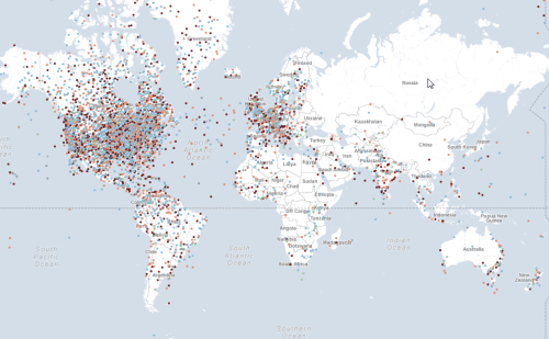
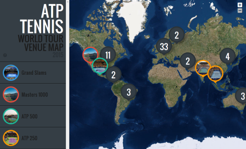
Take a dataset of the locations of all the men’s tennis tournaments for the year and present them across a map. Simple yes…the map could just have a dot for every tournament but at small scales it would look ugly and the dots would be lost amongst the background at large scales. Here, Saunder has taken advantage of the tool of production to have locations aggregate at small scales and ‘explode’ to reveal individual tournaments as you zoom in or you click on the numbered symbols. The fact a few always appear gives the user a clear hint of what to expect when you tackle the numbers.

The side panel is unencumbered and presents the taxonomy of tournaments with simple colour motifs that link to the map. Expanding the side panel allows you to access the tournaments by name or location and is sensibly presented in date order. The information panel opens when you click a tournament to reveal consistent information and the pictures go beyond just showing us the main court of play. Across the map, they reveal a pattern of surface types with hard courts, clay and grass tending to occupy discrete regions. These also tend to reflect the seasons in which a tournament takes place. While the panels contain a lot of content, brevity has been achieved using icons to avoid the need for superfluous text and which presents prize money, the current champion etc in a different visual style. This adds interest and breaks up what might otherwise have been a dense panel of text. The large symbols are a bold statement but they work to fill space and to make the theme and function of the map explicitly figural.  They also work well across an imagery basemap and of course, using imagery means we get to zoom into and see the actual venues.

Fundamentally, a simple but detailed dataset that is handled well in a web map. Clean and clear design thinking underpins the map and elevates it beyond many of its contemporaries that simply dump data and expect the map to work.

MapCarte 354/365: Urban Forest by OOM Creative, 2013

MapCarte354_trees

Click image to view the web map.

Melbourne’s Urban Forest Visual by OOM Creative is simply conceived and well built. There’s nothing pretentious or bloated about the map and it’s clean and elegant approach to mapping every tree in the city of Melbourne is a template for the use of modern web maps. The web site houses the embeded map so there’s no going to a separate site. The User interface is uncluttered and intuitive. The overall design builds on a limited but effective colour palette that repeats across the map and the site itself. The use of a dark basemap and bright colours creates a pleasing contrast between background and detail.

The map shows the location of every tree recorded by a census and categorises them by genus using different shapes. Almost immediately, this simple act of making the effort to categorise point data and show them differently takes this web map further than many similar maps that might just show the presence of a phenomena or not. Binary web maps are common (things exist and are shown, or they don’t). OOM Creative have thought cartographically about the work. Further, the symbols are coloured to indicate the remaining lifespan of the tree. Immediately, you can see where streets are populated with the same genus of tree creating a particular uniform scene, or perhaps where their is a rich variety. It’s easy to spot the botanical gardens! It’s also easy to see the spatial pattern of the health of trees and where resources perhaps need to be targeted for remediation or replanting in the coming years.

You can modify the map view to focus on the detail at a precinct level and also select a subset of the data to show trees by age or by use. The map forms part of a larger story about the Melbourne canopy and conservation efforts. It’s an educational web site of which the map forms a core component. Perhaps the most endearing aspect of the map is, in addition to clicking on each tree to reveal information, you can ’email a tree’. Designed as a way for people to report tree health, damage or other information, it has also been used as a simple way of communication to express to a tree how important it has been, or any range of other eccentric human reactions. In this sense the map provides a fascinating way for people to interact with their environment in an emotional way.

You can see the web map as part of the Urban Forest Visual web site here.

MapCarte 351/365: Paperscape by Damien George and Rob Knegjens, 2013

MapCarte351_paperscapeClick the image to view web map

Big data is one of those ill-defined buzzwords that is rarely used appropriately. It’s a fairly all-encompassing term that relates to a dataset that is so large, unwieldy and incomprehensible that it creates difficulties in terms of processing. For cartography, big data might be regarded as a dataset that creates difficulties for analysis in the sense of distilling it to something meaningful to map; or it might relate to the the visualization techniques we have to build to handle something that is problematic to display using traditional means. It’s debatable whether a million items is big enough to be called big data but it certainly creates big cartographic design problems. Paperscape attempts to resolve the problem by creating a map of nearly a million scientific papers.

MapCarte351_paperscape_detail2The map is a constellation of symbols; small circles coloured by the type of category of scientific work the paper explores. Colours tend to occupy similar spaces and sit comfortably within the overall constellation. The broad category is labelled but the beauty of the map is when you zoom in there’s a progressive reveal of detail. Circles become larger and we see more labels and more symbols appear. Larger symbols indicate increased citation rates as a measure of the paper’s importance. You can switch the colours to represent age with newer papers appearing more saturated along a single hue colour scheme.

MapCarte351_paperscape_detail1This is no dumb map though. Clicking the symbols gives you full bibliographic details and additional controls to create links to all other papers that are either referenced by or cited in the paper. It’s a novel way of representing a bibliographic database and does a great job of bringing a cartographic design solution to the representation of a million individual records and their complex interconnectivity.

It’s multiscale, easy to understand and interactive. It’s also well designed.

You can view Paperscape here.

MapCarte 275/365: The population and the state capitals by Carlos Lemos, 2010

MapCarte275_brazil

Click image above to go to web map

The word infographic has become a part of the lexicon used to describe information delivered using graphics. Maps have always been information graphics and although this example is described as an infographic it’s actually a map; an abstract, interactive web map, but a map nevertheless. It deals with spatial information and organises it in a manner that assists the communication of the message the author wishes to impart.

Lemos shows the distribution of the population of municipalities in relation to the capital of each Brazilian state. It illustrates the urban hierarchy too in a clean, efficient graphical manner. It’s a cartogram that dispenses with the real geography in favour of a version that ignores everything except the crucial aspects…population sizes illustrated as proportional symbols, organised in a linear fashion, by state.

The map’s use is supported by a simple yet elegant functionality including data display returned via a hover rather than a click. You can zoom to disentangle the symbols giving clarity to each spoke of the map. Transparency is well used and gives a sense of density.

Simple. Effective. Enthralling and informative. Maps do not need to be graphically complex to impart their information but they do need to be engaging.

MapCarte 270/365: A hand drawn map of Toulouse by Karl Azémar, 2014

MapCarte270_toulouse

Click the image to view web map

There’s a growing trend in contemporary cartography that is supporting the ability for easy and rapid re-styling of OpenStreetMap data. It’s a mapping equivalent of paint by numbers and we’ve featured one or two on MapCarte (e.g. Stamen’s Watercolor in MapCarte108 or Space Station Earth by Eleanor Lutz MapCarte 236). How long the current interest can sustain cartography is questionable because ultimately it’s someone else’s base data and the only outcome is a map of basic topographic detail, styled in a particular way. What purpose infinitely re-styled maps has is still open to question though they are giving people the ability to stretch their digital creative juices.

This example by Karl Azémar goes a step further than most as he creates a framework for the map by making it appear in a window with a border that suggests an draughtsman’s drawing table. The sliding ruler is a nice touch as it also holds the controls for zooming. The legend and credits panel is moveable and the map is well drawn…literally. The hand drawn pencil and coloured pencil effect is well developed using different line treatments and shaded fills akin to the sort of map one used to create in a geography workbook.

What lifts this map above similar pencil styled maps is the way Azémar has considered not only the layout of the entire map window but also the content that includes a treatment for the names using Post-It notes. It’s a good way to handle labels on this sort of map and he even uses different colours to denote different categories of city. There’s a lot of good cartographic hierarchy in this map.

You can read more about how the map was made here.

MapCarte 264/365: Plan oblique relief Europe by Jonas Buddeberg, Bernhard Jenny & Johannes Liem, 2014

MapCarte264_planoblique


Click the image to view the web map

Representation of terrain is as old as cartography itself and there remain numerous ways of creating interesting effects. Plan oblique can be traced back to the work of Xaver Imfeld in 1887 (featured in MapCarte 182). It’s an interesting technique because it uses a planimetric base (thus preserving scale in all directions across the entire map) yet represents terrain in apparent 3D. The trick is that the terrain is effectively stretched in the north/south axis such that the base of the terrain remains static and the peaks move…stretching everything in between. The technique overcomes some of the limitations we inevitably get with panoramic maps where foreshortening and occlusions are potentially problematic.

There are plenty of ways one can create a plan oblique effect using Digital Elevation Models (unless you have a preference for the hand-drawn approach like Imfeld) but the beauty of the map application developed by Buddeberg et al. is it gives the user all the tools to modify the variables that control the appearance on the fly. Azimith and inclination are basic variables to allow the creation of hillshades and 3D relief. Additionally, users can modify hyposmetric tints, the rotation and, crucially, the inclination of the viewing angle that modifies the plan oblique effect. The user controls are intuitive; the effect impressive; and the way in which the application reveals the nuance and beauty of a plan oblique representation unparalleled.

MapCarte 254/365: Where Were You on Sept. 11, 2001? By New York Times, 2011

MapCarte254_911

 Click above to view interactive map

It’s often the case that a map with lots of push-pins is considered pretty poor cartography. Most would recommend that the data ascribed to each point be summed, aggregated or reported differently. Sometimes, though, the point of the push-pins goes beyond cartographic purism. This map paints an emotional picture of the response to the terrorist attacks of September 11th 2001 and was published on the 10th anniversary as a way of reflecting on the events of the day. Contributors were encouraged to leave a message and to tag their pin with an emotion such as ‘angry’, ‘fearful’, ‘unmoved’, ‘secure’ or ‘hopeful’. Any attempt to look at the responses analytically and come up with a different cartographic representation would detract from the raw emotion.

The very point of this map is to lay bare the data. It’s points on a map that reflect individual reactions to the horror of the attacks. Each person’s contribution is no more or less than any other and so providing a place for the comments to live is the purpose and it needs no more cartographic finessing. This, then, might almost be considered a spatial book of condolence.

There have been hundreds of maps that paint a picture of the attacks showing the detail of the site, the plan of the attack, the social network of the terrorists and the reconstruction but none that simply uses a map to give people a place to share their words. Maps can be divisive and the harsh lines we place on them to demarcate territory often cause conflict. This shows us that they can also be a place for humanity and that brings people together irrespective of boundaries.

MapCarte 236/365: Space Station Earth by Eleanor Lutz, 2014

MapCarte236_lutz

Web maps used to offer little more than the ability to drop a few (thousand) digital push pins onto a pre-defined base map. They rarely suited the purpose yet deman for better maps and the ability to do more with a web map has led to quite a revolution. In only a few short years we’ve gone from having to use canned base maps and symbols and even map types to a wide range of possibilities. It’s now possible to configure pretty much any aspect of your map, be it designing a novel backdrop through restyling options, using bespoke symbology, to leveraging technology to create something entirely new. This rich canvas is being exploited by those who are able to push the boundaries; both cartographers and others who simply want to play with maps, map data or present their ideas spatially in an innocative, fresh way.

Here, Eleanor Lutz provides a great example of the way in which you can re-style OpenStreetMap data, through MapBox, to create a unique map. Space Station Earth harks back to classic viseo games as you hover and fly over a space-themed landscape. The geographies are familiar but the symbology is entirely re-designed. Some names have been changed to give the impression they’re space colonies (e.g. Paris Colony), custom textures are applied throughout and linework for roads and building outlines give us a meatllic, chrome-inspired world. Oversize markers simulate lights with a hazy glow in the depths of dark space.

Water becomes space itself so that land masses seem like artificial space-stations floating in a galaxy. The metaphor of space becoming the water than isolates different land masses works well. The depth and texture Lutz builds into her map within a map scale and between map scales is superb and demonstrates the essence of contrast and hierarchy in map design.

While for demonstration purposes, the map inspires and shows how far we’ve come in a short space of time in terms of designing maps on the web.

You can see the full Space Station Earth map here.

MapCarte 231/365: Walt Disney World Resort, 2014

MapCarte231_disneyClick image to view web map

MapCarte 114 focused on the original Disneyland map by Sam McKim from 1958. It was a beautifully drawn map that brought the magic of the Magic Kingdom to life as well as creating a brochure for people to use as a way of getting around the park. Here, we celebrate a web map of Walt Disney World Resort. In many ways it’s the modern counterpart to McKim’s originals but built for a new type of consumer.

The web map is interactive in a way that the paper version cannot possibly be but it retains the sense of style of the originals. It uses the Google Maps framework but with their own content fused into the service so that the resort appears as part of the map itself. As you zoom in, detail is rendered so the map builds in detail. This isn’t just in the addition of more content, but also the detail in the textured landscape of the basemap. There’s even clouds that appear to float over the resort.

At the largest zoom level the buildings and layout of the resort is illustrated using beautifully rendered digital artwork with clean lines but with textures, shadows and depth. Many features are depicted planimetrically but those that are given more importance are drawn obliquely using an axonometric approach so some of their front and side elevations are shown. It’s a useful technique not only to give more detail to the buildings but to distinguish what’s important from the background.

Typical pictorial symbols are used across the map for certain points of interest (gift shops, restaurants etc) and labels sit cleanly. Pleasingly the typeface isn’t too large which can so often detract.

Well composed, clean and clear web mapping.


MapCarte 227/365: U.S. Daily Temperature Anomalies 1964-2013 by Enigma labs, 2013

MapCarte227_anomalies

Click image to view web map

We’re almost drowning in data these days. The impact of the various Open movements is seeing the unlocking and emancipation of so much data from both private and public bodies. This causes difficulties in a sense because there always seems to be a race to do the coolest visualization in the shortest amount of time with any new dataset…and that usually leads to some pretty poor cartography. Quality so often takes second place to speed and the desire to be seen to be the first to have published something. Occasionally though, we see a gem and this web map of U.S. daily temperature anomolies is one such example.

There’s a huge amount of data to be sifted and for an approach to displaying the salient characteristics to be determined. A minimalist map base works well – anything to simplify the experience and give the reader a fighting chance at understanding the patterns is going to help. Colour is also at a minimum with just reds and colds used to signify major temperature trends. A counter keeps us up-to-date with the date and provides a useful visual anchor. The patterns of flashing dots dance across the map and because they tend to appear in waves we don’t get the usual disorienting impact of flashing maps.

The data has been simply categorised to make it clear and instantly recognisable and the chart provides a useful way to position the map in time in relation to the longitudinal data. The user interface is well crafted and everywhere you expect functionality, you get it. The map has basic pan and zoom; the graph slider can be moved. The animation can be paused and you can change the animation speed. The best bit, though, is the map is just the beginning. The data can be explored and scrolling down the page reveals well written, digestible detail, again presented with clear graphics in a strong layout.

Web maps that use defaults tend to suffer. When you go beyond the defaults and really think about each element of your work you develop something that is clearly in a league of its own (carto)graphically.