MapCarte 250/365: American Golf by Sports Illustrated, 1990

MapCarte250_golf


There’s something uniquely compelling about the shapes that maps make. The outlines of countries, in particular, are one-off. They are instantly recognisable and allow artists and illustrators, as well as cartographers, a rich seam to exploit. There’s arguably no better way of representing something than combining a theme with a map shape.

Take this fantastic example from Sports Illustrated in 1990. The illustration is a wonderful use of the shape of the United States used as a golf green. The surrounding water hazards are depicted in a rich blue, the greens are lush and the ‘rough’ in Canada and Mexico frames the green perfectly. Even the Great Lakes are turned into a series of bunkers.

The illustration was commissioned to accompany an article about the massive growth in interest in golf at the time. The use of the map emphasises the point, making us see the spread of golf as nationwide. Whether the intent was to provide a strong message or not, the illustration shows us the extent to which map shapes can be used artistically.

MapCarte 247/365: The Hobbit and Lord of the Rings by J. R. R. Tolkien, 1937 and 1954

MapCarte247_tolkien_hobbit

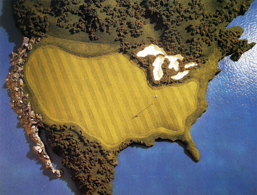
Fantasy maps are increasing in number and scope as more video games take place in imagined worlds and computer power is able to render environments in ever more detail. The world of Minecraft is particularly interesting from a cartographic perspective since users can add worlds. Indeed, Ordnance Survey have added their Minecraft version of Great Britain to the virtual world. More details here.

But imaginary maps, or maps of imaginary worlds, are not new. Take, for example, The Hobbit and the Lord of the Rings trilogy by J. R. R. Tolkien. The films of the last decade have brought a new found interest that has seen countless maps and other geo-products developed including the very well produced The Hobbit Journey Through Middle-Earth as a way of teasing the film The Desolation of Smaug. You can see the web map here which uses a mix of sound, visuals and purported satellite imagery and maps that even have dancing clouds. It’s a great example of the current trend for photo-realistic worlds and immersive, interactive content.

Here though, we want to reflect on a much simpler yet more important and cartographically intersting version – the originals drawn by J. R. R. Tolkien himself.

MapCarte247_tolkien_hobbit2

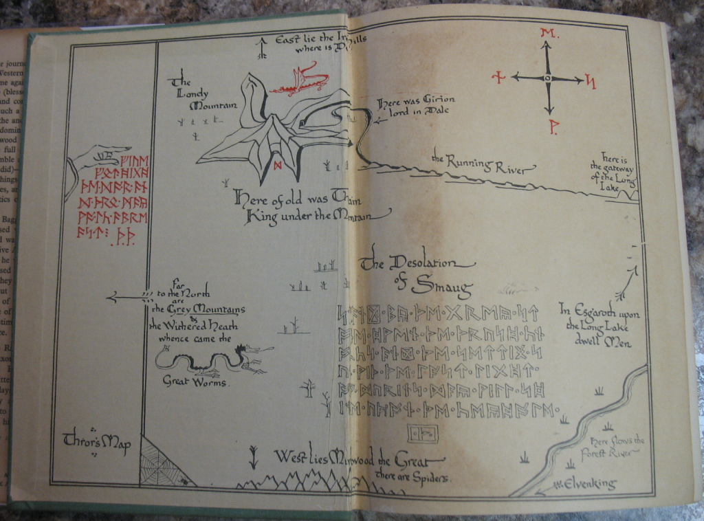
The lead map in this entry and the one above come from the inside front and back covers of The Hobbit published in 1937. They are two colour prints of the world as Tolkein envisaged it without CGI or fancy special effects. It presents the layout of the world with the key places. Mountains are represented in aspect across an otherwise planimetric map though there’s a hint at perspective with far off mountainscapes appearing on the horizon. It’s a sort of progressive projection and Tolkien was clearly a student of cartography enough to replenish his maps with high quality cartographic flourishes.

MapCarte247_tolkien
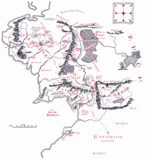
The final map here is from The Lord of the Rings book The Fellowship of the Ring, published in 1954 and gives us a view of the larger world the characters inhabit. Again, the two colour approach is used which allows highlights to be generated and contrast achieved. The linework is simple but effective and the use of white space hints at a world beyond.

As an inspiration for the landscapes that eventually made it to Peter Jackson’s films it’s easy to see how these original maps inspired the use of the landscape of New Zealand. A great example of the use of the real world to act as a set for an imaginary one.

Beautifully simple maps that bring to life an imagined place and which, along with others, underpin the fantasy maps of today.


MapCarte 245/365: Florida Wildlife Corridor by Mike Reagan, 2013

MapCarte245_florida


The general mode of production for maps these days requires a mastery of the computer. Whether you use proprietary software through a Graphical User Interface, or code your map from scratch the basic toolset is one of mastery of a computer. Of course, technology in cartography has always changed and the experts of the tools of the time always rise to become the cartographers of the time. This was the same when it was copperplate engravers, drawing pens, scribing tools as it is today with computer scientists. When we see maps constructed differently they often stand out. It’s also the case that if they are made by someone with a mastery of their specific tools they stand out all the more.

And so it is with Mike Reagan’ map of the Florida Wildlife Corridor, painted in watercolour. There’s a certain human element that one might argue is missing from many maps where our own skills are mediated by algorithms and a computer’s precision but when painted, the artist’s skill becomes visible to all. The landscape is painted in shades of beige and greens and reflects land use types with a consistency of colour hard to achieve by hand. The map is also hand-lettered but again, consistency is upheld which gives the map a sense of uniformity and structure. These aren’t random marks; they’re carefully crafted; each one resulting from a decision.

Paintings evoke emotions because we see them as art. Painted maps can do the same.

MapCarte 244/365: War in the Falklands by London Sunday Times, 1982

MapCarte244_falklands


There was a time not so long ago when newspapers included simple yet dramatic illustrations, often that incorporated maps. That’s not to say that such work doesn’t still exist but it tends to encompass larger scale projects. What perhaps has not changed is the drama that a media illustrator often brings to the subject. Of course, this is by design not only to capture attention but also to perhaps enforce an editorial perspective.

Here is a lovely example of a black and white newspapre graphic (dare we say infographic?) from  1982 by The Sunday Times of London. The Falklands War between Great Britain and Argentina was underway and the British Navy and Military were on their way to battle. This map flips the map to a transverse perspective to fit a horizontal layout. Argentina is at the top – seemingly overbearing as an oppressor, emerging from a dark backdrop. The bottom half shows an ocean in perspective with a foreboding British submarine making a hasty route to the islands. The arrows from Argentina reinforce the invasion. The islands are stuck in the middle!

This is propaganidist cartography. Subtle but effective at rallying the Telegraph’s right-wing readership who file in behind the advancing submarine. Such maps and illustrations had to be rapidly produced but they were often highly dramatic. They told not only the story of where, but were imbued with layers of additional imagery and meaning.


MapCarte 170/365: Tour de France 2010 by I Love Dust, 2010

MapCarte170_tdf2010Map shapes used as containers for a collage of graphics isn’t necessarily original but they work very well, particularly for magazines, posters and promotional material. They actually require very little cartography. Country outlines are iconic and change very little. Couple them with a map theme that also has clear connections to the country and you have an attractive graphic which will catch the eye.

I love Dust produced this enticing map for Bicycling magazine to illustrate Le Tour de France. The map outline is filled with simple graphics representing the race or the regions. The map is simply a motif and the result is an abstract tour of various symbols. Embeded in the map on the same graphic level is the outline route itself, beginning in The Netherlands and finishing in Paris.

It’s a simple graphic celebration of the race in map form. A very effective way of using cartography as art.

MapCarte 168/365: Deutschlandkarte by Matthias Stolz, 2009 & 2012

MapCarte168_stolzThe production of maps in weekly publications and academic journals has been a mainstay in a number of publications but none has perhaps been as beautifully designed than those in the weekly magazine of German newspaper Die Zeit.

MapCarte168_diezeit1

The series of thematic maps has featured in a continuous single-spread feature in the weekly mazazine and now numbers well over 200 separate maps. It would be invidious to select one that rises above the others so here, we reflect on the maps by including the two book compilations by Matthias Stolz that provides a compendium of 101 of the maps, a couple of examples and a link to the Pinterest board.

MapCarte168_diezeit2

Various cartographers, artists, map-makers and designers have produced the maps over many years and they cover all manner of everyday topics exploring the distribution of facilities throughout Germany to popular hairdresser’s names and divorce rates. Each map is unique and often highly stylized or artistically driven. They offer not only a wonderful look at the serious and not-so-serious aspects of daily life in Germany but any aspiring thematic cartographer should explore these maps and cannot fail to be inspired.

MapCarte168_diezeit3

There’s rarely a map that one wouldn’t find catches their attention. That’s the point…they are designed to reel you in and take an interest in whatever it is that is being mapped. They make use of strong visuals and adorn the map with copious illustrations. They take graphic licence to another level in playing with cartographic symbology. Often, rules are broken but to good effect.

There’s plenty more of the maps to see on the Die Zeit Pinterest board here.

MapCarte 167/365: Dry well-bores by Torgeir Husevaag, 2005

MapCarte167_husevaag2

Most maps are designed to show something that people want to know. Some are designed to show people what they might prefer not to know. This isn’t necessarily negative cartography but it’s often an uneasy way of looking at the world.

After some 50 years of successful oil exploration and drilling in the North Sea which has supported the Norwegian economy, Torgeir Husevaag paints a picture of all the futile test-drillings, literally. His hand-drawn approach lends a certain human exposure to the highly scientific approach of the drillings themselves. It’s an almost paradoxical way of representing the subject matter which would more usually be seen through engineer’s plans and charts using sterile, heavily specified symbols and linework.

MapCarte167_husevaag

The 150 or so dry bores are numbered and linked to show them in sequence. There’s no particular need for this and the lines don’t actually exist but by showing them in this manner he creates a richer story. It explains the perhaps haphazard, unscientific search akin to looking for a needle in a haystack.

This is an alternative history told through a sequence of maps. The illustrations are well produced and the unconventional symbology a rich metaphor for the futility of the endless search for black gold.

More at Husevaag’s web site here.

MapCarte 95/365: Pictorial Guide to the Lakeland Fells by Alfred Wainwright, 1955-1966

MapCarte95_wainwrightThis MapCarte entry is more concerned with the illustrations and maps that Alfred Wainwright produced for his 59 walking guides and publications than specifically the Pictorial Guide to the Lakeland Fells series though they are perhaps the most widely known. The Pictorial Guide consisted of seven volumes compiled entirely of his own hand-written manuscripts, his hand-drawn maps and beautiful original illustrations drawn entirely in pen and ink. The Pictorial Guide has been in continuous publication since their first edition and remain as popular as ever. Their unique style and design that marries art, cartography and the written word brings a sense of romance to the long distance footpaths Wainwright wrote about and illustrated in such detail and with immense passion.

Wainwright’s maps are charming and bring to life not only the beauty of the landscapes he loved but also some of the desolation and isolation of the fells. The simple black ink drawings and maps lay bare the landscape yet contained a depth of detail and information that could only be re-told by someone who had walked every single mile and seen with his own eyes.

MapCarte95_wainwright2

The ascent maps are planimetric in the foreground and morph to become perspective in the distance showing natural features and the climb ahead along the route.  Contours not only provide useful information but add to the representation of the 3rd dimension.  The hand-drawn approach lends itself to giving a sense that the maps are somehow more real and match their in situ use perfectly (as tools to support wayfinding).  The maps are not just landscape sketches though.  Planimetric detail is marked and pictorial symbols (e.g. trees) are also used to good effect.  As a small format book the publications and the maps they contain are perfectly suited to their purpose. Many of the pages in the guides contain diagrams illustrating the directions of the fells on a compass rose. Drawings of key features as hikers would see them give a clear idea of location, scale and orientation. Small inset maps are littered throughout to bring clarity to specific parts of a route.

The Pictorial guides took 13 years to complete and are beautifully designed and constructed guidebooks that encompass the 214 peaks in the Lake District. The work is borne of a personal obsession but which clearly has the enjoyment of others as the driving motive. As such, the maps support navigation by all and are so much more than simply Wainwright’s own perspective. The cartography is exquisite but it is the bringing together of all the constituent parts of his guide book manuscripts that makes Alfred Wainwright’s work so enduring.

MapCarte 70/365: Amundsen’s South Pole Expedition by Gordon Home, 1911

MapCarte70_homeThe vast emptiness of Antarctica has long described as one of the last places on earth to be mapped. The maps produced around the time of the expeditions of Shackleton, Scott and Amundsen illustrated the stories, trials and tribulations of their famous treks to reach the South Pole. Most of the maps were not drawn by cartographers, but pieced together from journal entries by others. Here, Amundsen’s expedition is mapped by English landscape artist, writer and illustrator Gordon Home based on telegraph reports and which appeared in Amundsen’s own book of the expedition published after his return.

Home’s pen and ink drawing uses a grossly distorted perspective with a detailed foreground giving way to the mountain ranges, plateaus and empty open ice fields that were negotiated. Scale is inconsistent throughout but that’s an inevitable and immaterial consequence of this style of mapping. Curiously, the south pole is at the top but placed in the more normal orientation the map wouldn’t have looked right since the horizon would have been at the bottom. Home simply rotated the map to fit the need to create a linear route that plotted the journey from start to finish, bottom to top.

Using the map as a device to tell a simple linear story is well executed by Home. There’s actually very little by way of description and detail but that in itself gives the map a quality that allows the reader to imagine the severity of the challenge faced by the expedition teams. The foreboding blackened sky adds to the drama and sense of bleakness.