This MapCarte series has attempted to draw attention to classic cartographic design that we recognise in great maps. Occasionally it has also highlighted the work of artists who either approach cartography in an innovative way or use maps as part of their artistic works. This example falls squarely in the latter category as renowned British artist Damien Hirst moves away from the infamous Tiger Shark in formaldehyde as part of his ‘The Physical Impossibility of Death in the Mind of Someone Living’ series to explore the structure of maps. The subject of death is, though, never far away from Hirst’s work as these spectacular urban maps are constructed entirely out of medical instruments.
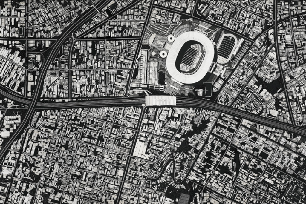
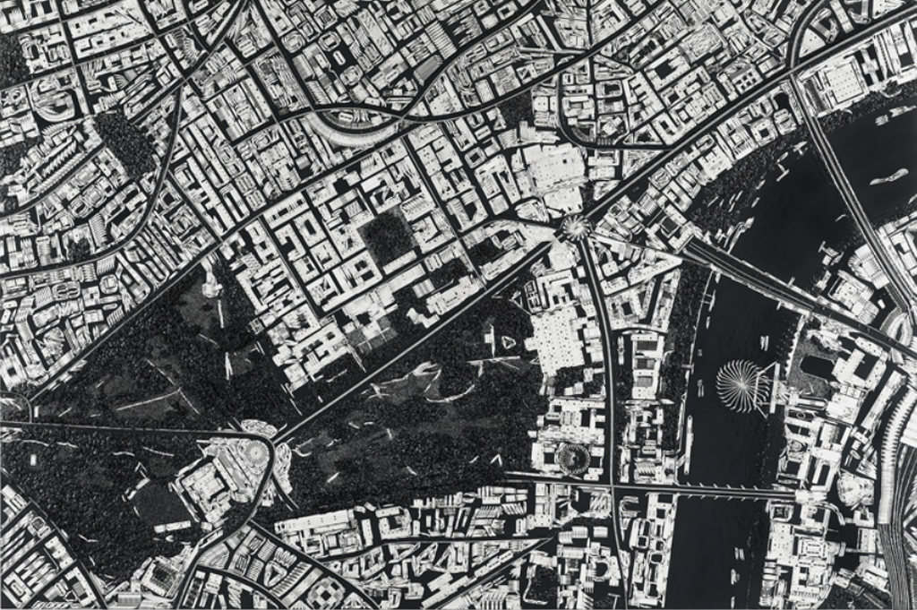
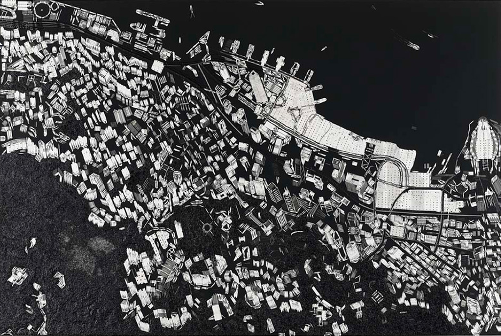
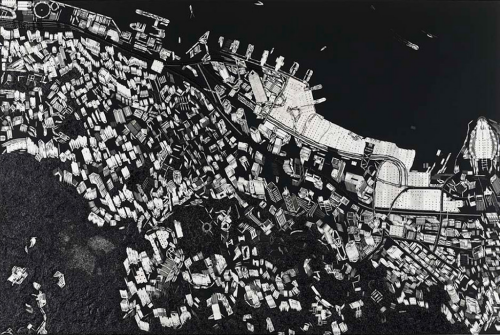
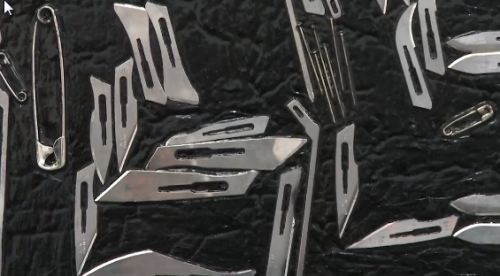
 Britain’s richest living artist, compared by Tracey Emin to Andy Warhol in terms of his importance to art, has displayed this series called ‘Black Scalpel Cityscapes’ in São Paolo, Brazil, which features surgical instruments arranged as bird’s-eye map views of 17 cities, including Moscow, New York, Beijing, and Vatican City. The works use scalpels, razor blades, skin graft blades, safety pins, stiching needles, wire cutting spools, hooks and gloss black paint to represent buildings, roads and other features of the urban landscape to create faithful vies of the cities.
Hirst uses his art to comment on themes of surveillance and modern imagery based maps such as Google Earth. His use of surgical tools is a metaphor for the dissection of societal wide anxieties over surveillance and the digitization of warfare, as well as Orwellian distopias and the way surveillance imposes on individuality.
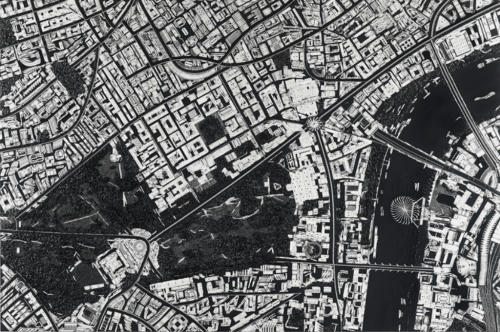 Hirst suggests these works show portraits of living cities but all of them have echoes of conflict either as sites of recent terrorist activity, epicentres of religious or socio-cultural importance or major world cities. Even Leeds, UK (his birthplace) is represented. Milton Keynes, UK was the inspiration because of the regularity and systematic structure.
 While some may wittily suggest this is at the cutting edge of art, it’s certainly taking cartography to a new place. Our usual modes of design and production are challenged by Hirst yet the images he produces are familiar, accurate and aesthetically pleasing. He hasn’t created some modernist haze, but the use of sterile instruments to create sterile scenes in black and white that we recognise immediately as a satellite view or an aerial photograph is impressive. The works are beautiful and engaging. They mimic our more usual ways of seeing cities from above. The materials challenge our thinking and challenges our cartographies.
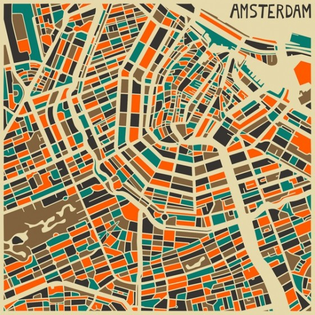
Many of the works are planimetric but Hirst even tackles 3D in the Hong Kong example. While there is no colour at all in the images, the metal of the surgical instruments catches the light as you view the works to create different views of the world. Hirst also recognises that the works have to be a certain size for the instruments to work since at smaller scales the size and shape of the instruments wouldn’t create the curves and lines required. These works are not just random cartographic experiments. Hirst has studied cartography, scale and representation to bring his art to life.
 More of these works can be seen at Design Boom’s web site here and Hirst discusses the work himself in a short film on the White Cube gallery web site here.
Now then…how much for one of these pieces Mt Hirst?

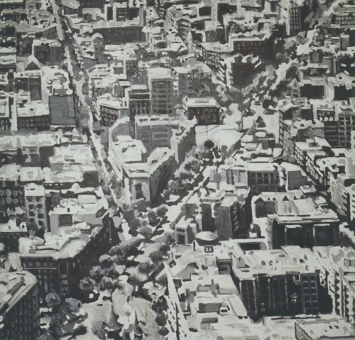 Back to the use of maps as a framework for artistic expression with Richter’s Townscapes. Here, artist Richter has created a range of paintings that are based on oblique views of different towns and cities. He approaches each work from a different perspective and experiments with scale that mimics the approach a cartographer takes in determining how much to generalize a feature.
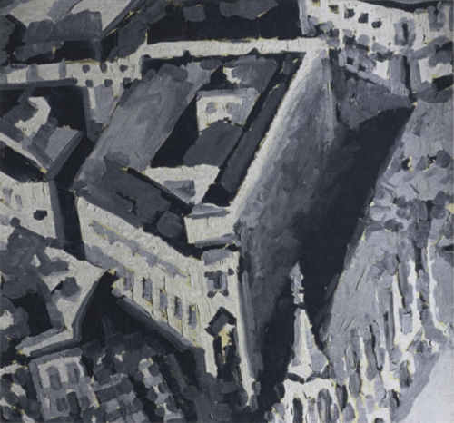 For some paintings, the scale is smaller and the view is from a higher elevation and so the buildings take on a rather abstract form, perhaps just the general shape and the inclusion of major features. Examples that are at a larger scale inevitably include more of the building’s detail. That said, the large scale paintings are perhaps less easy to recognise due to the larger size of shapes. Because the paintings are all in shades of grey we tend to see large indistinct blocks of grey which are not necessarily immediately seen as buildings. Of course, standing back from the paintings gives us a different perspective, the image occupies a smaller form and we tend to see the images more clearly. At distance they begin to look like monochrome oblique aerial photographs.
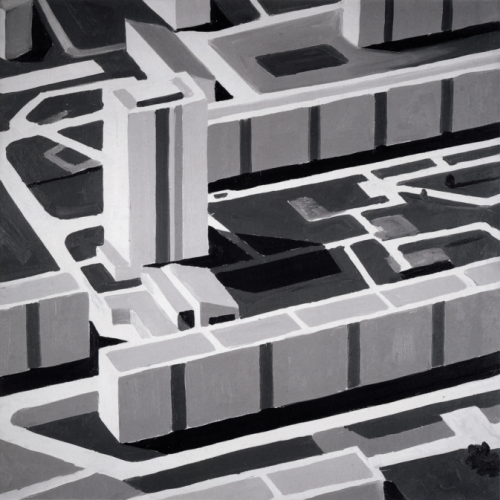 Richter also experiments with different brushstrokes and textures, going from very fluid approaches to strongly geometric. As a collection, they give us a fascinating way to reflect on the urban form and, perhaps, show us a little of the artistry in how we approach the task of generalization as part of cartographic design. Scale, form, texture and viewing distance all strongly modify the viewing experience. These are key processes in understanding cartographic design.