MapCarte 278/365: Socio-economic tectonics by Kenneth Field, 2014

MapCarte278_Field


Forgive the fact it’s one of mine but others feel it worthy of inclusion…

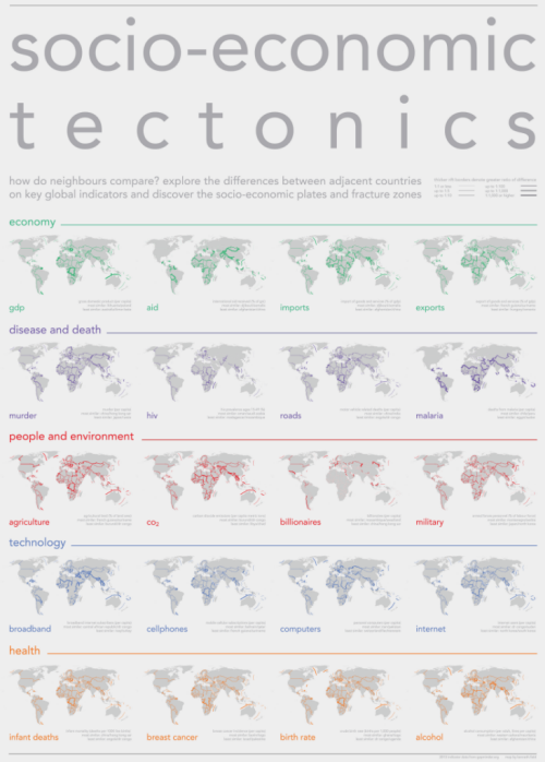
The standard way of illustrating socio-economic data for countries on a world map would be a choropleth. Options, of course, exist, to show data in a different way including proportional symbols or cartograms. All of these techniques are perfectly reasonable but all suffer from one problem, namely that it’s up to the map reader to make visual comparisons between areas shaded differently or symbolised differently. The focus is on how one place compares to another. What if the question is based on trying to understand how similar or dissimilar neighbours are?

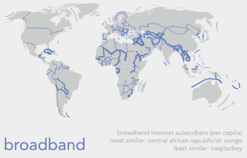
This map looks specifically at the relationship between bordering countries to create a set of proportional line symbols that represent their dissimilarity…let’s call it a proportional adjacency map (any better ideas?). It’s a sort of linear cartogram.  Thinner lines mean countries share a very similar value for the variable. Thicker lines mean adjacent countries are very dissimilar. Additional ‘boundaries’ have been added to show how countries differ when they are separated by a stretch of sea or ocean.

MapCarte278_Field_detail


The map shows twenty key socio-economic indicators, four for each of five broad themes. The use of small multiples gives a sense of how different countries vary across different measures. The only colour used on the map simply provides a motif for each of the five themes. Additionally, there is a note for each variable to express which two adjacent countries are most similar, and which are most dissimilar. The title is simply designed to capture attention and provide a metaphor for the socio-economic fracture zones that crisscross the planet.

The style of the map has been deliberately kept subdued so only the coloured fracture zones stand out. It demonstrates that if we’re trying to map a specific characteristic of data that isn’t well supported by conventional techniques then sometimes we have to make a new technique or modify one to suit our purposes. In many ways this map tehnique is the counter to a choropleth and literally fills in the gaps.

You can download a full size print version of the map here.

MapCarte 155/365: The carbon atlas by The Guardian, 2007

MapCarte155_carbonThere’s something very appealing about a well composed thematic map. The geometric character of the symbols often used as an overlay gives the work an abstract aesthetic whether they are draped across a real map of the world or not. Of of the central tenets of good thematic map design is that the underlying geography is really just a placeholder. Providing topographic detail is really nothing more than a distraction to the main event. The most explicit illustration of this is when the base map is disregarded altogether.

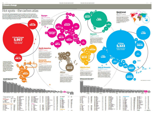
Here, The Guardian use a Dorling cartogram based on proportioanlly sized circles that convey both quantity of the phenomena being mapped as well as the geography itself. There’s no need for a base map as the position and adjacencies of the symbols work perfectly to tell the story. Cartograms are not to everyone’s taste though and they tend to find more favour outside North America than within which is in itself curious. They are often reserved for reporting of election results when the size and shape of real areas is secondary to the proportion of vote and the amount of red or blue one wants to paint across the map in true proportion.

They are also more heavily used in the media precisely because they are visually striking and attention-grabbing. The strong geometry coupled with bold colours used to differentiate between continents is particularly impactful. There’s a really good hierarchy of detail in the map from the large simple symbols through the typographic components providing facts to the small-print where we can read a little of the story. There’s a useful legend in the top right that relays the colour coding as well as an overall measure and the graphs and country list at the foot provide detail for those wanting to mine it.

A strong print graphic that The Guardian has used in subsequent years to good effect when updating the information.

MapCarte 152/365: What is fracking? by National Geographic, 2013

MapCarte152_fracking1

National Geographic have long been associated with graphical excellence for their maps, their pull-out posters and the graphics that adorn their print magazine. To this staple diet of work we can now add animated mapping in short-form videos that allow their graphic designers to make use of additional mechanisms to tell a story.

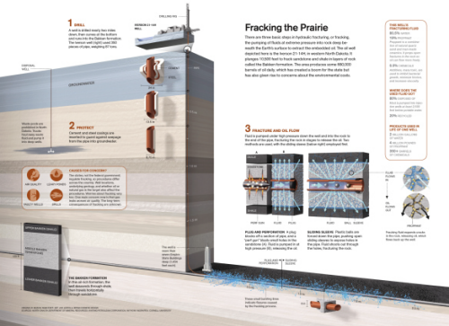
The March 2013 edition of the National Geographic Magazine (print and digital) focused on America’s search for oil from their own reserves and, particularly, on the controversial extraction method fracking that taps in to hard-to-reach reserves. The story requires multiple scales and graphics to fully illustrate the science and geography of the technique and the work produced in both print and digital form is a tour de force in research, design, graphics, video and story telling. Each is excellent in their own right but as a collection weaves them expertly into a cohesive story in the familiar National Geographic Style.

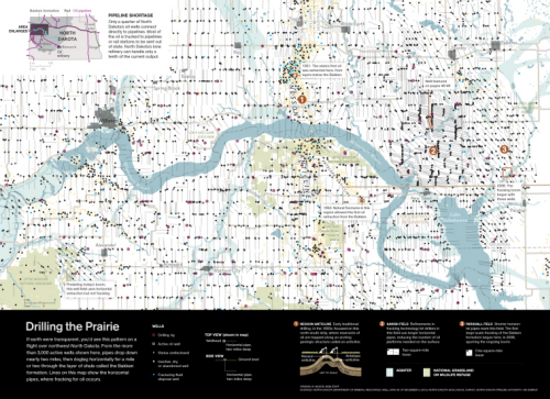
The work focuses on the new boom region of North Dakota with a map that shows over 3,000 existing wells as dots and their associated pipelines in grey that are shown across the surface giving a sense of the chaos under the surface that we cannot see. The use of the Missouri River as a central anchor point contrasts the natural beauty of the rural landscape with the massive human transformation. The next graphic takes us to an individual well – a real one that gives the reader a sense that this is real rather than simply a diagrammatic indication. Making the graphic real and showing the actual fracking activity mapped from seismic data allows us to imagine this process some 3,000 time…or 8,000 when projected to the whole state…and 50,000 times if we are to believe the projected number of wells.

MapCarte152_fracking2

Then we get to the video. It video begins with a wide shot of the United States with generalised oil producing regions we zoom in to North Dakota with a muted topographic map for context which acts as a base for oil wells that fade in to the scene. As we zoom in further detail is added that gives the strong impression of just how many wells there are before the map fades out and the map tilts and rotates to leave a 3D view of a collection of wells that then zooms to a single well. The zoom effect from continental to individual well is dramatic and tells its own story.

The subsequent 3D animated model illustrates the fracking process itself which is well presented with clear, informative design. The video ends by retracing the route in summary form back out to the continental US. An accompanying commentary tells us the story as we proceed through the video giving us clear links between what we are seeing and what is occurring.

This is a high quality, well designed and produced piece of work that integrates maps with animated diagrams, mixes 2D and 3D, print and animation to good effect and uses labels sparingly and for effect. It’s educational and shows National Geographic extending their graphical excellence and story telling into new territory.

MapCarte 144/365: Counties Blue and Red Move to the Right by New York Times, 2012

MapCarte144_watkins

Some of the best print cartography has always resided in the pages of quality newspapers. The use of maps and graphics have long been used effectively to illustrate stories and to provide a visually impactful way of engaging readers. Who wants to wade through pages of text that attempts to describe something when a full page spread of well crafted graphics can provide far more information as well as be more visually appealing?

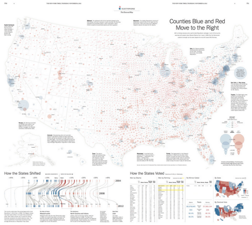
The New York Times are currently at the forefront of journalistic cartography both in print and online. Here, Derek Watkins et al. uses a two-page print spread to illustrate not just the results of the 2012 Presidential election but also the context at a county level. The proportional symbols are well positioned and the overlaps are generally handled well (though transparency can cause some issues of perception with this sort of massively varying data it’s always a compromise). The swing in votes is illustrated by a small arrow which shows how voting changed between 2008 and 2012.

MapCarte144_watkins_detail

There are useful textual vignettes surrounding the main map to give some sense to the pattern the map illustrates and a band at the foot anchors the page with a novel graph showing change at State level. Tabular data presents the actual data and there’s even room for some headline figures and a State and Electoral Vote map…the latter using a cartogram approach.

This is an excellent example of composition and layout. Each component tells a part of the story and they fit together like a perfect jigsaw to tell the bigger story. The colours are both indicative of the different parties but are also in sympathy and balance across the page. The visual hierarchy is subtle but reinforces key information across the entire page.

Excellent print cartography that combines a rich variety of complimentary elements in a finely tuned overall composition.

MapCarte 39/365: Death in Grand Canyon by Kenneth Field and Damien Demaj, 2012

MapCarte39_field1

Forgive the posting of one’s own work but as it’s the author’s birthdays on 8th and 10th Feb and the map won the ‘best map at the International Cartographic Conference in Dresden, 2013 we figured if others feel it has cartographic merit it’s deserving of inclusion in MapCarte…

This map was designed in two ways for both print and web, each allowing the consideration of the opportunities and limitations of the two mediums. With print, you get the map at once and it has an immediate impact yet we have to resort to an inset for the detailed areas. With the web, multiscale allows us to increase detail as we zoom in and so we can use a hex-binning technique at smaller scales and switch to true locations for every location at larger scales. We can also switch out the basemap at larger scales online to use a satellite image that gives us a clearer impression of the actual character of the landscape. Additionally, whereas we can only include c.20 text vignettes describing the incidents on the print map, the full details of all 700+ incidents can be explored on the web map.

The map employs a chromastereoscopic technique that allows us to encode some variable using spectral colours. When viewed through chromadepth glasses (that contain small prisms) red is refracted so it appears closer to the eye and blue refracted so it appears farthest away. Other colours are refracted between these two endpoints which creates a 3D holographic effect. Elevation was encoded in this way so we see deep red plateaus descending to the blue of the Colorado. Other map elements used pure red hues to build subtle visual hierarchies for the map content. The ‘comic book’ style complements the dramatic colours and theme and pictograms are used to represent categories of incident..as ‘warning’ triangles on the print map and tesselated hexagons on the online version.

The chromasteroscopic technique is unlike other 3D techniques in that the map is perfectly legible without the 3D glasses…a little jarring visually because of the highly saturated colours but Grand Canyon provided a great landscape to map this way because of the naturally red rock.

Print map can be downloaded here.
Online version of the map is here.
Chromadepth glasses can be obtained from American Paper optics here

Thanks for the indulgence…normal service resumes tomorrow.