Some of the best print cartography has always resided in the pages of quality newspapers. The use of maps and graphics have long been used effectively to illustrate stories and to provide a visually impactful way of engaging readers. Who wants to wade through pages of text that attempts to describe something when a full page spread of well crafted graphics can provide far more information as well as be more visually appealing?
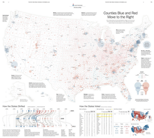
The New York Times are currently at the forefront of journalistic cartography both in print and online. Here, Derek Watkins et al. uses a two-page print spread to illustrate not just the results of the 2012 Presidential election but also the context at a county level. The proportional symbols are well positioned and the overlaps are generally handled well (though transparency can cause some issues of perception with this sort of massively varying data it’s always a compromise). The swing in votes is illustrated by a small arrow which shows how voting changed between 2008 and 2012.
There are useful textual vignettes surrounding the main map to give some sense to the pattern the map illustrates and a band at the foot anchors the page with a novel graph showing change at State level. Tabular data presents the actual data and there’s even room for some headline figures and a State and Electoral Vote map…the latter using a cartogram approach.
This is an excellent example of composition and layout. Each component tells a part of the story and they fit together like a perfect jigsaw to tell the bigger story. The colours are both indicative of the different parties but are also in sympathy and balance across the page. The visual hierarchy is subtle but reinforces key information across the entire page.
Excellent print cartography that combines a rich variety of complimentary elements in a finely tuned overall composition.


