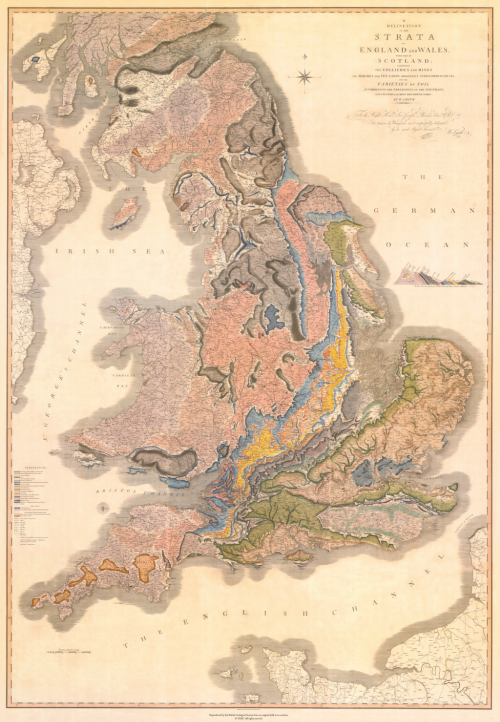
MapCarte 343/365: A deliniation of the strata of England and Wales by William Smith, 1815

MapCarte343_smithIn a world where many seem rather quick to suggest their map is ‘the first to show…’ it’s refreshing to be able to show actual firsts from the world of cartography that exhibit good design. English geologist William Smith is credited as the first to have created a nationwide geological map. Smith’s legacy is in the first ever map to collate a full geological record of a whole country into a single map.

Smith’s map is perhaps also an early marker for that most current trend in digital map-making – the mashup of third-party basemaps and some sort of overlay. He uses conventional symbols to show urban and rural areas, roads, tramways and collieries and mines. The geology itself is applied over the top and all hand-drawn using a range of colours to denote the different rock types. One of Smith’s approaches was to use the fossil record as a way of establishing the strata as opposed to simply rock composition. His map was more accurate as a result. Indeed, the map Smith created is not far off the modern geological map of England and Wales at this scale illustrating just how accurate he had managed to make his map.
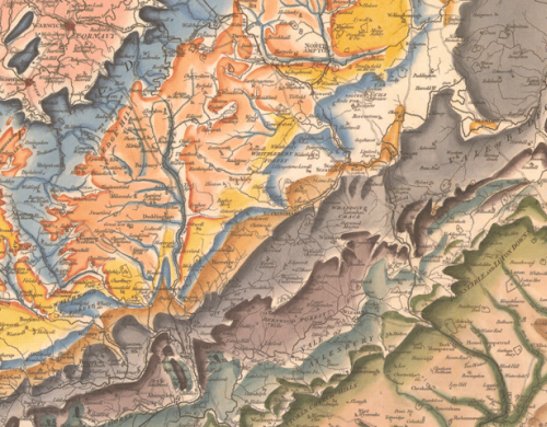
MapCarte343_smith_detailThe map was made in a range of formats: on sheets, or canvas or mounted on rollers. In total the map measures approximately 8 feet tall by 6 feet wide. He oversaw the hand-colouring of each of ~400 maps and each is numbered and signed.

MapCarte343_smith_detail2It’s possible Smith could also claim to have made a map with one of the longest titles. The full title is: A delineation of the strata of England and Wales with part of Scotland: exhibiting the collieries and mines, the marshes and fen lands originally overflowed by the sea, and the varieties of soil according to the variations in the substrata, illustrated by the most descriptive names.

A fantastic cartographic first in both the quality of the surveying and the accuracy of the resulting work, but also for the beauty and richness of the cartographic depiction. In all ways, this map underpins much of what has subsequently been made regarding geological cartography.

 

MapCarte 192/365: Map of Vesuvius by John Auldjo, 1832

MapCarte192_vesuvius

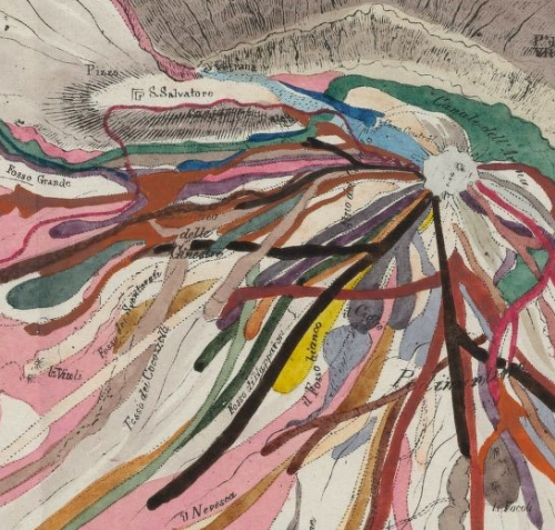
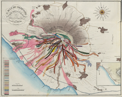
Making a map of a single geographical feature and a single phenomena is a challenge, particularly if you want to make it interesting. So making a map of a single volcano has the potential to be rather tedious. Except, this map from the late 1800s is anything but boring.

All lava flows resulting from eruptions are mapped beautifully. The geographical accuracy is perhaps not perfect but the colours used to demarcate the different years works wonderfully well. The map presents a rich spatio-temporal pattern of the ferocity of the eruptions and illustrates the variety of the flows perfectly.

MapCarte192_vesuvius_detailThe use of such overlapping colours would normally be regarded as a cartographic oddity but representing different time periods and the lava flows that demonstrate very particular characteristics works well.

A graphical description of a very unique phenomena that makes a beautiful map.


MapCarte 146/365: El Capitan, by National Geographic, 2011

MapCarte146_yosemite1

Click the image to view the web map

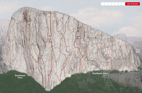
Maps that look simple often belie the effort that went into making them. The two related maps here, of El Capitan’s vertical structure, by National Geographic Magazine fall squarely into that category.

The first map by Martin Gamache and Lawson Parker, Scaling the Wall is a simple interactive map that illustrates some of the milestones of those that have conquered the wall. From 1958’s first major ascent to the newest route in 2010 (at thetime of creation of the map in 2011). The interactive map takes on the appearance of a photograph yet it’s a detailed computer generated image. It helps that El Capitan looks grey in real life but the colour provides a perfect neutral backdrop for the bright red ascent routes overplotted. Seven key routes are picked out but showing all routes reveals the detail of every route climbed on the 2,916 vertical feet. What a feat of human endurance and determination.

MapCarte146_yosemite2

Click the image to view the web map

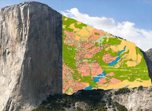
The second map by Roger Putnam contrasts the human activities of the first by illustrating the geology as an overlayed thematic layer. Putnam mapped the face himself using field notes and collecting samples to create the first ever high-resolution geological map of El Capitan. Previous surveys and maps had been compiled from surveyor’s visual assessment made from ground level using telescopes. Putnam’s work benefitted from a croudsourced approach ,where other climbers helped in climbing over 100 routes, as well as the collection of high-resolution GigaPan imagery and LiDAR surveys from ground level.

The 3D model built using GIS was then annotated to include detailed notes about the makeup of rock layers.One output, the resulting map of the geology of the face, illustrates over 850,000 points of data pin-pointed on a map build from the LiDAR data and GigaPan photos. The geological map has nothing but a legend and a swipe control to move the geologic overlay across a detailed photograph of the face.

These two maps are the result of a significant survey and scientific effort. Published as web maps with simple select and swipe controls, they give us a unique insight. Standing in Yosemite valley looking up at El Capitan is awe-inspiring enough for most of us but maps like these allow us to get up close and personal.

MapCarte 27/365: Willamette River historic channels by Daniel E. Coe, 2013

MapCarte27_coe

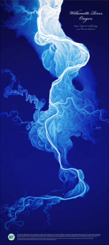
Borrowing heavily from the Mississippi river channel maps designed by Harold Fisk (MapCarte 26), Daniel Coe has taken LiDAR data of the Willamette River, Oregon and created a stunning image of historic river channels.

At a glance the map might appear to be a plume of smoke or possibly an electric storm. The title is the only real hint of what the image represents but it’s enough. Adding contextual detail such as roads or cities would take this abstract map and revert it to a simple topographic reference map. The impact would be lessened and here we have an example of ‘less is more’ as the map invites the reader to figure out what they’re looking at. Once understood, you begin to explore the many twists and turns of the channels and can visualize the feel of the water rushing through and carving the landscape. Coe uses a single blue hue that becomes lighter to represent deeper channels and this simple effect is stunning…almost creating an x-ray of the landscape that picks out one feature and shows it far more clearly than a standard map can ever hope to show.

Further details and a link to buy a large format poster here.

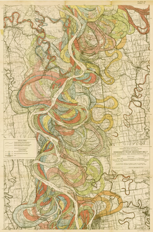
MapCarte 26/365: Alluvial map of the Lower Mississippi Valley by Harold N. Fisk, 1944

MapCarte26_fisk

In 1941, the Mississippi River Commission appointed Harold Fisk to undertake a geological survey of the Lower Mississippi Valley.  His detailed and exhaustive report contained 15 maps that illustrated the historical courses of the river, colour coded for different ages of point bar migration, chute cut-offs, and avulsions.

As a collection they succinctly present the complicated story of channel evolution of the river and are archived by the US Army Corps of Engineers (download here).  Rather than attempting to fit all detail on one map, Fisk let the geography drive the size and scale necessary to show detail clearly.  The maps exhibit a perfect blend of neutral basemap to provide a context for the coloured detail of the river morphology though almost every colour has a percentage of black to allow it to tone harmoniously with the grey background.

The organic historical stream flow patterns make an intriguing visual and despite the fluidity of the mapped phenomena the maps appear very structured.