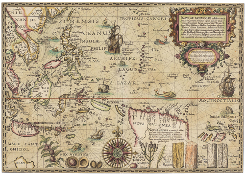
MapCarte 289/365: The Molucca Islands by Petrus Plancius, 1594

MapCarte289_plancius

Maps have always served a multitude of purposes and supported the great period of trade in the 16th century, particularly for the Portuguese who dominated the Southeast Asian spice trade. When the Dutch wanted to enter the region to support their own trading aspirations they required maps and this map by Petrus Plancius, astronomer and cartographer, became key not only for their trade but also for cartography.

Plancius used maps acquired from the Portuguese and created his map using Mercator’s projection which had to this point found little favour with navigators due to its complex mathematics. By adorning his map with the riches that lay in wait for bold navigators he was able to persuade his map to be used. In many senses it is a persuasive map with the imagery and style evoking a rich bounty of nutmeg, sandalwood and cloves for those who dared.

The map is both a navigational chart and includes rhumb lines and the depiction of shoals and rocky areas but it is also an early example of the use of maps for corporate purposes as it underpinned the development and later success of the Dutch East India Company. Amusingly, despite its scientific basis the map is still embellished with sea monsters to fill in the gaps and for decoration.

A beautiful example of late 16th century copperplate engraved cartography that supports dual purposes and is perhaps one of the most early forms of persuasive cartography.

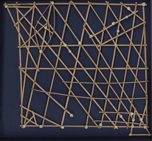
MapCarte 243/365: Marshall Islands Stick Chart by anon, late 19th Century

MapCarte243_stick


It’s doubtful any collection of cartographic design would be complete without some reference to Marshall Island stick charts. They represent perhaps one of the finest examples of form and function in map design. These navigation charts represent a system of ocean swells and the way in which islands disrupted the swells. They allowed the Marshallese to paddle by canoe between islands using these maps to aid their choice of route.

The charts were made of coconut fronds tied together to create a framework that represented the predominant direction of wave crests. Islands were represented by shells tied to the framework. Of course, there was no uniform system of design or construction but these were an early form of personalised mapping. The map-maker knew the ebb and flow of the seas and created a physical representation of their mental map.

Ironically, though the materials were perfectly suited to the wet conditions, being entirely waterproof, they were not used en route. They were more commonly consulted prior to a journey and committed to memory, with the canoeist laying in their vessel to understand how it was interacting with the swells to determine their course.

Map-making doesn’t have to be complex. Simple tools. Simple representations and a single, uncluttered theme. These charts are the epitome of cartographic simplification. All unwarranted detail is omitted. their form suits their function perfectly.

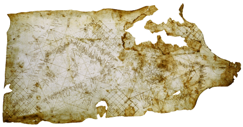
MapCarte 239/365: Carta Pisane by anon., c.1275

MapCarte239_pisaneThe form of a map goes a long way to defining whether it is well designed but rarely is a well designed map devoid of function. The balance between the two is likely harmonious if we see beauty in the form and function. Sometimes the simplicity of the function defines the form itself and beauty is derived largely from how the map is designed to work. This is certainly true of the Carte Pisane, the world’s oldest known portolan chart. Derived from the Italian word Portolano, or port, this map is designed to allow mariners to navigate between coastal settlements.

MapCarte239_pisane_detail


Their construction is simple, being based on the use circles, lines and grids with numerous compass directions. Coastlines and names were added according to known compass directions so the map’s appearance is strictly according to the knowledge of compass and wind direction between two ports. It’s a simple and ingenious approach to making a map to support one function – getting from A to B by sea. The shape of a coastline was accentuated by labelling the ports at 90 degrees to the coastline.

There is little need for any interior geography and the commercial importance of various trading regions is clear given the relatively poor shape and detail of the British Isles.

History can teach us much about map design. The portolan chart and Carte Pisane are exquisite examples of early map-making.

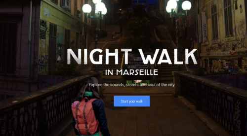
MapCarte 136/365: Night Walk in Marseille by Google, 2014

MapCarte136_nightwalk

Click on the image to launch Night Walk in a web browser

Explore the sights, scenes and soul of the city. Of course, that might apply to any map of an urban area that is packed with dense, useful and interesting information but here, it’s the tagline for Night Walk, an immersive trail taken through Marseille. It’s actually a virtual tour with central characters, Julie and Christophe, who narrate and guide as you explore the environment. It deals with the micro-scale in the sense that you follow them on a trail through the vibrant Cours Julien neighbourhood.

This experiment in virtual mapping may not have worked as well in a mundane or somewhat featureless area but with interesting street art and various characters we meet along the way it’s an ideal medium in which to give the map user a tour. Here, the fact that the experience is imbued with characters all adds to the character and personality of the experience. The two are intertwined so we see some of the individuals and their own take on the place which translates into our own experience.

Technically, this is a Google experiment that shows the streets using 360-degree photosphere imagery, stitched together perfectly and enriched with photographs, video, sound and a plethora of interesting facts. It’s built upon a customised Google Maps framework and if you use the mobile version then the Location API is harnessed to provide you with location specific information unique to your own location.

Whilst being guided, you get a sense that you are experiencing something unique to you (even though you are not) and that you are seeing aspects of the environment that may be difficult to convey using a more traditional map. This latter aspect is certainly true and begins to show how maps can take fundamentally different forms to that which we are used to, in order to tell a story in a more useful way. You are entirely free to explore by zooming, panning and clicking to unlock detail and moving ahead much as you would with Street View.

With this experiment, Google are showing us that actually, the abstraction of reality may not be the future of the map. Instead, we may be able to immerse ourselves into very real, macro-scale virtual worlds that don’t just show us a place, but allow us to experience it. They are becoming masters of pushing the boundaries of mapping and their experiments at the very least open our eyes to how we might represent places in different ways to achieve different aims.

MapCarte 118/365: Britannia by John Ogilby, 1675

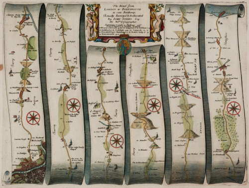
MapCarte118_ogilbyIn 1674 translator and publisher John Ogilby was appointed as His Majesty’s Cosmographer and Geographic Printer and published Britannia, a road atlas of Great Britain, in 1675 which set the standard for many years to come.

The atlas contained 100 strip maps accompanied by text at a scale of one inch to one mile.  The scale was innovative for the time and later adopted by Ordnance Survey in its first (one inch to one mile) map series. Ogilby’s maps are a linear cartogram and north varies between strips.

MapCarte118_ogilby_detail

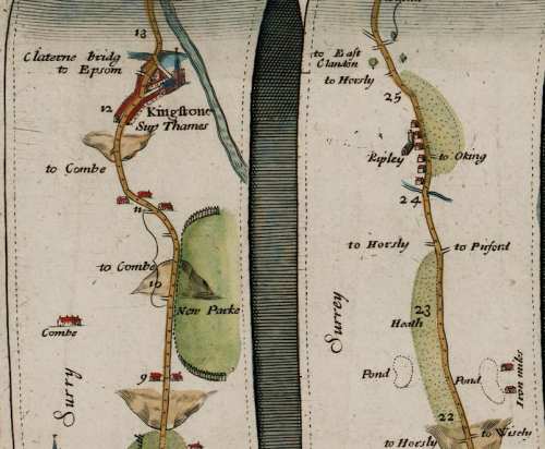
People can orient themselves in the direction of travel regardless of the true direction.  The scroll effect suggests their use for navigation as if they were to be opened and used on the journey itself.  The lines have been necessarily straightened to fit into each strip but the essential details along the route are maintained. Features are artistically represented but all have a practical value and a great deal of extraneous detail is omitted.  Hills are included, oriented to depict whether you would be ascending or descending depending on the direction approached. Distances are included as well as place names, illustrations of villages, towns and forests. The maps, marginalia and cartouches are particularly ornate and typography also includes flowing ascenders and descenders.

Ingenious for its time and a style still used today to show the linearity of route networks (e.g. motorway networks) in many street atlases. Certainly, the use of straightened lines has become a very familiar cartographic approach for depicting transport networks with subway maps being perhaps the most abstract.

MapCarte 116/365: Google Maps by Google, 2005-present

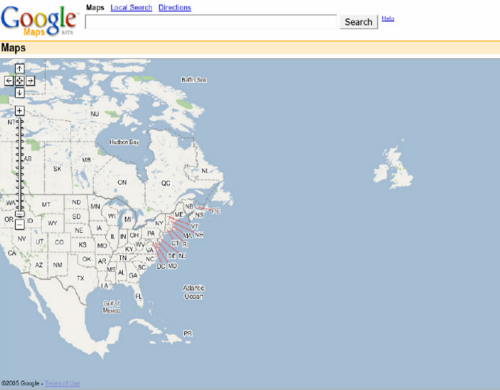
MapCarte116_google1Lars and Jens Rasmussen’s mapping company was acquired by Google in 2004 and the mapping landscape transformed on February 8th 2005 when Google Maps was released as a web-based product (maps.google.com).  Google Maps (and numerous complimentary products) has both disrupted and revolutionised the way the people view, use and make maps and how they interact with their surroundings. Google’s intent to organise the world’s information to support their Search capabilities has often been expanded to the ideal of “organising the world’s information, geographically”. Let’s not forget that Google are a company whose focus is advertising and the revenue raised from placing adverts on web pages, their search results and on the map is what funds the business. The map has become a key mechanism for people and we perhaps cannot have predicted the astonishing rise of its use.
MapCarte116_google5

Several other disruptive technologies have converged to enable this to happen, not least the ubiquity of the internet and rapid development and uptake of mobile devices. People now expect information to be streamed rapidly, often through a map interface. Google’s map is now part of our everyday toolkit in a way that can perhaps never have been imagined. Designed to support Google’s mission but designed so well that it is perfect form of viral marketing itself.
MapCarte116_google4

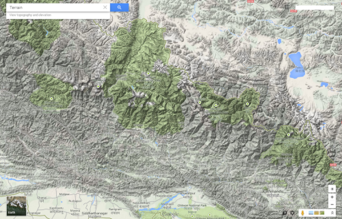
In addition to becoming the default map of choice for finding places and navigating, the Google Maps API has also underpinned the democratization of online mapping to allow anyone to create geographically contextualized mashups and also customise the base map data to their own style. The original design left much to be desired and problems of disjointed data and poor cartography have been addressed so today’s product gives a finely tuned, responsive and clean map experience.
MapCarte116_google3

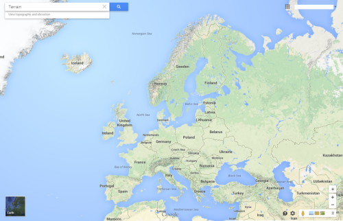
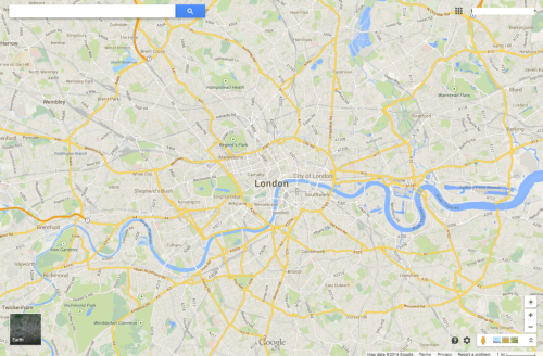
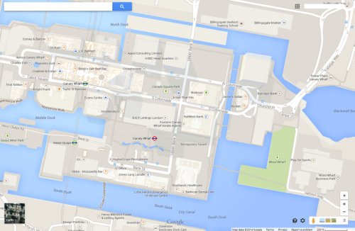
The design is recognizable and supports a strong, clear brand that is consistent at a local scale, globally.  Integration of complementary functionality (e.g. routing, traffic information, overlay of social media and photographs, zooming, panning, querying and measuring) provides an application with a multitude of purposes that goes beyond a general reference map.  The design is automatically modified depending on its use.  For instance, secondary roads widen at particular scales when you overlay traffic information to show each direction of traffic flow.  The appearance of 3D buildings and moving shadows at large scales (in some cities) represent the built environment like never seen before.
MapCarte116_google2

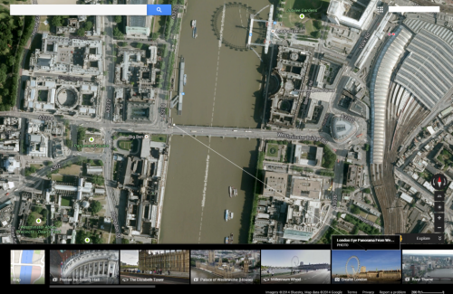
Google Maps is used every day by millions to actually ‘do something’. No other map in history can claim such widespread adoption and use. it’s successful because it works. With that many people using and testing if it wasn’t up to the task it’s use would soon diminish. It is content rich yet very straightforward. The colour is subtle and the typography sits well at each scale and transitions between scales. This is a single map but designed at 20+ scales to work at each scale and to work across the scales. It accommodates a wide and diverse range of users and is localised. It supports terrain layers, satellite imagery and hybrid mapping. it allows you to incorporate photo tours and switch between 2D and 3D and StreetView. There isn’t much this map does not do.
MapCarte116_google6

Can we ignore the fact that Google brought Mercator back to prominence? Maybe not…but Web Mercator is a perfect technical solution for serving tiles of data because it tesselates in squares, is efficient and scales rapidly. It won’t be long before projections can be modified in web maps so until then we just have to accept them (and deploy our own maps using different projections) when necessary.

Quite simply the map is, and continues to be revolutionary. The 2005 map would get nowhere near MapCarte. The 2014 version is state-of-the-art and in less than 10 years Google are leading big league cartography and fully deserve inclusion.

I’d be surprised if anyone reading this doesn’t know how to access Google Maps but just in case…it’s here.