MapCarte 366/365: Non-stop by Alberto Lucas López, 2015

MapCarte366_lopezJust when you thought your daily dose of MapCarte from 2014 had finished…here’s the beginnings of a less frequent, intermittent post of great maps on which to feast your cartographic senses.

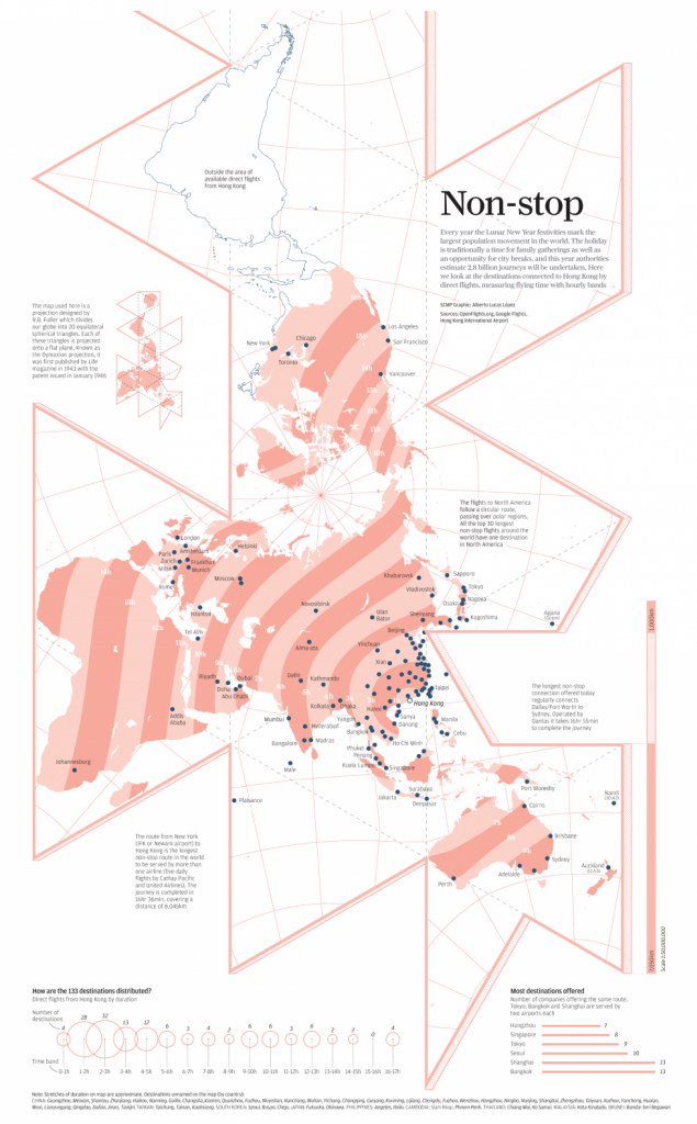
In an age where flashy, spinning, animated, colourful web maps seem to be all the rage it’s refreshing to see that applying some control on your cartography can still bring to life a fantastic example of the art of map-making. Here, Alberto López has created a simple but graphically effective map showing the non-stop flight paths from Hong Kong. The first aspect that grabs you is the use of RB Fuller’s Dymaxion projection. Visually interesting, it adds something unique to the display. The same data could easily be shown across a cylindrical projection or, if we wanted concentric flight time zones, an azimuthal projection dentred on Hong Kong…but the map would not have been as interesting or stimulating.

Similarly, instead of the usual use of flowlines that arc across the map (on a cylindrical projection) or which would radiate from a point (on the azimuthal), López has chosen instead to use time bands.  The simple two colour approach to showing time also echoes the coastline, graticule, map frame and other components. The use of blues for the destinations and also the outline of the area outside the range of non-stop aircraft is subtle and uses contrast to good effect.

There’s a subtle use of two different typefaces, one for the main map components and descriptions and another for the introductory panel that again creates a visually useful and pleasing contrast. The inverted distance band labels in white situates them well in the visual hierarchy. The simple but useful graphs add to the story by showing us some of the salient aspects of the data in a more useful way.

This is effectively a two-colour map (maybe use the blue for all textual components instead of black?) which creates an interesting and engaging map. There’s a lot of good cartographic design going on here to establish good hierarchy, contrast and balance which when brought together creates a great finished product. It doesn’t need to be anything more than it is and proves that keeping things simple is both an art and an effective solution.

The map was published as part of the South China Morning Post’s infographics feature here including links to a larger version.

MapCarte 337/365: A New and Enlarged Description of the Earth by Gerardus Mercator, 1569

MapCarte337_mercatorThere’s arguably no more widely known figure in historical cartography than Mercator. His legacy has been the mathematical basis and projection developed and first used in his map of 1569. The map’s content at the time was rich and presented as complete a knowledge of the Earth as had been seen before. The projection, though, surpasses the content and is still the basis of many maps and, in particular, navigational charts to this day. The reason is simple – the Mercator projection allows one to plot straight lines of constant bearing (rhumb lines) which makes it a perfect map to support navigation.

MapCarte337_mercator_detail

The map was produced across 18 separate sheets measuring a total of 202cm wide by 124cm tall. It was compiled from a range of sources including previous maps made by other cartographers, Mercator himself and portolan charts by Portuguese and Spanish sailors. These charts provided Mercator with the detail of coastlines that made this new projection so useful for supporting navigation. It was the first time the detail and projection had been used combined. The map is littered with cartouches and other marginalia including descriptions of the science of measurement that forms the basis of the map. In one such legend Mercator states that his first priority is “to spread on a plane the surface of the sphere in such a way that the positions of places shall correspond on all sides with each other, both in so far as true direction and distance are concerned and as correct longitudes and latitudes.”

A remarkable map of the time and one that continues to be used, and it has to be said mis-used, to the present.

MapCarte 182/365: Reliefkarte der Centralschweiz by Xaver Imfeld, 1887

MapCarte182_imfeld2

Throughout cartographic history there have been a number of eminent artists, map-makers and illustrators who have brought beauty and precision to the depiction of relief. We can trace relief depiction back to the very earliest maps when illustrations of mountains in aspect were etched into clay tablets. Since, many different techniques have been used including panoramas, oblique illustration, hachures and contours.

At first sight this beautifl map by Imfeld appears to be just another planimetric map with well executed hill shading but looking closer, it uses an intriguing additional approach. Rather than viewing mountains in an orthographic perspective, Imfeld has re-positioned the viewing angle to create a parallel orthographic view. This has the effect of showing the mountains partially in aspect which accentuates their form while not obscuring too much detail.

MapCarte182_imfeld

Imfeld, from Switzerland, became famous for his cliff drawings and especially for two masterpieces: The “Reliefkarte der Centralschweiz” shown here and his map of the Mont Blanc area. He’s less recognised as the first to use a parallel orthographic projection which has seen many reinventions yet here it is, drawn by hand to a high degree of precision. His mastery of colour, tone and shading is spectacular. Though containing many labels, they merge into the map without becoming dominant.

A superb topographic map, ahead of its time in many ways but giving modern map-makers a great example of relief depiction that improves on the standard orthographic approach.

MapCarte 163/365: The Feltron 2008 atlas, 2008

MapCarte163_feltronPersonal geographies are becoming big business. In cartographic terms we’ve seen massive increases in maps derived from social media, personal monitoring, geotagged photographs and just about anything else our various devices capture and record. Many of the maps we see, though, are not much more than data dumps…points placed on a map with very little cartographic work undertaken to extract, ascribe and communicate some salient, useful information. In short, we rarely see any thought put into maps made of personal data.

This atlas is an altogether different piece of personal mapping. Since 2005 Nicholas Felton has kept track of his life in every conceivable way. He publishes an annual report that paints a rich picture of all of this which has become both intriguing but also a model for information design and presentation with carefully crafted maps and graphs. His annual works contain numerous expertly produced maps and each year showcases a different design ethos but the 2008 edition stands out cartographically.

The poster for his 2008 edition is reminiscent of Buckminster Fuller’s Dymaxion world map. The graphic shows a collage of his travels from the year in greyscale with only lime green as a contrasting colour to pick out key aspects. The 13 maps in equilateral triangles provides a unique portrait and a convenient use of the projection metaphor. You can cut the map out and fold it into a polyhedra with each face showing a different destination and story. The timeline provides additional details along with annotated highlights. The pages inside the atlas include even more maps and graphics.

Felton’s reports (including 2008) can be viewed on his web site here.

MapCarte 145/365: Hora Mundial by Eduardo Asta & Vincenzo Scarpellini, 2004

MapCarte145_astaIs it possible, or even desirable to constantly strive for originality in cartographic work? It’s suggested that there are only about 7 major story lines that one might fit any film to (boy meets girl…you know the rest). Much the same might be said about maps. Truly original, innovative mapping is very rare indeed and the passage of time makes the search for originality even harder. But why do we place so much value on originality? Many great maps borrow heavily from what has gone before and time and again we can spot lineage to other maps or other map-makers. Sometimes there’s a direct hat-tip and sometimes it’s merely clever ‘theft’ but if it makes a great end product does it matter?

Take this really great graphic which shows nothing more than the world time zones. they’ve been mapped countless times before yet this example is elegant and eye-catching. It uses the most striking colour combination of black and yellow as its main theme and has a neat motif of the aeroplane travelling east and west along the equator while a similarly styled perpendicular line focuses on the Brazilian time zone. Is this design new? Well no. It’s based strongly on the much earlier design by Erik Nitsche for General Dynamics (a postcard from 1955) shown below.

MapCarte145_nitsche

Asta and Scarpellini are entirely open about their inspiration and it works. Their work has a strong aesthetic and clean lines. It’s modern in appearance and works well at different sizes. It uses a Goode Homosoline projection..generally under-used but visually different with it’s large interruptions and which exhibits a strong form in its own right.

A simple layout, minimalist linework and strong, bold typographic elements give this work a clean, vibrant structure and appearance. What it teaches us as map-makers is that borrowing great design ideas from other classic design can translate well and create new, beautiful work in its own right.

MapCarte 98/365: Here and There by Jack Shulze and Matt Webb, 2009

MapCarte98_hereandnow

Created as a pair of maps of Manhattan, one looking uptown from 3rd and 7th and one looking downtown from 3rd and 35th, these fantastically curved maps are an exploration of the speculative projections of dense cities.  Conceptually, they are an inverse of the more normal progressive projection that begins in the foreground with a planimetric map and then gently curves to the horizon to reveal an aspect.

The maps shows the viewer as a 3D person standing at the base of the map surrounded by large-scale local detail in perspective and bends to reveal the city stretched out ahead in plan view.  It’s an intriguing and innovative way of representing an environment that would normally be out of sight and Shulze and Webb cleverly take design cues from Google’s map (grey buildings, yellow roads, haloed text) to give the map a sense of familiarity that juxtaposes the unfamiliarity of the warped view.

MapCarte98_hereandnow2


The gridded streetscape of New York lends itself well to this type of representation, as does the length of the island of Manhattan which creates a tall, narrow, large format poster that emphasizes the approach. A great re-imagination of geography and cartography that challenges us to think about not only place but the way in which we map it.

MapCarte 69/365: The World According to Standard by Richard Harrison, 1940

MapCarte69_harrisonArtists and illustrators owe as much to cartography as cartography does to them. Here, Richard Edes Harrison’s double page spread in the May 1940 issue of Fortune Magazine shows the world as it exists for Standard Oil. The map owes much to earlier flow maps such as Charles Minard’s such as Export of British Coal map but as a magazine illustration the map-maker can apply a little more artistic license.

Known for his innovative cartographic solutions, Harrison developed a projection that suited the map’s needs. The maps are based on a warped azimuthal equidistant projection centred on the Poles which allows the northern hemisphere to appear at the visual centre. This approach places North America and the main flow lines of oil distribution central in the map layout. The projection gives space for Standard’s key production areas in Texas and Venezuela which supports the pictorial elements.

The map takes on the appearance of a drop of liquid and the overall layout is well supported by flags, drawn proportional to the dead-weight gross tonnage of the tanker fleet, and a well constructed legend in the top right. Text curves according to the projection which supports the overall design aesthetic.


MapCarte 63/365: The Peak Leisure Club by Zaha Hadid Architects, 1982

MapCarte63_hadid

Doing something different is often a good way to bring attention to your design. Here, as a competition entry to design a proposal for an architectural landmark to stand apart from the congestion and intensity of Hong Kong, Zaha Hadid chose to veer away from the familiar approach of traditional elevations and axonometric projections.

The crucial element in her map was to place the water’s edge at approximately 30 degrees to the horizontal and present the buildings as almost vertical in the image. If you rotate the image so that the water and land are horizontal then, of course, the buildings make no sense. To emphasise the architecture and the man-made landscape (i.e. to focus on her design for the landmark buildings), she warped the terrain. This gives focus, but more so, a sense of drama and ‘difference’ because it’s not how we might expect to see Hong Kong harbour. The map reader’s interest is immediate and the challenge of seeing the landscape presented in this way creates interest.

The building design itself was described as ‘suprematist geology’ and required considerable excavation of bedrock. Because of this, the map here was intended to reflect the unique, modern appearance as both integral to the surrounding geology hence similar colours and shades are used for both the landscape and buildings. The club building was intended to represent the ‘high life’ so presenting the map in portrait, squeezing the image width and exaggerating height of the buildings also helped bring that sense of aspiration.

MapCarte 49/365: Dymaxion map by R. Buckminster Fuller, 1943

MapCarte49_dymaxion

First published as an article in The March 1st 1943 edition of Life magazine, Buckminster Fuller’s compromise projection contains far less distortion than other flat maps. The map was printed as a pull-out section designed to allow readers to assemble the map. It divides the globe’s surface into a continuous surface without bisecting major land masses and it is unique in that there is no right way up. It can be read from any orientation and rearranged in a number of alternative ways.

MapCarte49_dymaxion2

Fuller went on to publish his ‘Airocean’ world map using the projection in 1954 that employed a modified icosahedron. The term Dymaxion was a name applied by Fuller to this and many other of his inventions. Each triangular edge matches the scale of a partial great circle on the corresponding globe and it that sense, points within each facet shrink towards its middle point (which is the inverse of many other projections).

The map was intended to be folded in different ways though in its most common orientation it shows an archipelago of almost uninterrupted continents and allows the plotting of migratory paths and flow particularly well.

The original Life magazine article can be read here.

MapCarte 44/365: Plan de Paris by Louis Bretez, 1739

MapCarte44_turgotA classic example of the principle of adding detail to communicate complexity. Commissioned by the the chief of the municipality of Paris, Michel-Étienne Turgot, the Turgot map of Paris was prepared by Louis Bretez and originally published in atlas form across 20 pages, each 50 cm by 80 cm giving an accurate birds-eye view of a part of the city. In its entirety the map would measure 250 cm high by 322 cm wide, corresponding to a scale of approximately 1:400.

MapCarte44_turgot_detail

Bretez took over two years to survey the city in detail and was granted permission to enter mansions and gardens to take measurements and draw sketches. The map uses an isometric projection and for the time, went against the trend of more geometric, planimetric depictions of cities in favour of a return to a pseudo-panoramic style. The benefit of an isometric projection allows scale to remain constant across the map so buildings in the foreground are to the same scale as those in the background.

This is large-scale mapping in the extreme and the result of a huge effort. It paid off with a beautiful map!