MapCarte 92/365: Reshaping New York by The New York Times, 2013

MapCarte92_newyorktimes

Click the image to view the online map

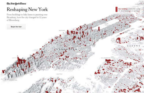
As part of a special series of articles exploring the mayoral legacy of Michael Bloomberg, The New York Times presented a map-based application that told the story of some of his more notable achievements and impact on the city of New York. Telling a story through maps isn’t novel but telling it through a responsive digital environment with clean, crisp graphics, a minimum of words and a narrative that allows the user to explore is an achievement. The New York Times are contemporary masters of digital map-based story-telling.

The application takes the form of a linear tour, opening with a clear statement ‘from buildings to bike lanes to painting over Broadway, how the city changed in 12 years of Bloomberg’. There’s a ‘begin tour’ button yet it doesn’t actually matter where you click to advance the story to the next page. This is a clever trick…no need for people to have to worry about hitting a particular point on the page…the page turns wherever you touch it…much like you can turn the page of a book pretty much anywhere on the page.

The maps include 3D renderings of the city’s buildings….simple grey blocks rather than detailed facades work because the skyline is uniquely familiar. Key buildings in the story are picked out in red – the only other hue used as a focal colour and there are subtle shadows and shading to add depth and structure to the image. It’s a nicely composed illustration with labels added with a semi-transparent knock-out mask as appropriate. Some clicks reveal (rapidly) an aerial photograph that contrasts well with the simple map rendering. These maintain the interest and help to illustrate the facts using real imagery that reinforces the reality. As you move through different topics, different colours are used to match different themes. Red for buildings. orange for rezoning, green for bike lanes. Three colours that we can easily recall when thinking about the topics in the story.

Between stories and scenes, the maps animate smoothly with an almost surreal fuzziness until they stop and come into focus. This is a great trick and allows us to pause while the map gets to where it’s going before the focus draws our attention back.

MapCarte 77/365: PLUTO is Free! by Andrew Hill, 2013

MapCarte77_hill

Click on the image to view online web map

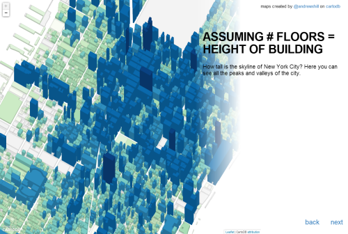
Andrew Hill expertly designs and stitches together a selection of maps that celebrate the release of New York City’s PLUTO dataset in 2013. This is more about celebrating the release of a major dataset than producing a ‘map’ yet the well crafted cartography is what makes the data shine. The PLUTO dataset contains tax lot level data from the NYC Department of Finance Tax Map. It contains land use and geographic data about the city’s five boroughs. Hill cycles through maps that each ask a single, simple question of the data. The map reveals the story of the city and uses multiscale design and user interaction where appropriate.

As you cycle through, the range of maps is well matched to each dataset and illustrated with simple, effective and eye-catching approaches. The collection illustrates how map choice has a major role to play in how we perceive the data. Of course, Hill could have presented most of the maps using standard choropleths but the result would not have been as compelling.

The maps were initially prepared to provide images for projection at a party so the original design needed to be impactful and visually stunning. The high contrast layout goes a long way to helping create a strong aesthetic. They also work as a linear gallery online, highlighting not only the data but high quality cartography, professionally applied in a clean UI.

MapCarte 74/365: Tornado Days by Brenden Heberton, 2013

MapCarte74_heberton

Click the image to view the online map

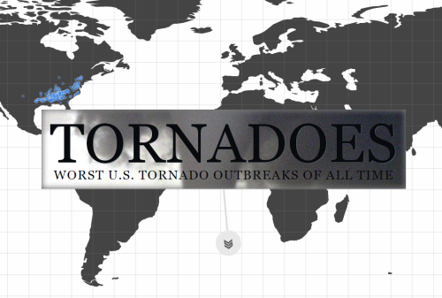
There have been plenty of maps made using NOAA’s historical tornado data but this web map by Brenden Heberton went beyond the map by combining a wide range of multimedia in an innovative way.  Heberton has built a story around the data and used several maps and different media to create a multi-dimensional cartographic product. In some respects, it’s a modern equivalent of a classic National Geographic poster map adorned by fantastic illustrations, inset maps, descriptions, graphs and other visual content. What Heberton achieves here is expertly marshalling modern versions of all these map components into a cohesive whole.

The reader scrolls down to reveal new facts, new maps and a new layout. This heightens the interest and keeps people immersed in the rich story being told. The maps are styled using a bare minimum of linework and labels so they sit comfortably amongst other page detail. The thematic content contrasts by using a bright colour over the relatively grey backgrounds. Video and audio get added to the mix as you work your way through the story but rather than maintaining a consistent template, each new chapter of the story interleaves the components in different ways so sometimes the video becomes the backdrop rather than the inset. Maps as a component of a story…expertly collated into an immersive, interactive web map.

MapCarte 24/365: The Racial Dot Map by Dustin Cable, 2013

MapCarte24_Cable

Click image to view the online web map

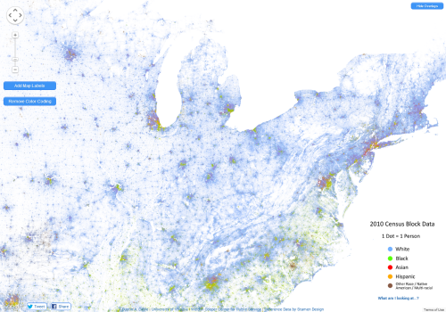
Dot maps have always provided a way of overcoming some of the limitations of the choropleth map for mapping population based data. When constructed correctly, unpopulated places are devoid of symbols so we see the true structure of the populated places through dot density.

Here, Dustin Cable has made good use of the web map as a medium to create a highly detailed map which re-renders at each scale revealing increasing levels of detail. At its most detailed he assigns 1 dot to 1 person. Dots are inevitably placed randomly within the finest census geography available but with a dasymetric technique being deployed at larger scales he creates an accurate view of the racial diversity. Colour is used to differentiate between the main race types and user controls allow you to toggle between a simple monochrome representation to the coloured version which allows you to see structure more clearly in one; and diversity in another.

Cable allows the user to remove the UI controls to create an uncluttered viewing experience and also allows us to toggle basiv topographic detail (roads, place names etc). This is a great way of allowing us to orientate as well as seeing how geography acts to split the racial groups but also provides the flexibility to remove map content to give increased clarity to the data itself. Marrying a highly detailed map with simple display is the winning combination on this map.

MapCarte 23/365: Earth Wind Map by Cameron Beccario, 2013

MapCarte23_Beccario

Click image to view the online web map

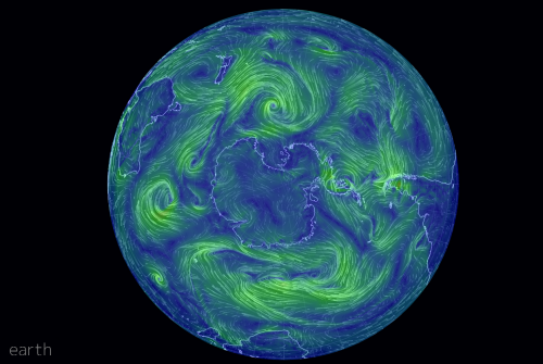
Building upon the original wind map concept, Cameron Beccario has expanded the scope to a global scale.  The near real-time map offers a range of data views including wind, mean sea level pressure and temperature. The animated flowlines are coded using ‘industry standard’ colour schemes (though some are subject to long debates about their effectiveness). The map is mesmerising but really comes into its own with simple and intuitive controls to vary a wide range of parameters. You can modify the height of the wind layers you’re viewing, the time (to explore historical conditions) and also the projection. This provides a fascinating way to morph the global view into different shapes that reveal alternative patterns visible in the data. Controls are hidden from the main view to reduce clutter and Beccario includes full references and discussion of the product. A work of art and a strong aesthetic built upon solid cartography.

MapCarte 17/365: Bomb Sight by The Bomb Sight Project, 2012

MapCarte17_BombSight

Click image to view the online web map

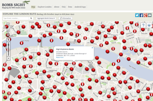
This web map presents the London WWII bomb census between 7.10.1940 and 6.6.1941. It’s a terrific effort that catalogues anti-invasions sites, bomb types and adding an overlay of the bomb maps themselves.  The map is the result of a year’s worth of work which hints at the effort needed to build an interactive web map with good quality content.

Zoomed out to a scale of 1:72,000 or smaller the map of London becomes awash with red symbols which ordinarily would be considered the antithesis of how to depict multiple overlaying features. Yet here, the result is to visually demonstrate the extent of the blitz and it’s visual impact is stunning. Zooming to a slightly larger scale and you can pick out individual strafing attacks and the impact of lines of bombs. When you zoom in further the symbols begin to separate and change into ones which portray individual bombs that can be interrogated.

Filters, graphs, search, statistics and ancillary information make this a well produced piece of work and if you view on a mobile device there’s a great augmented reality version that means you can view through your mobile phones camera with an overlay of bomb details as you wander around London.

Great example of a portal to historical information through a web map.