MapCarte 355/365: Townscapes by Gerhard Richter, 1968-1970

MapCarte355_richter2
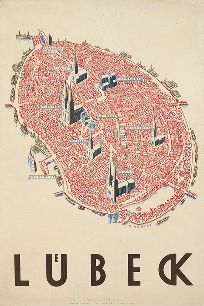
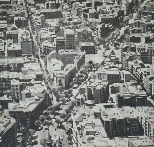
Back to the use of maps as a framework for artistic expression with Richter’s Townscapes. Here, artist Richter has created a range of paintings that are based on oblique views of different towns and cities. He approaches each work from a different perspective and experiments with scale that mimics the approach a cartographer takes in determining how much to generalize a feature.

MapCarte355_richter1
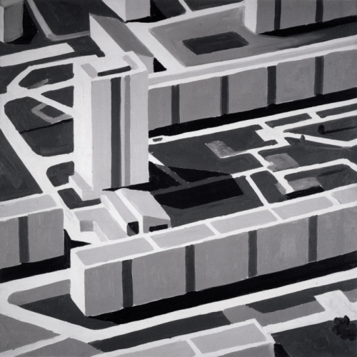
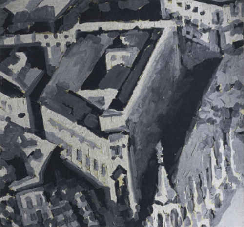
For some paintings, the scale is smaller and the view is from a higher elevation and so the buildings take on a rather abstract form, perhaps just the general shape and the inclusion of major features. Examples that are at a larger scale inevitably include more of the building’s detail. That said, the large scale paintings are perhaps less easy to recognise due to the larger size of shapes. Because the paintings are all in shades of grey we tend to see large indistinct blocks of grey which are not necessarily immediately seen as buildings. Of course, standing back from the paintings gives us a different perspective, the image occupies a smaller form and we tend to see the images more clearly. At distance they begin to look like monochrome oblique aerial photographs.

MapCarte355_richter3Richter also experiments with different brushstrokes and textures, going from very fluid approaches to strongly geometric. As a collection, they give us a fascinating way to reflect on the urban form and, perhaps, show us a little of the artistry in how we approach the task of generalization as part of cartographic design. Scale, form, texture and viewing distance all strongly modify the viewing experience. These are key processes in understanding cartographic design.

You can view more of Richter’s Townscapes at his web site here.

MapCarte 230/365: Lübeck by Alfred Mahlau, 1934

MapCarte230_lubeck

Maps can be used as powerful promotional pieces. When an artist or illustrator with a very unique aesthetic uses maps as part of their work we often see the map design take on strong elements of their artistic leaning. So it is the case with German painter and graphic artist Alfred Mahlau. Much of his work was in graphic design for advertising, textile patterns, sets and even stained glass windows.

In general, Mahlau’s work was highly illustrative with minimal lines and strong blocks of colour. He was known for his lettering and his particularly clever way of dealing with umlauts as in this poster. Mahlau produced this poster, which has been reproduced in different colours and formats, as a promotional piece for the town of Lübeck in northern Germany which largely sits on an island in the River Trave and acts as one of Germany’s major ports. The island contains the old part of the city and as such has a number of historic buildings amongst a dense network of narrow streets that share the same red tile roofing and architecture.

Mahlau captured the essence of Lübeck in his perspective view. The many buildings are drawn in a similar style and the cathedrals and churches are seen rising above. It’s a simplified drawing but retains something of the character and charm of this small island settlement. The boats surrounding the island give away the fact it’s situated on water yet he cleverly uses subtle shadows to emphasise this aspect.

This view of Lübeck does way more than any aerial photograph or planimetric map could. It gives the town character and evokes a sense of place merely through the illustrative form.

MapCarte 228/365: Milano Congressi (MiCo) by Matteo Riva, 2013

MapCarte228_milano


Distilling a complex city like Milan into a map to support a 3-day trip to the city by a tourist unfamiliar with the area means additional constraints for the cartographic processes. The processes of selection and omission become vital, perhaps moreso than for a general purpose map which has the luxury of providing the scope to include more. Here, if you include more than can be reasonably navigated in three days you risk the user becoming frustrated, or perhaps trying to achieve too much.

Matteo Riva’s work in graphic design and illustration sees him use simple geometric shapes and straight lines in much of his work. He uses a lot of saturated block colours and a lot of contrast. Typographic components are key to the overall design and play an important role. All of these facets are seen in his map of Milan. Clean, simple geometries and vivid use of colour creates a collage of the city. Key places are marked but the white space (grey given the background colour) shows how much is missing. The benefit is it gives the selected places space to breath on the map. None of the graphics is competing for space.

At a glance it’s obvious what are buildings or parks or roads or the subway. Underground stations and hotels feature prominently because they are the main hubs people traverse between and through.

The design supports the map’s purpose well and the unconventional graphic approach lends a certain character to the map that shows that different isn’t necessarily a bad thing in cartography.

You can see more of Riva’s illustrations and maps on his web site here.

MapCarte228_milano_detail

MapCarte 224/365: Bangkok by Nancy Chandler, 1974-present

MapCarte224_bangkok2


Tourist guides are essential travel companions to help us navigate the unfamiliar.  We trust them implicitly to give us sage advice, to identify the key places to visit in an often constrained amount of time and to present a city or region in a way that supports our quest for discovery. In many ways they represent the view of a place that we perceive rather than the place itself because it’s such a strong filter. It’s also a difficult job for a cartographer to determine what to include or exclude because they’re effectively making choices that thousands and more will follow blindly.

The best maps and guides become well known for their accuracy and utility and the more a product is revered the more we trust it. This applies to Nancy Chandler’s maps of Bangkok. They are unique. They don’t necessarily give you the top attractions but that is entirely the point. Since the first edition in 1974 right up to the current 26th edition they provide a rich window on the quirky and unique places to eat, drink and visit. And they do it in style with a fantastic colour scheme and hand drawn approach. The colours give the map a unique aesthetic that somehow captures the hustle and bustle of Bangkok. They make the map sing and dance and give the reader a sense of colour, vibrancy and excitement. In support of a product for tourists this is great cartography.


MapCarte224_bangkok1

The double-sided map splits Bangkok into sections and the central shopping areas. The information is detailed on all sorts of museums, restaurants, hotels, galleries, temples and many other features. There’s copious text which acts to annotate locations. Without the text there would be a great deal of white space but that simply evidences the judicious editing and careful selection of the content. This map highlights a very personal geography but one that many people identify with. The map has become a staple companion for countless people who visit and has become part of the excitement of the city itself.

Making a tourist map that becomes part of the enjoyment of the tourist experience itself is an achievement. This map certainly holds a special place for visitors to Bangkok.

You can see more of Chandler’s work and other maps at her web site here.

MapCarte 200/365: Breathing City by Joey Cherdarchuk, 2014

Making maps is all about taking a dataset and making something meaningful from it – something that communicates a finding or a result, or something that speaks to an issue or an emotion. In our democratised mapping world, more people than ever are taking interesting datasets and attempting to produce something map-like. All too often the results leave us frustrated but every now and then a perfect storm creates something magical.

Using a detailed dataset of how Manhattan’s population occupies space during their at home and at work phases of the day, Joey Cherdarchuk could have just plotted it using a standard technique. That wasn’t enough. Using the shape of Manhattan as an inspiration he envisaged a lung…a breathing lung that inhaled and exhaled according to the time of day. The data is animated as the map remains static so we get a breathing city and a breathing map. Adding a simple line graph that mimics a cardiograph monitor simply tops off the combination of visuals, metaphor and thinking that makes this map something special. Using a black background and simple text components frames the work well.

The data is unremarkable…but the map produced makes it intriguing and brings it to life.

Details of how Cherdarchuk constructed it are on his blog here.


MapCarte 176/365: Melbourne after dark by Cartographics International, 1979

MapCarte176_melbourne

Maps tend to be designed and produced for what might be termed normal circumstance viewing. By that, we mean that you’d expect the map to be viewed in reasonable light, in fairly benign circumstances and so on. Of course, that isn’t always the case but how many times do we see maps designed to deal specifically with unique viewing conditions?

The map shows what was then open ‘After Dark’ in Melbourne in 1979.  It was printed to look like Melbourne at night time (then) with the amber overhead street lighting. Consequently, the map was designed to be viewed at night with virtually no natural light and with only poor street lighting. This renders the normal colouring we might apply to a map rather pointless so an entirely different design is required.

Cartographics International was established by Chris Crook, Maris Lakis and John Robertson.  This map illustrates their unique take on cartographic design for viewing under street lighting. The colours are highly saturated and contain high contrast with surrounding detail. They are presented on a black background which minimises glare and the almost neon approach is highly effective. 

MapCarte176_melbourne_detailIt’s not just the colour that is different – symbology and linework is quite sparse so as not to create a cluttered map difficult to disentangle visually. Bold lines are used throughout to help legibility. Many labels are printed against a white mask to give maximum contrast.

Maps do not have to look the same – we always consider our users but this map demonstrates how to really accommodate viewing conditions for those that would use the map.