MapCarte 172/365: Gapminder by Ola Rosling, Anna Rosling Rönnlund and Hans Rosling , 2005-

MapCarte172_gapminder
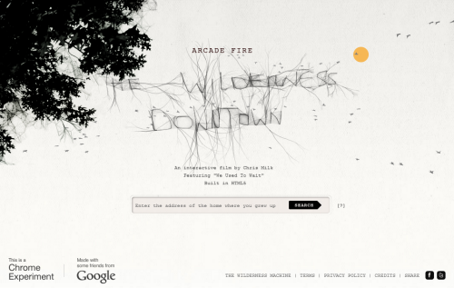
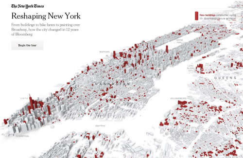
Map’s do not have to be conventional to resonate but more often than not a map is likely to be something people gravitate towards. Can the same be said for graphs? Perhaps the sight of a scattergraph doesn’t fill many with excitement yet graphs (either alone or in combination with maps) are powerful forms of communication.

Graphs have been used successfully to highlight issues and facts for centuries. In 2005, the Gapminder FOundation was formed and began to gain momentum in bringing attention to global inequalities between nations through simple explanations and clear graphical illustrations. It also helped that statistician Hans Rosling was at the helm to bring his captivating presentational abilities to bear on the work.

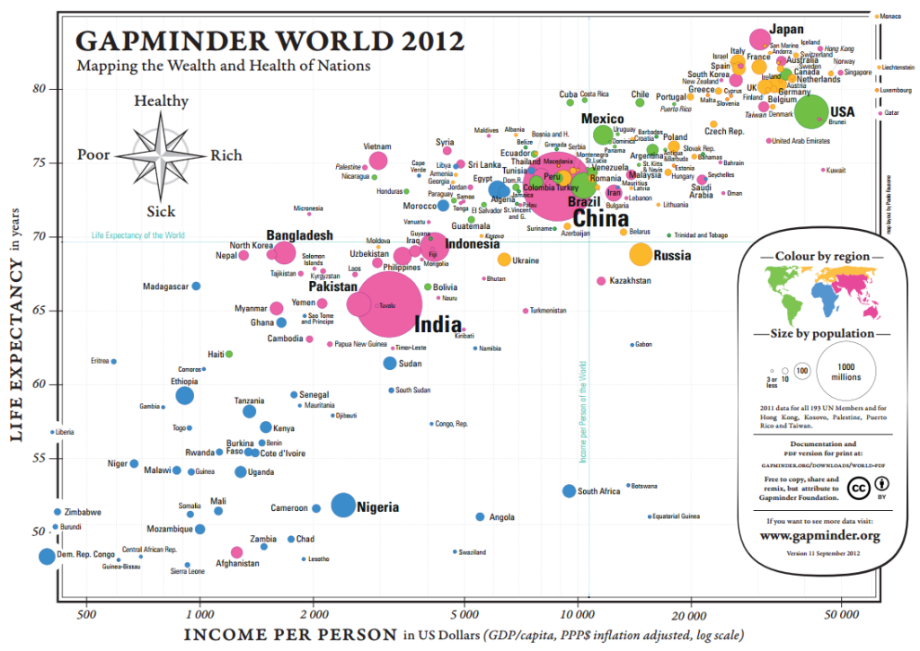
Gapminder built the Trendalyzer software (subsequently bought by Google) and used it to create Gapminder World, an interactive web application that displays development statistics for all countries. The static map displayed above is a scatter graph comparing life expectancy with income. Countries are symbolised by size (population) and coloured to show their continent. An interactive version can be seen on the web site here.

Hans Rosling’s famous TED talk and various performances have done much to shed light on global disparities. The use of simple maps and graphs has been a cornerstone of bringing this information to the wider public. Rosling himself shares a fantastic quote in the following clip from the BBC’s Joy of Stats: “that having the data is not enough. I have to show it in ways that people both enjoy and understand”. This is the art of graphicacy whether scattergraphs or maps.

By animating, adding a subtle soundtrack, narrating and walking through the same graph as displayed above Rosling teaches us. The geography and the map comes alive. He shows the overview and then picks out key detail. The graph shows us but by adding to it, Rosling forces us to share the understanding.

See the Gapminder web site here which contains a plethora of maps, graphs, videos and data that looks in detail at global inequalities.

MapCarte 166/365: The Wilderness Downtown by Chris Milk, 2010

MapCarte166_milk


Click the image to launch the app. Use Google Chrome.

As technology develops new ways of working then inevitably art has a new avenue to pursue. It also goes that cartography experiments as people use maps as a canvas for various endeavours.

The Wilderness Downtown is an interactive music video/movie featuring We used to wait by Arcade Fire and built as a way of experimenting with Google Chrome’s interface.  Constructed in collaboration with Google, it’s without doubt one of the most innovative ways in which maps feature in a short film.  Many of the components of the movie are based on the Google Maps suite; the viewer types in an address before launching the movie which then launches multiple inter-related Chrome windows to create a map-based journey through your neighbourhood that accompanies the music.

The main hooded and mysterious character is seen running through the neighbourhood the viewer specified, across satellite images and amidst rotating Street Views.  Animated components (flying birds, exploding trees) add to each window to use the maps in innovative ways as you become the eyes of the runner.  The concept of allowing people to fly through their own neighbourhoods and stop and look at their own house as part of a music video is truly unique and this work spawned many derivatives.

Linking maps to music, animation and user-controls allows them to play a central character in a narrative. This example supports music. Innovation such as this is really only limited by the imagination.

MapCarte 157/365: Histomap revisited by Santiago Ortiz, 2013

MapCarte157_histomapView the interactive histomap by clicking the image above

Maps don’t have to be made to look the same. Often, very abstract graphics can be equally deserving of the title ‘map’ even though they may not look anything like our conventional view of a map. In 1931, John B. Sparks produced what he referred to as a histomap which was a detailed diagrammatic layout and explanation of history with a focus on the relative power of contemporary states, nations and empires. It’s a pictorial map that plots four thousand years of world history linearly and which shows us how different countries came to be. The map begins at 2000 B.C. and identifies different ‘people’ loosely based on their geographical location in the world. Time passes as you read from top to bottom over 158cm and these peoples form identifiable groups and eventually, countries.

The original can be viewed on David Rumsey’s Map Collection site here and is an excellent information graphic in its own right. It has twin timelines on the left and the right to aid rapid reading across and the sans serif typeface allows a copious amount of detail to be included. Colours are simple and bold and allow the ebb and flow of the relative proportions of sub-groups to be seen through time. Representing time on any map poses challenges because to be really useful we need to see comparisons between and across different periods. Sparks was successful to an extent because he chose simply to plot everything on one lengthy document but there’s no denying it’s cumbersome.

Step forward 80 or so years and technology offers a new way to view the information. Rather than completely re-imagine the original, Santiago Ortiz has taken it and amplified it by creating a scrolling magnifier. The reader’s focus remains central to the image and simple mouse movements up and down (no clicking or dragging!) make the diagram scroll. The entire diagram fits within the window on screen and simply warps to unfurl as you explore. When you do click, you open a second tab that links to the Wikipedia article for that century. The map, then, not only gives information directly through the original image but adds to it through a link to additional resources. It’s an organised graphical map portal to world history.

There’s often very little that can be done to improve upon classic information design yet Ortiz brings a new approach, user interaction and aesthetic to the work. He enriches it and makes it attractive to modern eyes using modern viewing and data linkage mechanisms.

MapCarte 152/365: What is fracking? by National Geographic, 2013

MapCarte152_fracking1

National Geographic have long been associated with graphical excellence for their maps, their pull-out posters and the graphics that adorn their print magazine. To this staple diet of work we can now add animated mapping in short-form videos that allow their graphic designers to make use of additional mechanisms to tell a story.

The March 2013 edition of the National Geographic Magazine (print and digital) focused on America’s search for oil from their own reserves and, particularly, on the controversial extraction method fracking that taps in to hard-to-reach reserves. The story requires multiple scales and graphics to fully illustrate the science and geography of the technique and the work produced in both print and digital form is a tour de force in research, design, graphics, video and story telling. Each is excellent in their own right but as a collection weaves them expertly into a cohesive story in the familiar National Geographic Style.

The work focuses on the new boom region of North Dakota with a map that shows over 3,000 existing wells as dots and their associated pipelines in grey that are shown across the surface giving a sense of the chaos under the surface that we cannot see. The use of the Missouri River as a central anchor point contrasts the natural beauty of the rural landscape with the massive human transformation. The next graphic takes us to an individual well – a real one that gives the reader a sense that this is real rather than simply a diagrammatic indication. Making the graphic real and showing the actual fracking activity mapped from seismic data allows us to imagine this process some 3,000 time…or 8,000 when projected to the whole state…and 50,000 times if we are to believe the projected number of wells.

MapCarte152_fracking2

Then we get to the video. It video begins with a wide shot of the United States with generalised oil producing regions we zoom in to North Dakota with a muted topographic map for context which acts as a base for oil wells that fade in to the scene. As we zoom in further detail is added that gives the strong impression of just how many wells there are before the map fades out and the map tilts and rotates to leave a 3D view of a collection of wells that then zooms to a single well. The zoom effect from continental to individual well is dramatic and tells its own story.

The subsequent 3D animated model illustrates the fracking process itself which is well presented with clear, informative design. The video ends by retracing the route in summary form back out to the continental US. An accompanying commentary tells us the story as we proceed through the video giving us clear links between what we are seeing and what is occurring.

This is a high quality, well designed and produced piece of work that integrates maps with animated diagrams, mixes 2D and 3D, print and animation to good effect and uses labels sparingly and for effect. It’s educational and shows National Geographic extending their graphical excellence and story telling into new territory.

MapCarte 97/365: Lightning Strikes vs Lottery Wins by 422 South, 2014

MapCarte97_422south

Click the image to see the animation on Vimeo

Beautifully crafted cinematic quality visualisations tend to be used to map data that flows. Typically, we see movement of cars, planes, ships, migratory patterns of animals and the development of spatial datasets (e.g. OpenStreetmap) using these techniques. The medium is well suited to flow data and allows us to do what static cartography cannot – actually show the way in which goods, commodities, ideas and a wide range of phenomena traverse space.

Here though, 422 South have taken the same approach and applied it to events that occur at a single point is space but at different times. At first sight a map that shows the location of lottery wins alongside the location of lightning strikes seems obscure. Of course, one bears no relationship with the other and there is very little reason for them to be mapped together. The point, though, is to contrast good luck (lottery wins) against bad luck (lightning strikes). A typical approach for this sort of data would be to just map all the locations at once but instead, the animated approach allows the temporal aspect to be represented.

Lottery wins are displayed as proportional symbols with the circle size relative to the size of the win. The symbols are outlines with a hollow fill so they overlap neatly without obscuring information as events are added to the map cumulatively. Lightning strikes do not persist on the map – they appear as flashes. The life-changing persistence of one event and the fleeting impact of another is well matched by the mapped representation that reflects the character of the events. The satellite image of The Netherlands sits well across the muted basemap and transparency and camera position are used well during the animation.

Animation works well and shows us the regular pulse of lottery wins juxtaposed with the rather more random incidence and prevalence of lightning strikes. Overall, a novel way of animating data that does not in itself move but one wonders if at any point lightning struck twice and resulted in a nearby lottery win!

MapCarte 92/365: Reshaping New York by The New York Times, 2013

MapCarte92_newyorktimes

Click the image to view the online map

As part of a special series of articles exploring the mayoral legacy of Michael Bloomberg, The New York Times presented a map-based application that told the story of some of his more notable achievements and impact on the city of New York. Telling a story through maps isn’t novel but telling it through a responsive digital environment with clean, crisp graphics, a minimum of words and a narrative that allows the user to explore is an achievement. The New York Times are contemporary masters of digital map-based story-telling.

The application takes the form of a linear tour, opening with a clear statement ‘from buildings to bike lanes to painting over Broadway, how the city changed in 12 years of Bloomberg’. There’s a ‘begin tour’ button yet it doesn’t actually matter where you click to advance the story to the next page. This is a clever trick…no need for people to have to worry about hitting a particular point on the page…the page turns wherever you touch it…much like you can turn the page of a book pretty much anywhere on the page.

The maps include 3D renderings of the city’s buildings….simple grey blocks rather than detailed facades work because the skyline is uniquely familiar. Key buildings in the story are picked out in red – the only other hue used as a focal colour and there are subtle shadows and shading to add depth and structure to the image. It’s a nicely composed illustration with labels added with a semi-transparent knock-out mask as appropriate. Some clicks reveal (rapidly) an aerial photograph that contrasts well with the simple map rendering. These maintain the interest and help to illustrate the facts using real imagery that reinforces the reality. As you move through different topics, different colours are used to match different themes. Red for buildings. orange for rezoning, green for bike lanes. Three colours that we can easily recall when thinking about the topics in the story.

Between stories and scenes, the maps animate smoothly with an almost surreal fuzziness until they stop and come into focus. This is a great trick and allows us to pause while the map gets to where it’s going before the focus draws our attention back.