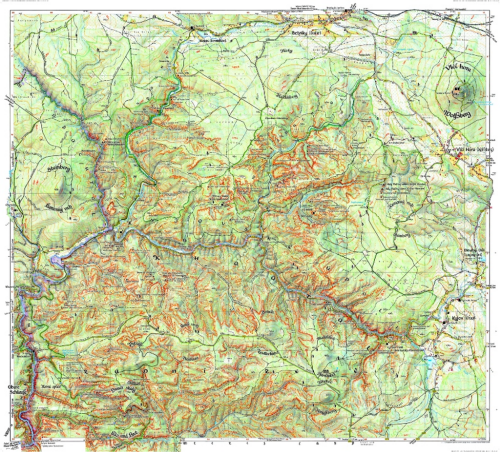
MapCarte 312/365: Khaatal 1:10.000 by Rolf Böhm, 2012

MapCarte312_bohmSpecial purpose maps demand special purpose design in order that the unique characteristics are brought to the fore. Maps that support hiking and orienteering need a very detailed visual description of the landscapeand terrain that goes beyond a standard topographic map. For instance, while contours are prominent on most topographic maps they tend to dominate rocky outcrops and small cliff-lines. Of course, knowing precisely where these dangerous areas are is critical to avoid a serious mistake. This map, designed by Rolf Böhm brings a beautiful aesthetic to a map to support outdoor pursuits.

The map of Khaatal covers a popular hiking and climbing area south-east of Dresden in Saxony, Germany. Böhm, a passionate cartographer and hiker, depicts the unique natural character of the rock formations along the Elbe river with clarity.  His process of making the map illustrates the care and attention to detail required for the final product. All in all the map is drawn 3 times – first of all there is the work in the terrain taking notes and making sketches, then the map is fine-drawn in hand at the desk on a white sheet of paper and finally it is finished using a computer.

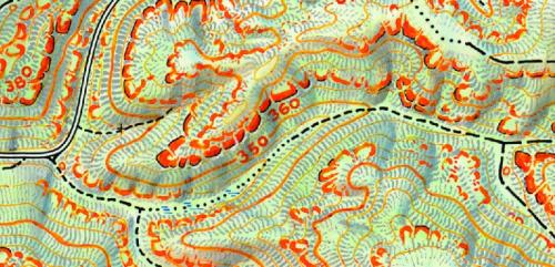
MapCarte312_bohm_detail

The result is a map that attracts users with its artistic depiction of the unique landscape of Saxon Switzerland. The lively representation of the terrain consists not only of contour lines and hand-drawn hillshading (applied using watercolours) but is accompanied by an artistic depiction of the sandstone pinnacles which are classified by their height. Besides rock hachures indicate the direction and steepness of the rock formations…and all in a rich red that allows them to stand out and contrast with other map detail.

The choice of type style for the map lettering supports the impression of a traditional hand-drawn map. Nevertheless, the map provides high accuracy and rich up-to-date information for hikers and climbers.

You can see more of the map and the detailed process of its construction at Böhm’s web site here.

 

MapCarte 264/365: Plan oblique relief Europe by Jonas Buddeberg, Bernhard Jenny & Johannes Liem, 2014

MapCarte264_planoblique


Click the image to view the web map

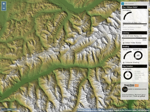
Representation of terrain is as old as cartography itself and there remain numerous ways of creating interesting effects. Plan oblique can be traced back to the work of Xaver Imfeld in 1887 (featured in MapCarte 182). It’s an interesting technique because it uses a planimetric base (thus preserving scale in all directions across the entire map) yet represents terrain in apparent 3D. The trick is that the terrain is effectively stretched in the north/south axis such that the base of the terrain remains static and the peaks move…stretching everything in between. The technique overcomes some of the limitations we inevitably get with panoramic maps where foreshortening and occlusions are potentially problematic.

There are plenty of ways one can create a plan oblique effect using Digital Elevation Models (unless you have a preference for the hand-drawn approach like Imfeld) but the beauty of the map application developed by Buddeberg et al. is it gives the user all the tools to modify the variables that control the appearance on the fly. Azimith and inclination are basic variables to allow the creation of hillshades and 3D relief. Additionally, users can modify hyposmetric tints, the rotation and, crucially, the inclination of the viewing angle that modifies the plan oblique effect. The user controls are intuitive; the effect impressive; and the way in which the application reveals the nuance and beauty of a plan oblique representation unparalleled.

MapCarte 185/365: Mt. Hood by Kelly Abplanalp, 2013

MapCarte185_hood


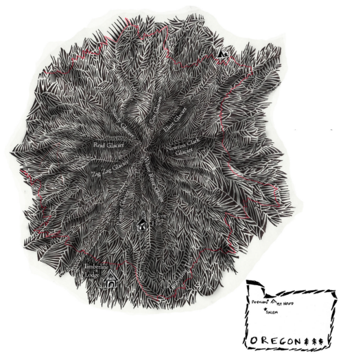
Hachuring has been a very successful technique for the depiction of relief over the centuries yet it suffers from the problem that it requires a lot of space on the map. It can have the effect of causing visual clutter and a very dark image despite it’s excellent relief portrayal.

If you base your entire map on a modified hachure then you will really limit your space for any other detail but this can result  in some surprising results. Kelly Abplanalp has used a heavy hachure effect with large strokes for her map of Mt Hood. The subject lends itself to the technique due to the overall shape and the variation in terrain across relatively short distances. There’s an almost feathered effect created by the different densities of stroke and the major terrain changes can be easily identified.

This is more art than a map though it creates a strong aesthetic and a very bold impression. It demonstrates how you can take a cartographic technique and explore its potential for artistic interpretation. The inset map is a nice touch, being designed using similar stroke patterns and a brevity of labelling and other contextual detail ensures the main map image is clear and visually imposing. The red linework adds a pleasing contrast and accent colour.


MapCarte 48/365: Colorado ski country by Hal Shelton, 1965

MapCarte48_shelton

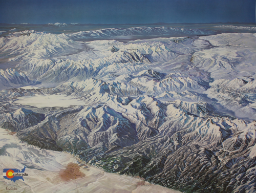
Hal Shelton’s work for U.S. Geological Survey and Jeppeson Co. in the mid 1900s resulted in numerous innovative and highly realistic works, predominantly in terrain representation. His hand drawn and painted maps depicted relief as detailed satellite images before the technology allowed them to be digitally produced.

Much of his work was in the creation of planimetric terrain but here, Shelton took a landscape panorama approach to mapping the Rocky Mountains in Colorado as a way to showcase and advertise the location of the numerous ski resorts. The work is highly detailed and applies a natural-colour style palette to give the appearance of a birds-eye representation. The map is oriented so the viewer sees across the plain (Denver in the lower left) and across the front range that adds to the sense of drama of the mountains and what lies beyond. The brownish plains give way to green foothills and finally the white snow-covered terrain. Labels are added unobtrusively just for the ski areas.

MapCarte 42/365: Mount Everest by the National Geographic Society, 1988

MapCarte42_natgeo

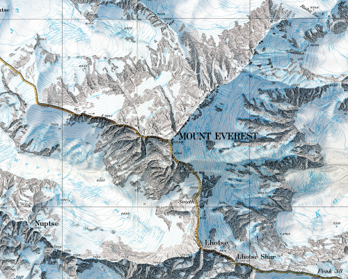
Mount Everest has been mapped extensively using a plethora of relief representations.  Possibly the most frequently cited example of excellence in design is by Eduard Imhof in the 1960s for his impressive use of colour. Here, though, Bradford Washburn used Swissair Survey aerial photos and Space Shuttle infrared photos to plot Mount Everest at 1:50,000 before applying his beautifully drawn representation.

Possibly the last example of hand drawn Swiss relief representation makes clear the most detailed and accurate map ever made of Mount Everest.  The digital age has yet to provide ways of matching such exquisite artistry.  The peaks, glaciers, rocks and hydrography are particularly clear with scree slopes depicted in astonishing detail.  Blue contours sit well in the overall design and take on the appearance of layers of ice.  The typography is beautifully set and the map has a soft, photo-realistic feel that adds visual impact.  The border separating China and India is so subtle it looks like it is actually painted on the ridgelines.  A masterpiece of accurate planimetric terrain representation showing natural beauty and scientific information in the most vivid possible way.