By Damien Demaj and Kenneth Field
Here we present the results of a non-scientific survey of cartographic experts drawn from the academic and professional world (originally published as two papers in The Cartographic Journal Volume 49, Issue 1). The survey asked participants to present their top ten most expertly designed maps from throughout history. Here, we share the most frequently cited maps that emerged from that survey and describe why they exhibit design excellence. By showing map-makers a range of high quality cartographic work we aim to provide exemplars that demonstrate how design affects a map and expertly marries from with function. The techniques on display are well executed and create products that are both well suited to their purpose and have an aesthetic quality that invites people to take notice. They are all, in their own ways, beautiful examples of the art of design in cartography. We have deliberately avoided a ‘top ten’ approach and, instead, offer three examples in a range of map categories. The examples are neither definitive, nor exhaustive and should act as a starting point to explore design in cartography from those who have managed to set the bar high.
Artistic maps
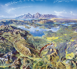
Figure 1. Yellowstone National Park by Heinrich Berann, part of a set published by the US National Parks Service between 1986 and 1995
Heinrich Berann’s work is predominantly in the panoramic style of mapping. As a painter, he used his artistic talent to invent a new way of painting landscapes for the purposes of tourist mapping. Berann’s work is meticulous in its attention to detail, uses highly saturated colours and a unique curved projection that mimics what might be seen (though exaggerated) from an aeroplane. The foreground of the map is almost planimetric which curves across away from the point of view to a horizon depicting the mountains in profile. The map is immediately pleasing to the eye and creates a unique sense of place that, for tourism mapping, is well suited to the need to attract visitors. Berann also developed a trademark way of rendering cloudscapes which again, represent the sky in a way that is unlikely to be seen in the natural environment. This map of Yellowstone national park was one of four he prepared for the United States Park Service and inspired numerous others to work in a similar style (Troyer, 2002).
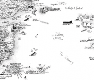 Figure 2. The Island by Stephen Walter published by TAG Fine Arts, 2008
The Island is another satirical map which takes the view of London, UK being an isolated island floating somewhere amidst its various commuter towns (Walter, 2008). It appears independent from the rest of the country, emphasized by the border of Greater London being depicted as a coastline. Walter’s map is entirely hand drawn using pictorial sketches and text and instead of the known landmarks you might find on a traditional topographic map, he fills the space with a vast array of local information based on his personal knowledge, feelings and impressions of a place. He details the interesting and mundane and the map becomes a social commentary that invites others to create an emotional bond with the work through a shared lens. Walter uses a large format (101 x 153cm) to give himself enough space to contain the intricate detail and builds visual hierarchy in the map through the density of ink. Central London, for instance, contains reverse white type on a black shaded background to emphasize the density of the centre of the city.
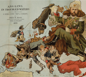
Figure 3. Angling in Troubled Waters: a Serio-Comic map of Europe by Fred W Rose published by GW Bacon, 1899
Rose’s pictorial illustration depicts the threat posed to British interests by Russian territorial ambitions during the Balkan crisis in late Imperial Europe. The use of maps in this way feature heavily in cartoons and other satirical works where familiar shapes of countries are coupled with images of people or events to make a geopolitical point. Rose makes good use of the fishing metaphor to illustrate which countries are fishing and what their catches (colonial possessions) are. It’s a highly illustrative and engaging form that draws the eye in to explore the interplay between figures and parts of the map. As a means of stirring debate and controversy, these types of map are a particularly provocative way of capturing the imagination. The use of map shapes and images as a basis for artistic impression is a good approach to communicate such messages since the outlines of countries are familiar shapes and artists such as Rose successfully play on the familiarity to evoke a response (BibliOdyssey, 2009).
Depicting Relief
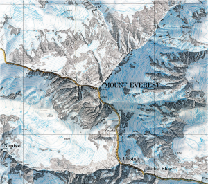
Figure 4. Mount Everest published by the National Geographic Society, 1988
Mount Everest has been mapped extensively using a plethora of relief representations. Possibly the most frequently cited example of excellence in design is by Eduard Imhof (1962) for his impressive use of colour. Here, though, Bradford Washburn used Swissair Survey aerial photos and Space Shuttle infrared photos to plot Mount Everest at 1:50,000 (Washburn, 1988). Possibly the last example of hand drawn Swiss relief representation makes clear the most detailed and accurate map ever made of Mount Everest. The digital age has yet to provide ways of matching such exquisite artistry. The peaks, glaciers, rocks and hydrography are particularly clear with scree slopes depicted in astonishing detail. Blue contours sit well in the overall design and take on the appearance of layers of ice. The typography is beautifully set and the map has a soft, photo-realistic feel that adds visual impact. The border separating China and India is so subtle it looks like it is actually painted on the ridgelines. A masterpiece of terrain representation showing natural beauty and scientific information in the most vivid possible way (National Geographic, 2012).
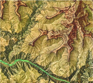
Figure 5. The Heart of the Grand Canyon published by the National Geographic Society, 1978
Bradford and Barbara Washburn were mountaineers, explorers and cartographers. During an impressive career they were strongly supported by the National Geographic Society and many of Bradford Washburn’s maps are unrivalled in the realm of mountain cartography. It took seven years and numerous skilled individuals to survey and map the Grand Canyon at 1:24,000 (Garrett, 1978). Washburn’s original maps were combined by Lockwood Mapping, cliff-drawing was by Rudi Dauwalder and Alois Flury in Switzerland and relief-shading crafted by Tibor Toth at National Geographic. Browns bear similarity with natural wood and textures help immerse readers in the landscape. The color transition of the landscape from the vivid green plateaus to the ocher red canyon arms to the deep brown-grey valleys and turquoise waters creates a stunning contrast. At such a scale, Washburn was able to represent the Canyon in a way never before seen and as a large format poster the map remains a classic National Geographic product for which the Washburns received the Alexander Graham Bell Medal for “unique and notable contributions to geography and cartography.” (National Geographic, 2012).
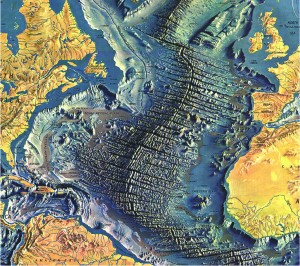
Figure 6. Atlantic Ocean Floor by Heinrich Berann, 1977
In 1967 Berann painted the first in a series of plan oblique physiographic maps of the ocean floor for Marie Tharp and Bruce Heezan and their collaboration culminated in the 1977 World Ocean Floor map. The spectacular 1977 map revolutionized the theories of plate tectonics and continental drift as well as demonstrating the plan oblique technique of relief representation effectively. Berann skillfully combined blue-greys to create a topologicallly accurate, though hugely exaggerated, picture of the ocean floor that leads readers to want to explore. The Mid-Atlantic Ridge and fracture zones appear so life-like with a rippling effect and intricate detail that it draws your eye in and captures your attention. This creates a strong figural component positioned central to the map page that suggests the page (and fracture zone itself) splitting down the middle. The yellow land and deep grey-blue ocean floor provides a strong contrast between land, shoreline and oceans (Troyer, 2002).
Geological mapping
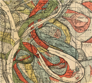
Figure 7. Alluvial map of the Lower Mississippi Valley by Harold N. Fisk, 1944
Improving the navigability of the Mississippi River has been ongoing for decades due to the constantly changing morphology. In 1941, the Mississippi River Commission appointed Harold Fisk to undertake a geological survey of the Lower Mississippi Valley. His detailed and exhaustive report contained numerous maps that illustrated the historical courses of the river, colour coded for different ages of point bar migration, chute cut-offs, and avulsions. As a collection they succinctly present the complicated story of channel evolution of the river and are archived by the US Army Corps of Engineers (2004). Rather than attempting to fit all detail on one map, Fisk let the geography drive the size and scale necessary to show detail clearly. The maps exhibit a perfect blend of neutral basemap to provide a context for the coloured detail of the river morphology though almost every colour has a percentage of black to allow it to tone harmoniously with the grey background. The organic historical stream flow patterns make an intriguing visual and despite the fluidity of the mapped phenomena the maps appear very structured.
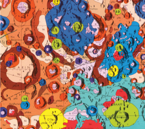
Figure 8. Geologic map of the central far side of the Moon by Desiree E. Stuart-Alexander, 1978
Prepared for the National Aeronautics and Space Administration by U.S. Department of the Interior and U.S. Geological Survey as part of the Geologic Atlas of the Moon, 1:5,000,000, this map was the first of its kind. It was compiled from NASA Lunar Orbiter and Apollo photographs and Soviet Zond photographs as well as geochemical and geophysical data obtained from orbiting spacecraft to show the detailed geological character of the Moon in glorious detail. The map illustrates the topography as a technicolour mosaic that is almost Jackson Pollock-esque in design. The engaging palette of colours immediately attracts interest in the map which accentuates the strange form of the Lunar landscape. What might appear to be a small design element, the thin black line outlining each feature helps to accentuate the image and delineate one feature from another as distinct forms in contrast to the monotonous appearance of the real landscape. The map is in two versions, one that includes geological notation and grids and a version without (Stuart-Alexander, 1978a, 1978b).
Figure 9. Geological Map of London and its Environs by R.W. Mylne, 1871
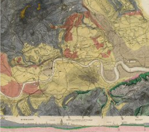
First published in 1856 in a period of great change in the understanding of public health and disease in cities, this was an important map in its day. Robert Mylne was a Civil Engineer and Architect and knew that a detailed geological map was essential for informing major public works such as improved water supply and sewerage systems for London. The original version contained only contours to show differences in elevation and though proposals to modernise the sewage system were neglected at the time due to a lack of funds, the Great Stink of 1858 persuaded Parliament of the urgency of the problem. The map informed the design of an extensive underground sewerage system that drained downstream of the centre of population. By 1871 the engraved map had been hand coloured to show the underlying geological structure and informed the construction of deep artesian wells and bore holes to supply the city with clean water. The combination of plan view and cross-section help to tell the story of London’s topography and geology.
Mapping the Z dimension
Figure 10. View and Map of New York City by Herman Bollmann, 1962
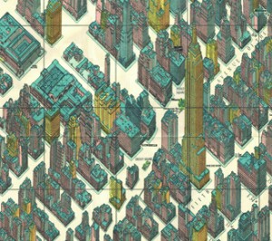
Published for the 1964 New York World’s Fair, Bollman’s map maintains scale equally throughout by an axonometric projection, a technique developed as early as the 15th Century. Bollmann, a woodcarver and engraver, drew this spectacularly detailed map by hand from 50,000 ground and 17,000 aerial photographs to allow readers to view all parts of the map at the same scale (Hodgkiss, 1973). The map exaggerates widths of streets to create a perfect amount of white space in which buildings sit. The dense fabric of the city is represented at the same time as giving clarity to individual buildings. Vertical exaggeration is used to give a sense of the skyscrapers soaring. The street numbering is consistently placed and beautifully letter-spaced. The rich detail invites closer inspection and the colouring, predominantly in pastel shades (to identify building function) with deep grey roof-tops mimics the grey skyline of Manhattan. Other versions exist such as Constantine Anderson’s 1985 map and Tadashi Ishihara’s version from 2000 (Codex99, 2011). Bollman himself went on to create similar ‘Bildkarten’ or picture plans of over 60 European cities.
Figure 11. Ascent from Eskdale in A Pictorial Guide to the Lakeland Fells by Alfred Wainwright, 1957
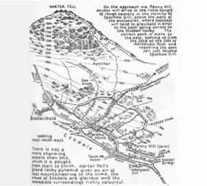
Alfred Wainwright is probably best known for his 7 Pictorial Guides to the Lakeland Fells (Wainwright, 1955-1966). The example here illustrates the hand drawn style used throughout his 59 walking guides and publications, each one painstakingly detailed using pen and ink based on his own surveys. He drew all the maps, wrote the accompanying text and produced countless illustrations in the hand-lettered publications. The ascent maps are planimetric in the foreground and morph to become perspective in the distance showing natural features and the climb ahead along the route. Contours not only provide useful information but add to the representation of the 3rd dimension (Garland, 1991). The hand-drawn approach lends itself to giving a sense that the maps are somehow more real and match their in situ use perfectly. The maps are not just landscape sketches though. Planimetric detail is marked and pictorial symbols (e.g. trees) are also used to good effect. As a small format book the publications and the maps they contain are perfectly suited to their purpose.
Figure 12. Here and there: a horizonless projection in Manhattan by Jack Shulze and Matt Webb, 2009
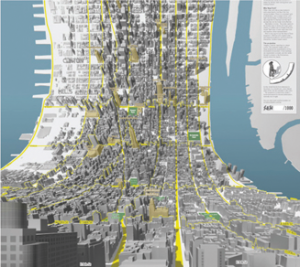
Created as a pair of maps of Manhattan, one looking uptown from 3rd and 7th and one looking downtown from 3rd and 35th, BERG (2009) explain how the maps are an exploration of the speculative projections of dense cities. Conceptually, they are an inverse of the approach used by Wainwright (Figure 11) and Berann (Figure 3). The map shows the viewer in the 3rd person standing at the base of the map surrounded by large-scale local detail in perspective and bends to reveal the city stretched out ahead in plan view. It’s an intriguing and innovative way of representing an environment that would normally be out of sight and Shulze and Webb cleverly take design cues from Google’s map (grey buildings, yellow roads, haloed text) to give the map a sense of familiarity that juxtaposes the unfamiliarity of the view. The gridded streetscape of New York lends itself well to this type of representation, as does the length of the island of Manhattan which creates a tall, narrow, large format poster that emphasizes the approach.
Street Mapping
Figure 13. Melway Street Atlas, first published 1966
The first edition of Melway was released in 1966 after 5 years of production and contained 106 original hand drawn maps. Now in its 39th edition (http://www.melway.com.au/), the map was created in response to shortcomings in available directories at the time. By the 1980s Melway was the most popular street directory in Melbourne. The maps are designed with a rich and diverse palette of colours, from the blue suburb names to the bright orange secondary streets to the black major roads giving clarity to distinct features. The publication was awarded the International Cartographic Association award in 1982 and the inaugural award for cartographic excellence by the Australian Institute of Cartographers. Street labeling is positioned above the roads, instead of being placed within the road which was against the market trend at the time. Type hierarchy, positioning and colour provided space in which to label a wide range of contextual information. The maps maintain an often imitated ‘house style’ and it has become so ubiquitous that it’s not unusual for people to give a Melway grid reference as directions.
Figure 14. Britannia by John Ogilby, 1675
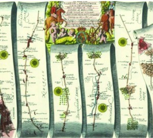
In 1674 translator and publisher John Ogilby was appointed as His Majesty’s Cosmographer and Geographic Printer and published Britannia, a road atlas of Great Britain, in 1675 which set the standard for many years to come. The atlas contained 100 strip maps accompanied by text at a scale of one inch to one mile (Mullen, 2010). The scale was innovative for the time and later adopted by Ordnance Survey in its 1st map series. Ogilby’s maps are a linear cartogram and north varies between strips. People can orient themselves in the direction of travel regardless of the true direction. The scroll effect suggests their use for navigation as if they were to be opened and used on the journey itself. Features are artistically represented but all have a practical value and a great deal of extraneous detail is omitted. The maps, marginalia and cartouches are particularly ornate and typography also includes flowing ascenders and descenders. Ingenious for its time and a style still used today to show the linearity of route networks (e.g. motorway networks) in many street atlases.
Figure 15. Atlas and Guide to London by A to Z (the Geographer’s Map Company), first published in 1938
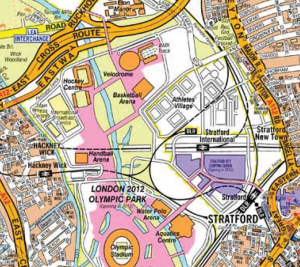
The Geographer’s Map Company was started in 1936 and is now the largest independent map publishing company in the UK (http://www.az.co.uk/). It still produces the iconic London A-Z street atlas in addition to over 340 other mapping products. Phyllis Pearsall, a painter and writer, founded the company after discovering that the Ordnance Survey map she was following to get to a party wasn’t up to the task and she became lost. She conceived the idea of mapping London which involved walking over 3,000 miles and over 23,000 streets mapping each as she went. Pearsall proofread, designed and drew the map with the help of a single draftsman. Although a map containing hundreds of combinations of type form: bold, italics, spacing of characters, color, san serif, reversed type, size, rotation, upper and lower case, the design and placement of the typography is meticulous. The use of orange primary routes, yellow secondary and white local was unique and possibly the inspiration for Google Maps at street level. The pocket book size of the original was a perfect form for navigation and despite the atlas being crammed with detail it is extremely well structured in graphical terms.
General Reference Atlas
Figure 16. The Times Survey Atlas of the World by The Times, extract from 2nd Edition, 1920
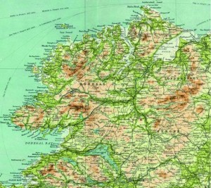
The Times Atlas of the World (latterly with the addition of Comprehensive Edition) was first published in 1895 and is currently in its 13th Edition (published in 2011 http://www.timesatlas.com). Originally containing 117 pages and over 130,000 names it has grown to a 544 page publication with 125 map plates and over 200,000 indexed names and is marketed as The Greatest Book on Earth. The 10th Edition, published in 1999, was the first to be produced entirely using computer cartography but until that time much of the map drawing was by hand. Unsurpassed global coverage of the world’s physical and political features in a single volume, the atlas is both prestigious and authoritative. It has a classic style and traditional appearance and is meticulously presented. Crucially, the intricate design has stood the test of time and the maps are beautifully laid out, easy to read and fascinating. In an age of querying the internet for answers, when questions of authority and accuracy remain, the Times Atlas is unparalleled and remains a reference publication of the highest quality.
Figure 17. National Geographic Atlas of the World, by the National Geographic Society, extract from the 6th Revised Edition, 1992 published by the National Geographic Society
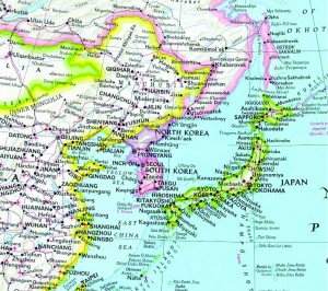
First published in 1963, the National Geographic Atlas of the World is now in its 9th Edition (published in 2010 http://www.nationalgeographic.com/atlas/) and contains 300 maps and nearly as many illustrations. The maps are beautiful and engaging and the overall design has become a hallmark of National Geographic publications. One of the most notable design features involves colourfully marking the country boundaries yet keeping the interior of the geographic areas as black text on a white background. This helps establish a clear figure-ground between mapped features and the labels and harks back to the use of hand painted tint bands on early historical maps. The atlas is also notable for its use of the Winkel Tripel Projection, a standard since 1998, and for its custom proprietary fonts originally designed in the 1930s and named after staff cartographers of the era (Darley, Bumstead, Riddiford etc.). The fonts and extensive labeling alone sets the atlas apart from others and gives it an unmistakable style. Touches, such as the curved lettering from point features around a coastline, are also a signature national Geographic style.
Figure 18. Great World Atlas by Dorling Kindersley, 2008
Dorling Kindersley first published their Millennium World Atlas in 1999, inspired by success of their Eyewitness Travel Guide series. The latest version (published in 2008 http://www.dk.co.uk/nf/Book/BookDisplay/0,,9781405329859,00.html) contains 528 pages with rich, vibrant cartography, a wide range of cloud-free satellite images, high quality terrain models and fold-out pages. Dorling Kindersley were one of the first to use satellite imagery linked to maps and as hybrid map/satellite image illustrations. Each page is beautifully presented with many using a unique approach of clipping map areas from their surroundings as opposed to allowing map detail to bleed off the edge of the page. This particular treatment allows the page to be filled with images, facts, illustrations and text which gives supporting information rarely found elsewhere in atlas mapping. Each map features its own legend rather than relying on one in the preliminary pages. Given the amount of content and irregular shapes the balance, structure and harmony of each page is remarkable and the detail gives readers an opportunity to explore geography as a traveler rather than using the atlas merely as a reference tool.
Cartograms
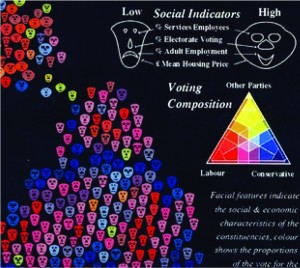
Figure 19. The distribution of voting, housing, employment and industrial composition in the 1983 General Election by Danny Dorling, 1991
As Tufte (1990 p9) said “The world is complex, dynamic, multidimensional; the paper is static, flat. How are we to represent the rich visual world of experience and measurement on mere flatland?”. This example of a multivariate cartogram by Dorling (1991, 1994) does just that. The Dorling cartogram creates a social landscape so circles are proportional to the population of the area they represent. Here, though, Chernoff Faces (Chernoff, 1973) replace circles to ascribe additional information. Sizes of faces are proportional to the electorate and shape, eyes, nose and mouth each display additional socio-economic variables allowing a theoretical maximum of 625 different faces. In reality only a fraction of these permutations exist, each coloured in one of 36 trivariate colours. The strength of the image is its overall impact as well as the ability to mine detail. Faces evoke emotional reactions and show social differences we can easily interpret. Sharp local divisions or gradual changes emerge. While such glyphs can often overload a map image, Dorling combines them masterfully and the strong colours on a black background create additional contrast and impact.
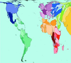
Figure 20. Total Population by Worldmapper.org, 2006
Gastner and Newman (2004) outlined the holy grail of population density equalizing cartograms: a method to account for differences between areas of different population sizes while retaining the general shape of individual regions and their contiguity with neighbouring regions. Their method overcomes the stylized cartograms use of geometric shapes to represent areas and produces useful, elegant and easily readable maps which have been widely adopted, particularly to illustrate political differences or socio-economic conditions. The example here is one of a collection of over 700 maps of the world by Worldmapper.org (http://www.worldmapper.org; Dorling et al. 2010). An ambitious project, the maps paint a vivid picture of the world in a way never before seen from transport to poverty, pollution to religion and every conceivable human, social, economic and environmental condition in between. The maps are deliberately stark which emphasises the single mapped variable. The colours are vivid against a light background and represent 12 geographical regions for visual comparison across different maps. The beauty of the maps lies in their effectiveness at portraying the discomfort of a wholly unequal world.
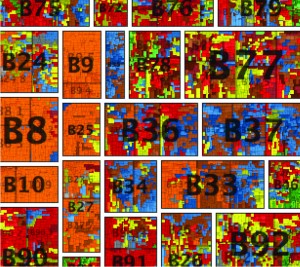
Figure 21. Egalitarian Mapping of People in Britain by giCentre, City University, 2010
Successful and elegant display of large multivariate datasets is rarely achieved because many attempt to fit their data into geographical space. Spatial treemaps provide an alternative way of mapping a large number of geographical units by modifying space (Shneiderman, 1992, Wood and Dykes, 2008). Here, Wood et al. (2010a, b) show 1,526,404 postcode units in Great Britain, sized by population and arranged so that geographical relationships and postcode geography hierarchy are maintained. The map is richly coloured according to a socio-economic classification comprising 7 super-groups split into 52 sub-groups. The map is beautifully arranged allowing patterns in the vast amount of information to become clear at local, regional and national scales. In a single map, they have managed to effectively display detailed information about 60 million people recorded in 40 census variables in over 1 million places. The colour gives the appearance of a stain-glassed window inviting you to explore the information at different distances. Sans serif type is a good choice to tie in with the clean regular lines of the map itself and transparency allows large labels to be placed unobtrusively.
Abstract maps
Figure 22. Visualizing friendships by Paul Butler, 2010
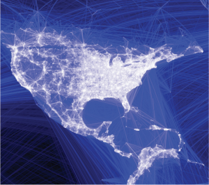
Butler (2010) suggests that “visualizing data is like photography. Instead of starting with a blank canvas, you manipulate the lens to present the data from a certain angle.” His social graph of 500 million facebook users cleverly demonstrates this philosophy. He asks “what might the locality of friendship look like between users of facebook” and takes the links between facebook user’s location and the location of their friends, plots a black-blue-white great circle arc between them and the result is a detailed map of the world. There are no other geographical datasets yet the shapes of continents, locations of cities and some international boundaries emerge. The map is made entirely out of human relationships. The black background contrasts well with the almost fluorescent lines to create a fiber-optic appearance that lights up the globe. The long distance curves contrast well with the shorter, almost straight, lines of local connections to create an intriguing spider-web pattern. The facebook logo is so widely known that the map needs no other data or contextual information to enable us to make sense of the theme or patterns.
Figure 23. London’s Kerning by NB Studio, 2006
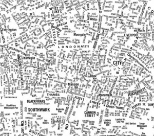
Maps based entirely on typography are abstract representations of a landscape and have been used effectively as fills for land use and through repetition for linear networks. Type functions literally as well as to locate mapped features. This example, by NB Studio, was one of the first to gain wide attention. Prepared for The London Design Festival in 2006 (NB Studio, 2006) as a commentary on social space, the large format poster went on to win the design week awards in 2007. The map shows only names of locations, streets or places. Larger fonts reflect more important spaces with smaller fonts representing a less celebrated space. Smaller type is used as a replacement for roads and view at a distance, the structure of the city emerges as the form, orientation and positioning combine to create landmarks and shapes that can be easily identified. The map is a great example of the power of typography in map-making and also illustrates how effective a single colour can be. Maps do not always need to be in colour to be visually stunning or effective.
Figure 24. Redrawing the Map of Great Britain from a Network of Human Interactions by Ratti et al., 2010
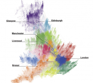
Regional boundaries defined for the purposes of administration inevitably split a country into arbitrary areas. Ratti et al. (2010) questioned whether these boundaries respect the natural ways in which people interact by delineating space using an analysis of the network of over 12 billion individual telephone calls. What they achieved was a beautifully abstract map of Great Britain that shows people interact inside traditional boundaries. The map base is a grid of squares each comprising 3,042 pixels. Each pixel is a node and its connection strength to every other pixel is shown by varying opacity. This creates a strong structural framework for the map with connecting lines showing the strongest 80% of links. Colours identify regions that emerge through analysis with the dark colour for London allowing lines connecting it with elsewhere to be clearly seen across lighter regions. The prudent use of labels to identify major cities is just enough to support interpretation and the leader lines tie them well to the map, clearing the map itself of labeling. The tilted viewing angle allows connections to be seen in a way that a plan view wouldn’t allow.
Thematic maps
Figure 25. Maps Descriptive of London Poverty, by Charles Booth 1898-9
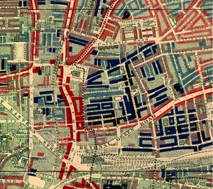
Charles Booth, an English philanthropist and businessman is renowned for his survey into life and labour in London at the end of the 19th Century. Critical of the value of census returns as a way of identifying inequality, he set to work investigating poverty for which he was recognized by awards from the Royal Statistical Society and the Royal Society. The Maps Descriptive of London Poverty are an early example of social cartography (LSE, 2002). Using Stanford’s Library 6 inches to 1 mile Map of London and Suburbs, Booth coloured each street to indicate the income and social class of its inhabitants. This choropleth overlay on a light base is an early form of ‘mashup’ and used a rudimentary diverging colour scheme with black for the lowest class (Vicious, semi-criminal) through dark blues and into reds and yellows (Upper-middle and upper classes, wealthy). Neighbouring colours were deliberately similar in hue so the map illustrated social transitions across space though strong gradients are easily seen when blacks and reds are in close proximity. The overlay is slightly transparent to allow the underlying base map detail to be seen for interpretation.
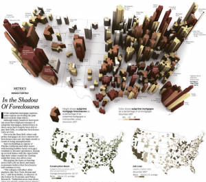
Figure 26. In the shadow of foreclosures by the New York Times, April 5th 2008
Very few newspapers have a team dedicated to data visualization and information design. Many (e.g. Data Blog at The Guardian) produce data dumps that are the antithesis of design. The New York Times, however, creates consistently high quality maps and graphics to tell their stories. Small Labs Inc (2011) provide an excellent repository of over 300 superb examples of their work to date which are a catalogue of best practice in thematic map design. The map of foreclosures (New York Times, 2008) displays multiple variables in a striking 3D graphic giving the map the look of buildings on a city landscape. The map labels don’t dominate even though they add important contextual statistics. Subtlety is the key here. The fine san serif shape means it sits further in the background and doesn’t obstruct the foreclosure shapes. The white US country background provides a neutral landscape for the buildings to emerge from. Simple, thin, solid black lines delineate the state lines. The map page is complemented by two traditional but expertly constructed choropleths and the overall page maintains a clean fresh appearance with excellent visual balance.
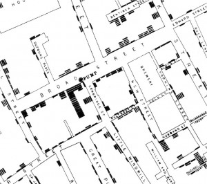
Figure 27. Detail of area around the Broad Street pump, by John Snow, 1854
John Snow was an English physician, the father of modern epidemiology and the inventor of anaesthesia among many successes (Vinten-Johansen, 2006). His famous map, published later as part of his essay on the mode and distribution of deaths from cholera in Soho, London in 1854 (Snow, 1855) is a classic not only in cartography but also analytically. Snow used the map as an exploratory tool to establish that cholera was a water-borne disease. He was the first to propose cholera’s mode of communication in this way and the map helped solve a critical problem of the time. Cartographically, Snow’s map is often cited as the first to use separate thematic layers to determine a spatial relationship between variables. The beauty of the map is in its brilliant simplicity, showing only the detail required to make the link between deaths and water distribution. The mapping of deaths using a single symbol identified individuals for impact with multiple deaths being seen as a density due to their clustering. This is a form of hot spot mapping, but without the commonly employed surface of colours representing generalized data we often see today.
Schematic maps/diagrams
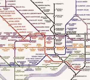
Figure 28. London Underground Pocket Railways map by Harry Beck, 1933
The London Underground map was originally created by engineering draughtsman Harry Beck in 1931 and first published in 1933. Beck drew the diagram in his spare time and although London Underground was originally skeptical of his radical proposal it became immediately popular and imitated across the globe for countless other metro and mass transit systems (Garland, 1994). Beck realized that the physical locations of the stations was largely unimportant because the railway ran mostly underground so a schematic diagram was a more effective solution by which to navigate. The simplified map consisted of stations, colour-coded straight line segments which run vertically, horizontally or at 45 degree diagonals. Ordinary stations (marked as ticks) were differentiated from interchanges (diamonds, later to be replaced by circles). The map exaggerates the detailed central area and contracts the external areas. The map shows no relationship to above ground geography other than the River Thames. The same approach is still in use today by Transport for London (Transport for London, 2012), though the map has gone through countless revisions and design changes the core characteristics remain.
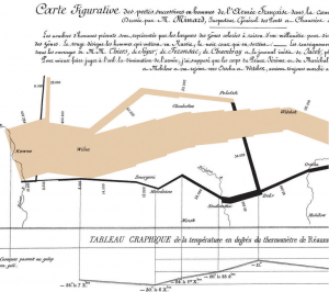
Figure 29. Carte figurative des pertes successives en hommes de l’Armée Française dans la campagne de Russie 1812-1813 by Charles Minard, 1869
The Minard map was published in 1869 on the subject of Napoleon’s disastrous Russian campaign of 1812. French civil engineer Charles Joseph Minard’s maps and graphics are often cited among the best in information design. The schematic flow approach of this statistical graphic, which is also a map, displays 6 separate variables in a single two-dimensional image: geography, time, temperature, the course and direction of the army’s movement, and the number of troops remaining. The map has been described as one of the most complete statistical maps of all time (Tufte, 2001). It is superbly clear in its representation using only two colours with black emphasizing the death toll on the retreat. The horrific human cost is the story of the map as Napoleon entered Russia with 442,000 men and returned with barely 10,000 which included some 6,000 that had rejoined from the north, symbolized as 1mm of line width to 10,000 men. The geography of the battles are marked and the temperature shown across the bottom supports interpretation. Napolean underestimated the vastness of Russia and the inhospitable winters. Minard exquisitely mapped the total disaster.
Figure 30. Web trend map 4 by iA Inc, 2009
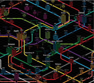
This fascinating schematic maps the most influential internet domains and people onto the Tokyo Metro map. Each domain is assigned to individual stations on the Tokyo Metro map in ways that complement the characters of each (Reichenstein, 2009). Complementary websites are grouped to a line that suits it and the map produces inter-linkages among companies in multiple ways inspiring some intriguing interplay. For instance, Twitter is assigned the station with the biggest ‘buzz’ and Google is mapped at Shinjuku which is the world’s busiest station. Web domains can be evaluated based on their position (proximity to a main line or hub representing importance), height (success measured in traffic, revenue and media attention) and width (stability as a business entity). The axonometric gridlines define street level with all subways positioned below the gridded surface. The Trend Setters are labeled using speech bubbles as if they are saying their name and other labeling works well to support differentiation of major trends. The colour palette is extraordinarily vivid and works well against pure black. Why map the internet in this way? As iA say themselves: because it works.
Maps in mass media
Figure 31. Escape the map by Mercedes Benz, 2011
Escape the map is an online advertisement for Mercedes-Benz (http://www.escapethemap.co.uk/). It offers an immersive, interactive experience for the viewer who becomes a participant in the story. The work has drama, doesn’t overtly force the brand and follows a ‘choose your own adventure’ type plot. It’s sophisticated, memorable and unique. The map and map related objects like the falling map pins and address (locator) are key metaphors in the story. The advert immerses you in the future, how we may use maps in cars and how important location is and will become not just for navigation but as a defining way of living. The heads up display on the electronic paper map works particularly well. The work clearly illustrates how popular maps have become in the mass media and there are numerous references to familiar online web map services, virtual globes and their techniques (such as facial blurring on Google Street View) as well as having a sub-plot that references social media such as Twitter. This familiarity with ubiquitous mapping and social media tools means the advertisement hooks us into a familiar world to tell its futuristic story.
Figure 32. OpenStreetMap: a year of edits by Ito!, 2008
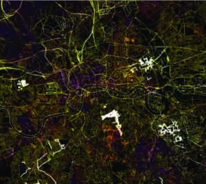
Ito! work with large transport datasets and have been pioneers in the creation of imaginative animations showing temporal activity in transport data (http://www.itoworld.com/static/data_visualisations.html). Their stunning visuals have been used for such diverse projects as displaying road traffic count data and the impact of the Icelandic ash cloud on air traffic in 2010. The first animation they produced displayed, in animated form, the entire year’s worth of edits to the OpenStreetMap database. It paints a fascinating picture as the OpenStreetMap movement captures and publishes new features from single roads to entire countries. The simple temporal legend gives a sense of the speed at which data was acquired and reflects the impact and speed of OpenStreetMap itself in this era of democratized mapping and citizen science. The animation moves rapidly to reflect the equally rapid map changes to create a flickering movie. New edits light up the map across the black backdrop and then disappear as they are added to the core of the map suggesting database integration; an excellent way of showing the quantity and rapidity of change for such a large and important dataset.
Figure 33. The Wilderness Downtown by Chris Milk, 2010
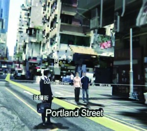
The Wilderness Downtown is an interactive music video/movie featuring We used to wait by Arcade Fire and built as a way of experimenting with Google Chrome’s interface (http://thewildernessdowntown.com/). Constructed in collaboration with Google, it’s without doubt one of the most innovative ways in which maps feature in a short film. Many of the components of the movie are based on the Google Maps suite; the viewer types in an address before launching the movie which then launches multiple inter-related Chrome windows to create a map-based journey through your neighbourhood that accompanies the music. The main hooded and mysterious character is seen running through the neighbourhood the viewer specified, across satellite images and amidst rotating Street Views. Animated components (flying birds, exploding trees) add to each window to use the maps in innovative ways as you become the eyes of the runner. The concept of allowing people to fly through their own neighbourhoods and stop and look at their own house as part of a music video is truly unique.
Web maps
Figure 34. Madri+d Map of Knowledge by Madri+d, 2010
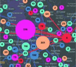
The Madri+d Map of Knowledge (http://www.madrimasd.org/mapa-conocimiento/) allows people to locate strategic information on the activities of companies and networks that form the Community of Madrid. The map acts as a visual network so shared interests, ideas, publications and projects can be seen. It’s a striking design with highly saturated colours which become immediately engaging the moment you roll your mouse over the map symbology. The symbols move and reshape/size and interlinkages appear automatically. The application uses sound to emphasis different user interactions, augmenting visuals in interesting and useful ways. Users can switch between a wide range of basemap styles for different purposes. The satellite image has been reclassified to reflect the look and feel of the overlaying symbol and user interface. The floating symbols integrate well with the basemaps and morph at different scales to sizes that better reflect the position of the businesses as the scale increases. A navigable locator map shows you where you at all times and map controls are unobtrusive. The application is in Spanish, yet non-native speakers are able to use it and have a pleasant and engaging experience.
Figure 35. Google Maps by Google, 2005
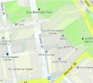
Lars and Jens Rasmussen’s mapping company was acquired by Google in 2004 and the mapping landscape transformed on February 8th 2005 when Google Maps was released as a web-based product (maps.google.com). Google Maps (and numerous complimentary products) has revolutionised the way the people view, use and make maps and how they interact with their surroundings. The Google Maps API underpinned the democratization of online mapping to allow anyone to create geographically contextualized mashups. The design is recognizable and supports a strong, clear brand that is consistent at a local scale, globally. Integration of complementary functionality (e.g. routing, traffic information, overlay of social media and photographs, zooming, panning, querying and measuring) provides an application with a multitude of purposes that goes beyond a general reference map. The design is automatically modified depending on its use. For instance, secondary roads widen at particular scales when you overlay traffic information to show each direction of traffic flow. The appearance of 3D buildings and moving shadows at large scales (in some cities) represent the built environment like never seen before. Quite simply the map is, and continues to be revolutionary.
Figure 36. Immigration Explorer by Matthew Bloch and Robert Gebeloff, The New York Times, March 10th 2009
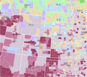
Examples of good web maps are rare but this map by New York Times is an exception (Bloch and Gebeloff, 2009). Beginning with a clear story, user controls allow effortless mining of layers of information across an unobtrusive colour palette with sensibly deployed pop-ups. The temporal dimension can be explored and the switching between choropleth and proportional symbol maps perfectly marries the map type to the data. Users can select variables and modify their depiction such as changing the relative size of symbols to make the best use of screen size. Using terms like ‘bubbles’, rather than ‘proportional symbols’, simplifies terminology so it makes sense for the average reader. A simple, neutral basemap supports the overlay detail and zooming is enabled but not beyond levels not supported by the data. Symbology is transparent, allowing overlapping symbols and base map detail to remain visible. Fine white outlines around only those symbols that overlap, subtle haloes and abbreviated labels at small scales which switch to full names at large scale are examples of a high attention to detail. This is a well-crafted web map that perfectly blends form with function using the medium appropriately.
Topographic Maps
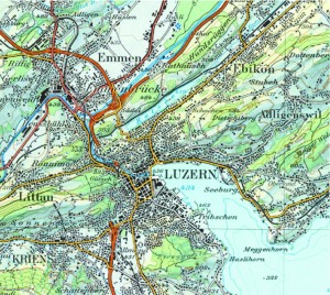
Figure 37. 1:100,000 Topographic Map of Switzerland (extract Beromunster sheet 65-3950-32) by Swisstopo, 2002
Swiss cartography is renowned for its accuracy, quality and artistry and no collection of the best topographic maps could ignore them. Swisstopo, the official name for the Swiss Federal Office of Topography (www.swisstopo.ch) are responsible for the production of topographic maps at a range of scales and while 1:25,000 is their most detailed map, this extract of the 1:100,000 series represents a range of excellent design principles. The use of colour in particular to vary label meaning, show quantities, represent or imitate reality and to decorate visually enlivens the map. (Tufte, 1990). The Swiss style is well structured, maintains uniformity, uses white space effectively, contains beautiful typography and unrivalled depiction of relief on topographic reference maps. The typeface sets a classic tone using primarily ‘antique’ looking serifs that includes a unique combination of thick and thin strokes. Hill shading is in the classic Swiss style based on the work of Eduard Imhof (1982). The maps are rich in content and deliver complex information in a succinct, well organised manner. Swisstopo topographic maps are truly works of art.
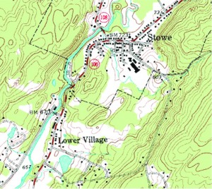
Figure 38. 1:24,000 Quadrangle series (extract from Stow, VT 44072D6) by USGS, 1968
The United States Geological Survey (USGS) largest (in terms of scale and quantity) and best-known map series is the 7.5-minute or 1:24,000 quadrangle series. The scale is unique in national mapping being related to the measurement of 1 inch to 2000 feet. Each of nearly 57,000 maps is bounded by two lines of latitude and longitude covering 64 square miles in southern latitudes but, due to convergence of meridians, only 49 square miles in northern latitudes. The specification has been applied to many other geographies that the US mapped during military operations which demonstrates a high level of flexibility and versatility in the design. As a brand, the series is instantly recognizable and successful. The content serves both civilian and military purposes and supports varied usage. Marginalia is well structured and complex information delivered in a succinct, well organised manner. The series was officially completed in 1992 and while The National Map (http://nationalmap.gov/ustopo/) represents a new generation of digital products the impact of the originals persists with new maps arranged in the 7.5-minute quadrangle format as well as retaining the same look and feel.
Figure 39. MasterMap® by Ordnance Survey, 2001
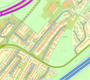
Not so much a map as a digital product that records every single fixed feature of Great Britain in a contiguous database, MasterMap® represents the most detailed, consistent and up-to-date geographical database of any country at a scale of 1:1250. Four separate layers contain topographic, transport, address and imagery data to form the full product. Every feature is assigned a Topographical Identifier (TOID) that gives it a unique reference as well as attribute information to classify it and support mapping tasks. Continuous review means the database is as current as the latest ground survey data capture and the product is versatile and flexible enough to suit a myriad of mapping purposes at different scales. The schema is robust and currently the database contains over 460 million individual features with extensive metadata. As a product, the release of MasterMap® was, and remains, innovative and its scale and level of detail are unsurpassed. The uniqueness of its design is in the construction of a database that supports the mapping needs of a diverse user base.
Summary
The 39 maps presented here are by no means definitive or exhaustive but represent the broad consensus of 20 cartographers acknowledged in their field. Hopefully they illuminate the concepts discussed in Field and Demaj (2012) and show how they can be expertly applied. Of course, the list can never be complete and in compiling the examples presented, we have had to reject many which might have equal merit. And what of our own favorites? The work of Beck, Minard, Berann, Bollmann and National Geographic would rise to the top of the cartographic pile at the time of writing though frankly, tomorrow, others might be preferred. As with music or art, where we may express a particular favourite song or painting at one time or another, so it is the same with maps and that has been a fascinating aspect of this exercise. Debates between the authors have been interesting and stimulating and served to prove that excellence in cartographic design is at least in part, in the eye of the beholder.
Acknowledgements
The authors wish to thank the cartographic experts who took part in our survey and offered their top 10 well designed maps. It was a hard job to whittle down the list from over 100 examples cited so apologies if we have missed out one of your favourites!
References
Army Corps of Engineers (2004) Lower and Middle Mississippi Valley Engineering Geology Mapping Program http://lmvmapping.erdc.usace.army.mil/index.htm (accessed 18 January 2012)
BERG (2009). Here and there: a horizonless projection in Manhattan http://berglondon.com/projects/hat/ (accessed 19 January 2012)
BibliOdyssey (2009). Satirical maps: An incomplete evolution of the cartoon political map. http://bibliodyssey.blogspot.com/2009/06/satirical-maps.html (accessed 18 January 2012)
Bloch, M. and Gebeloff, R. (2009) Immigration Explorer, New York Times http://www.nytimes.com/interactive/2009/03/10/us/20090310-immigration-explorer.html (accessed 26 January 2012)
Butler, P. (2010) Visualizing friendships, http://www.facebook.com/note.php?note_id=469716398919 (accessed 20 January 2012)
Chernoff, H. (1973) The use of faces to represent points in k-dimensional space graphically. Journal of the American Statistical Association, 68, 342, 361-8
Codex99 (2011) The streets of New York http://www.codex99.com/cartography/110.html (accessed 19 January 2012)
Dorling, D. (1991) The visualization of spatial social structure. PhD thesis. University of Newcastle Upon Tyne. http://www.sasi.group.shef.ac.uk/thesis/index.html (accessed 19 January 2012)
Dorling, D. (1994) Cartograms for visualizing human geography. In H. Hearnshaw and D. Unwin (eds) Visualization in GIS, Wiley, Chichester, 85-102
Dorling, D., Newman, M. E. J. and Barford, A. (2010). The atlas of the real world: Mapping the way we live, Thames and Hudson, London
Field, K. and Demaj, D. (2012) Reasserting design relevance in cartography: some concepts, The Cartographic Journal, 49, 1, xx-xx
Forrest, D. (2003). ‘The top ten maps of the twentieth Century: a personal view’ The Cartographic Journal, 40, 1, 5-15
Garland, K. (1991). Lead, kindly light: the design and production of illustrated walkers’ guides, Information Design journal, 7, 1, 47-66
Garland, K. (1994) Mr Beck’s Underground Map, Capital Transport Publishing, London
Garrett, W. E. (1978) Grand Canyon. National Geographic. July. 154(1): 2–5.
Gastner, M. T. and Newman, M. E. J. (2004) Diffusion-based method for producing density equalizing maps, Proceedings of the National Academy of Sciences of the USA, 101, 7499-7504
Hodgkiss, A. G. (1973) The Bildkarten of Hermann Bollmann, Cartographica, 10, 2, 133-145
Huffman, D. (2011) On human cartography, http://somethingaboutmaps.wordpress.com/2011/04/20/on-human-cartography/ [last accessed January 10th 2012]
Imhof, E. (1962) Schweizerischer Mittelschulatlas, 13th ed. Konferenz der kantonalen Erziehungsdirektoren, Zurich
Imhof, E. (1982) Cartographic relief representation, Walter de Gruyter, Berlin, republished by Esri Press, 2007
London School of Economics and Political Science (2002) Charles Booth Online Archive http://booth.lse.ac.uk/ (accessed 19 January 2012)
Mullen, C. (2010) John Ogilby’s Britannia, 1675 http://www.fulltable.com/vts/m/map/ogilby/mna.htm (accessed 19 January 2012)
National Geographic (2012) Bradford and Barbara Washburn http://www.nationalgeographic.com/explorers/bios/washburns/ (accessed 18 January 2012)
NB Studio (2006) ISTD London’s Kerning http://www.nbstudio.co.uk/projects/istd-londons-kerning (accessed 18 January 2012)
New York Times (2008) In the shadow of foreclosures http://www.nytimes.com/imagepages/2008/04/05/business/20080406_METRICS.html (accessed 19 January 2012)
Ratti, C., Sobolevsky, S., Calabrese, F., Andris, C., Reades, J, Martino, M., Claxton, R., Strogatz, S. H. (2010) Redrawing the Map of Great Britain from a Network of Human Interactions, PLoS ONE, 5, 12, e14248. doi:10.1371/journal.pone.0014248
Reichenstein, O. (2009). Web Trend Map 4 http://www.informationarchitects.jp/en/web-trend-map-4-final-beta/ (accessed 19 January 2012)
Shneiderman, B. (1992). Tree visualization with tree-maps: 2-d space-filling approach. ACM Transactions on Graphics, 11, 92–99
Small Labs Inc. (2011) New York Times Infographics http://www.smallmeans.com/new-york-times-infographics/ (accessed 19 January 2012)
Snow, J. (1855) On the Mode of Communication of Cholera. London, Churchill
Stuart-Alexander, D. E. (1978a) Geologic Map of the Central Far Side of the Moon I-1047 http://www.lpi.usra.edu/resources/mapcatalog/usgs/I1047/150dpi.jpg (accessed 18 January 2012)
Stuart-Alexander, D. E. (1978b) Geologic Map of the Central Far Side of the Moon http://astrogeology.usgs.gov/Projects/PlanetaryMapping/DIGGEOL/moon/1047/lfar.htm (accessed 18 January 2012)
Transport for London (2012) Maps http://www.tfl.gov.uk/gettingaround/1106.aspx (accessed 19 January 2012)
Troyer, M. (2002). The world of H. C. Berannhttp://www.berann.com/ (accessed 18 January 2012)
Tufte, E. (1990) Envisioning Information, Graphic Press, Cheshire
Tufte, E (2001). The Visual Display of Quantitative Information (2nd edition ed.). Graphics Press, Cheshire
Vinten-Johansen, P. (2006) The John Snow Archive and Research Companion http://johnsnow.matrix.msu.edu (accessed 19 January 2012)
Wainwright, A. (1955-1966). The Pictorial Guide to the Lakeland Fells, Vol 1-7, Westmorland gazette, Kendal
Walter, S. (2008) The Island. http://www.stephenwalter.co.uk/drawings/drawa1.php (accessed 18 January 2012)
Washburn, B. (1988) Mount Everest–Surveying the Third Pole. National Geographic. November. 174 (11). 653–659.
Wood, J. and Dykes, J. (2008) Spatially Ordered Treemaps, IEEE Transactions On Visualization And Computer Graphics, 14, 6, 1348-1355
Wood. J., Slingsby. A. and Dykes. J. (2010a). Layout and Colour Transformations for Visualising OAC Data, in Proceedings of the GIS Research UK 18th Annual Conference GISRUK 2010, Haklay, M., Morley, J., Rahemtulla, H., Eds., 455-462
Wood. J., Slingsby. A., Dykes. J. and Radburn, R. (2010b). Examples of graphics developed by giCentre and used by Leicestershire County Council http://www.gicentre.org/clg/ (accessed 20 January 2012)



Topographic maps of swisstopo can be found on map.geo.admin.ch as interactive map,e.g. http://s.geo.admin.ch/54f65bd3