MapCarte 340/365: Airspace: the invisible infrastructure by NATS, 2014

Cinematic cartography provides us with a sumptuous feast of data representation. It captures the intricacies and patterns of large datasets and, in particular, those that have some element of flow or movement about them. Here, NATS give us a state-of-the-art 2 minute 30 second video showing the patterns of air traffic in and out of UK airspace over a 24hr period incorporating some 7,000 separate flight movements.

Of course, there are the usual flights in and out of the UK in addition to local flights but there’s also some really fascinating vignettes and what NATS do well is not simply present the viewer with a mass of moving stuff…they have gone to the effort of incorporating text and moving the image around to explain precisely what is being seen. This teasing out of individual elements gives context to the overall patterns and allows us to appreciate the complexity all the more.

There’s an ebb and flow of movement beginning with transatlantic traffic, then European arrivals followed by the first wave of departures and the congestion build up around the usual nodes of London, Manchester and central Scotland. They then focus on the holding stacks over Heathrow airport before picking out some military training flights and the movement of oil-rig workers from Aberdeen to North Sea rigs.

The aesthetic of the film perfectly matches the function with darker base elements and glowing flow lines. The marginalia and textual components are in balance with the overall piece and the movement, panning and zooming works well to take us on a tour without awkward jolts visually or in relation to the content in view. Speed, resolution and camera control are perfectly attuned to give the viewer a pleasing visual experience.

Fascinating and beautiful. The melding of cartography with large fluid datasets in an engaging form.

You can read more about the video and also links to other similar works from NATS on their web site here.

MapCarte 332/365: Flight patterns by Aaron Koblin, 2006

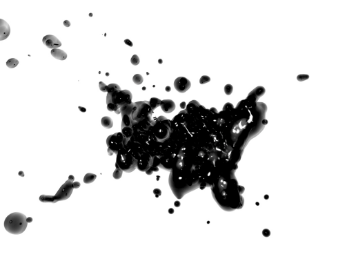
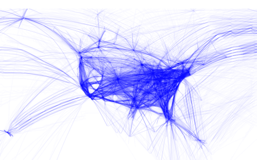
MapCarte332_koblin1Making maps from digital data has become a key outcome of the democratization of data and the use of the internet to store and share. Ad to that the availability of a wide range of digital mapping tools from full-scale professional GIS, through high-end illustration packages to open source offerings and new players offering ways to build maps through coded solutions. Each to their own but there’s a rich suite of products to suit tastes and abilities. A number of people have played with flight data from openflight.org but here, Aaron Koblin goes that extra mile to create a range of different products.

He used the Processing language to convert origins and destinations to geodectic curves to show all commercial flights routes between paired airports. His products are relatively simple…perhaps more data art than map but certainly their end appearance is map-like and they portray spatial relationships. He has created a number of alternatives that show all routes or which classify them by colour based on make or model of aircraft. He’s extracting the detail in the data and working with them in map form.

MapCarte332_koblin2His maps aren’t just static though. There are zoomable slippy maps that show the work in greater detail, overcoming one of the limitations of digital map design that means we have a constrained format. The ability to use multiple scales means we can design across a range of scales despite the dimensions of the viewing mechanism being relatively constrictive.

MapCarte332_koblin3Finally, he turns the relatively easily understood linear representations into animations and more artistic forms such as the blobular version. Of course, this perhaps ventures a little far from a form that allows people to interpret the data but it’s bringing new approaches to the cartographic aesthetic. Experimentation with form is useful. It perhaps doesn’t always carry a function other than to look appealing but beautiful data art is pleasing cartography all the same.

You can see more of Koblin’s flight patterns here and here.

MapCarte 237/365: Carte figurative des pertes successives en hommes de l’Armée Française dans la campagne de Russie 1812-1813 by Charles Minard, 1869

MapCarte237_minardAs it is colloquially known, he Minard map was published in 1869 on the subject of Napoleon’s disastrous Russian campaign of 1812. French civil engineer Charles Joseph Minard’s maps and graphics are often cited among the best in information design and this is perhaps the most famous of his works.

The schematic flow approach of this statistical graphic, which is also a map, displays 6 separate variables in a single two-dimensional image: geography, time, temperature, the course and direction of the army’s movement, and the number of troops remaining.  The map has been described as one of the most complete statistical maps of all time by Edward Tufte and it’s rare to find a list of classic maps that argues with this commendation.

It is superbly clear in its representation using only two colours with black emphasizing the death toll on the retreat.  The horrific human cost is the story of the map as Napoleon entered Russia with 442,000 men and returned with barely 10,000 which included some 6,000 that had rejoined from the north, symbolized as 1mm of line width to 10,000 men.  The geography of the battles are marked and the temperature shown across the bottom supports interpretation.

Napoleon underestimated the vastness of Russia and the inhospitable winters.  Minard exquisitely mapped the total disaster.

MapCarte 169/365: Roadtrip 2009 by Ole Østring, 2009

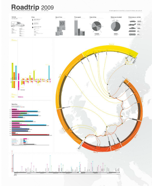
MapCarte169_ostringIt’s becoming common practice to log personal details of life events. In some ways this began in earnest with the consumerisation of GPS technology. The ability to purchase a cheap consumer grade GPS receiver allowed people to capture points of interest and record tracklogs of their journeys. Smartphones brought the same technology into a consumer device and, with that, it was no longer geogeeks that were interested in recording such information. Now, everyone can record their paths through life.

The mapped result is often little more than a data dump of routes with all of the errors that GPS data returns. What these maps tell us is often very little but when you apply some cartographic nous they can become something altogether different as Ole Østring illustrates. His poster recalls a road trip around Europe in 2009. The geography of the trip is presented in a typical way by showing the routes he used on a basemap outline. What he then does though is use that as  a background and re-works the data to show a timeline illustrated diagrammatically as a modified golden spiral.

While not a true golden spiral, the work benefits from using such a purist’s shape. We are immediately drawn to it’s flow and see that it holds flow information of the route as a timeline. Thus, the journey is imagined in two ways – geographically and temporally. The poster contains all sorts of other useful statistical nugget of information clearly and cleanly presented. The overall image is strong with a clever use of colour and hierarchy for maximum contrast of key elements.

An example of taking what may otherwise be rudimentary data and turning it into something graphically exquisite.

There’s a detailed, zoomable version at Østring’s web site here.

MapCarte 158/365: Visualizing friendships by Paul Butler, 2010

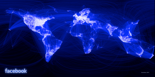
MapCarte158_facebookIt seems almost inconceivable that we once lived in a time where mapping abstract geometries, overlaying hundreds, if not thousands of features and applying a huge dose of transparency wasn’t mainstream. Yet it was only four years ago that Paul Butler suggested that “visualizing data is like photography.  Instead of starting with a blank canvas, you manipulate the lens to present the data from a certain angle.”

His social graph of 500 million facebook users cleverly demonstrates this philosophy.  He asks “what might the locality of friendship look like between users of facebook” and takes the links between facebook user’s location and the location of their friends, plots a black-blue-white great circle arc between them and the result is a detailed map of the world.  There are no other geographical datasets yet the shapes of continents, locations of cities and some international boundaries emerge. The map is made entirely out of human relationships and the geometries that represent them. He takes the approach of an airline route map yet applies it to other, more ephemeral connections.

The black background contrasts well with the almost fluorescent lines to create a fiber-optic appearance that lights up the globe.  The long distance curves contrast well with the shorter, almost straight, lines of local connections to create an intriguing spider-web pattern.  The facebook logo is so widely known that the map needs no other data or contextual information to enable us to make sense of the theme or patterns.

MapCarte158_facebook_detail

This sort of map has become commonplace; almost boring as people replicate the technique with a multitude of abstract datasets. It obviates the need for a reference basemap to ground the thematics but if you’ve got enough data then the structure of the familiar is seen. You need no other geographies.

MapCarte 126/365: Contagion by Hasaim Hussein, 2009

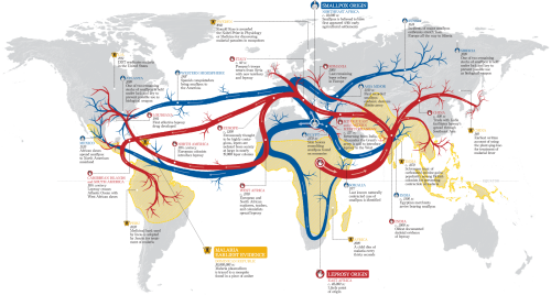
MapCarte126_husseinUsing a map as the backdrop on which you drape a striking thematic overlay is common practice in cartography. Maps do not have to be the containers of data, they can simply be the framework on which other information is laid out. Of course, it helps considerably that the overlay has some spatial component else the map would be rather pointless.

Hasaim Hussein has created a striking map showing the likely transmission path in space and time of three of the world’s most deadly contagious diseases, leprosy, smallpox and malaria. Matching the subject with the symbology is an easy way to convey a sense of the map’s data so the use of red arteries (for leprosy) and blue veins ( for smallpox) work well as the tendrils flow across the world. Central Africa is the origin of leprosy and northern Africa the origin for smallpox. Malaria doesn’t spread in the same way so, instead of transmission lines, it’s represented as areas of modern endemic malaria.

The visual balance is well executed in this work. The origin and density of the transmission lines is central and the map layout balances very well around this central fulcrum. The visual centre of the map is just above the graphical centre and this map layout hangs off that point perfectly. Contrast and hierarchy are also carefully managed with a light grey background map giving way to vibrant foreground colours. The origins and flows are simple to locate and follow and the various major time periods and places are linked to the main flow lines not just with a small unobtrusive leader line but also through matching the text colour to the disease and using small simple pictographs. These all help to focus the attention and enable us to move easily across the map from one recognisable component to another, related recognisable component.

A map tends to be read in parallel with the eye struggling to find an anchor and then figure out how to proceed. the secret with many good maps is to structure the work to help the eye and brain read as if the work was in serial (much like words on a page). By cleverly using structure you can make a complex pattern be easily read and digested. North arrows and scale bars? Absolutely no need on this type of map.

MapCarte 66/365: Perpetual Ocean by NASA, 2012

Tens of thousands of swirling ocean currents were captured and presented by NASA’s Goddard Space Flight Center in this animated map that creates a cinematic cartographic experience.  These are surface currents that cover the period June 2005 to December 2007; the result of physical observation and modelling.

The simplicity of the final map belies the complexity and computing power required to generate the results but rather than creating a detailed and complex graphic to expose how much effort and work went into the map, the work is left to shine and to amaze the viewer.

NASA themselves describe the results as creating a ‘visceral experience’. Indeed, if cartography is about connecting and generating an emotional response then they succeeded. One of the rare animated maps that uses a soundtrack to good effect.

Numerous versions of the animation can be found on NASA’s web site here.

MapCarte 41/365: Migration flows in the United States by Chris Walker, 2013

MapCarte41_walker

Click image to view online web map/diagram

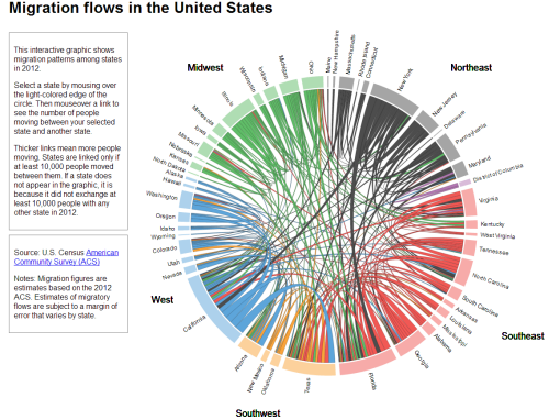
As Harry Beck’s underground map proves so well, a map need not follow conventional geography. Charles Minard’s map of Napoleon’s March on Moscow is in a similar vein being heavily diagrammatic. The data may be geographical yet presenting it in a meaningful way may require the rejection of geography.

Here, Chris Walker takes a similar approach and uses a chord chart to show the inter-state migration of people in the US in 2012. Good use of size to connotate magnitude and colour to enable differentiation between the States at a regional level. Simple mouseover interaction means viewers don’t get RSI through having to click everywhere and the chart modifies to reveal single State flows. Trying to put this information onto a map wouldn’t work as it’d be too overcrowded yet because of the positioning of the regions the circle at least provides a clever link to the real geography.

A great example of using a simple approach to a complex data yet still retaining the detail that makes the topic worth exploring. The simplicity of the graph allows the detail and the complexity of the data to be seen clearly. This works. Simply.