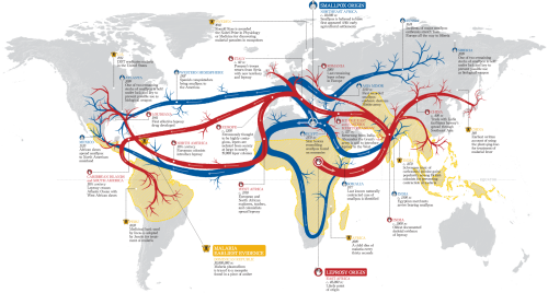
 Using a map as the backdrop on which you drape a striking thematic overlay is common practice in cartography. Maps do not have to be the containers of data, they can simply be the framework on which other information is laid out. Of course, it helps considerably that the overlay has some spatial component else the map would be rather pointless.
Hasaim Hussein has created a striking map showing the likely transmission path in space and time of three of the world’s most deadly contagious diseases, leprosy, smallpox and malaria. Matching the subject with the symbology is an easy way to convey a sense of the map’s data so the use of red arteries (for leprosy) and blue veins ( for smallpox) work well as the tendrils flow across the world. Central Africa is the origin of leprosy and northern Africa the origin for smallpox. Malaria doesn’t spread in the same way so, instead of transmission lines, it’s represented as areas of modern endemic malaria.
The visual balance is well executed in this work. The origin and density of the transmission lines is central and the map layout balances very well around this central fulcrum. The visual centre of the map is just above the graphical centre and this map layout hangs off that point perfectly. Contrast and hierarchy are also carefully managed with a light grey background map giving way to vibrant foreground colours. The origins and flows are simple to locate and follow and the various major time periods and places are linked to the main flow lines not just with a small unobtrusive leader line but also through matching the text colour to the disease and using small simple pictographs. These all help to focus the attention and enable us to move easily across the map from one recognisable component to another, related recognisable component.
A map tends to be read in parallel with the eye struggling to find an anchor and then figure out how to proceed. the secret with many good maps is to structure the work to help the eye and brain read as if the work was in serial (much like words on a page). By cleverly using structure you can make a complex pattern be easily read and digested. North arrows and scale bars? Absolutely no need on this type of map.
