
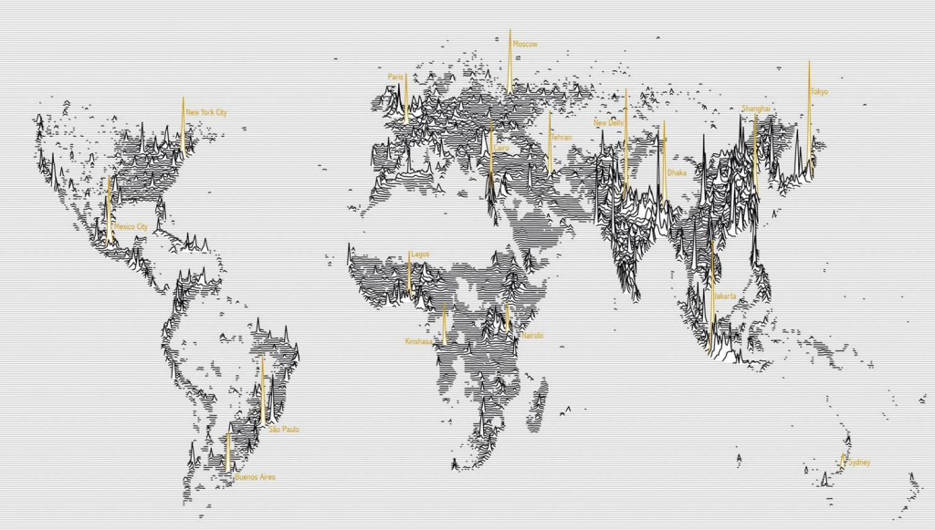
Global population density drawn as horizontal lines…almost like a cardiograph of the pulse of the world’s populus. Not the first map of population that’s ever been made but a compelling, alternative and fresh approach. A map that is also a piece of art and the beauty of its design lies in its simplicity with colour used sparingly and for emphasis. There’s an attention to detail that most will overlook that makes this so pleasing to view. The thickness of line varies to show populated vs non populated areas and although there’s no coastline plotted the coastal emphasis of populated space gives the map its familiar shape. The lines peak to show size of a populated place as a plan oblique vertical graph. Design is implicit. At the time of writing James is selling these as fine art prints.

Pingback: MapCarte 303/365: London: The Information Capital by James Cheshire and Oliver Uberti, 2014 | Commission on Map Design