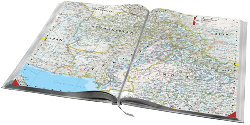
 First published in 1963, the National Geographic Atlas of the World is now in its 10th Edition, published in 2014, and contains over 300 maps and nearly as many illustrations. The maps are beautiful and engaging and the overall design has become a hallmark of National Geographic publications.
Though most new atlases are published to update changing geographies a key element in the success of an atlas series is continuity. If a design works, it becomes a house style and something instantly recognisable. Many people familiar with maps can spot a Nat Geo map in an instant…most other people will also be able to spot one even if they are unable to name it.
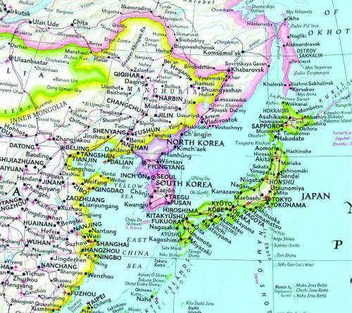
 One of the most notable design features involves colourfully marking the country boundaries yet keeping the interior of the geographic areas as black text on a white background (this extract from the 1992 6th Edition). This helps establish a clear figure-ground between mapped features and the labels and harks back to the use of hand painted tint bands on early historical maps.
The atlas is also notable for its use of the Winkel Tripel Projection, a standard since 1998, and for its custom proprietary fonts originally designed in the 1930s and named after staff cartographers of the era (Darley, Bumstead, Riddiford etc.). The fonts and extensive labeling alone sets the atlas apart from others and gives it an unmistakable style. Touches, such as the curved lettering from point features around a coastline, are also a signature National Geographic style.
You can see more of National Geographic’s atlas at their web site here.

