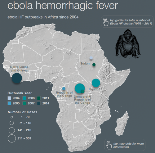
Most web maps tend to be based on a single theme. They exist behind a URL and they rarely sit in a context. We visit the map, we see it, we leave it. There are few products that have attempted to compile a digital set of maps into a coherent atlas and presented as an application. The atlas of infectious diseases does just that and is all the more remarkable because it was designed and produced as a student project at Oregon State university.
The atlas is designed for the iPad as a downloadable app (though a static version containing the maps is also available as a PDF download). The atlas showcases a range of infectious diseases using strong graphics, designed for digital display with simplified map shapes, bare basemaps and highly contrasting thematic overlays. These maps are designed to communicate quickly and efficiently.
The maps hang together as a coherent whole even though they show distinct subject matter. their use of colour goes a long way to ensuring continuity across the pages. navigation is intuitive and there is a good use of supplementary graphical material and textural components.
 The map types vary enough to maintain interest but never as a way of simply creating unnecessary differences. the map types support each theme well. The atlas builds a strong picture of the history of infectious disease as well as a contemporary assessment.
Design of digital atlases needs a different mindset than that of a more comprehensive print version. They need to be simpler in terms of the complexity of visuals (though not simplistic), contrast needs to be well managed across each page and there needs to be sufficient interest to encourage people to ‘turn the page’. As an exercise in creating a modern cartographic product it’s perfect for student engagement. What we have here is a benchmark for how students can design and produce a high quality product using modern design and authoring tools.
More details can be found at the atlas web site here.


