Atlases are designed to set out a social, economic, cultural and physical history of a place. They provide a slice in time that explains a country or a region and are often out-of-date fairly rapidly due to changing circumstances. It’s an inevitable problem for many atlas producers that as soon as one edition is published, work on the next begins in earnest. Of course, that also brings rewards since we can amass a collection of atlases that together paint the changing picture and, as cartographers, show us the changes and altering style of map-making and representation.
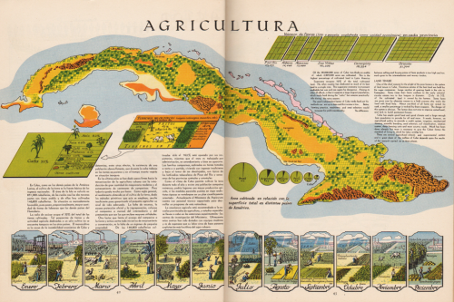
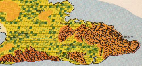
The Atlas de Cuba by Canet and Raisz was a little different. It attempted to paint a living picture of Cuba…literally given the hand drawn beauty of the work. They set out to explore problems and how these might manifest as well as what the solutions may be. Raisz’s work is evident. His maps are bold in use of colour and graphically rich as they combine beautiful landform mapping with innovative thematics. The page illustrated here, on agriculture, is typical of the maps. Relief is depicted in oblique ‘molehill’ style and the land use is laid out in a regular grid to create a patchwork of statistical information on the different crops. Simple blocks of complimentary colours give us a clear indication of the crops and the page is adorned with other graphs, legends and illustrations to bring the work to life.
There’s a simplicity in the work of this atlas that belies the effort it takes to make such maps. Keeping things simple is a mainstay of cartography but actually being able to achieve it and bring a subject to life is no simple task. To get it right across an entire atlas is an even more impressive achievement.
You can see many more illustrations from the atlas on John Krygier’s blog here.


