MapCarte 321/365: Palm Springs Modern by Nat Reed, 2012

MapCarte321_reed
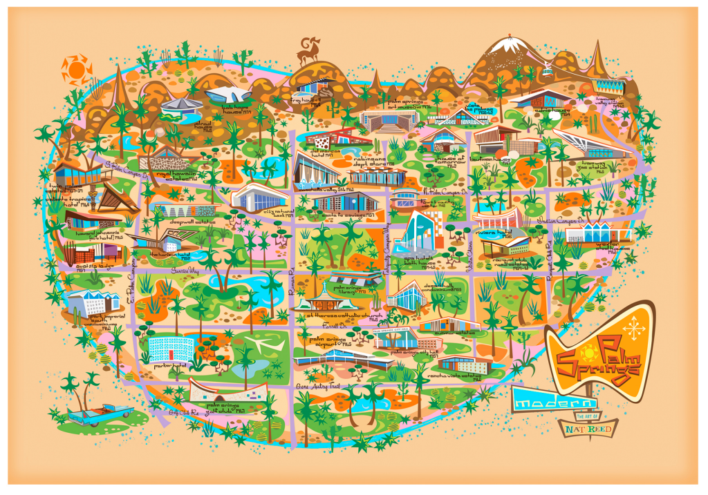
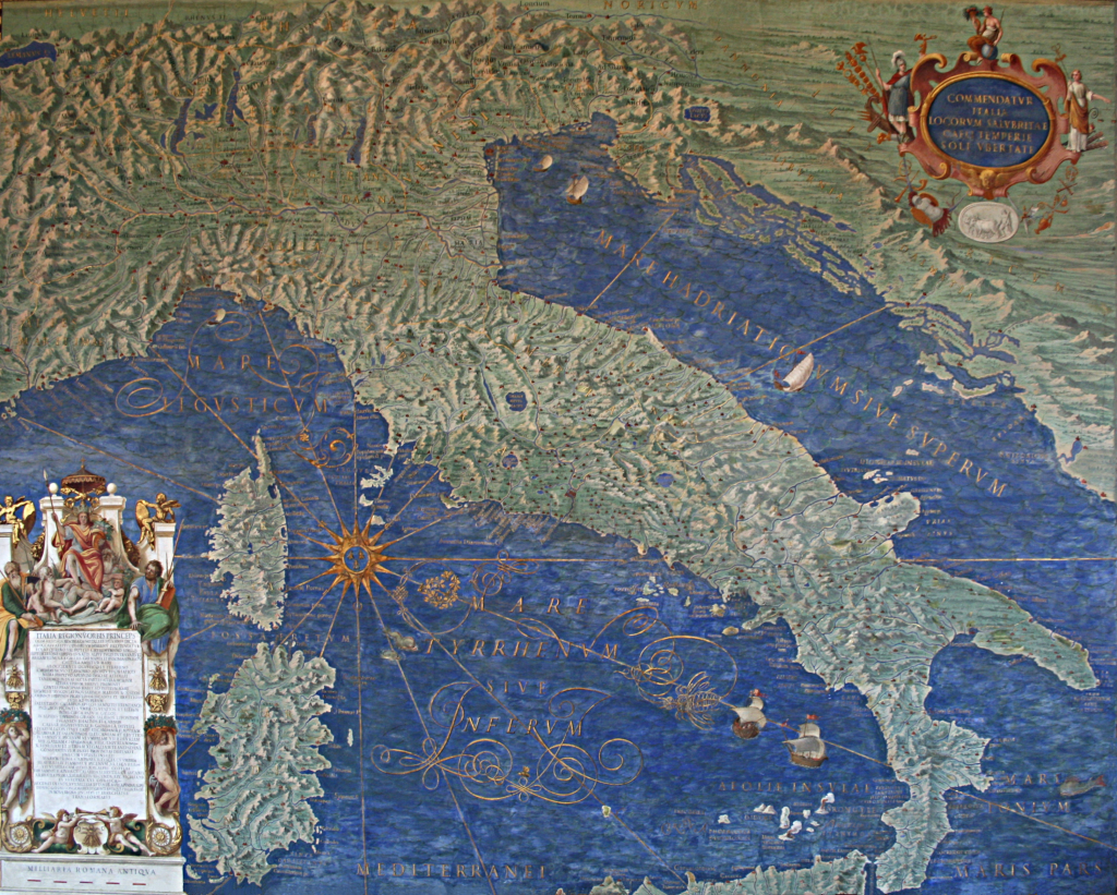
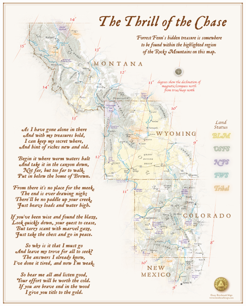
When mapping a specific theme it’s often useful to create the map to reflect that theme; to make the map speak to the mapped phenomena and attract the map viewer with an object that does justice to the content. There’s little point creating a map of Palm Springs Mid-Century Modern architectural heritage in some nonsensical gothic style. It just wouldn’t work and your map loses credibility. Here, Nat Reed has captured the spirit of the 20th century Desert Modernism that found its home in Palm Springs.

The use of glass, clean lines, the combination of natural and manmade resources and the focus on indoor/outdoor spaces is what characterised this particular design aesthetic with the backdrop of the stunning desert landscape. The affluent clientele were a perfect audience for these visionary architects to let their creative juices run wild and they created notable buildings of almost every type. Today, Palm Springs remains vibrant but lives off much of its historical vibe, including the architecture. Nat Reed’s map evokes that spirit and reflects the design ideals inherent in the architecture.

MapCarte321_reed_detail
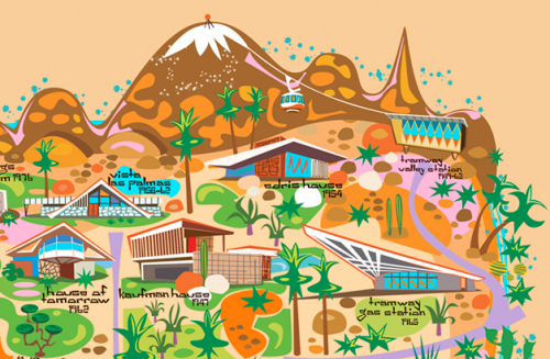
The map is heavily stylized in shape. Scale is abandoned and symbology is clean and angular (see the sun, cacti and big horn sheep for instance). The map captures the retro feel perfectly. Colours are bright and vibrant; the illustrations of the buildings cartoon-like yet also showing some of the essential character of each building. This is a fantasy map luring you to the fantasy land of Palm Springs and with at least an inspiration from early Disneyland maps. The grid structure of the streets holds the work together amongst the palm trees and other green foliage. There’s even an outer river or moat that seems to envelope Palm Springs making it appear even more like a fantastical island. With north to the right, the San Jacinto mountains are shown in aspect at the top of the map with the city laid out before them. The typographic elements are also in keeping with the overall theme.

Here is a modernist map that creates a perfect cartographic link to the theme being mapped.

More details of Reed’s map and other prints on his web site here.

MapCarte 320/365: Piri Re’is Map by Piri Re’is, 1513

MapCarte320_piriAfter the discovery of the Americas, numerous maps were made by the various sefaring nations of the period, most notably the Spanish and Portuguese. Possibly the most intriguing and, certainly, one of the most elegant maps was made not by the obvious cartographers but by a Turk, Piri Re’is. Only a portion of the map remains. At one point it would have included the whole world as seen by the Ottomans but only the western segment has survived. This alone, though, tells a remarkable cartographic story.

The map is significant as being the only 16th century map to display the Americas in its correct longitudinal position relative to Africa. As a portolan chart it is used predominantly for navigation. The coastal detail is impressive and the ocean is marked with numerous compass roses, rhumb lines (lines of constant bearing) and scale bars. The map is embellished with beautiful tall ships as well as many vignettes depicting indigenous people, flora and fauna, towns and settlements. The colours bring the map to life with careful shading of the coastline allowing it to stand proud in a visual sense and the use of red and blue alternating rhumb lines acting as spokes away fro the compass roses. Colour, generally, is well balanced, used sparingly but effectively as a differentiating tool.

MapCarte320_piri_detailThe labelling is particularly impressive and illustrates a compilation of collective knowledge derived from 20 maps used as sources. Maps from Alexander the Great, Ptolemy, Columbus and Portuguese explorers all played a part in the design of the map which reminds us that maps need not be entirely original. What is important, however, is to acknowledge the sources which this map does in its copious notes in the lower left.

The coastline of the Americas continues south and along the bottom. Could this be Antarctica or simply an artistic extension of the unknown southern tip of the Americas. Of course, it’s intriguing to wonder what the rest of the map might have looked like. Piri Re’is himself was a distinguished naval captain who rose to the post of Admiral of the Ottoman fleet. He won numerous battles and surveyed, mapped and wrote the famous Kitab-I Bahriye (Book of Navigation) in 1521. He was executed in 1553 for failing in his attempt to defeat the Portuguese in the Persian Gulf. He left a remarkable cartographic legacy with this map.

MapCarte 319/365: The Gallery of Maps by Ignazio Danti, 1550-1583

MapCarte319_vaticanWhat could be more carto-artistic than 40 painted map frescoes in a 120m gallery? The Vatican is home to The Gallery of Maps, a stunning set of large-scale paintings that showcase Italy through wonderfully rich and vibrant topographic maps. They were drawn by geographer Ignazio Danti as part of a Commission by Pope Gregory XIII in 1580. Others painted (literally by numbers) to fill in the detail.  It was simply designed as a way of decorating The Vatican. The 40 works took three years to complete and cover the whole of Italy as well as a range of panoramic views of major cities.

MapCarte319_vatican2The timing was ripe for maps to be considered an important element in scientific discovery as well as for decoration. The age of discovery had revealed new knowledge and scientific instrumentation such as the sextant, magnetic compass and telescope had improved accuracy of measurement. Mercator and Ortelius were making landmark world maps at around the same time. Pope Gregory XIII wanted The Vatican to join the cartographic revolution through this ambitious project.

MapCarte319_vatican3The maps are beautifully drawn and detailed. The large-scale paintings have a consistency that ensures they are seen as a set. The rich greens and blues for land and water create a beautiful palette that gives the hall a richness of colour. Terrain is well presented with detailed shading and the maps are full of ornate flourishes such as waves in the sea, cities, tents, boats and sea creatures. While many of these elements are totally out of scale compared to the backdrop map, they show a range of important scenes and the design supports the scale, size and purpose of the project as a gallery through which you walk en route to the Sistine Chapel.

MapCarte 318/365: Cassini Carte de France by César-François Cassini de Thury, 1788

MapCarte318_cassiniMapping entire countries is not for the feint-hearted. In 1744, Cassini prepared the first systematic, nationwide survey of a nation state, France. He was later commissioned to produce a more detailed map series to ultimately consist of 180 separate map sheets. This was not the work of a year or even a decade of preparation. This feat was the culmination of a century’s work by three generations of the Cassini family. Monumental in design and scope, Cassini’s map series was the result of scientific survey based on the triangulation of France which began in 1669 by his ancestors. By 1678 the Paris region had been mapped at a scale of 1:86,400. Various wars and other campaigns meant that surveying the remainder of France didn’t truly get going until 1733 when Cassini (strictly, Cassini III) recommenced the survey. Cassini’s map of 1744 laid out the traingulation of France but it required further surveys to fill in the map with topographic detail.

The new topographic map series, also at a scale of 1:86,400 began in 1748. It encompassed an 18-year plan with 10 maps to be published per year. The first two maps in the series took 8 years to be prepared yet they became the first properly surveyed, planimetrically accurate maps of a country. The level of detail was astonishing for the time and out-shone previous cartographic efforts by other European map-making dynasties. These maps immediately elevated France to the pinnacle of European cartographic excellence.

MapCarte318_cassinidetailThe map of Paris shown here was part of the second survey series. The detail and artistry is incomparable for the time. The use of colour highlights different land use types with a bright pink being used to show built up areas intersected by a generalized but highly detailed street network. Shadows are used throughout to emphasise different elements which raises them to create a pseudo-natural look and feel. This is particularly evident on the deep green forested areas which also contain a pattern fill. Topography is shown with shading and fine hachure abd shadows are also used to add depth to rivers, shown in blue. The typography is beautifully applied and pictorial symbols finish off the detail showing the positions of churches and other landmarks.

This is a key map in the history of cartographic design. Accurate and beautiful. Form and function.

MapCarte 317/365: MasterMap® by Ordnance Survey, 2001

MapCarte317_mastermap

Ordnance Survey has long held a reputation for unsurpassed quality and coverage in its mapping. It’s been steadfast in its approach to mapping of Great Britain such that the quality is world renowned and the envy of many countries. In 2001, Ordnance Survey launched a brand new product to bring its large scale products into the 21st century.

MapCarte317_mastermap2

Not so much a map as a digital product that records every single fixed feature of Great Britain in a contiguous database, MasterMap® represents the most detailed, consistent and up-to-date geographical vector database of any country at a scale of 1:1250.  Four separate layers contain topographic, transport, address and imagery data to form the full product. Later, additional layers for water and sites were added.

MapCarte317_mastermap3


MapCarte317_mastermap4

Every feature is assigned a Topographical Identifier (TOID) that gives it a unique reference as well as attribute information to classify it and support mapping tasks.  Continuous review means the database is as current as the latest ground survey data captured in the field and the product is versatile and flexible enough to suit a myriad of mapping purposes at different scales.

MapCarte317_mastermap5
MapCarte317_mastermap6

The schema is robust and currently the database contains over 460 million individual features with extensive metadata.  As a product, the release of MasterMap® was, and remains, innovative and its scale and level of detail are unsurpassed.  The uniqueness of its design is in the construction of a database that supports the mapping needs of a diverse set of user requirements. Key to the utility of the product is the ability to select and style the elements from the database that are required for a specific need. Thus, the product can be styled to give it the classic Ordnance Survey appearance, or to match a user-specified style and product requirement.

More details of Mastermap can be found on the Ordnance Survey web site here.

MapCarte 316/365: Ocean Chart by Henry Holiday, 1874

MapCarte316_snarkThe old adage less is more is a mantra of map design. While adding detail to show complexity is important, particularly in thematic or statistical cartography, it’s often possible to achieve it through a minimalist approach. For topographic mapping, the white spaces no longer suggest a lack of knowledge that needs filling with strange mythical creatures, but a graphical brevity. Being overly ornate detracts from the message of a map and beautiful, aesthetically pleasing maps are often those that appear quite stark at first glance. This map is possibly the most stark of the lot…a humorous take on large scale mapping at a scale of 1:1 accompanying the famous Lewis Carroll nonsense poem The Hunting of the Snark (An Agony in 8 Fits).

The plot of the poem is of ten crew on a tall ship hunting the Snark yet it’s been interpreted to have many meanings. The poem was illustrated by Henry Holliday who also drafted the Ocean Chart map to accompanycomments in the poem itself that can be easily interpreted as a commentary on the problems of maps and map interpretation:

He had bought a large map representing the sea,
Without the least vestige of land:
And the crew were much pleased when they found it to be
A map they could all understand.

“What’s the good of Mercator’s North Poles and Equators,
Tropics, Zones, and Meridian Lines?” 
So the Bellman would cry: and the crew would reply
“They are merely conventional signs!

“Other maps are such shapes, with their islands and capes!
But we’ve got our brave Captain to thank: 
(So the crew would protest) “that he’s bought us the best—
A perfect and absolute blank!”

The poem alludes to problems of interpreting complex maps and that the poor crew, who lacked the ability to read a map were delighted to see that the ocean chart, being blank, was perfectly understandable and represented the vast emptiness of the ocean perfectly. That said, the surrounding random map and associated terms are haphazardly arranged to cause maximum confusion, regardless of which orientation in which the map is held.

It’s difficult to argue with the accuracy and clarity of the map. More seriously, it reminds us of the need for accuracy, meeting our user’s abilities in interpretation, not getting overly caught up in convention when a more appropriate approach may be useful, and also the need to use white space wisely.

MapCarte 315/365: Yu ji tu by Anon, c.1136

MapCarte315_yujituDesign excellence in a map may not be simply because it looks pretty or that one might suggest it has some sense of aesthetic value. In fact, this impression of beautiful cartography often irritates because design is about much more than how a map looks. It’s about getting the form correct, but in concert with the function. A pleasing map to look at will not necessarily be a well designed map. And so the converse is true. This map, dating back to the Chinese Song Dynasty (960-1279) and being made in c.1136 might not be considered particularly pleasing to look at. It is, however, perhaps the most important Chinese map ever produced.

MapCarte315_yujitu_detail

The title translates to ‘Maps of the Tracks of Yu’ (tu being Chinese for map) and is taken in honour of the Chinese ruler Yu the Great. The map, carved in stone, is remarkable in design terms for a number of reasons. Firstly, it’s depiction of the Chinese coastline is extremely accurate for a map of this size and scale. It measures 3ft square and the map’s most important contribution to cartography is that it was the first to use a grid to denote scale. There are approximately 5000 grid squares, each measuring 100 Chinese li (approx 30 miles) so the map is at a scale of approximately 1:4,500,000.

However, the claim of accuracy of topographic detail and scale belies another facet of the map in that it is used as a canvas upon which Chinese mythology is depicted. The origin of the Yellow river is given as sources named by Yu the Great and the legend mixes detail that acknowledges the past and present…meaning it’s part fact and part fiction.

On the face of it, a bland map carved in stone but it’s design is important in cartographic history.

MapCarte 314/365: Atlas Maior by Joan Blaeu 1662-1672

MapCarte314_blaeuatlasDutch cartography is renowned as amongst the very best, principally due to the many dutch cartographers, engravers and printers in the late 16th and early 17th century who formed the period known as the Golden Age of Dutch Cartography. Joan Blaeu was one of the very finest cartographers, son of cartographer Willem Blaeu though originally qualified as a doctor of law. Joan Blaeu became official cartographer of the Dutch East India Company. Alongside his father, he published many atlases and globes, initially using the copperplates purchased from the widow of another cartographer Jodocus Hondius II. Their first original atlas was published in two volumes in 1635 entitled Theatrum Orbis Terrarum. In itself, this was a magnificent pice of scholarly work but here, we celebrate perhaps his finest achievement, the Atlas Maior.

MapCarte314_blaeu1

After his father’s death, Joan Blaeu carried on the business and made many atlases, often working alongside other notable cartographers of the time. His Theatrum evolved into his final work, the Atlas Maior which had a monstrous 594 maps bound in eleven volumes and in its own ornate case (in the Latin version). This was the largest and most expensive book published in the 17th Century and contained some of the most detailed and finest cartography of the period.

MapCarte314_blaeu2

The maps are designed to showcase not only Dutch knowledge and world explanation but also cartographic expertise. They contain dense, rich information with beautiful and ornate layouts. The colours are vibrant and used to delineate different countries or regions with internal vignettes. Typographically, the maps contain a wealth of information using legible but ornate calligraphy. The many cartouche and painted marginalia add to the sense of this being a comprehensive work both scientifically and artistically.

MapCarte314_blaeu_cabinet

Blaeu had originally intended Atlas Maior to be the first of a much larger series. It contained maps of the earth, sea and heaven yet he intended to add maps of the coasts, seas and oceans in a second edition and of the skies in a third edition. He died before he was able to fulfil this ambitious opus yet even still, Atlas Maior is one of the most important works in the history of cartography. The design of such a large project was both revolutionary and brave.

MapCarte 313/365: The thrill of the chase wall map by Benchmark Maps, 2013

MapCarte313_fennMaps of imaginary places are highly sought after as works of art and are used frequently to illustrate works of fiction in print and on film. indeed, MapCarte has already included three exquisite examples for Winnie-the-Pooh (MapCarte 14/365), Treasure Island (MapCarte 36/365)and The Hobbit (Mapcarte 247/365). But sometimes the imagination is based in a real world and supports the readers quest to find something amongst the rocks, trees, pastures and streams. Author and collector Forrest Fenn’s remarkable book ‘The Thrill of the Chase’ was published in 2010 and explored not only his life but also his secretion of a large treasure chest somewhere in the Rocky Mountains north of his home in Santa Fe, NM.

Fenn has placed $1 million in gold and gems inside a bronze treasure chest and hidden it. The book and a poem he wrote provide clues to its whereabouts and he promises that the finder of the chest can keep the contents. this, then, is a real world search for hidden treasure and what better way to augment the search than provide a map. Benchmark Maps, award winning publishers of maps and atlases, worked with Fenn to produce a fold-out map which was incorporated into a more recent book ‘Too Far to Walk’. They then produced a limited edition fine print poster of 100 copies, each personally signed by Fenn.

MapCarte313_fenn_detail

Benchmark’s beautiful cartography is brought to bear on the map with a layout that frames the Rocky mountains as the detail fades from the background; the shape of the natural features over-riding any administrative jurisdictions. Colours are used to delineate the public lands and typography is selected to match the feel of a treasure map. At this scale there’s no way one could use it as a map to genuinely search out the treasure but just to look at the area and ‘know’ it’s in there somewhere is part of the thrill. Of course, x doesn’t mark the spot but the map includes the poem Fenn wrote that contains clues.

A beautiful map that accompanies a fantastic real-world search for hidden treasure. This is cartographic treasure and as a limited edition print simply adds to the story.

As of the date of writing no-one has found the treasure. You can read more about the map on Benchmark Map’s site here or on Forrest Fenn’s website here.

MapCarte 312/365: Khaatal 1:10.000 by Rolf Böhm, 2012

MapCarte312_bohmSpecial purpose maps demand special purpose design in order that the unique characteristics are brought to the fore. Maps that support hiking and orienteering need a very detailed visual description of the landscapeand terrain that goes beyond a standard topographic map. For instance, while contours are prominent on most topographic maps they tend to dominate rocky outcrops and small cliff-lines. Of course, knowing precisely where these dangerous areas are is critical to avoid a serious mistake. This map, designed by Rolf Böhm brings a beautiful aesthetic to a map to support outdoor pursuits.

The map of Khaatal covers a popular hiking and climbing area south-east of Dresden in Saxony, Germany. Böhm, a passionate cartographer and hiker, depicts the unique natural character of the rock formations along the Elbe river with clarity.  His process of making the map illustrates the care and attention to detail required for the final product. All in all the map is drawn 3 times – first of all there is the work in the terrain taking notes and making sketches, then the map is fine-drawn in hand at the desk on a white sheet of paper and finally it is finished using a computer.

MapCarte312_bohm_detail

The result is a map that attracts users with its artistic depiction of the unique landscape of Saxon Switzerland. The lively representation of the terrain consists not only of contour lines and hand-drawn hillshading (applied using watercolours) but is accompanied by an artistic depiction of the sandstone pinnacles which are classified by their height. Besides rock hachures indicate the direction and steepness of the rock formations…and all in a rich red that allows them to stand out and contrast with other map detail.

The choice of type style for the map lettering supports the impression of a traditional hand-drawn map. Nevertheless, the map provides high accuracy and rich up-to-date information for hikers and climbers.

You can see more of the map and the detailed process of its construction at Böhm’s web site here.