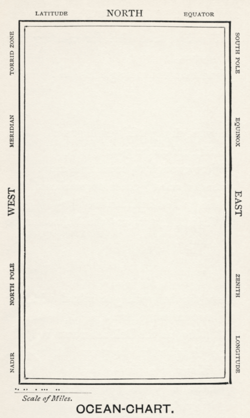
MapCarte 316/365: Ocean Chart by Henry Holiday, 1874

MapCarte316_snarkThe old adage less is more is a mantra of map design. While adding detail to show complexity is important, particularly in thematic or statistical cartography, it’s often possible to achieve it through a minimalist approach. For topographic mapping, the white spaces no longer suggest a lack of knowledge that needs filling with strange mythical creatures, but a graphical brevity. Being overly ornate detracts from the message of a map and beautiful, aesthetically pleasing maps are often those that appear quite stark at first glance. This map is possibly the most stark of the lot…a humorous take on large scale mapping at a scale of 1:1 accompanying the famous Lewis Carroll nonsense poem The Hunting of the Snark (An Agony in 8 Fits).

The plot of the poem is of ten crew on a tall ship hunting the Snark yet it’s been interpreted to have many meanings. The poem was illustrated by Henry Holliday who also drafted the Ocean Chart map to accompanycomments in the poem itself that can be easily interpreted as a commentary on the problems of maps and map interpretation:

He had bought a large map representing the sea,
Without the least vestige of land:
And the crew were much pleased when they found it to be
A map they could all understand.

“What’s the good of Mercator’s North Poles and Equators,
Tropics, Zones, and Meridian Lines?” 
So the Bellman would cry: and the crew would reply
“They are merely conventional signs!

“Other maps are such shapes, with their islands and capes!
But we’ve got our brave Captain to thank: 
(So the crew would protest) “that he’s bought us the best—
A perfect and absolute blank!”

The poem alludes to problems of interpreting complex maps and that the poor crew, who lacked the ability to read a map were delighted to see that the ocean chart, being blank, was perfectly understandable and represented the vast emptiness of the ocean perfectly. That said, the surrounding random map and associated terms are haphazardly arranged to cause maximum confusion, regardless of which orientation in which the map is held.

It’s difficult to argue with the accuracy and clarity of the map. More seriously, it reminds us of the need for accuracy, meeting our user’s abilities in interpretation, not getting overly caught up in convention when a more appropriate approach may be useful, and also the need to use white space wisely.

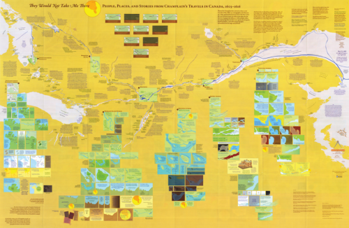
MapCarte 304/365: They would not take me there by Michael Hermann and Margaret Pearce, 2008

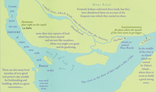
MapCarte304_champlainMaps are used for a wide variety of purposes to show something of a place, to tell a story or perhaps even to provide an insight into our imaginations. They can also be used very effectively to augment other works and materials to bring something new to the table. In this example, Pearce and Hermann have created a map that traces the story of Samuel de Champlain’s journeys in New France in the early 17th Century. It’s an example of a literary geography being brought to life through cartography.

The layout contains a very stark representation of the area of the St Lawrence River and part of the Great Lakes. The otherwise empty space is then filled with a multitude of small insets containing additional maps which act as stages in the journey. The result is both a fairly flat overall image but which contains depth and detail that one begins to see as they enter and explore the map – just as you might a good story.

MapCarte304_champlain_detail1The map isn’t simply a collection of randomly placed map elements which the reader is somehow expected to piece together. The map itself enhances the story so that the travel and the story in the journal is given a spatial context through arrangement. The map provides an additional actor on the stage to give rise to a richer sense of the story as if Champlain is narrating the story through the map.

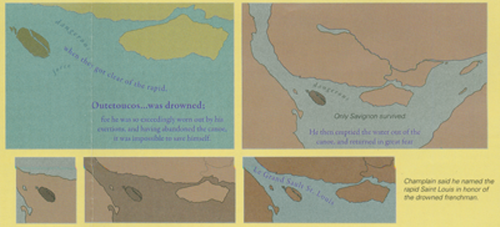
MapCarte304_champlain_detail2The design incorporates some elements that allow us to see different actors such as the native people’s thoughts and the map author’s comments which make the map an engaging commentary as well as a representation of the original journal. The conversations and incidents are brought alive through the map. Colour is also well played to give rise to an emotional response. Darker colours represents a more foreboding element to reinforce the narrative.

A great example of emotional and narrative cartography; of story telling and of using a map and all the visual stimuli of design to capture the imagination and to convey something more than the journal alone.

You can read more about the map from the author’s here and here and Daniel Huffman has written his own excellent critique here. Thanks to Daniel for suggesting this MapCarte entry.

MapCarte 247/365: The Hobbit and Lord of the Rings by J. R. R. Tolkien, 1937 and 1954

MapCarte247_tolkien_hobbit

Fantasy maps are increasing in number and scope as more video games take place in imagined worlds and computer power is able to render environments in ever more detail. The world of Minecraft is particularly interesting from a cartographic perspective since users can add worlds. Indeed, Ordnance Survey have added their Minecraft version of Great Britain to the virtual world. More details here.

But imaginary maps, or maps of imaginary worlds, are not new. Take, for example, The Hobbit and the Lord of the Rings trilogy by J. R. R. Tolkien. The films of the last decade have brought a new found interest that has seen countless maps and other geo-products developed including the very well produced The Hobbit Journey Through Middle-Earth as a way of teasing the film The Desolation of Smaug. You can see the web map here which uses a mix of sound, visuals and purported satellite imagery and maps that even have dancing clouds. It’s a great example of the current trend for photo-realistic worlds and immersive, interactive content.

Here though, we want to reflect on a much simpler yet more important and cartographically intersting version – the originals drawn by J. R. R. Tolkien himself.

MapCarte247_tolkien_hobbit2

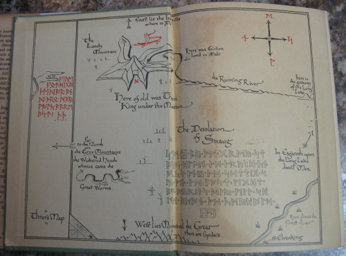
The lead map in this entry and the one above come from the inside front and back covers of The Hobbit published in 1937. They are two colour prints of the world as Tolkein envisaged it without CGI or fancy special effects. It presents the layout of the world with the key places. Mountains are represented in aspect across an otherwise planimetric map though there’s a hint at perspective with far off mountainscapes appearing on the horizon. It’s a sort of progressive projection and Tolkien was clearly a student of cartography enough to replenish his maps with high quality cartographic flourishes.

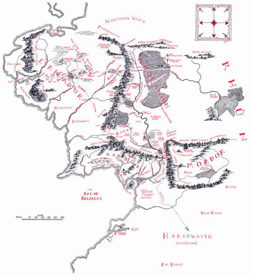
MapCarte247_tolkienThe final map here is from The Lord of the Rings book The Fellowship of the Ring, published in 1954 and gives us a view of the larger world the characters inhabit. Again, the two colour approach is used which allows highlights to be generated and contrast achieved. The linework is simple but effective and the use of white space hints at a world beyond.

As an inspiration for the landscapes that eventually made it to Peter Jackson’s films it’s easy to see how these original maps inspired the use of the landscape of New Zealand. A great example of the use of the real world to act as a set for an imaginary one.

Beautifully simple maps that bring to life an imagined place and which, along with others, underpin the fantasy maps of today.