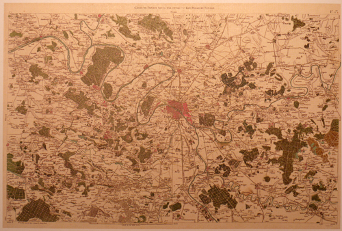
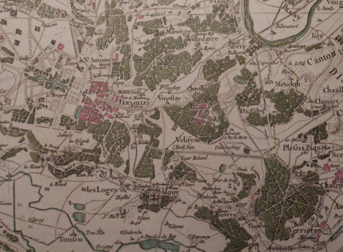
 Mapping entire countries is not for the feint-hearted. In 1744, Cassini prepared the first systematic, nationwide survey of a nation state, France. He was later commissioned to produce a more detailed map series to ultimately consist of 180 separate map sheets. This was not the work of a year or even a decade of preparation. This feat was the culmination of a century’s work by three generations of the Cassini family. Monumental in design and scope, Cassini’s map series was the result of scientific survey based on the triangulation of France which began in 1669 by his ancestors. By 1678 the Paris region had been mapped at a scale of 1:86,400. Various wars and other campaigns meant that surveying the remainder of France didn’t truly get going until 1733 when Cassini (strictly, Cassini III) recommenced the survey. Cassini’s map of 1744 laid out the traingulation of France but it required further surveys to fill in the map with topographic detail.
The new topographic map series, also at a scale of 1:86,400 began in 1748. It encompassed an 18-year plan with 10 maps to be published per year. The first two maps in the series took 8 years to be prepared yet they became the first properly surveyed, planimetrically accurate maps of a country. The level of detail was astonishing for the time and out-shone previous cartographic efforts by other European map-making dynasties. These maps immediately elevated France to the pinnacle of European cartographic excellence.
 The map of Paris shown here was part of the second survey series. The detail and artistry is incomparable for the time. The use of colour highlights different land use types with a bright pink being used to show built up areas intersected by a generalized but highly detailed street network. Shadows are used throughout to emphasise different elements which raises them to create a pseudo-natural look and feel. This is particularly evident on the deep green forested areas which also contain a pattern fill. Topography is shown with shading and fine hachure abd shadows are also used to add depth to rivers, shown in blue. The typography is beautifully applied and pictorial symbols finish off the detail showing the positions of churches and other landmarks.
This is a key map in the history of cartographic design. Accurate and beautiful. Form and function.

