MapCarte 321/365: Palm Springs Modern by Nat Reed, 2012

MapCarte321_reedWhen mapping a specific theme it’s often useful to create the map to reflect that theme; to make the map speak to the mapped phenomena and attract the map viewer with an object that does justice to the content. There’s little point creating a map of Palm Springs Mid-Century Modern architectural heritage in some nonsensical gothic style. It just wouldn’t work and your map loses credibility. Here, Nat Reed has captured the spirit of the 20th century Desert Modernism that found its home in Palm Springs.

The use of glass, clean lines, the combination of natural and manmade resources and the focus on indoor/outdoor spaces is what characterised this particular design aesthetic with the backdrop of the stunning desert landscape. The affluent clientele were a perfect audience for these visionary architects to let their creative juices run wild and they created notable buildings of almost every type. Today, Palm Springs remains vibrant but lives off much of its historical vibe, including the architecture. Nat Reed’s map evokes that spirit and reflects the design ideals inherent in the architecture.
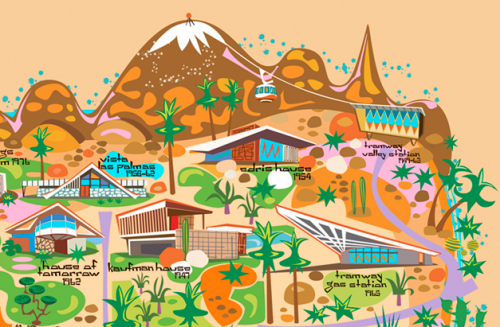
MapCarte321_reed_detailThe map is heavily stylized in shape. Scale is abandoned and symbology is clean and angular (see the sun, cacti and big horn sheep for instance). The map captures the retro feel perfectly. Colours are bright and vibrant; the illustrations of the buildings cartoon-like yet also showing some of the essential character of each building. This is a fantasy map luring you to the fantasy land of Palm Springs and with at least an inspiration from early Disneyland maps. The grid structure of the streets holds the work together amongst the palm trees and other green foliage. There’s even an outer river or moat that seems to envelope Palm Springs making it appear even more like a fantastical island. With north to the right, the San Jacinto mountains are shown in aspect at the top of the map with the city laid out before them. The typographic elements are also in keeping with the overall theme.

Here is a modernist map that creates a perfect cartographic link to the theme being mapped.

More details of Reed’s map and other prints on his web site here.

MapCarte 266/365: Wonder map of Melbourne by John Power Studios, 1934

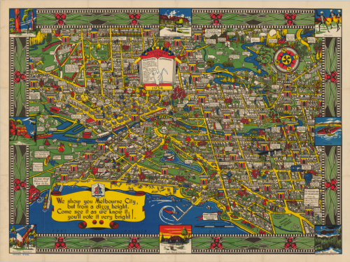
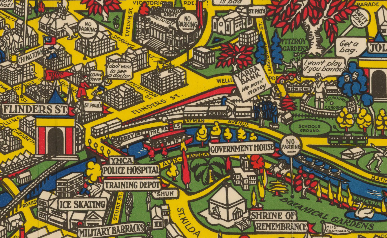
MapCarte266_melbourneIn 1914 Macdonald Gill drew his Wonderground map of London (featured in MapCarte 15). It brought a cartoonesque aesthetic to the streets of London and included pictorial elements and other delightful characters that produced a playful, whimsical but detailed and well marshalled map. Twenty years later, this map appears. It’s a map of Melbourne, Australia which displays a remarkable resemblance to Gill’s original. Considering we’ve already discussed Gill’s map, why is it necessary to include a derivative?

In design terms, there’s very little that is genuinely new in cartography. Most of what we seen owes something to what has gone before either in terms of some small element or, perhaps, in its overall style. Taken to extreme, derivative works can become merely pastiches (see the perpetual use of Beck’s subway map as a basis for alternative cartographies for instance) but sometimes they reflect an homage to a particular approach.  There’s a fine balance between homage, pastiche and plagiarism but here, the authors have shown a keen eye for their own landscape and geography and created a map in the style of Gill’s but with a clear Australian dimension.

MapCarte266_melbourne_detail

In this sense it’s worth promoting the idea that design doe not necessarily need to be wholly original to work. Many great cartographic effects and styles get re-used and re-imagined. New places and new ideas can add to the canon but in the main, maps tend to show subtle or blatant lineage.

MapCarte 205/365: Manchester Music Map by CreativeLynx c.2002

MapCarte205_manchester


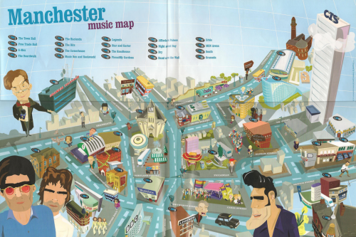
Making a map to support rourism requires two important design considerations – the content must be unique and speak to the audience; and the design must be attention-grabbing. Manchester’s music scene arguably provides the first in abundance given the number of iconic musicians and bands that hail from the area. Creative lynx came up with an aesthetic that did the second job.

This fantastic cartoon-styled map throws geography and scale out of the window. It’s useless as a tool for navigation but, instead, it emphasises key spaces of historical significance to some band or other. Places, buildings, venues and meeting spots are located. These are the important places for this map.  It goes beyond that by positioning the musicians in amongst the city itself, showing them taking ownership of Manchester and in so doing, defining its cultural relevance. Interest is encouraged through varying sizes of the main characters so you are invited to go beyond the larger figures to find and figure out who the smaller ones are.

A heavily stylized tourist map that supports the intended purpose and to develop a particular sense of place.

MapCarte 154/365: Sicilian Mafia by Peter Brookes, 1986

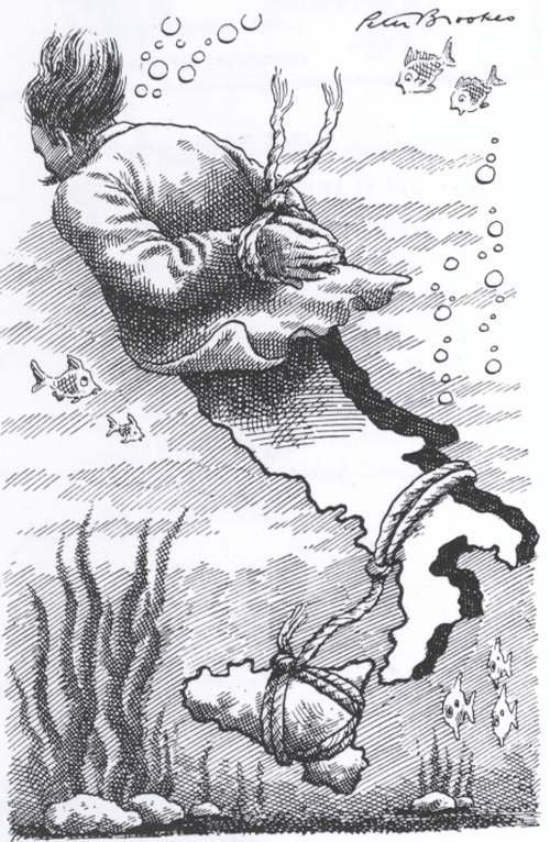
MapCarte154_brookesCartoonists and satirists find great inspiration from maps and this often leads them to use, modify or base their own work on them. Maps give us such iconic shapes that we relate to instinctively. We most likely know the shape of our own country and also of those we are most familiar with. The shapes are unique and so they become symbols in their own right. The fact they then have a symbolic association means it’s very easy to attach other imagery to the shapes to create new work. This is often satirical in nature as national stereotypes are contorted into country shapes.

There is a long tradition of cartoons being published in daily newspapers as a way to provide a commentary on the day’s events. Cartoonists are always seeking to entertain but to be clever in the juxtaposition of their work and some overarching political, social or economic message. Here, The Times’ cartoonist Peter Brookes goes to work on a theme that explores the Italian Mafia. The association with Sicily is clear and the narrative of the victim of Italy being dragged to a watery grave resonates as being stereotypical of the way some of the Mafia’s victims may have died. The political message is clear – the ongoing issues of the Mafia and their underlying involvement in politics is dragging the country down. It’s being shackled by the problems and drowning.

It’s a very simple, clear message that commented on the state of Italian politics and the involvement of the Mafia at the time. The fact that Italy is shaped like it is, that it is so recognisable and that Sicily could be used as a rock to drag the rest of the country down was a gift to Brookes. He took considerable artistic licence for the north of the country but you do not need the entire shape to make use of the important component of the southern half. The subdivision of the country is neatly handled by placing a jacket across the northern half and simply using the country as legs and feet.

Having the imagination to see satire in graphical work and to incorporate maps into the design is not an easy task. Maps have many uses and as shapes in their own right they provide us with rich, unique symbology.