MapCarte 74/365: Tornado Days by Brenden Heberton, 2013

MapCarte74_heberton

Click the image to view the online map

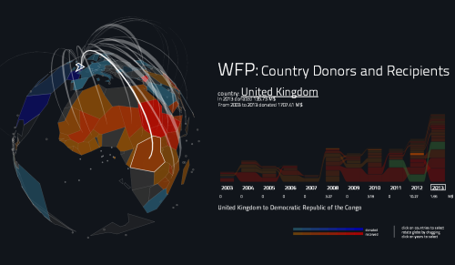
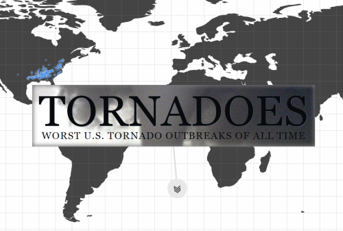
There have been plenty of maps made using NOAA’s historical tornado data but this web map by Brenden Heberton went beyond the map by combining a wide range of multimedia in an innovative way.  Heberton has built a story around the data and used several maps and different media to create a multi-dimensional cartographic product. In some respects, it’s a modern equivalent of a classic National Geographic poster map adorned by fantastic illustrations, inset maps, descriptions, graphs and other visual content. What Heberton achieves here is expertly marshalling modern versions of all these map components into a cohesive whole.

The reader scrolls down to reveal new facts, new maps and a new layout. This heightens the interest and keeps people immersed in the rich story being told. The maps are styled using a bare minimum of linework and labels so they sit comfortably amongst other page detail. The thematic content contrasts by using a bright colour over the relatively grey backgrounds. Video and audio get added to the mix as you work your way through the story but rather than maintaining a consistent template, each new chapter of the story interleaves the components in different ways so sometimes the video becomes the backdrop rather than the inset. Maps as a component of a story…expertly collated into an immersive, interactive web map.

MapCarte 67/365: World Food Program Donations by Santiago Ortiz, 2014

MapCarte67_ortizClick the image to view the online map

It’s the interactivity that makes this web map application by Santiago Ortiz so compelling. The mouse is predominantly used as a device to move across the image with mouseover controls allowing you to ‘brush’ the various components. As you move your mouse across the globe, country outlines or flow lines showing connectivity between countries are highlighted. The associated component in the graph is similarly highlighted so physical connections create visual connections seamlessly.

Clicking countries or graph components re-focuses the globe to the country of choice and refreshes the visual representation to make it country specific. Holding the mouse button provides an intuitive way of rotating the globe and the movement is smooth and pleasing on the eye.

The design is strong, with a heavily generalised map of countries depicted on the otherwise transparent globe that makes for a great visual atop a jet black canvas. The globe and the graph share colours (strengthening the visual links) and also share space with neither being dominant. The application is designed for exploration, to reveal patterns and to see how countries compare. A terrific example of slick, simple and powerful web map design.

MapCarte 64/365: Population density by Derek Watkins, 2012

MapCarte64_watkins

Click the image to view the online map

Simplicity in map design is difficult to achieve but Derek Watkins perfects the art with elegant efficiency in his interactive map of world population density, an interactive rendering of Bill Bunge’s The Continents and Islands of Mankind. Good design is often more about what you leave out than what you include. Avoiding unnecessary interaction and pointless user-controlled options, the map shows a single theme but allows you to control the binary classification (populated or not) to reveal different views of the dataset.

Beautifully generalised, almost amoebic ‘blobs’ are used to show populated areas. The image above shows 5 people per square kilometer but this can be changed using the classification bar to show different classifications up to areas of 500 people per square kilometre. This reveals the most populated areas on earth and where populated places with similar densities exist. The alternative would have been to show different densities as a choropleth but the classification is what gives the map its interaction to create several maps of different densities.

The lack of a coastline focuses attention on the populated places and our ability to recognise the familiar shapes of the world allow us to identify places easily. A subtle toggle to add place names is included but switched off by default – a nice touch.

There are no zoom or pan controls – the map works at one scale and shows that not every online map has to be slippy. Colour is simple – just black on white and with a red flash for the value of the data in the legend…which also acts as a title.

MapCarte 62/365: 50 years of The Rolling Stones by Sergio Alvarez and Javier Santana, 2012

MapCarte62_stones

Click the image to view the online map

Maps are one of the oldest devices for telling stories. This fundamental concept seems to have been reinvented in the online realm as web maps provide a canvas for integrating a range of multimedia with maps as well as providing interaction to support user engagement. The ability of a map to invite a reader/user in and provide them with a rich, immersive environment is core to good map design. Web mapping extends the possibilities by providing additional ways to interrogate data. Here, a simple dataset of all locations of the touring history of The Rolling Stones is mapped.

The map itself is stripped of virtually all detail. The colours are limited to a few greys with the splash of highly contrasting red used to great effect in the typographic components. As the user ‘turns the page’ to reveal each tour year the map shows cities and the links between them; location labels are only revealed with a mouse over (not a click!) so they don’t clutter the image. Useful navigation tools are minimalist but intuitive.

Simple story. Simply presented with simple but highly effective design.

MapCarte 61/365: PrettyMaps by Stamen Design, 2010

MapCarte61_stamenpretty

View the online map here

Described as an ‘experimental design’, Stamen have thrown away the rule book with this example of styling digital data to the extreme. It’s not so much a map as a work of art taking many aspects of modernism and applying it liberally to the data. It owes much to artists such as Jasper Johns who made the map of the U.S.A. famous when he used it as a basis for his own experiments with abstract map imagery (MapCarte 3/365)

Virtually every aspect of this map is counter to how you would typically style features with bright contrasting colours and angular shapes yet hiararchy of features is preserved, they are recognisable and can be distinguished from one another in the landscape. The map is not especially useful as a backdrop for other thematic detail yet the point of this is to explore ways of re-imagining the map and challenging our preconceptions of map design.

It has a strong aesthetic and although rendered as an online map, the beauty of this work is not necessarily as an online map – as it makes heavy weather of rendering in the browser – but the style it deploys.

MapCarte 41/365: Migration flows in the United States by Chris Walker, 2013

MapCarte41_walker

Click image to view online web map/diagram

As Harry Beck’s underground map proves so well, a map need not follow conventional geography. Charles Minard’s map of Napoleon’s March on Moscow is in a similar vein being heavily diagrammatic. The data may be geographical yet presenting it in a meaningful way may require the rejection of geography.

Here, Chris Walker takes a similar approach and uses a chord chart to show the inter-state migration of people in the US in 2012. Good use of size to connotate magnitude and colour to enable differentiation between the States at a regional level. Simple mouseover interaction means viewers don’t get RSI through having to click everywhere and the chart modifies to reveal single State flows. Trying to put this information onto a map wouldn’t work as it’d be too overcrowded yet because of the positioning of the regions the circle at least provides a clever link to the real geography.

A great example of using a simple approach to a complex data yet still retaining the detail that makes the topic worth exploring. The simplicity of the graph allows the detail and the complexity of the data to be seen clearly. This works. Simply.

MapCarte 40/365: The Internet Map by Ruslan Enikeev, 2012

MapCarte40_enikeev

Click the image to view online map.

There have been plenty of attempts to map the vast interconnected world of wires that we call the internet. Part physical structure, part virtual world, the network consists predominantly of hubs (domains) connected in some way. Early attempts to map the internet focused on the connections resulting in a mass of overlapping lines that created the appearance of a constellation.

Here, Ruslan Enikeev prefers simply to map the domains (as they were in 2011) and not the connections which appear implicitly by the arrangement of the domains themselves. In many ways this is a monster Dorling cartogram with proportional circles representing the amount of traffic for over 350,000 sites, 2 million links and 196 countries. The space between the circles represents the frequency by which users go from one site to another.

Larger clusters are national websites, colour is used to represent different countries. What Enikeev does very well is take advantage of the multiscale character of a web map to reveal detail as you zoom in. Circles not only become visible but he intelligently increases label density too. This provides a hook to engage map readers and encourage them to dig deeper. Of course, each site can be clicked to reveal detail about the site and traffic.

MapCarte 39/365: Death in Grand Canyon by Kenneth Field and Damien Demaj, 2012

MapCarte39_field1

Forgive the posting of one’s own work but as it’s the author’s birthdays on 8th and 10th Feb and the map won the ‘best map at the International Cartographic Conference in Dresden, 2013 we figured if others feel it has cartographic merit it’s deserving of inclusion in MapCarte…

This map was designed in two ways for both print and web, each allowing the consideration of the opportunities and limitations of the two mediums. With print, you get the map at once and it has an immediate impact yet we have to resort to an inset for the detailed areas. With the web, multiscale allows us to increase detail as we zoom in and so we can use a hex-binning technique at smaller scales and switch to true locations for every location at larger scales. We can also switch out the basemap at larger scales online to use a satellite image that gives us a clearer impression of the actual character of the landscape. Additionally, whereas we can only include c.20 text vignettes describing the incidents on the print map, the full details of all 700+ incidents can be explored on the web map.

The map employs a chromastereoscopic technique that allows us to encode some variable using spectral colours. When viewed through chromadepth glasses (that contain small prisms) red is refracted so it appears closer to the eye and blue refracted so it appears farthest away. Other colours are refracted between these two endpoints which creates a 3D holographic effect. Elevation was encoded in this way so we see deep red plateaus descending to the blue of the Colorado. Other map elements used pure red hues to build subtle visual hierarchies for the map content. The ‘comic book’ style complements the dramatic colours and theme and pictograms are used to represent categories of incident..as ‘warning’ triangles on the print map and tesselated hexagons on the online version.

The chromasteroscopic technique is unlike other 3D techniques in that the map is perfectly legible without the 3D glasses…a little jarring visually because of the highly saturated colours but Grand Canyon provided a great landscape to map this way because of the naturally red rock.

Print map can be downloaded here.
Online version of the map is here.
Chromadepth glasses can be obtained from American Paper optics here

Thanks for the indulgence…normal service resumes tomorrow.


MapCarte 28/365: Bike Share Map by Ollie O’Brien, 2013

MapCarte28_obrien

Click the image to view online map

Developed from an initial version showing London’s bike share scheme in 2010, Ollie O’Brien has developed his map to provide links to around 100 similar schemes across the globe. Technically, the work showcases the potential of tapping into real-time data feeds that makes the map not only interesting but truly purposeful. The one key aspect that web mapping offers is the ability for a map to update when data changes. Here, O’Brien demonstrates how to harness that and create a genuinely useful information product which captures change approximately every 2 minutes.

The map itself takes a standard thematic proportional symbol approach that indicates size of the bike station and uses colour (which can be modified to your own liking) to show whether a station is relatively full or empty. The addition of statistics on each bike station (revealed by a mouse roll-over), the overall statistics for a city, usage graphs and animations that show the ebb and flow of daily use patterns add to the utility of the map. Here, detail is the key and the map gives the user a number of different ways to consume it as well as modifying the viewing experience.

More detail on Ollie’s site here.

MapCarte 25/365: In Flight by Kiln, 2014

MapCarte25_kiln

Click image to view the online web map

The first map of 2014 to be added to MapCarte is an impressive effort by Kiln, who have designed a multimedia app that celebrates 100 years of aviation history. Designed for The Guardian, the app shows how a story can be told through expertly integrating pictures, audio, commentary and animation with the map as a central character. The map holds the story together, providing a focal point that the story returns to at different points. The map itself is simple in design and allows you to explore historic flight data as well as real time patterns.

The background map is tastefully presented and the animated flight lines work well (with a nod to a number of other web maps that illustrate flow). The pace of the presentation is crucial and allows people an immersive experience. Controls are obvious and support, rather than interfere, with its use. Functionally, the app gives the user variation and holds the attention well. The commentary means that the map is supported by a story we can follow.