
Click image to view online web map/diagram
As Harry Beck’s underground map proves so well, a map need not follow conventional geography. Charles Minard’s map of Napoleon’s March on Moscow is in a similar vein being heavily diagrammatic. The data may be geographical yet presenting it in a meaningful way may require the rejection of geography.
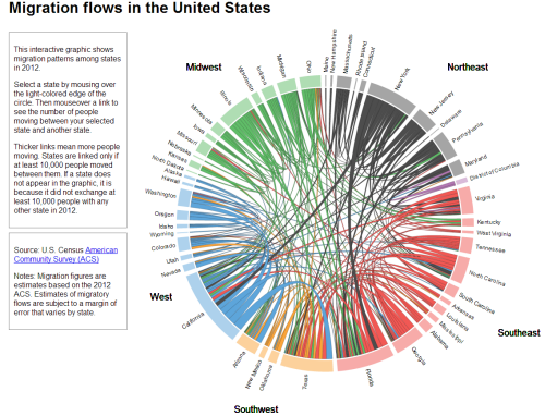
Here, Chris Walker takes a similar approach and uses a chord chart to show the inter-state migration of people in the US in 2012. Good use of size to connotate magnitude and colour to enable differentiation between the States at a regional level. Simple mouseover interaction means viewers don’t get RSI through having to click everywhere and the chart modifies to reveal single State flows. Trying to put this information onto a map wouldn’t work as it’d be too overcrowded yet because of the positioning of the regions the circle at least provides a clever link to the real geography.
A great example of using a simple approach to a complex data yet still retaining the detail that makes the topic worth exploring. The simplicity of the graph allows the detail and the complexity of the data to be seen clearly. This works. Simply.
