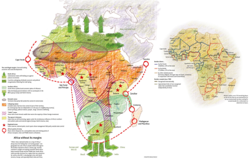
MapCarte 234/365: Africa without its margins by Philippe Rekacewicz, 2012

MapCarte234_africa

Newspaper maps often showcase the very best of graphic design since graphic design is one of the cornerstones of producing a well prepared publication. The ability to combine text, photographs and illustrations across a pleasing layout not only develops a house style but a sense of character that readers identify with. Maps are part of this style and Le Monde have consistently produced high quality graphics whether it be a small, simple location map or a more detailed piece that conveys a richer story.

Le Monde maps do not always follow the same graphic approach yet they are all expertly produced. This example from Philippe Rekacewicz takes a hand-drawn approach. It looks like a sketch map but the content of the map demands a fuzziness. Mapping Africa without borders means a map with very uncertain areas. The hand-drawn approach is endearing and lends itself well to this uncertainty. You easily forgive the lack of accuracy of the lines and demarcation simply because of the graphical approach. The colouring in is as you would expect from a set of colouring pencils with pencil coastline and the hint of erased and redrawn elements.

The smaller map depicts how the real borders were drawn by the French, British and other colonial powers but it’s the larger map with it’s borders indicative of mineral belts, nomadic zones and the spaces in between that’s particularly alluring.

Newspaper maps often show us how one-off cartographic products should be produced. Le Monde produces some of the best and although we’ve selected one example here it’s worth perusing their gallery here.

MapCarte 183/365: The Iraq-ISIS Conflict in Maps, Photos and Video by New York Times, 2014

MapCarte183_iraq_nyt4

Click the image to view the online story and maps

It’s quite possible that with every new story the New York Times graphics department do their utmost to out-do even themselves. Their maps have already featured in MapCarte and at the half-way point it’s a fair bet that one of the remaining 182 posts will feature their work.

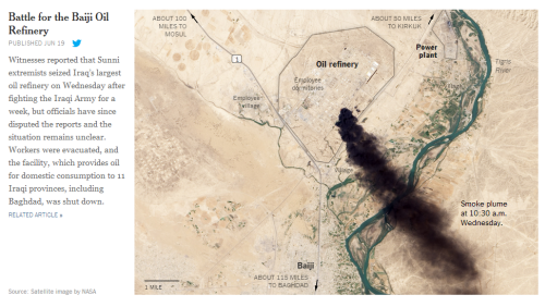
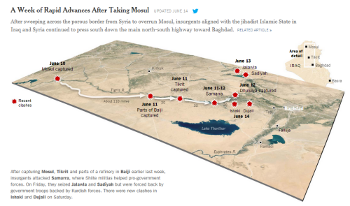
This example illustrates how to combine a range of illustrative media into a coherent story. Their isn’t a single map or image, technique or dataset that would convey the story in a singel pane or a few web pages. The solution is a scrolling page that reveals new insights as you progress through the imagery and text.

MapCarte183_iraq_nyt1

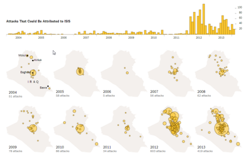
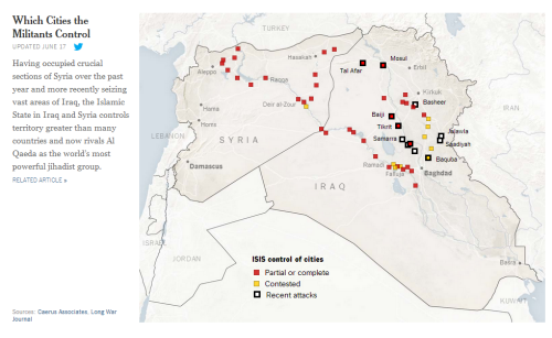
The maps are not complex. In fact, they are relatively simple affairs yet simplicity is often the key to communication. Each is used to tell a specific dimension of the story and they expertly mix topographic diagrams with small multiples, point of interest maps with satellite imagery.

MapCarte183_iraq_nyt2

The selection of just the right map type with just the right amount of detail is what makes this example of web-based reporting (story-telling?) so compelling. You want to scroll and learn more. You are encouraged through the work to want to explore and to have them reveal more.

MapCarte183_iraq_nyt3


Perhaps the most exquisite aspect of this example of cartographic storytelling is that the maps are web-based yet they are static. There is simply no need for interaction, click events, popups or animations. Simple, static maps that are individually balanced and well designed but collectively present a rich visual narrative. A good lesson in cartographic restraint.

MapCarte 25/365: In Flight by Kiln, 2014

MapCarte25_kiln

Click image to view the online web map

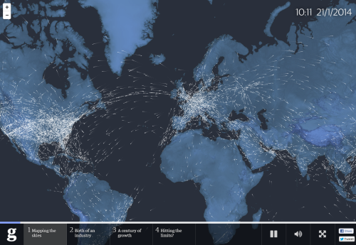
The first map of 2014 to be added to MapCarte is an impressive effort by Kiln, who have designed a multimedia app that celebrates 100 years of aviation history. Designed for The Guardian, the app shows how a story can be told through expertly integrating pictures, audio, commentary and animation with the map as a central character. The map holds the story together, providing a focal point that the story returns to at different points. The map itself is simple in design and allows you to explore historic flight data as well as real time patterns.

The background map is tastefully presented and the animated flight lines work well (with a nod to a number of other web maps that illustrate flow). The pace of the presentation is crucial and allows people an immersive experience. Controls are obvious and support, rather than interfere, with its use. Functionally, the app gives the user variation and holds the attention well. The commentary means that the map is supported by a story we can follow.