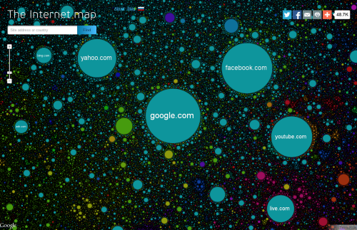
Click the image to view online map.
There have been plenty of attempts to map the vast interconnected world of wires that we call the internet. Part physical structure, part virtual world, the network consists predominantly of hubs (domains) connected in some way. Early attempts to map the internet focused on the connections resulting in a mass of overlapping lines that created the appearance of a constellation.
Here, Ruslan Enikeev prefers simply to map the domains (as they were in 2011) and not the connections which appear implicitly by the arrangement of the domains themselves. In many ways this is a monster Dorling cartogram with proportional circles representing the amount of traffic for over 350,000 sites, 2 million links and 196 countries. The space between the circles represents the frequency by which users go from one site to another.
Larger clusters are national websites, colour is used to represent different countries. What Enikeev does very well is take advantage of the multiscale character of a web map to reveal detail as you zoom in. Circles not only become visible but he intelligently increases label density too. This provides a hook to engage map readers and encourage them to dig deeper. Of course, each site can be clicked to reveal detail about the site and traffic.


