 Click the image to view web map
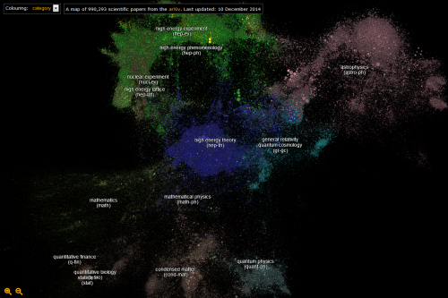
Big data is one of those ill-defined buzzwords that is rarely used appropriately. It’s a fairly all-encompassing term that relates to a dataset that is so large, unwieldy and incomprehensible that it creates difficulties in terms of processing. For cartography, big data might be regarded as a dataset that creates difficulties for analysis in the sense of distilling it to something meaningful to map; or it might relate to the the visualization techniques we have to build to handle something that is problematic to display using traditional means. It’s debatable whether a million items is big enough to be called big data but it certainly creates big cartographic design problems. Paperscape attempts to resolve the problem by creating a map of nearly a million scientific papers.
 The map is a constellation of symbols; small circles coloured by the type of category of scientific work the paper explores. Colours tend to occupy similar spaces and sit comfortably within the overall constellation. The broad category is labelled but the beauty of the map is when you zoom in there’s a progressive reveal of detail. Circles become larger and we see more labels and more symbols appear. Larger symbols indicate increased citation rates as a measure of the paper’s importance. You can switch the colours to represent age with newer papers appearing more saturated along a single hue colour scheme.
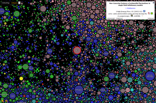
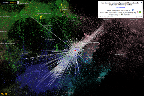 This is no dumb map though. Clicking the symbols gives you full bibliographic details and additional controls to create links to all other papers that are either referenced by or cited in the paper. It’s a novel way of representing a bibliographic database and does a great job of bringing a cartographic design solution to the representation of a million individual records and their complex interconnectivity.
It’s multiscale, easy to understand and interactive. It’s also well designed.
You can view Paperscape here.