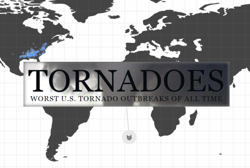
Click the image to view the online map
There have been plenty of maps made using NOAA’s historical tornado data but this web map by Brenden Heberton went beyond the map by combining a wide range of multimedia in an innovative way. Heberton has built a story around the data and used several maps and different media to create a multi-dimensional cartographic product. In some respects, it’s a modern equivalent of a classic National Geographic poster map adorned by fantastic illustrations, inset maps, descriptions, graphs and other visual content. What Heberton achieves here is expertly marshalling modern versions of all these map components into a cohesive whole.
The reader scrolls down to reveal new facts, new maps and a new layout. This heightens the interest and keeps people immersed in the rich story being told. The maps are styled using a bare minimum of linework and labels so they sit comfortably amongst other page detail. The thematic content contrasts by using a bright colour over the relatively grey backgrounds. Video and audio get added to the mix as you work your way through the story but rather than maintaining a consistent template, each new chapter of the story interleaves the components in different ways so sometimes the video becomes the backdrop rather than the inset. Maps as a component of a story…expertly collated into an immersive, interactive web map.


