MapCarte 49/365: Dymaxion map by R. Buckminster Fuller, 1943

MapCarte49_dymaxion

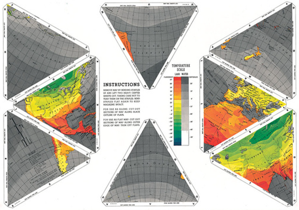
First published as an article in The March 1st 1943 edition of Life magazine, Buckminster Fuller’s compromise projection contains far less distortion than other flat maps. The map was printed as a pull-out section designed to allow readers to assemble the map. It divides the globe’s surface into a continuous surface without bisecting major land masses and it is unique in that there is no right way up. It can be read from any orientation and rearranged in a number of alternative ways.

MapCarte49_dymaxion2

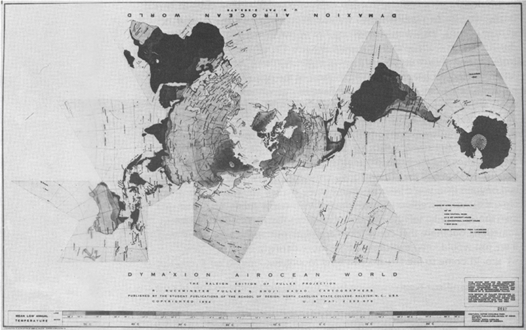
Fuller went on to publish his ‘Airocean’ world map using the projection in 1954 that employed a modified icosahedron. The term Dymaxion was a name applied by Fuller to this and many other of his inventions. Each triangular edge matches the scale of a partial great circle on the corresponding globe and it that sense, points within each facet shrink towards its middle point (which is the inverse of many other projections).

The map was intended to be folded in different ways though in its most common orientation it shows an archipelago of almost uninterrupted continents and allows the plotting of migratory paths and flow particularly well.

The original Life magazine article can be read here.

MapCarte 48/365: Colorado ski country by Hal Shelton, 1965

MapCarte48_shelton

Hal Shelton’s work for U.S. Geological Survey and Jeppeson Co. in the mid 1900s resulted in numerous innovative and highly realistic works, predominantly in terrain representation. His hand drawn and painted maps depicted relief as detailed satellite images before the technology allowed them to be digitally produced.

Much of his work was in the creation of planimetric terrain but here, Shelton took a landscape panorama approach to mapping the Rocky Mountains in Colorado as a way to showcase and advertise the location of the numerous ski resorts. The work is highly detailed and applies a natural-colour style palette to give the appearance of a birds-eye representation. The map is oriented so the viewer sees across the plain (Denver in the lower left) and across the front range that adds to the sense of drama of the mountains and what lies beyond. The brownish plains give way to green foothills and finally the white snow-covered terrain. Labels are added unobtrusively just for the ski areas.

MapCarte 47/365: Collins Crossworld Puzzle by Kenneth Gibson and Kathryn Kelly, 2013

MapCarte47_collins

The world map…as a crossword. That makes it a crossworld. Such a simple idea and a well crafted design with clues that broadly fit the locations of their position on the map. Sometimes the simplest of ideas can turn into the most effective of maps. Interaction is implicit.

The classic black and white print crossword depiction is favoured and thankfully the temptation to colour continents was ignored. The map demonstrates the use of familiar shapes as a backdrop to support the primary use.

MapCarte 46/365: Cloudless atlas by Mapbox, 2013

MapCarte46_mapboxAerial photographs and remotely sensed images have not only been used for decades to derive map detail but they are increasingly used as the map itself. This can provide a detailed view of the world as it exists rather than the abstract landscape that a map often presents. Of course, problems of cloud cover, poor resolution and mismatched imagery, often captured at different times of the year can create a less than pleasing result.

A fresh approach to making a mosaic of NASA’s LANCE-MODIS data has been developed by Mapbox. Rather than taking the best image of a particular place and then quilting them together, Mapbox stacked images and processed them, pixel by pixel to get the average of the least cloudy pixel before stitching it all back together to create a seamless cloud-free atlas. Completely synthetic but a great example of using generalisation techniques to create a product that is greater than the sum of its parts (literally). Beautiful, consistent imagery.

MapCarte 45/365: Rangerland – Sloane is where you find it by Anon, 1982

MapCarte45_sloane

Our mental maps of the world can be impacted by knowledge, experience and our sense of what and where is important to us as individuals. It’s no wonder, then, that our own personal maps are heavily distorted and reflect a warped geography often exaggerating the familiar and ignoring places and detail that are irrelevant to us. When drawn, we often see bizarre landscapes emerge.

Here, a comical take on the mental map of what is important to the individual from ‘Sloane Rangerland’. The shapes of countries are hugely distorted. There’s a focus not only on England but also a wildly exaggerated road network comprising of the important roads around Sloane Square, London. Only the important towns and cities are located with no real sense of hierarchy yet the map works. Its annotations (as speech bubbles) narrate the landscape and demonstrate that hugely personal maps can be successful in communicating a very specific theme.

This map also illustrates the value of mapping in black and white. Colour can often complicate a map so if it’s unnecessary then consider monochrome – it certainly focuses the design thinking.

MapCarte 44/365: Plan de Paris by Louis Bretez, 1739

MapCarte44_turgotA classic example of the principle of adding detail to communicate complexity. Commissioned by the the chief of the municipality of Paris, Michel-Étienne Turgot, the Turgot map of Paris was prepared by Louis Bretez and originally published in atlas form across 20 pages, each 50 cm by 80 cm giving an accurate birds-eye view of a part of the city. In its entirety the map would measure 250 cm high by 322 cm wide, corresponding to a scale of approximately 1:400.

MapCarte44_turgot_detail

Bretez took over two years to survey the city in detail and was granted permission to enter mansions and gardens to take measurements and draw sketches. The map uses an isometric projection and for the time, went against the trend of more geometric, planimetric depictions of cities in favour of a return to a pseudo-panoramic style. The benefit of an isometric projection allows scale to remain constant across the map so buildings in the foreground are to the same scale as those in the background.

This is large-scale mapping in the extreme and the result of a huge effort. It paid off with a beautiful map!

MapCarte 43/365: Geography Bewitched by Robert Dighton, 1795

MapCarte43_dightonA great early example of satirical mapping. The use of the shapes of various countries has long been the inspiration or basis for making maps and produces interesting curiosities that match familiar shapes with familiar imagery. This example by Robert Dighton, the well-known !8th century painter and published by Bowles and Carver, was one of a series including England, Wales and Ireland that received similar treatment under the title “Geography Bewitched”.

The map is titled “a droll caricature Map of Scotland” and shows a stereotypical Scotsman in what resembles national costume. Hand coloured, the map positions the character on a landscape complete with Scottish thistle. This style of mapping has been used to good effect in newspapers and cartoons and are particularly collectable.

In terms of design, the artist makes excellent use of the shape of the country in which he fits the caricature. Here, the shape of the map is intrinsically linked to the intended output but supports the general principle of ensuring the map-maker considers the map shape and how it underpins the shape and layout of the overall map page.

MapCarte 42/365: Mount Everest by the National Geographic Society, 1988

MapCarte42_natgeo

Mount Everest has been mapped extensively using a plethora of relief representations.  Possibly the most frequently cited example of excellence in design is by Eduard Imhof in the 1960s for his impressive use of colour. Here, though, Bradford Washburn used Swissair Survey aerial photos and Space Shuttle infrared photos to plot Mount Everest at 1:50,000 before applying his beautifully drawn representation.

Possibly the last example of hand drawn Swiss relief representation makes clear the most detailed and accurate map ever made of Mount Everest.  The digital age has yet to provide ways of matching such exquisite artistry.  The peaks, glaciers, rocks and hydrography are particularly clear with scree slopes depicted in astonishing detail.  Blue contours sit well in the overall design and take on the appearance of layers of ice.  The typography is beautifully set and the map has a soft, photo-realistic feel that adds visual impact.  The border separating China and India is so subtle it looks like it is actually painted on the ridgelines.  A masterpiece of accurate planimetric terrain representation showing natural beauty and scientific information in the most vivid possible way.

MapCarte 41/365: Migration flows in the United States by Chris Walker, 2013

MapCarte41_walker

Click image to view online web map/diagram

As Harry Beck’s underground map proves so well, a map need not follow conventional geography. Charles Minard’s map of Napoleon’s March on Moscow is in a similar vein being heavily diagrammatic. The data may be geographical yet presenting it in a meaningful way may require the rejection of geography.

Here, Chris Walker takes a similar approach and uses a chord chart to show the inter-state migration of people in the US in 2012. Good use of size to connotate magnitude and colour to enable differentiation between the States at a regional level. Simple mouseover interaction means viewers don’t get RSI through having to click everywhere and the chart modifies to reveal single State flows. Trying to put this information onto a map wouldn’t work as it’d be too overcrowded yet because of the positioning of the regions the circle at least provides a clever link to the real geography.

A great example of using a simple approach to a complex data yet still retaining the detail that makes the topic worth exploring. The simplicity of the graph allows the detail and the complexity of the data to be seen clearly. This works. Simply.

MapCarte 40/365: The Internet Map by Ruslan Enikeev, 2012

MapCarte40_enikeev

Click the image to view online map.

There have been plenty of attempts to map the vast interconnected world of wires that we call the internet. Part physical structure, part virtual world, the network consists predominantly of hubs (domains) connected in some way. Early attempts to map the internet focused on the connections resulting in a mass of overlapping lines that created the appearance of a constellation.

Here, Ruslan Enikeev prefers simply to map the domains (as they were in 2011) and not the connections which appear implicitly by the arrangement of the domains themselves. In many ways this is a monster Dorling cartogram with proportional circles representing the amount of traffic for over 350,000 sites, 2 million links and 196 countries. The space between the circles represents the frequency by which users go from one site to another.

Larger clusters are national websites, colour is used to represent different countries. What Enikeev does very well is take advantage of the multiscale character of a web map to reveal detail as you zoom in. Circles not only become visible but he intelligently increases label density too. This provides a hook to engage map readers and encourage them to dig deeper. Of course, each site can be clicked to reveal detail about the site and traffic.