MapCarte 39/365: Death in Grand Canyon by Kenneth Field and Damien Demaj, 2012

MapCarte39_field1

Forgive the posting of one’s own work but as it’s the author’s birthdays on 8th and 10th Feb and the map won the ‘best map at the International Cartographic Conference in Dresden, 2013 we figured if others feel it has cartographic merit it’s deserving of inclusion in MapCarte…

This map was designed in two ways for both print and web, each allowing the consideration of the opportunities and limitations of the two mediums. With print, you get the map at once and it has an immediate impact yet we have to resort to an inset for the detailed areas. With the web, multiscale allows us to increase detail as we zoom in and so we can use a hex-binning technique at smaller scales and switch to true locations for every location at larger scales. We can also switch out the basemap at larger scales online to use a satellite image that gives us a clearer impression of the actual character of the landscape. Additionally, whereas we can only include c.20 text vignettes describing the incidents on the print map, the full details of all 700+ incidents can be explored on the web map.

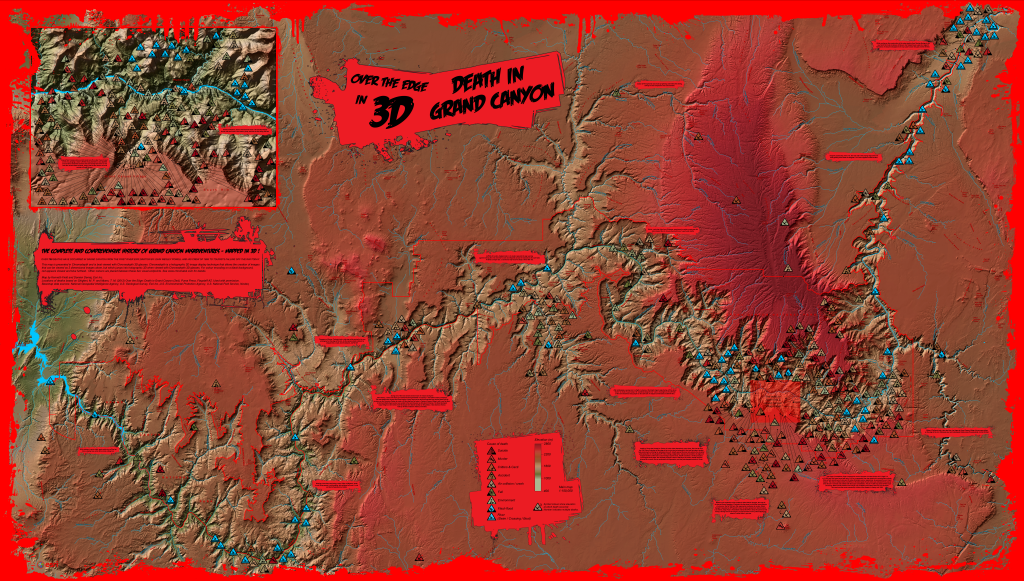
The map employs a chromastereoscopic technique that allows us to encode some variable using spectral colours. When viewed through chromadepth glasses (that contain small prisms) red is refracted so it appears closer to the eye and blue refracted so it appears farthest away. Other colours are refracted between these two endpoints which creates a 3D holographic effect. Elevation was encoded in this way so we see deep red plateaus descending to the blue of the Colorado. Other map elements used pure red hues to build subtle visual hierarchies for the map content. The ‘comic book’ style complements the dramatic colours and theme and pictograms are used to represent categories of incident..as ‘warning’ triangles on the print map and tesselated hexagons on the online version.

The chromasteroscopic technique is unlike other 3D techniques in that the map is perfectly legible without the 3D glasses…a little jarring visually because of the highly saturated colours but Grand Canyon provided a great landscape to map this way because of the naturally red rock.

Print map can be downloaded here.
Online version of the map is here.
Chromadepth glasses can be obtained from American Paper optics here

Thanks for the indulgence…normal service resumes tomorrow.


MapCarte 38/365: McArthur’s Universal Corrective Map of the World, Stuart McArthur, 1979

MapCarte38_mcarthur

What’s a ‘normal’ looking world map? If you’re from Europe then north is at the top of the map and the Greenwich meridian is usually centred. If you’re from North America then you’d likely see the Americas centred with Europe pushed to the right and Asia appearing on the left. Of course, these are just the ways the map is normally presented. There is no particular reason but familiarity leads to a somewhat conventional view of the world. This map is designed to challenge the familiar.

Maps can be presented in any orientation and alignment and projections give us enormous flexibility. Challenging such engrained conventions is a little harder but here, Stuart McArthur achieved just that with a relatively sparse yet stark representation. He drew his first South-Up map when he was 12 years old. His geography teacher told him to re-do his assignment with the “correct” way up if he wanted to pass. Three years later, as an exchange student in Japan, he was taunted by his friends from the USA for coming from “the bottom of the world.” It was then, at age 15, he resolved to one day publish a map with Australia at the top. Six years later, while at Melbourne University, he produced the world’s first “modern” south up map and launched it on Australia day in 1979.

The map places Australia at just about the visual centre of the page but there are other subtle design elements that help reinforce the message. The gradient of light to dark tan for the land from top to bottom helps highlight Australia and has the converse effect on Asia, North America and Europe. The block of text adds a certain Australia humour to the overall map ending with “South lives. South dominates. Long live Australia, rulers of the Universe”

MapCarte 37/365: Scents of Glasgow by Kate McLean, 2013

MapCarte37_mclean

An installation artwork that combines a visual map of the perceived smells encountered in Glasgow during the winter months of 2012 with a collection of 9 individual bespoke scents created from natural ingredients, bottled as part of the installation.

This, then, is a smell map. It’s designed to inform us of the history, culture, urban planning and climate of the city. For instance, carbolic soap alludes to the shared “stair” cleaning in the tenement buildings, green moss to the damp winter climate. Hot Bovril (a drink) at the football is a ritual, as is Lorne (square) sausage sizzling at the markets, cafés and food outlets on building sites.

The large dots represent the source of the smell and the smaller dots show their range and intensity. Not necessarily pleasing on the nose, but pleasing on the eye. More information about the map and similar works here.

MapCarte 36/365: Treasure Island by Robert Louis Stevenson, 1883

MapCarte36_stevenson

Maps have the ability to transport us to far off places without ever having been there. They also take us to completely fictitious places. Robert Louis Stevenson’s tale of action and adventure in Treasure Island contained a detailed map on the inside cover that showed the location of a career’s worth of looting by the notorious pirate Captain Flint. The map was integral to the story. X marked the spot of the buried treasure and so the hunt began.

The map is well drawn which makes it believable. It contains all elements of topographic detail you’d expect; depths and rhumb lines finish the nautical chart and the title cartouche and pictorial flourishes add to the intrigue and resonate with the reader of the book and the characters in the book. It contains annotations which, of course, many maps do as personalised geographies are added over time. It’s a vital part of the story and making the map believable and tangible made the story that much more believable. The map and the story have become patterns for pirate stories ever since but above everything the parable here is that maps lie. X didn’t actually mark the spot so no matter how well designed, aesthetically pleasing and believable a map may appear to be…they may be telling completely fictitious stories.

MapCarte 35/365: Islandia by Abraham Ortelius ca.1603

MapCarte35_ortelius

A highly decorative map. The first relatively accurate map of Iceland from indigenous sources published by Abraham Ortelius in various editions of his masterful Theatrum Orbis Terrarum. This map first appeared in the 1587 edition of Theatrum but the later versions (this is from the 1603 edition) had been refined, particularly in relation to the hand colouring. The content suggests Ortelius used many sources and the original map on which this is based is most likely drawn by the Icelander Gudbrandur Thorlaksson.

The mountains, fjords and glaciers are depicted in remarkable detail. Mount Hekla is seen erupting and it contains a wealth of detail about settlements and other points of interest…so in that sense this is an accurate, albeit stylised, topographic depiction. Perhaps the most interesting aspect of the map, however, is in the depiction of a fantastic array of legendary and mythical sea monsters from the 15th and 16th century. There are early depictions of sea horses and manta rays, walrus and even polar bears atop icebergs in the top right. Some fanciful creatures also exist and each is lettered, and has a short piece of associated descriptive text on the reverse of the map. A beautiful map that fills the empty voids with delightful curiosities.

MapCarte 34/365: The Peters World Map by Arno Peters, 1973

MapCarte34_peters

Not so much a map as a projection and a statement that caused considerable cartographic debate in the years following its publication. Here, the world map version shows the projection that Peters created (or reincarnated given the Gall orthographic from the late 19th century) which Arthur Robinson claimed resembled “wet, ragged long winter underwear hung out to dry in the Arctic Circle”. Perhaps not aesthetically pleasing, the map is well designed in other ways.

The map is included here more for what it represents in the sense that its unique re-shaping of the world and the value in challenging the bias of other projections which gave mapping an alternative. It raised public consciousness of cartography and was used by many development agencies due to the way it presented Africa and promoted the equal-area projection for thematic maps in particular.

The projection is now rarely used and the rise of Web Mercator has meant that many good projections are marginalised in favour of ease of use. Peters, then, represents the single-minded approach to cartography when all around are following the herd. Mapping can be more than conforming, it can be a place to explore, innovate, resurrect and challenge. Designing good quality map-based information graphics requires good cartographic knowledge. Peters attempts to highlight inequalities inherent in other projections were a jarring information graphic of the time.

MapCarte 33/365: Twin Peaks by David Lynch, 1988

MapCarte33_lynch

Fictional cartography expertly created by director David Lynch who presented this map to potential television producers as a way of giving a sense of place to his fictional place (and programme) Twin Peaks. rather than present scripts, lynch drew the map to give an idea of where the action was to take place with White Tail and Blue Pine mountains clearly shown as a key feature in the landscape.

The town becomes more believable as a map. The monochrome presentation gives a sense of quirkiness, darkness and intrigue as well as creating something more interesting than a simple planimetric, abstract version. This reflects the stories to be told and creates a ‘mood’ and an emotional reaction in the map reader. The map sacrifices accuracy for detail which enhances the elements of the landscape that are relevant to the story. The sense of the all_american small town that harbours bone-chilling evil are well captured in Lynch’s treatment.

MapCarte 32/365: Guide for visitors to Ise Shrine, Japan c.1950

MapCarte32_ise

This intriguing Japanese tourist map demonstrates some interesting design. It’s hand painted giving it a certain artistic aesthetic (similar to panoramic maps) and the use of colour presents the landscape in an abstract way but with a golden ‘glow’. While unnatural, this frames the main map. The various towns are illustrated and embeded amongst familiar mountains. The lack of detail presents a pleasant and accessible landscape that invites the reader in.

The most intriguing aspect however is that the oblique representation of the landscape gives way to a diagrammatic and planimetric view of the extended rail link to the right. This allows the map to show the detail of the city network alongside the more compressed and generalised main map. Two very different scales on one map…much like an inset but one which is integrated into the map in a unique way. The painting has less content as it approaches the right edge before it becomes schematic to support the transition and the upright orientation of the typography works well with other vertical map elements.

Finally, a great example of letting the map content define the layout rather than the opposite. The landscape naturally expands east-west and creates a long, narrow map format. A good example of letting the map itself influence the overall design rather than constraining it to standard formats.

MapCarte 31/365: Yellowstone National Park by Heinrich Berann, 1962

MapCarte31_berann1

Heinrich Berann might be considered the father of panoramic style mapping.  As a painter, he used his artistic talent to invent a new way of painting landscapes for the purposes of tourist mapping. His map of Yellowstone National Park, part of a set of four such works for the US National Park Service, captures Berann at the height of his abilities.

His work is meticulous in its attention to detail, uses highly saturated colours and a unique curved projection that mimics what might be seen (though exaggerated) from an aeroplane.  The foreground of the map is almost planimetric which curves across away from the point of view to a horizon depicting the mountains in profile.  The map is immediately pleasing to the eye and creates a unique sense of place that, for tourism mapping, is well suited to the need to attract visitors.

Berann also developed a trademark way of rendering cloudscapes which again, represent the sky in a way that is unlikely to be seen in the natural environment.  In this sense, his panoramas are hidiously distorted in scale and representation but if the art of cartography is to capture a landscape and communicate something of its beauty then here, the distortions do their job superbly. His work has inspired many others…many of which we’ll showcase in MapCarte during the year.

More examples of Berann’s work appear on the web site showcasing his life and works here.

MapCarte 30/365: Tourist Editions of the One Inch map by Ordnance Survey, 1950s/60s

MapCarte30_os1

By the middle of the twentieth century, developments in surveying, photogrammetry, cartographic reproduction and printing technology had modernised medium scale topographic mapping. Ordnance Survey’s popular One-inch to the mile series provided the foundation for various tourist editions that demonstrated the mapping technology using the dramatic geography of the united kingdom’s most scenic and varied landscapes. The example here is from the Loch Lomond and The Trossachs Tourist Map (1:63,360) and illustrates the accurate contouring that characterised the work but also the way in which the design effectively captures both high and low relief areas.

The maps could have merely illustrated contours for representing relief but they added purple/grey hill shading for the shaded slopes and a light yellow-buff for the lit slopes that gave character to the slopes and which mimic, to some extent, the purples often seen on heather-clad slopes. Pale green tints are applied to lowland areas. This map would not have worked as well with Imhof-inspired blue hues better suited to mountainous areas and demonstrates that the geography of an area should in part lead the map-maker to make choices in depiction that relate to specifics and not just cartographic principles. There’s a subtlety in the colour choice that works particularly well on this map.